Draw — 10 posts
1
Coordinates
10 coordinates
10 selected
▼
| # | Code | Theme | Subject | Style | Awareness | Source |
|---|---|---|---|---|---|---|
| 1 | T9S1A3 | treatments | T9 — Pelvic Pain / Pelvic Floor Dysfunction | photography | A3 — Solution-aware | CURATED |
| 2 | T10S2A3 | treatments | T10 — Dizziness / Vertigo & Balance Disorders | graphic-design | A3 — Solution-aware | CURATED |
| 3 | L3S3A4 | lifestyle | L3 — Improper lifting mechanics and repetitive strain at work | illustrative-3D | A4 — Product-aware | CURATED |
| 4 | L2S4A2 | lifestyle | L2 — Training load mismanagement and overuse during sport or exercise | comparison-card | A2 — Problem-aware | CURATED |
| 5 | T2S5A2 | treatments | T2 — Neck Pain | qa-card | A2 — Problem-aware | CURATED |
| 6 | T3S6A3 | treatments | T3 — Sciatica | myth-buster | A3 — Solution-aware | CURATED |
| 7 | T12S7A1 | treatments | T12 — TMJ Dysfunction | list-tips | A1 — Unaware | CURATED |
| 8 | C2S8 | clinic | C2 — Recreational and competitive athletes recovering from or preventing injury | stat-card | — | CURATED |
| 9 | T11S9A2 | treatments | T11 — Concussion | checklist | A2 — Problem-aware | CURATED |
| 10 | T4S2A1 | treatments | T4 — Shoulder Pain | graphic-design | A1 — Unaware | CURATED |
2
Content Briefs
10 briefs · 2026-06-02T10:11
10 briefs generated
▼
1.
T9S1A3
photography
Solution-aware
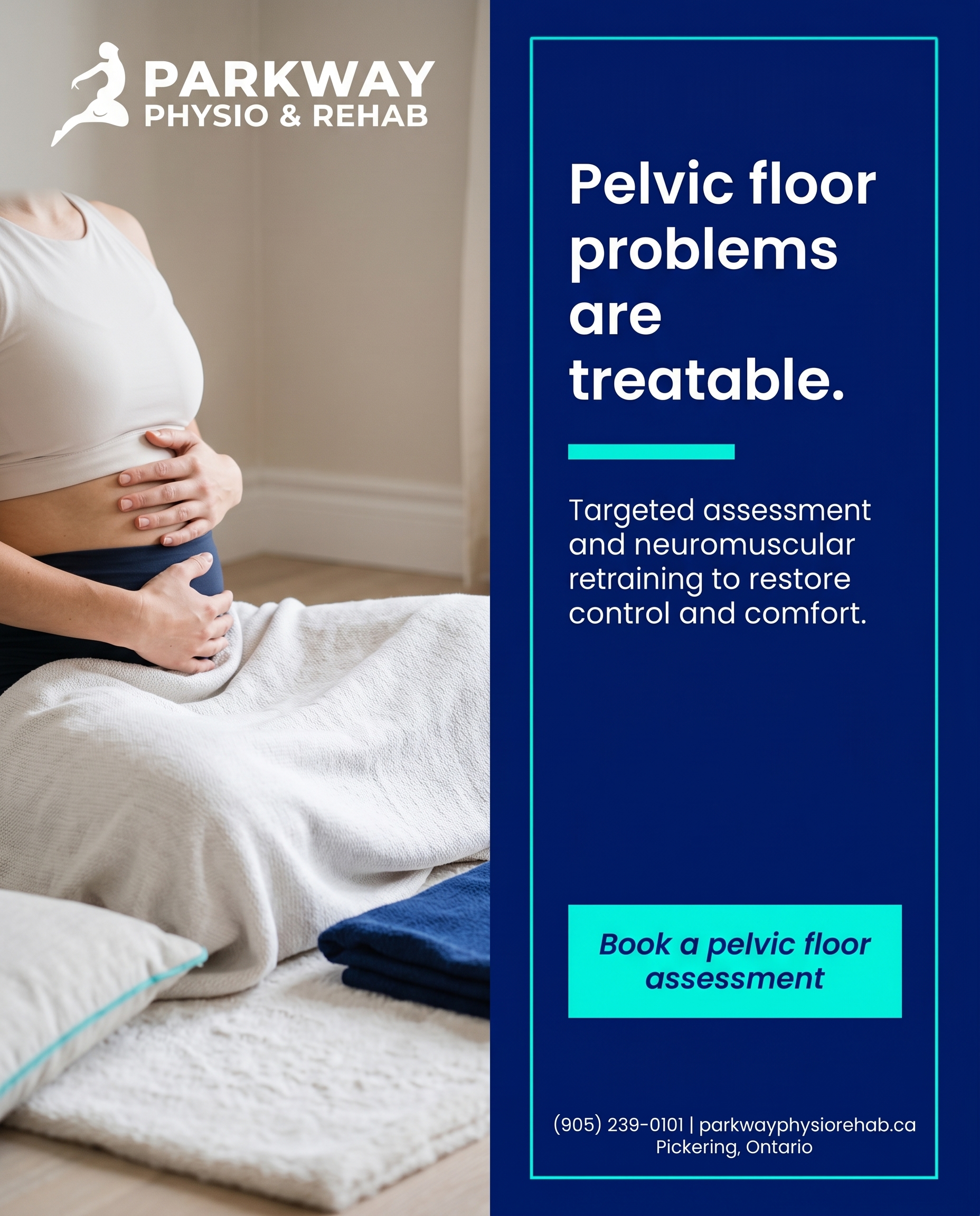
A reassuring, real-life photography post showing that pelvic floor dysfunction is treatable through dedicated pelvic floor physiotherapy — assessment plus neuromuscular retraining to restore control and comfort. The angle answers 'what actually fixes this?' for someone who already knows their symptoms have a name but doesn't realise targeted rehab exists.
Content: A reassuring, real-life photography post showing that pelvic floor dysfunction is treatable through dedicated pelvic floor physiotherapy — assessment plus neuromuscular retraining to restore control and comfort. The angle answers 'what actually fixes this?' for someone who already knows their symptoms have a name but doesn't realise targeted rehab exists.
Style: photography
2.
T10S2A3
graphic-design
Solution-aware
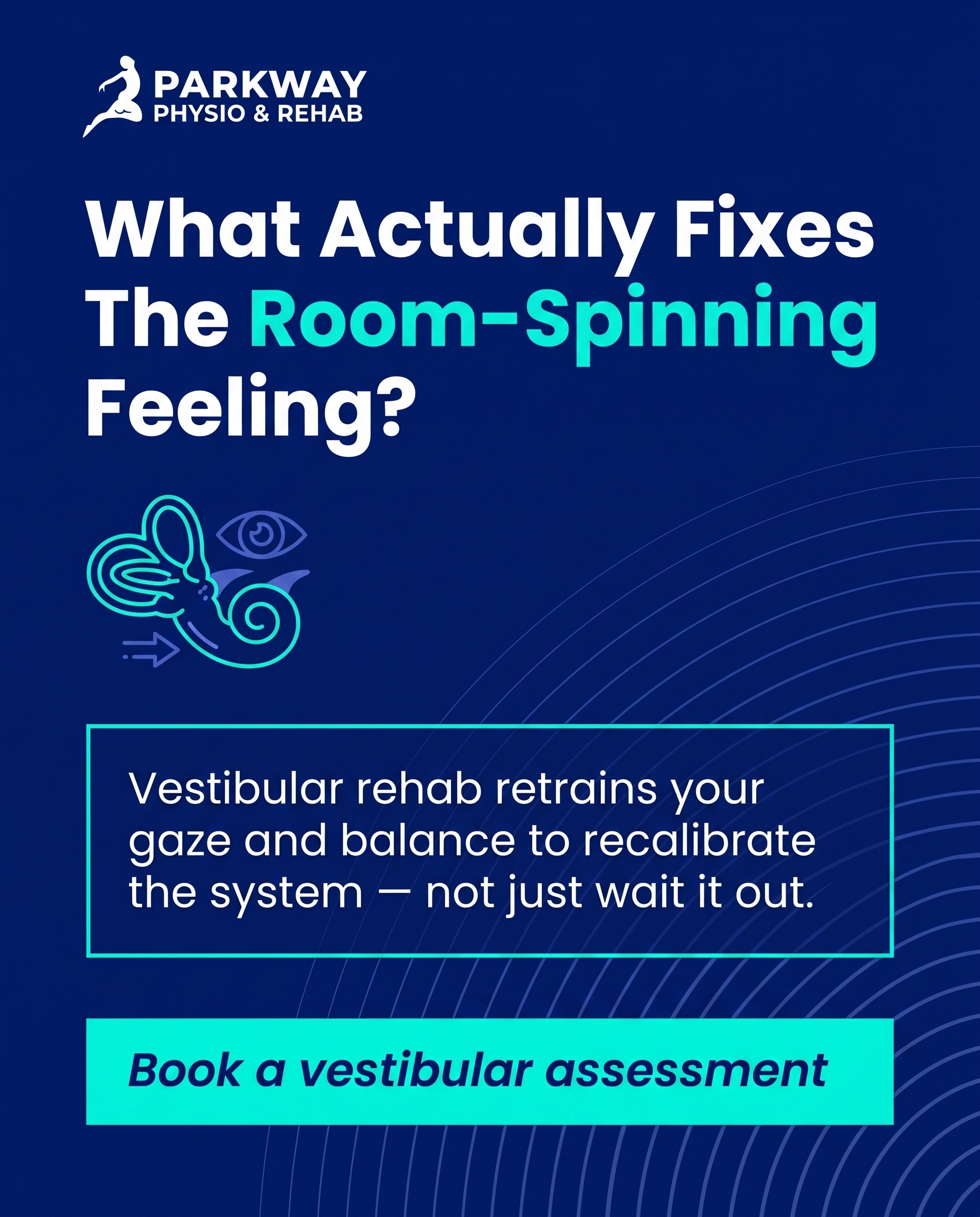
A clean graphic explainer on vestibular rehabilitation as the treatment for dizziness, vertigo and balance issues — showing how guided gaze and balance retraining recalibrates the system rather than just waiting it out. Speaks to the reader asking 'okay, but what fixes the room-spinning feeling?'
Content: A clean graphic explainer on vestibular rehabilitation as the treatment for dizziness, vertigo and balance issues — showing how guided gaze and balance retraining recalibrates the system rather than just waiting it out. Speaks to the reader asking 'okay, but what fixes the room-spinning feeling?'
Style: graphic-design
3.
L3S3A4
illustrative-3D
Product-aware
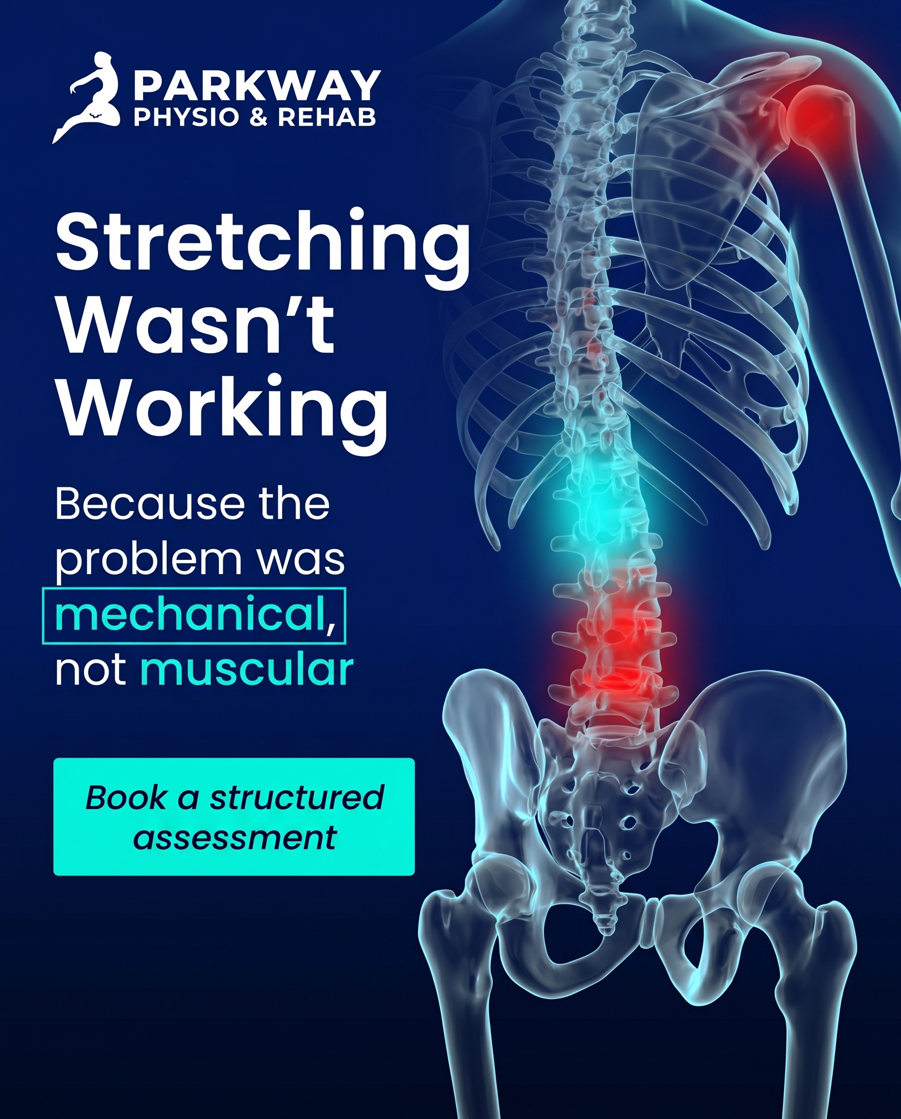
A 3D-illustrative piece for desk and manual workers whose repetitive strain and lifting habits keep flaring up, making the case for why a structured assessment here — combining manual therapy, exercise prescription and biomechanical/lifting retraining — beats generic stretches or rest. The angle is 'why bring this to us specifically,' grounded in addressing the mechanics and the recovery in one place.
Content: A 3D-illustrative piece for desk and manual workers whose repetitive strain and lifting habits keep flaring up, making the case for why a structured assessment here — combining manual therapy, exercise prescription and biomechanical/lifting retraining — beats generic stretches or rest. The angle is 'why bring this to us specifically,' grounded in addressing the mechanics and the recovery in one place.
Style: illustrative-3D
4.
L2S4A2
comparison-card
Problem-aware
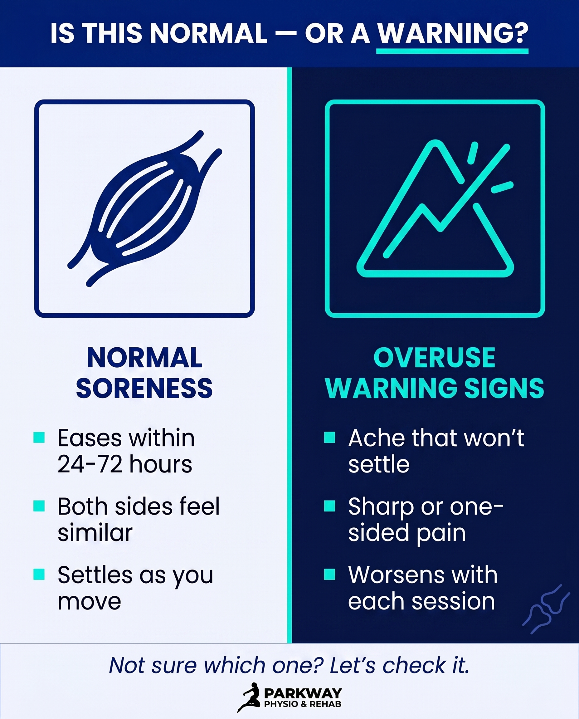
A comparison-card contrasting normal post-training soreness against the warning signs of overuse and training-load mismanagement, so the reader can judge whether what they're feeling is a real problem. The angle validates the ache that 'won't settle' as a pattern worth taking seriously, not just toughing out.
Content: A comparison-card contrasting normal post-training soreness against the warning signs of overuse and training-load mismanagement, so the reader can judge whether what they're feeling is a real problem. The angle validates the ache that 'won't settle' as a pattern worth taking seriously, not just toughing out.
Style: comparison-card
5.
T2S5A2
qa-card
Problem-aware
A Q&A-card tackling the question 'is my neck pain actually a problem or just stiffness?' — naming the signals (persistent ache, limited turning, pain spreading to shoulder or arm) that distinguish a passing tightness from something needing assessment. Confirms the reader's concern is legitimate without alarmism.
Content: A Q&A-card tackling the question 'is my neck pain actually a problem or just stiffness?' — naming the signals (persistent ache, limited turning, pain spreading to shoulder or arm) that distinguish a passing tightness from something needing assessment. Confirms the reader's concern is legitimate without alarmism.
Style: qa-card
6.
T3S6A3
myth-buster
Solution-aware
A myth-buster correcting the belief that sciatica only gets better with bed rest or that it always means surgery, and showing that structured rehab — manual therapy plus progressive, targeted exercise — is what actually settles the nerve pain. Answers 'what really fixes sciatica?' by replacing the rest-and-wait myth with an active recovery path.
Content: A myth-buster correcting the belief that sciatica only gets better with bed rest or that it always means surgery, and showing that structured rehab — manual therapy plus progressive, targeted exercise — is what actually settles the nerve pain. Answers 'what really fixes sciatica?' by replacing the rest-and-wait myth with an active recovery path.
Style: myth-buster
7.
T12S7A1
list-tips
Unaware
A list-tips post that connects everyday experiences — jaw clicking, morning jaw soreness, headaches, teeth clenching, trouble chewing — to a single named condition the reader hasn't considered: TMJ dysfunction. The angle makes an unaware reader realise these scattered annoyances are one thing worth caring about.
Content: A list-tips post that connects everyday experiences — jaw clicking, morning jaw soreness, headaches, teeth clenching, trouble chewing — to a single named condition the reader hasn't considered: TMJ dysfunction. The angle makes an unaware reader realise these scattered annoyances are one thing worth caring about.
Style: list-tips
8.
C2S8
stat-card
A stat-card that signals this is a clinic where athletes belong — built around recovery and return-to-play numbers that reflect a sports-rehab culture of plyometrics, agility and return-to-play testing. The message is recognition: 'people who train and compete come here to get back on the field.'
Content: A stat-card that signals this is a clinic where athletes belong — built around recovery and return-to-play numbers that reflect a sports-rehab culture of plyometrics, agility and return-to-play testing. The message is recognition: 'people who train and compete come here to get back on the field.'
Style: stat-card
9.
T11S9A2
checklist
Problem-aware
A checklist helping someone after a knock to the head decide whether their lingering symptoms — headache, fog, light sensitivity, dizziness, trouble concentrating — point to a real concussion worth assessing. The angle answers 'is this actually happening to me?' by turning vague 'off' feelings into a clear set of signs to take seriously.
Content: A checklist helping someone after a knock to the head decide whether their lingering symptoms — headache, fog, light sensitivity, dizziness, trouble concentrating — point to a real concussion worth assessing. The angle answers 'is this actually happening to me?' by turning vague 'off' feelings into a clear set of signs to take seriously.
Style: checklist
10.
T4S2A1
graphic-design
Unaware
A graphic-design post for someone who doesn't yet think their shoulder is an issue, surfacing the small everyday limits — avoiding overhead reaches, sleeping on one side, a shoulder that aches by evening — and reframing them as worth noticing. The angle gets an unaware reader to pause and care before it becomes a bigger restriction.
Content: A graphic-design post for someone who doesn't yet think their shoulder is an issue, surfacing the small everyday limits — avoiding overhead reaches, sleeping on one side, a shoulder that aches by evening — and reframing them as worth noticing. The angle gets an unaware reader to pause and care before it becomes a bigger restriction.
Style: graphic-design
3
Developed Posts
10 posts · 2026-06-02T10:13
10 developed
▼
1.
T9S1A3
Rough Image Prompt
Elevated wellness lifestyle photography communicating reassurance and quiet confidence around pelvic floor recovery. Subject: a person shown from behind or focusing on torso/midsection and hands only — for example, hands resting gently on the lower abdomen, or seated on a soft mat in a calm home recovery posture, no face visible at all (no profile, no side-of-face, no back-of-head with facial features). Mood: calm, private, restorative, hopeful — the visual feeling of someone realising relief is possible. Soft natural daylight, warm and gentle atmosphere, considered editorial composition. Generic neutral home setting (soft textiles, simple uncluttered space) — no clinic interior, no treatment table, no medical equipment, no practitioner figure depicted. Integrate brand colour cues naturally through fabric tones, soft props, or a subtle colour wash. Brand colours available to draw from: deep navy #011A77, bright cyan-teal #02F7E0, soft off-white #F4F6FB, near-black #07091C, white #FFFFFF, mid navy tint #4A5DC7. Typography for the text overlay in Poppins, with Poppins italic available for the CTA. Text to render: headline 'Pelvic floor problems are treatable.', supporting line 'Targeted assessment and neuromuscular retraining to restore control and comfort.', CTA 'Book a pelvic floor assessment'. Keep all rendered text crisp and legible. Logo placement should vary by composition and is finalised downstream.
Text Overlay
Caption
You already know your symptoms have a name. What often gets missed is that there's a clear path forward.
Pelvic floor dysfunction isn't something you have to just live with or quietly manage on your own. Dedicated pelvic floor physiotherapy starts with a proper assessment to understand what's actually happening, then uses neuromuscular retraining to rebuild control, coordination, and comfort over time.
No guesswork. No vague advice to do more of a single exercise and hope. Just a targeted plan built around what your body needs.
This is one of the most treatable issues we see, and far too few people realise help like this exists. If that's you, you don't have to keep waiting it out.
📞 (905) 239-0101
🌐 https://parkwayphysiorehab.ca
✉️ info@parkwayphysiorehab.ca
Wondering if pelvic floor physio is right for you? Send us a message — we're happy to talk it through.
Hashtags
#PelvicFloorPhysio #PhysiotherapyPickering #PelvicHealth #WomensHealthPhysio #ParkwayPhysioRehab
2.
T10S2A3
Rough Image Prompt
A richly-designed typographic graphic-design post explaining vestibular rehabilitation as the active treatment for dizziness, vertigo and balance problems. The concept communicates that guided gaze training and balance retraining recalibrates the balance system rather than simply waiting for symptoms to pass. Components required: a clear headline, a short supporting explainer line, and a CTA. Optional supporting accent: a small, clean illustrative element symbolising balance and gaze recalibration — for example a stylised inner-ear / vestibular motif or a subtle directional eye-and-arrow icon set rendered as editorial illustration on a neutral or gradient field (small, supporting, not full-frame). Subtle abstract motion or directional lines can suggest the gaze and balance retraining concept. Keep the visual treatment primarily typographic with supporting accent elements — no photography, no clinic interiors, no people. Brand colours to draw from: deep navy #011A77, bright cyan-teal #02F7E0, soft off-white #F4F6FB, near-black #07091C, white #FFFFFF, mid navy-blue tint #4A5DC7. Typography: Poppins for headline, Poppins for supporting text, Poppins italic for CTA. Text to render: headline 'What Actually Fixes The Room-Spinning Feeling?', supporting text 'Vestibular rehab retrains your gaze and balance to recalibrate the system — not just wait it out.', CTA 'Book a vestibular assessment'. Logo placement varies by composition and is finalised downstream. Clean, intentional, clinical-modern design with strong contrast and considered use of the cyan accent on navy for key words.
Text Overlay
Caption
The room spins. You sit still and hope it passes. But waiting it out isn't the only option — and often it isn't the best one.
Dizziness, vertigo and balance issues usually trace back to a balance system that's out of sync. Vestibular rehabilitation works by retraining it. Guided gaze exercises teach your eyes and inner ear to talk to each other again. Balance retraining rebuilds your stability step by step. Over time, the system recalibrates — and the spinning settles.
It's targeted, it's progressive, and it's built around what's actually triggering your symptoms. Not a guess. A plan.
If the room has been spinning and you've been hoping it sorts itself out, there's a more direct way forward.
📞 (905) 239-0101
🌐 https://parkwayphysiorehab.ca
✉️ info@parkwayphysiorehab.ca
Dealing with dizziness or balance problems? Send us a message — we'll talk you through what an assessment looks like.
Hashtags
#VestibularRehab #PickeringPhysio #Vertigo #BalanceTraining #DizzinessRelief
3.
L3S3A4
Rough Image Prompt
An anatomically accurate 3D illustration concept communicating why a structured, mechanics-based assessment beats generic stretches or rest for repetitive strain. Subject: a translucent, glass-like 3D render of the lower spine and lumbar region with surrounding soft tissue, shown with clinical polish. Highlight the area of repetitive strain along the lower back and one shoulder/upper-arm zone using a soft red glow to indicate irritation and overload from lifting and repetitive work. Use a cool cyan accent glow to indicate the targeted focus area where structured treatment is directed — visually contrasting the 'irritation' against the 'focus' to suggest precise, intentional intervention rather than vague self-treatment. Components required: the anatomical spine/lumbar render as the central visual anchor, red glow highlight indicator for strain, cyan accent glow for treatment focus, and clean text overlay elements. Brand colours to draw from (exact hex): #011A77 deep navy, #02F7E0 bright cyan-teal, #F4F6FB soft off-white, #07091C near-black, #FFFFFF white, #4A5DC7 mid navy-blue tint. Typography: Poppins for headline, Poppins for supporting text, Poppins italic for CTA. Text content to render: headline 'Stretching Wasn't Working' / supporting text 'Because the problem was mechanical, not muscular' / CTA 'Book a structured assessment'. Rendering style: translucent, glass-like, anatomically accurate, clinical and intentional, editorial polish on a clean brand-coloured background. Logo placement should vary by composition and is finalised downstream.
Text Overlay
Caption
If the same ache keeps flaring up every few weeks, more rest and a quick stretch routine usually aren't the answer. Repetitive strain from lifting, desk work, and the same movements day after day tends to build up where the mechanics are off, not just where it hurts. That's why generic advice keeps falling short. A structured assessment looks at how you're actually moving and loading the area, then pairs hands-on manual therapy with targeted exercise prescription and lifting and posture retraining, all in one place. You address the irritation and the cause that keeps feeding it. The goal isn't a temporary fix that fades by next week. It's getting your back, shoulders, and the way you load them working properly so the flare-ups stop coming back. Bringing it to a team that treats the mechanics and the recovery together is the difference between managing a problem and solving it.
📞 (905) 239-0101
🌐 https://parkwayphysiorehab.ca
✉️ info@parkwayphysiorehab.ca
What's the ache that keeps coming back for you? Tell us below.
Hashtags
#Physiotherapy #PickeringON #RepetitiveStrain #BackPainRelief #MoveBetter
4.
L2S4A2
Rough Image Prompt
A comparison-card style social graphic for a physiotherapy clinic, contrasting two genuinely different states: normal post-training soreness versus the warning signs of overuse from training-load mismanagement. The post helps a recreational or competitive athlete judge whether what they're feeling is expected recovery or a pattern worth taking seriously. Two distinct content sides, each given equal visual weight, with concrete content-derived labels. Side one labelled 'NORMAL SORENESS' with short supporting descriptors. Side two labelled 'OVERUSE WARNING SIGNS' with short supporting descriptors. Typographic-led design with small supporting icon accents per side (a soft muscle/recovery icon for the normal side, a small alert or escalating-line icon for the warning side). Optionally a subtle small anatomical accent (a stylised muscle or joint motif) to reinforce the training context, kept supporting and not full-frame. Use only these brand colours: deep navy #011A77, bright cyan-teal #02F7E0, soft off-white #F4F6FB, near-black text #07091C, white #FFFFFF, mid navy-blue tint #4A5DC7. Typography: Poppins for headline and labels, Poppins for supporting text, Poppins italic for the CTA. Render the following text exactly: headline 'IS THIS NORMAL — OR A WARNING?', side one label 'NORMAL SORENESS', side one items 'Eases within 24-72 hours', 'Both sides feel similar', 'Settles as you move', side two label 'OVERUSE WARNING SIGNS', side two items 'Ache that won't settle', 'Sharp or one-sided pain', 'Worsens with each session', and CTA 'Not sure which one? Let's check it.' Logo placement should vary by composition and is finalised downstream. Clean editorial typographic treatment, intentional and richly designed, no clinic interiors, no treatment scenes, no people, no faces.
Text Overlay
Caption
Some soreness after training is part of the deal. Your muscles worked, they're adapting, and within a couple of days they settle. That's normal.
What isn't normal is the ache that won't settle. The one that shows up sharp, sits on one side, and gets a little louder every session. That's not something to tough out — it's a pattern worth taking seriously.
Overuse and training-load mismanagement rarely announce themselves with one dramatic moment. They build quietly until something gives. The good news? Caught early, they're far easier to settle and far quicker to recover from.
So if you've been telling yourself it'll sort itself out — and it hasn't — that's your signal.
Which side does your current ache fall on? Have a read through and let us know.
📞 (905) 239-0101
🌐 https://parkwayphysiorehab.ca
✉️ info@parkwayphysiorehab.ca
Hashtags
#PickeringPhysio #SportsInjury #OveruseInjury #TrainingSmart #PhysioRehab
5.
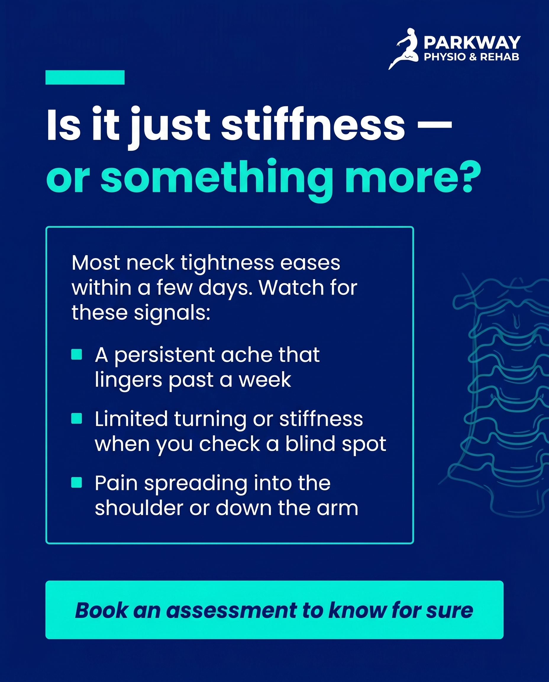
T2S5A2
Rough Image Prompt
A clean, typographic Q&A-card for a physiotherapy clinic addressing neck pain. Subject and content character: a calm, reassuring question-and-answer composition that helps the reader distinguish passing neck stiffness from a problem worth assessing — confident and clarifying, never alarmist. Components required: a clear question element, a clear answer element with three short signal descriptors, a small supporting anatomical accent (a simple, elegant illustration of the cervical spine / neck vertebrae, translucent or line-style, used as a small supporting accent rather than a full-frame image), and a CTA. Typography: Poppins for the question headline, Poppins for the answer and signal lines, Poppins italic for the CTA. Brand colours available (draw from this palette, exact hex): #011A77 deep navy, #02F7E0 bright cyan-teal, #F4F6FB soft off-white, #07091C near-black, #FFFFFF white, #4A5DC7 mid navy-blue. Text content to render: question 'Is it just stiffness — or something more?', answer framing 'Most neck tightness eases within a few days. Watch for these signals:', signal one 'A persistent ache that lingers past a week', signal two 'Limited turning or stiffness when you check a blind spot', signal three 'Pain spreading into the shoulder or down the arm', CTA 'Book an assessment to know for sure'. Keep the cervical spine accent small and supporting so the typography leads. Logo placement should vary by composition and is finalised downstream. Typographic-led design with a clinical-but-warm character; let the cyan-teal carry the key words and accents against navy or off-white surfaces.
Text Overlay
Caption
Stiff neck after a long day at the desk? Most of the time, it settles on its own within a few days. But sometimes a stiff neck is your body asking for a closer look.
Here's how to tell the difference. A passing tightness loosens up with movement and rest. Something worth assessing tends to linger — a persistent ache past a week, trouble turning your head when you check a blind spot, or pain that starts creeping into your shoulder or down your arm.
If any of those sound familiar, it's not you being dramatic. It's a legitimate signal, and the earlier we assess it, the simpler it usually is to settle. A quick check tells us whether it's a posture-and-tension issue or something the neck needs proper support to recover from.
Not sure which camp you're in? Send us a message — we're happy to point you in the right direction.
📞 (905) 239-0101
🌐 https://parkwayphysiorehab.ca
✉️ info@parkwayphysiorehab.ca
Hashtags
#NeckPain #PhysiotherapyPickering #PickeringON #PostureHealth #ParkwayPhysioRehab
6.
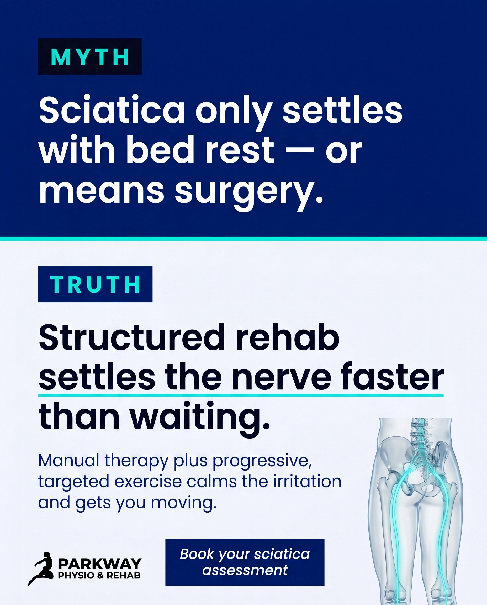
T3S6A3
Rough Image Prompt
Myth-buster style social post for a physiotherapy and rehab clinic, correcting the belief that sciatica improves with bed rest or always requires surgery. Typographic-led design with bold visual contrast between a MYTH statement and a TRUTH statement. Subject concept: active recovery for sciatica through structured rehab. Components required: MYTH label, single myth statement, TRUTH label, single truth statement, a short CTA, and a small supporting accent element. Accent element: a clean, anatomically accurate illustration of the lower spine and sciatic nerve pathway down through the glute and back of the leg, rendered in a polished translucent/glass-like style, with a subtle cyan glow tracing the nerve line to signal calming and settling rather than flare-up. Keep the anatomical render small and supporting, not full-frame — the typography leads. Brand colours to draw from: #011A77 deep navy, #02F7E0 bright cyan-teal, #F4F6FB soft off-white, #07091C near-black, #FFFFFF white, #4A5DC7 mid navy-blue tint. Typography: Poppins for headline and labels, Poppins for supporting text, Poppins italic for CTA. Text to render: MYTH label 'MYTH', myth statement 'Sciatica only settles with bed rest — or means surgery.', TRUTH label 'TRUTH', truth statement 'Structured rehab settles the nerve faster than waiting.', CTA 'Book your sciatica assessment'. Logo placement should vary by composition and is finalised downstream. Show clean, intentional, editorial design with strong typographic impact and clear contrast between the two states.
Text Overlay
Caption
Here's the truth about sciatica that catches a lot of people out.
Waiting it out in bed rarely settles it. And no — it doesn't automatically mean surgery either. For most people, that radiating leg pain calms down with structured, active rehab, not rest.
What actually moves the needle? Hands-on manual therapy to ease the irritation, paired with progressive, targeted exercise that builds tolerance back into the area. The nerve settles, movement returns, and you stop bracing for the next flare.
The sooner you start, the smoother the recovery tends to be. Ignoring early aches and hoping they pass usually just stretches the timeline out.
If that nagging pain down the back of your leg sounds familiar, let's put a proper plan in place.
📞 (905) 239-0101
🌐 https://parkwayphysiorehab.ca
✉️ info@parkwayphysiorehab.ca
Dealing with sciatica right now? Tell us how long it's been bothering you.
Hashtags
#SciaticaRelief #PhysiotherapyPickering #BackAndNervePain #ActiveRecovery #PickeringON
7.
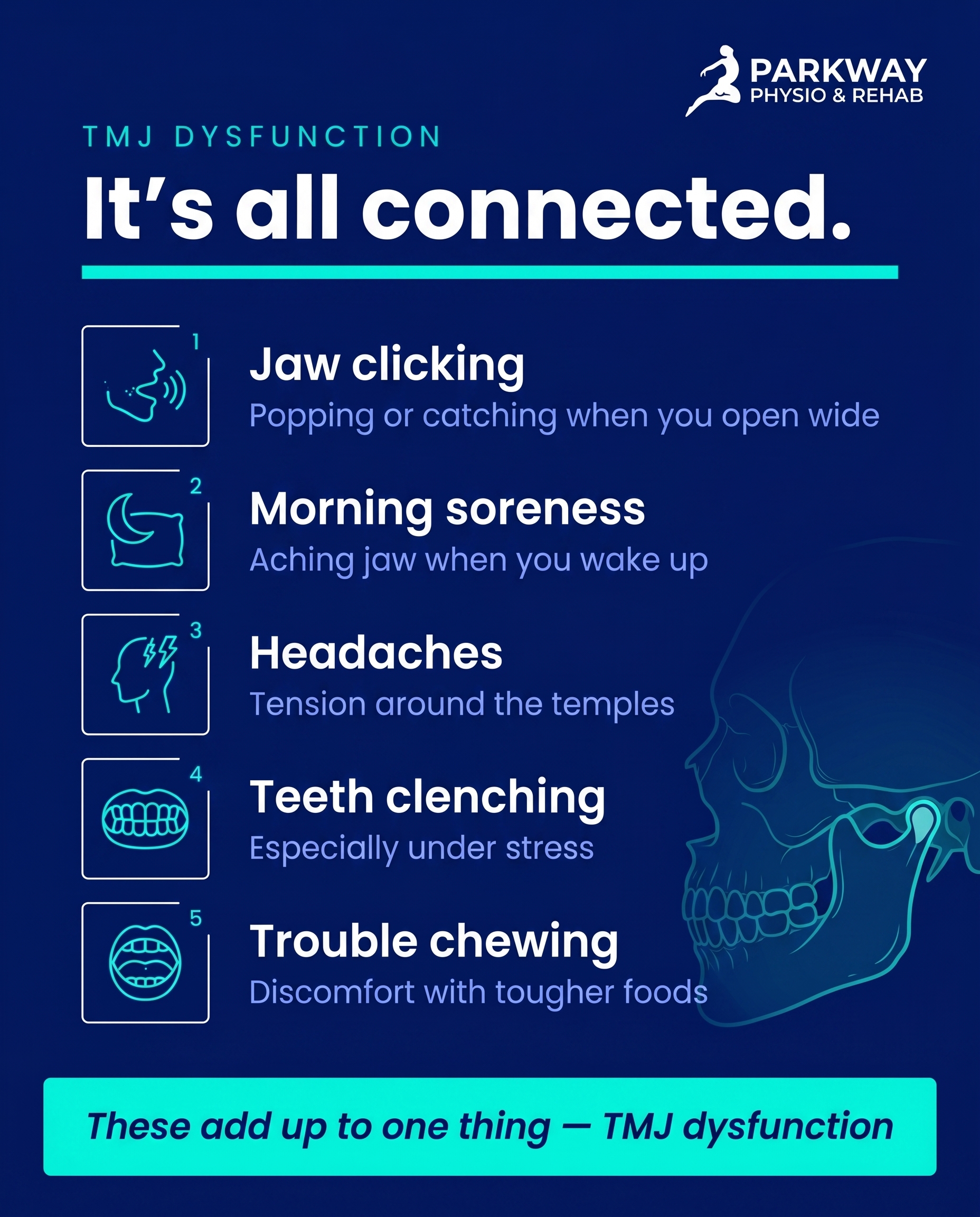
T12S7A1
Rough Image Prompt
A list-tips graphic-design post for a physiotherapy clinic connecting five everyday experiences to one named condition: TMJ dysfunction. The post communicates that scattered, unrelated-seeming annoyances are actually a single thing worth caring about. Typographic-led design with custom illustrated icon accents for each list item. Header text introduces the theme. Five short list items, each pairing a small illustrated icon with a short title line and one supporting line. Optional small supporting anatomical illustration of the jaw/TMJ joint rendered in a clean, translucent, editorial style as a subtle accent — not full-frame, not documentary, isolated on a clean field. Use only these exact brand colours: deep navy #011A77, bright cyan-teal #02F7E0, soft off-white #F4F6FB, near-black text #07091C, white #FFFFFF, mid navy-blue tint #4A5DC7. Typography: Poppins for headline, Poppins for item titles and supporting lines, Poppins italic for CTA. Icons should feel custom to each item: a small jaw/sound-wave motif for clicking, a moon or pillow motif for morning soreness, a head/temple motif for headaches, a clenched-teeth or pressure motif for clenching, a chewing/bite motif for trouble eating. Header text: 'It's all connected.' Item one title: 'Jaw clicking' supporting line: 'Popping or catching when you open wide'. Item two title: 'Morning soreness' supporting line: 'Aching jaw when you wake up'. Item three title: 'Headaches' supporting line: 'Tension around the temples'. Item four title: 'Teeth clenching' supporting line: 'Especially under stress'. Item five title: 'Trouble chewing' supporting line: 'Discomfort with tougher foods'. CTA text: 'These add up to one thing — TMJ dysfunction'. Clean, intentional, richly-designed typographic treatment. Logo placement varies by composition and is finalised downstream. Keep all text crisp and legible.
Text Overlay
Caption
You've been treating them as separate things. The jaw that clicks when you yawn. The dull ache that greets you most mornings. The headaches you blamed on screens. The clenching you only notice when you're stressed. The food you've quietly started avoiding because chewing isn't fun anymore.
Here's the part most people miss — these aren't five unrelated annoyances. They're often one thing: TMJ dysfunction. The jaw joint does a lot of work every single day, and when it's struggling, the signals show up in scattered, easy-to-dismiss ways.
The good news? It responds well to the right approach. Manual therapy, targeted exercise, and addressing the habits feeding into it can make a real difference.
If you read this list and thought "that's me" on more than one — it's worth getting checked.
📞 (905) 239-0101
🌐 https://parkwayphysiorehab.ca
✉️ info@parkwayphysiorehab.ca
Which of these sounds familiar? Let us know below.
Hashtags
#TMJDysfunction #PhysiotherapyPickering #JawPain #PickeringOntario #MoveBetter
8.
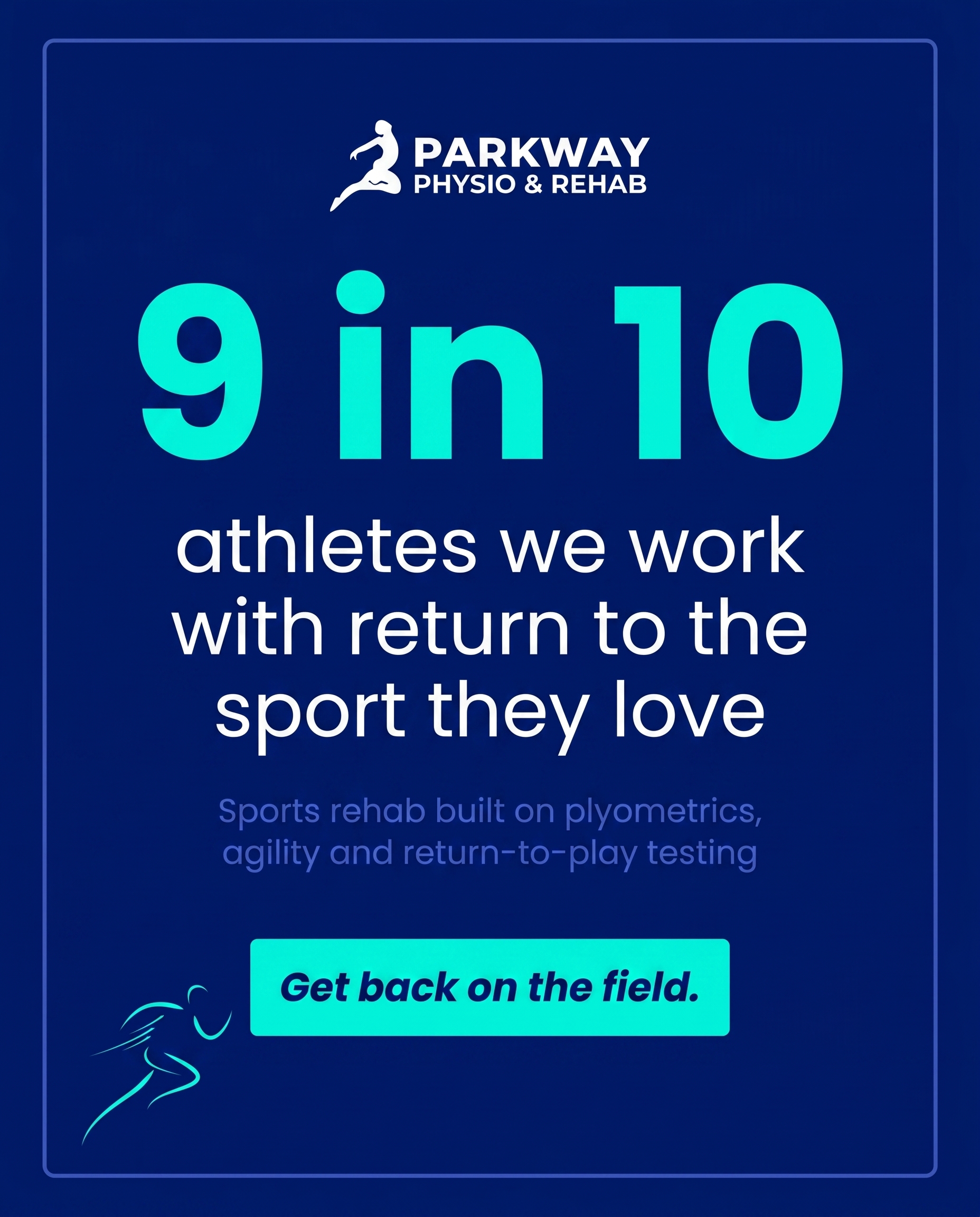
C2S8
Rough Image Prompt
A stat-card built around a single striking return-to-play statistic that signals this is a clinic where athletes belong. Content character: confident, sports-rehab energy, the stat dominates the composition as the visual anchor. Components: one large hero statistic, a short context line beneath it, and a small source attribution line. Optional supporting visual accent — a subtle athletic motion element such as a stylised running stride line, a clean abstract dynamic accent shape, or a small editorial object close-up of a running shoe or athletic tape on a neutral background — kept small and supporting so it never competes with the typography. Brand colours available to draw from (exact hex): deep navy #011A77, bright cyan-teal #02F7E0, soft off-white #F4F6FB, near-black #07091C, white #FFFFFF, mid navy-blue tint #4A5DC7. Cyan reads vividly as the stat highlight on navy surfaces. Typography: Poppins for the hero statistic, Poppins for supporting text, Poppins italic for the CTA. Text to render: hero stat '9 in 10', context line 'athletes we work with return to the sport they love', source line 'Sports rehab built on plyometrics, agility and return-to-play testing', CTA 'Get back on the field.' Logo placement should vary by composition and is finalised downstream. Show clean typographic dominance with the stat as the clear focal point, a dynamic athletic accent that signals movement and competitive energy, and crisp brand-colour contrast. Typographic-led design — no clinic interiors, no treatment scenes, no faces, no full-figure people.
Text Overlay
Caption
If you train, compete, or just hate sitting on the sidelines — this is your place. People who push their bodies come here to get back to what they love, and they leave on a plan, not a guess. Return-to-play isn't a vibe. It's tested. Plyometrics, agility work, and proper return-to-play screening mean you go back when you're ready, not when you're hopeful. No shortcuts, no crossing fingers and seeing how it holds up on game day. Recovering from a sports injury, or trying to stop one before it sidelines you? Let's build the plan that gets you back on the field stronger than you left it. Tell us what you're training for — we'll meet you there.
📞 (905) 239-0101
🌐 https://parkwayphysiorehab.ca
✉️ info@parkwayphysiorehab.ca
What are you working to get back to? Drop it below.
Hashtags
#SportsRehab #PickeringPhysio #ReturnToPlay #SportsInjuryRecovery #AthleteCare
9.
T11S9A2
Rough Image Prompt
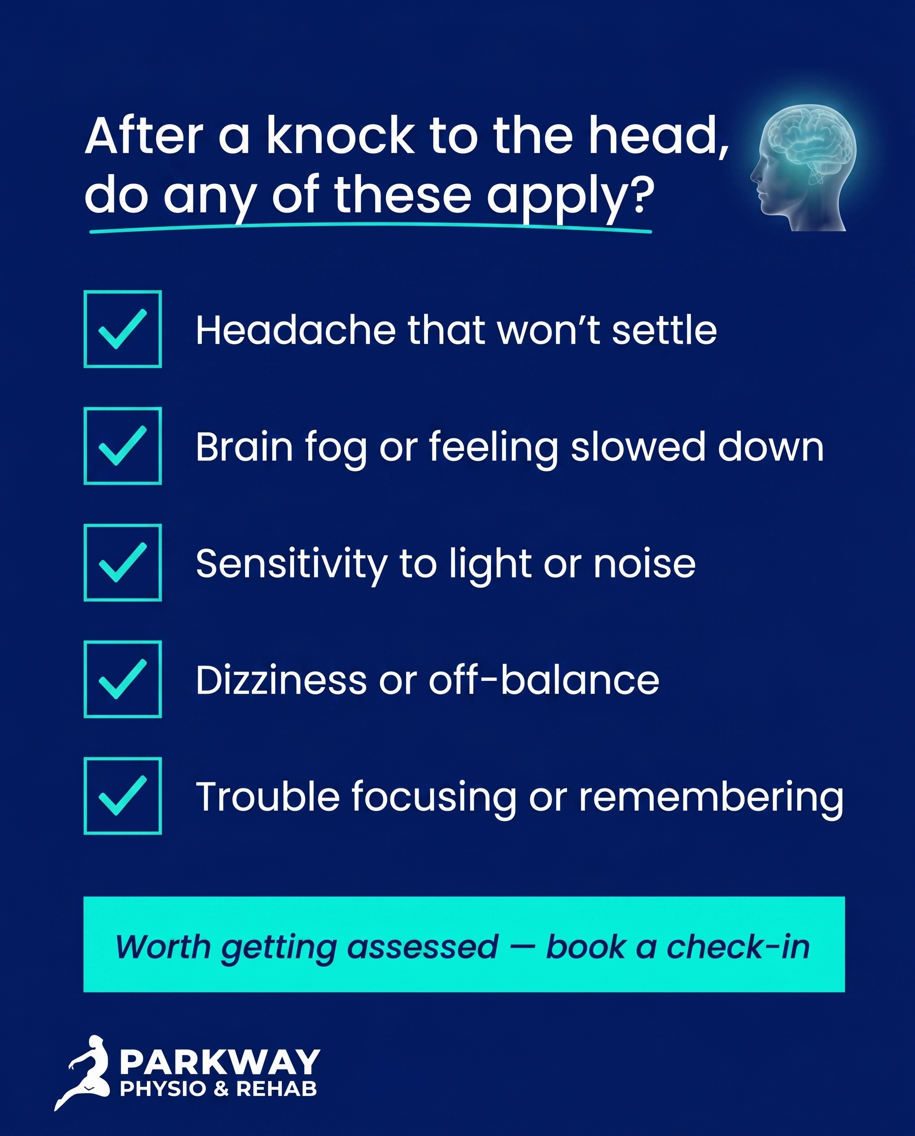
Create a typographic-led checklist post for a physiotherapy clinic on the theme of recognising lingering concussion symptoms after a knock to the head. The post turns vague 'something feels off' feelings into a clear set of recognisable signs to take seriously. Typographic in character with checkbox graphics and a small supporting symbolic accent. Components: a framing line, five short checklist items each with a clean checkbox graphic and a one-line label, and a soft CTA. Optional small supporting visual accent: a subtle anatomical illustration of a side-profile head/brain rendered in a clean translucent glass-like style with a soft cyan glow, OR an abstract symbolic motif (gentle radiating lines suggesting head pressure/fog) — kept small and supporting, never full-frame, never competing with the typography. Brand colour palette to draw from: #011A77 deep navy, #02F7E0 bright cyan-teal, #F4F6FB soft off-white, #07091C near-black text, #FFFFFF white, #4A5DC7 mid navy-blue tint. Typography: Poppins for the framing headline, Poppins for checklist item labels, Poppins italic for the CTA. Text content to render exactly: framing line 'After a knock to the head, do any of these apply?'; checklist items 'Headache that won't settle', 'Brain fog or feeling slowed down', 'Sensitivity to light or noise', 'Dizziness or off-balance', 'Trouble focusing or remembering'; CTA 'Worth getting assessed — book a check-in'. Checkbox graphics should feel clean and custom, in cyan or navy. Logo placement should vary by composition and is finalised downstream. Show clean clinical-polish typographic design with brand colours; keep all imagery illustrative and symbolic — no faces, no clinic interiors, no people.
Text Overlay
Caption
A bump to the head can leave you feeling a bit off without anything obvious to point to. Maybe the headache lingers. Maybe everything feels a touch slowed down, like you're moving through fog. Maybe bright screens or background noise bother you more than usual.
These aren't things to wait out and hope they fade. A concussion isn't always dramatic — it often shows up as a handful of quiet, persistent signs that something hasn't settled.
If a few of these feel familiar after a knock to the head, that's worth taking seriously. A proper assessment helps you understand what's going on and gives you a clear path back to feeling like yourself again.
No head injury is too small to check. The earlier we look, the better we can guide your recovery.
📞 (905) 239-0101
🌐 https://parkwayphysiorehab.ca
✉️ info@parkwayphysiorehab.ca
Felt off after a knock to the head? Save this and reach out — we're here in Pickering.
Hashtags
#ConcussionRecovery #Physiotherapy #PickeringOntario #BrainHealth #HeadInjuryAwareness
10.
T4S2A1
Rough Image Prompt
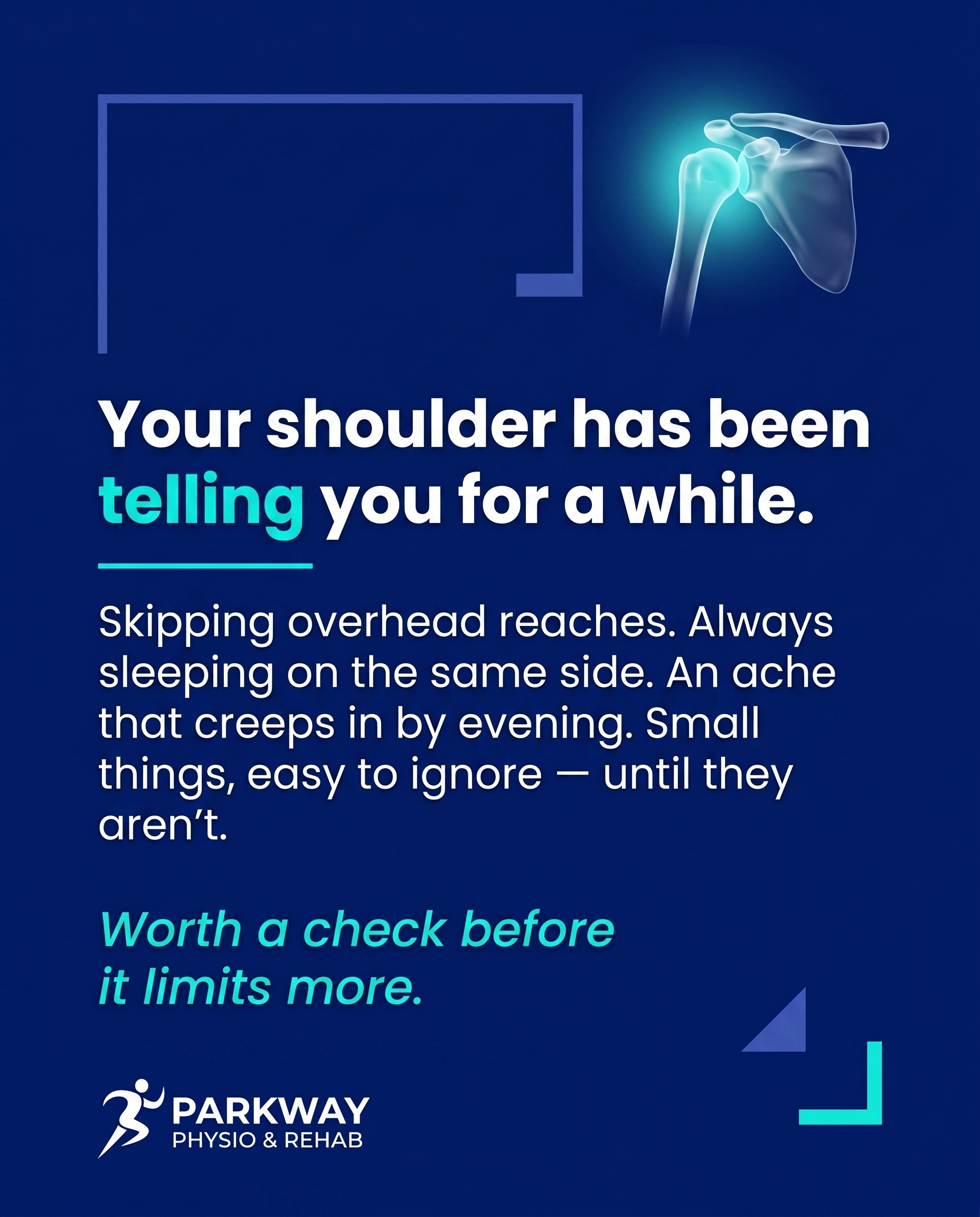
A typographic-led graphic-design social post for a physiotherapy clinic, designed to make someone pause and reconsider small shoulder limits they have been quietly working around. Concept and intent: surface the everyday, easy-to-dismiss signs of an early shoulder restriction and reframe them as worth noticing before they become a bigger problem. The visual treatment is primarily typography with a small supporting accent element. Components required: a headline, supporting text, and a CTA as the typographic hierarchy; one small supporting anatomical illustration of a shoulder joint (clean, editorial, translucent glass-like 3D style) with a subtle highlight or soft glow over the shoulder region to draw the eye, kept small and supporting rather than full-frame. Optional small abstract accent shapes to add intention to the composition. Brand colour palette to draw from (exact hex): deep navy #011A77, bright cyan-teal #02F7E0, soft off-white #F4F6FB, near-black #07091C, white #FFFFFF, mid navy-blue tint #4A5DC7. Typography: Poppins for headline, Poppins for supporting text, Poppins italic for CTA. Text content to render exactly: headline "Your shoulder has been telling you for a while.", supporting text "Skipping overhead reaches. Always sleeping on the same side. An ache that creeps in by evening. Small things, easy to ignore — until they aren't.", CTA "Worth a check before it limits more.". Logo placement should vary by composition and is finalised downstream. Keep the design clean, intentional, richly designed and on-brand, with the anatomical shoulder accent reading as a clear representation rather than a clinical photograph.
Text Overlay
Caption
You don't always notice the moment a shoulder starts limiting you. It's quieter than that.
It's reaching for the top shelf with the other arm without thinking. It's only ever sleeping on one side. It's that dull ache that shows up by the end of the day and fades by morning, so you tell yourself it's nothing.
None of these feel like a reason to book anything. That's exactly why they're worth noticing. Early shoulder restrictions are far easier to settle than the ones that have had months to set in and reshape how you move.
If you've quietly started working around your shoulder, that's your sign to pay attention. A proper assessment can tell you what's going on and what to do about it — before it becomes a bigger restriction.
Noticed any of these in yourself lately? Our team in Pickering is here when you're ready to look into it.
📞 (905) 239-0101
🌐 https://parkwayphysiorehab.ca
✉️ info@parkwayphysiorehab.ca
Hashtags
#ShoulderPain #PhysiotherapyPickering #MoveBetter #PickeringOntario
4
Refined Image Prompts
10 prompts · 2026-06-02T10:14
10 prompts refined
▼
1.
T9S1A3
Refined Image Prompt
Elevated wellness lifestyle photograph anchoring the left two-thirds of the frame: a person seated on a soft textured mat in a calm, uncluttered home space, shown only from the torso and midsection down, hands resting gently on the lower abdomen in a restful, restorative posture. No face is visible at all — no profile, no side of face, no back of head, framing crops cleanly above the shoulders. The mood is private, calm, hopeful and restorative, evoking quiet relief and renewed confidence. Soft natural daylight falls warm and diffuse across the scene from the left, gentle shadows, considered editorial composition with shallow depth of field. The setting is a generic neutral home interior with simple soft textiles, a plain wall, no clinic furniture, no treatment table, no medical equipment, and no second person in frame. Brand colour cues woven naturally into the scene through fabric and prop tones: a soft off-white #F4F6FB throw or mat, a folded textile in deep navy #011A77, and a subtle cyan-teal #02F7E0 accent on a cushion edge or small prop, plus a barely-there cool colour wash across the highlights.
The right third of the composition carries a clean clinical sports-physio layout with cyan energy pops, set against a solid deep navy #011A77 vertical panel with sharp 0-2px corners running full height. Reversed text on the navy panel reads in white #FFFFFF. Headline in Poppins, white #FFFFFF: "Pelvic floor problems are treatable." set in the upper portion of the panel, generous line spacing, left-aligned. Directly beneath the headline a short thin solid horizontal bar in bright cyan-teal #02F7E0 acts as an accent underline. Supporting line in Poppins, soft off-white #F4F6FB, smaller scale, left-aligned below the accent bar: "Targeted assessment and neuromuscular retraining to restore control and comfort." Toward the lower portion of the panel, a CTA button rendered as a solid cyan-teal #02F7E0 block with sharp 0-2px corners, containing text in Poppins italic, deep navy #011A77: "Book a pelvic floor assessment".
A thin outlined frame in cyan-teal #02F7E0 with sharp 0-2px corners traces just inside the edge of the navy panel for a crisp clinical containment. All rectangular surfaces — the panel, the button, and any frame — use uniformly sharp 0-2px corners. The overall register is clean, clinical, calm and editorial with precise cyan accents providing energy.
Place the provided logo file in the top-left corner over the photographic area, scaled small and legible, with adequate clear space around it. Preserve the logo exactly as supplied — do not redraw, recolour, distort, or alter its proportions, lettering, or marks in any way.
Contact details set discreetly along the bottom of the navy panel in Poppins, soft off-white #F4F6FB at small scale: "(905) 239-0101 | parkwayphysiorehab.ca | Pickering, Ontario".
Constraints: keep all rendered text crisp, sharp and fully legible; show no face, no profile, no facial features anywhere; include no clinic interior, no treatment table, no medical equipment, and no practitioner or second figure; keep the home setting simple and uncluttered; maintain only the specified hex colours throughout.
2.
T10S2A3
Refined Image Prompt
A richly-designed typographic graphic-design post on a deep navy surface in #011A77, clean clinical sports-physio aesthetic with vivid cyan energy pops, strong contrast, intentional and modern.
Layout: a balanced vertical composition built on a generous margin grid. The deep navy #011A77 fills the entire surface. A faint set of thin directional arc lines in #4A5DC7 sweeps subtly across the lower-right background at low opacity, suggesting rotational gaze and balance motion without dominating the field.
Upper-third headline block: the headline "What Actually Fixes The Room-Spinning Feeling?" set in Poppins, large and confident, in #FFFFFF, left-aligned across two to three lines. Render the words "Room-Spinning" in #02F7E0 to draw the eye as the key phrase. Keep generous line spacing and clean tracking.
Central accent element: a small, clean editorial illustration symbolising balance and gaze recalibration — a stylised inner-ear vestibular motif (a simplified looping semicircular canal form) paired with a subtle eye-and-directional-arrow icon, rendered in thin #02F7E0 line strokes with a few #4A5DC7 supporting tones on a neutral negative-space area of the navy field. Keep it small and supporting, sitting in clear space between the headline and the supporting text, not full-frame.
Mid-lower supporting block: a sharp-cornered (0-2px) outlined frame in a thin #02F7E0 stroke containing the supporting text "Vestibular rehab retrains your gaze and balance to recalibrate the system — not just wait it out." set in Poppins, #FFFFFF, comfortable readable size, left-aligned inside the framed block with even internal padding.
Bottom CTA: a solid sharp-cornered (0-2px) cyan block in #02F7E0 holding the CTA "Book a vestibular assessment" set in Poppins italic, in #011A77 for crisp contrast. Position the button left-aligned in the lower region with clear breathing space around it.
Embellishment discipline: every rectangular surface — the outlined supporting frame and the CTA block — uses sharp 0-2px corners uniformly. Attention is drawn through solid cyan blocks and thin outlined frames only, consistent with the brand register.
Logo: place the attached logo file in the top-left corner at a small, tasteful scale with clear margin around it. Preserve the logo exactly as supplied — do not recolour, redraw, distort, re-letter, or alter its proportions in any way; reproduce it faithfully.
Lighting and finish: flat, even, editorial digital rendering with crisp edges, strong figure-ground contrast, and a clean clinical-modern feel.
Constraints: keep the design primarily typographic with small supporting accent elements; use only the specified hex colours; render all text exactly as quoted with correct spelling; maintain clear margins and uncluttered negative space. No photography, no clinic interiors, no people, no anatomical realism, no gradients beyond the subtle background arc lines, no decorative corner rounding.
3.
L3S3A4
Refined Image Prompt
A clinically polished editorial composition set on a deep navy background of solid #011A77, with a subtle vertical depth gradient toward #07091C near the lower edge to add dimension. The central visual anchor is an anatomically accurate translucent glass-like 3D render of the lower spine and lumbar region with surrounding soft tissue, rendered with crisp clinical realism and a refined glassy material that catches soft studio light, edges defined with thin cyan rim-light highlights. The render is positioned slightly right of centre and vertically centred, large and commanding, occupying roughly the right two-thirds of the frame.
Along the lower lumbar vertebrae and into one upper shoulder/arm zone, apply a soft diffuse red glow indicating repetitive strain and overload, the glow concentrated tightly at the irritated joints so it reads as inflammation rather than colour wash. Contrasting this, apply a cool focused cyan glow of #02F7E0 to a precise targeted treatment zone along the lumbar region, sharper and more contained than the red, suggesting deliberate clinical intervention. The cyan accent should visibly read as intentional and directed against the diffuse red irritation.
Text occupies the left portion of the frame, left-aligned and stacked vertically with generous spacing. The headline "Stretching Wasn't Working" in Poppins, white #FFFFFF, large and prominent at the upper-left. Directly beneath it the supporting text "Because the problem was mechanical, not muscular" in Poppins, set in #02F7E0 cyan for the words "mechanical, not muscular" and #F4F6FB soft off-white for the rest, smaller scale. The word "mechanical" sits inside a thin outlined frame of #02F7E0 with sharp 0-2px corners as an accent treatment.
Toward the lower-left, the CTA "Book a structured assessment" in Poppins italic, set in #07091C near-black text inside a solid cyan #02F7E0 button block with sharp 0-2px corners, sized as a clear call-to-action pill that contrasts strongly against the navy surface.
Lighting is soft, even clinical studio lighting with controlled specular highlights on the glass render, no harsh shadows, an overall clean and intentional sports-physio mood with confident cyan energy pops against the deep navy. Composition is balanced, uncluttered, with clear negative space separating text from the anatomical render.
Place the supplied logo in the top-left corner at modest scale in its original colours, preserving the logo exactly as provided without recolouring, distorting, cropping, or redrawing it.
All rectangular elements — the CTA button, the outlined accent frame — use sharp 0-2px corners consistently. Accent treatment is limited to solid cyan blocks and thin cyan outlined frames only.
Constraints: keep the anatomy clinically accurate and the red glow contained to the strain zones; keep all text legible with strong contrast against the navy surface; maintain a clean, editorial, premium clinical finish; render all text exactly as quoted with correct spelling.
4.
L2S4A2
Refined Image Prompt
A vertical split-screen comparison graphic for a sports physiotherapy clinic, divided into two equal vertical halves with a clean central dividing line. The composition is typographic-led, clinical and energetic, with no people, no faces, no clinic interiors, and no treatment scenes.
The left half is a soft off-white surface in #F4F6FB. At the top of this half sits a small outlined frame badge with sharp 0-2px corners, a 2px border in #011A77, containing a simple soft muscle/recovery icon rendered as a clean line motif in #011A77. Below the icon, the side label "NORMAL SORENESS" in Poppins, set in #011A77, in caps. Beneath the label, three short stacked items in Poppins set in #07091C, each preceded by a small solid square dot marker in #02F7E0: "Eases within 24-72 hours", "Both sides feel similar", "Settles as you move". Generous line spacing between items, left-aligned, calm and ordered.
The right half is a deep navy surface in #011A77. At the top of this half sits a small outlined frame badge with sharp 0-2px corners, a 2px border in #02F7E0, containing a simple alert / escalating-line icon rendered as a clean line motif in #02F7E0. Below the icon, the side label "OVERUSE WARNING SIGNS" in Poppins, set in #02F7E0, in caps. Beneath the label, three short stacked items in Poppins set in #FFFFFF, each preceded by a small solid square dot marker in #02F7E0: "Ache that won't settle", "Sharp or one-sided pain", "Worsens with each session". Generous line spacing, left-aligned, matching the layout rhythm of the left side for symmetry.
Spanning the full width across the top, above both halves, a header band in deep navy #011A77 holding the headline "IS THIS NORMAL — OR A WARNING?" in Poppins, set in #FFFFFF, in caps, centred, with the word "WARNING" emphasised by a thin solid underline block in #02F7E0 directly beneath it. The header band uses sharp 0-2px corners.
Across the bottom, spanning the full width, a CTA strip on a soft off-white #F4F6FB surface with sharp 0-2px corners. Centred within it, the CTA text "Not sure which one? Let's check it." in Poppins italic, set in #011A77. A subtle, supporting stylised joint motif rendered as a faint line accent in #4A5DC7 sits low in one corner of the navy half, kept small and unobtrusive to reinforce the training context without dominating.
The central vertical divider between the two halves is a thin 2px line in #02F7E0, giving a crisp clinical separation and a cyan energy pop. Composition is balanced, intentional, and richly designed with clear margins and breathing room around every element. Overall register: clean clinical sports-physio with bright cyan energy accents against a structured navy-and-off-white palette.
Place the attached logo centred in the bottom CTA strip, small and clean, preserving its exact proportions, colours, and lettering without any distortion, recolouring, or redrawing — render it precisely as supplied.
Lighting is flat and even with crisp edges and high legibility. Use only these colours: deep navy #011A77, bright cyan-teal #02F7E0, soft off-white #F4F6FB, near-black #07091C, white #FFFFFF, and mid navy-blue tint #4A5DC7. Keep all rectangular surfaces, badges, bands, and strips at sharp 0-2px corners. Keep the design free of people, faces, clinic interiors, treatment scenes, and photographic imagery — purely editorial typographic treatment with supporting line icons.
5.
T2S5A2
Refined Image Prompt
A clean, typographic Q&A-card for a physiotherapy clinic addressing neck pain, designed as a calm, clarifying composition that helps the reader distinguish passing neck stiffness from a problem worth assessing. Clinical-but-warm character, confident and reassuring, never alarmist, with bright cyan energy pops against a deep navy surface.
Surface and layout: a full deep navy #011A77 background, portrait orientation, with a generous outer margin. The composition is typography-led and vertically structured into three zones: question at the top, answer block with three signal descriptors in the middle, and a CTA at the bottom. All rectangular elements use sharp corners (0-2px), no rounding.
Top zone — the question. Render the headline "Is it just stiffness — or something more?" in Poppins, set large and confident across two lines, left-aligned. The phrase "or something more?" rendered in bright cyan-teal #02F7E0 while "Is it just stiffness —" is in white #FFFFFF, so the cyan carries the key tension of the question. Above the headline, a short solid cyan-teal #02F7E0 horizontal block bar, sharp-cornered, roughly 48px wide and 6px tall, acting as a marker accent.
Middle zone — the answer block. A thin outlined frame with a 1.5px cyan-teal #02F7E0 border, sharp corners, containing the answer content with comfortable internal padding. Inside, the framing line "Most neck tightness eases within a few days. Watch for these signals:" in Poppins, white #FFFFFF, smaller than the headline, left-aligned. Below it, three signal descriptors stacked as a vertical list, each preceded by a small solid cyan-teal #02F7E0 square dot marker (sharp, 8px). Signal one "A persistent ache that lingers past a week". Signal two "Limited turning or stiffness when you check a blind spot". Signal three "Pain spreading into the shoulder or down the arm". All three signal lines in Poppins, white #FFFFFF, with comfortable line spacing between them for legibility.
Supporting anatomical accent: a small, elegant line-style illustration of the cervical spine and neck vertebrae, drawn in thin translucent cyan-teal #02F7E0 strokes at low opacity, positioned to the right side of the composition as a subtle supporting graphic — vertical orientation, scaled small so it never competes with the typography. It sits behind or beside the answer frame as a quiet clinical accent.
Bottom zone — the CTA. A solid cyan-teal #02F7E0 block button, sharp-cornered, sized to fit the text snugly. Inside, "Book an assessment to know for sure" in Poppins italic, deep navy #011A77 text, centered within the button for strong contrast.
Logo: place the supplied logo file small in the top-right corner, sitting cleanly against the navy surface with clear breathing room around it. Preserve the logo exactly as supplied — do not redraw, recolour, distort, or alter its proportions, lettering, or marks in any way.
Lighting and finish: flat, even, clean clinical rendering with no gradients on the background, crisp edges, high contrast between cyan-teal and navy, sharp typographic clarity throughout.
Constraints: keep the cervical spine illustration small and supporting so the typography always leads. Maintain consistent sharp corners on every rectangular element including the button, answer frame, marker bar, and dot markers. Keep the tone reassuring and clarifying. Use only the specified hex colours: #011A77, #02F7E0, #F4F6FB, #07091C, #FFFFFF, #4A5DC7. Keep all text exactly as written and fully legible with comfortable spacing.
6.
T3S6A3
Refined Image Prompt
A vertical myth-buster social post for a physiotherapy and rehab clinic, typographic-led with strong editorial contrast between a MYTH state and a TRUTH state. The composition is split into two stacked horizontal zones divided by a single crisp horizontal line.
The upper MYTH zone uses a deep navy surface in #011A77. In the top-left corner sits a small solid rectangular label block in #07091C near-black with sharp 1px corners, containing the word "MYTH" in Poppins, in #02F7E0 bright cyan-teal, letter-spaced and uppercase. Below the label, set large and dominant, the myth statement reads "Sciatica only settles with bed rest — or means surgery." in Poppins in #FFFFFF white, left-aligned, ranged across two to three lines with generous line spacing. The mood here is muted and heavy, slightly dimmed, signalling outdated belief.
A single sharp 2px-thick horizontal divider line in #02F7E0 bright cyan-teal separates the two zones, spanning the full width.
The lower TRUTH zone uses a clean surface in #F4F6FB soft off-white. In the upper-left of this zone sits a small solid rectangular label block in #011A77 deep navy with sharp 1px corners, containing the word "TRUTH" in Poppins, in #02F7E0 bright cyan-teal, letter-spaced and uppercase. Below it, the truth statement reads "Structured rehab settles the nerve faster than waiting." in Poppins in #07091C near-black, left-aligned and prominent, with the words "settles the nerve faster" carrying a thin solid cyan underline in #02F7E0. Beneath this, in smaller Poppins in #4A5DC7 mid navy-blue tint, a supporting line reads "Manual therapy plus progressive, targeted exercise calms the irritation and gets you moving." left-aligned and quieter in scale.
Positioned in the lower-right of the TRUTH zone, kept small and supporting rather than full-frame, sits a clean anatomically accurate illustration of the lower lumbar spine and the sciatic nerve pathway descending through the glute and down the back of the leg. Render it in a polished translucent glass-like style with soft internal reflections, and trace the nerve line with a subtle continuous cyan glow in #02F7E0 to signal calming and settling rather than flare-up. Keep it refined, small, and tucked into the corner so the typography clearly leads.
Near the bottom of the composition, a solid CTA button in #011A77 deep navy with sharp 1px corners contains the text "Book your sciatica assessment" in Poppins italic in #FFFFFF white, centred within the button.
Place the attached logo file in the bottom-left corner of the TRUTH zone, sized small and balanced against the CTA button. Reproduce the logo exactly as supplied with no recolouring, redrawing, distortion, or alteration of its proportions — preserve it precisely.
Lighting is flat, even, and editorial with crisp contrast. Overall register is clean clinical sports-physio with deliberate cyan energy pops against navy and off-white. Composition is intentional, structured, and grid-aligned with confident negative space.
Constraints: keep all rectangular elements sharp-cornered between 0 and 2px. Keep the anatomical render small and supporting in the corner. Use only the specified hex colours. Keep typography as the dominant focus. Maintain clean alignment and clear separation between the MYTH and TRUTH zones. Ensure all text is spelled exactly as quoted and renders legibly.
7.
T12S7A1
Refined Image Prompt
A clean clinical sports-physio editorial list graphic for a physiotherapy clinic, communicating that five scattered everyday symptoms point to one named condition. Vertical typographic-led composition built on a deep navy #011A77 full-bleed surface, conveying a calm, intentional clinical mood with vivid cyan energy pops.
Top zone: a header introducing the theme. The word "It's all connected." set in Poppins, in white #FFFFFF, large and confident across the upper portion, left-aligned with generous margin. Directly beneath the header sits a thin solid cyan-teal #02F7E0 horizontal underline bar with sharp 0-2px corners, acting as the primary accent that anchors the headline. A short eyebrow label above the headline reads "TMJ DYSFUNCTION" in Poppins, smaller, in cyan-teal #02F7E0, letter-spaced.
Centre zone: a vertical stack of five evenly spaced list rows. Each row pairs a small custom illustrated icon on the left with two lines of text on the right. Icons are rendered as clean minimal line illustrations in cyan-teal #02F7E0, each housed inside a small outlined frame box with a thin cyan-teal #02F7E0 1px stroke and sharp 0-2px corners. Each item title is set in Poppins in white #FFFFFF, and the supporting line directly beneath it is set in Poppins in a softer mid navy-blue tint #4A5DC7, smaller.
Row one: jaw-with-soundwave clicking icon. Title "Jaw clicking" supporting line "Popping or catching when you open wide".
Row two: crescent moon and pillow icon. Title "Morning soreness" supporting line "Aching jaw when you wake up".
Row three: head and temple pressure icon. Title "Headaches" supporting line "Tension around the temples".
Row four: clenched-teeth pressure icon. Title "Teeth clenching" supporting line "Especially under stress".
Row five: chewing bite icon. Title "Trouble chewing" supporting line "Discomfort with tougher foods".
A subtle supporting anatomical illustration of the jaw and TMJ joint floats in the lower-right background, rendered in a clean translucent editorial line style in low-opacity cyan-teal #02F7E0, isolated on the navy field as a faint accent — not full-frame, partially bleeding off the right edge, sitting behind the text without reducing legibility.
Bottom zone: a solid cyan-teal #02F7E0 block panel with sharp 0-2px corners spanning a contained width, holding the CTA. The CTA text "These add up to one thing — TMJ dysfunction" set in Poppins italic, in deep navy #011A77, reading crisply against the cyan block as the secondary attention anchor.
Number markers "1" through "5" appear as small cyan-teal #02F7E0 numerals beside each item, consistent and tidy.
Logo placement: position the attached logo file in the top-right corner of the composition, sized small and balanced against the headline, with clear surrounding padding. Reproduce the attached logo exactly as provided — preserve its original colours, proportions, lettering, and lockup without recolouring, redrawing, distorting, or restyling it.
Lighting and finish: flat, even, high-contrast editorial finish with no gradients, no drop shadows, no photographic depth. All surfaces sharp-cornered. Generous negative space, precise alignment, balanced vertical rhythm between rows.
Constraints: use only these exact brand colours — deep navy #011A77, bright cyan-teal #02F7E0, soft off-white #F4F6FB, near-black #07091C, white #FFFFFF, mid navy-blue tint #4A5DC7. Keep all text crisp, legible, and correctly spelled. Maintain clean clinical restraint throughout. Keep icons simple and uniform in stroke weight. Keep the anatomical jaw illustration subtle and translucent, never documentary or photographic.
8.
C2S8
Refined Image Prompt
A bold typographic stat-card composition set on a full-bleed deep navy #011A77 surface, built around a single dominant return-to-play statistic that radiates confident sports-rehab energy. The layout is clean, clinical and editorial, with crisp brand-colour contrast and a vivid cyan energy pop driving the focal point.
The hero statistic "9 in 10" is set in Poppins, rendered in bright cyan-teal #02F7E0, dominating the upper-centre to centre of the composition at very large scale as the unmistakable visual anchor. The numerals are tightly set and command roughly half the vertical space of the composition.
Directly beneath the hero stat, a short context line reads "athletes we work with return to the sport they love" set in Poppins in white #FFFFFF, at a comfortably readable mid scale, kept to two or three balanced lines, centred under the statistic with generous spacing so it sits clearly secondary to the number above it.
Below the context line, a small source attribution line reads "Sports rehab built on plyometrics, agility and return-to-play testing" set in Poppins in mid navy-blue tint #4A5DC7, at a small refined scale, centred, functioning as a quiet supporting credit that never competes with the typography.
A call-to-action sits toward the lower area of the composition: "Get back on the field." set in Poppins italic in deep navy #011A77, placed inside a solid bright cyan-teal #02F7E0 button block with sharp 0-2px corners, sized as a compact pill-free rectangular tag, centred horizontally.
Introduce a subtle athletic motion accent that signals competitive energy without competing with the type: a stylised dynamic running-stride line, a clean abstract motion streak, drawn as thin sweeping cyan-teal #02F7E0 strokes angling across one corner region of the composition. Keep this accent small, sparse and supporting, positioned in the lower-left or upper-right negative space so the typography retains clear dominance.
Apply a thin outlined frame in mid navy-blue tint #4A5DC7 inset a short margin from the composition edges, with sharp 0-2px corners, framing the whole layout as a crisp editorial border. Use solid blocks and clean outlined frames as the only accent treatments, in keeping with a clean clinical sports-physio register with cyan energy pops.
Lighting and finish are flat, even and digitally clean, with no gradients on the navy surface beyond a uniform saturated fill, ensuring maximum contrast between the cyan stat and the navy background.
Place the provided logo file in the top-centre of the composition at a small, restrained scale, with clear breathing space around it. Render the logo exactly as supplied without altering its colours, proportions, lettering or layout — preserve it perfectly and do not recreate, redraw or restyle it.
Constraints: keep the design typographic-led with the statistic as the single clear focal point; maintain crisp brand-colour contrast throughout; ensure all rectangular elements use sharp 0-2px corners consistently; keep the athletic accent minimal and supporting. No clinic interiors, no treatment scenes, no faces, no full-figure people, no photographic backgrounds behind the type.
9.
T11S9A2
Refined Image Prompt
A typographic-led checklist composition for a sports physiotherapy clinic, built on the dark scheme. Full background surface in deep navy #011A77, clean and uninterrupted, giving the design a clinical, focused mood. The overall register is clean clinical sports-physio with cyan energy pops — restrained, confident, with sharp 0-2px corners on every rectangular element.
Layout flows vertically with generous breathing room. At the top, a framing headline in Poppins reading "After a knock to the head, do any of these apply?" in white #FFFFFF, set left-aligned across the upper portion, with the words "do any of these apply?" given subtle emphasis through a thin cyan #02F7E0 underline running beneath that phrase. Keep the headline to two or three lines, comfortably spaced.
Below the headline, a vertical stack of five checklist rows, evenly spaced with equal gaps. Each row begins with a clean custom checkbox graphic on the left — a small sharp-cornered square (0-2px corners) drawn as a thin outlined frame in cyan #02F7E0 against the navy, each containing a crisp cyan checkmark inside. To the right of each checkbox, the item label in Poppins, white #FFFFFF, single line, vertically centred against its checkbox. The five labels render exactly as: "Headache that won't settle", "Brain fog or feeling slowed down", "Sensitivity to light or noise", "Dizziness or off-balance", "Trouble focusing or remembering". Keep each label on its own line, left-aligned, with consistent type size across all five.
In the upper-right negative space beside the headline, a small supporting symbolic accent: a subtle side-profile illustration of a head and brain rendered in a clean translucent glass-like style with a soft cyan #02F7E0 glow, kept small and quiet, semi-transparent, sitting behind or beside the typography as a supporting motif — never full-frame, never competing with the checklist text, low opacity so the type stays dominant.
At the bottom, a soft call-to-action in a solid cyan #02F7E0 block with sharp 0-2px corners, containing the CTA text in Poppins italic reading "Worth getting assessed — book a check-in" in deep navy #011A77, centred within the block for high contrast and a clear energy pop.
Place the attached logo cleanly in the bottom-left corner at modest scale, preserving its exact original colours, proportions, lettering, and layout — do not recolour, redraw, distort, or regenerate the logo in any way; render it precisely as supplied.
Lighting is flat and even with a clean digital-graphic finish, crisp edges, accurate hex colour reproduction, and tight typographic alignment throughout. Constraints: keep all imagery illustrative and symbolic only; no faces, no people, no clinic interiors, no photographic elements; maintain clear hierarchy with typography dominant and the anatomical accent subtle and supporting.
10.
T4S2A1
Refined Image Prompt
A typographic-led graphic-design social post for a physiotherapy clinic, designed in a clean clinical sports-physio register with cyan energy pops. The composition uses the dark scheme: a full deep navy #011A77 background surface that feels editorial, intentional, and richly designed, with generous breathing room around the typography.
Layout and composition: a strong left-aligned typographic hierarchy occupying roughly the left two-thirds of the canvas, with a small supporting anatomical shoulder illustration anchored in the upper-right region as a quiet visual accent. The vertical rhythm flows top to bottom: a thin outlined accent frame element near the top, then the headline, then the supporting text block, then the CTA, with the logo resting at the bottom.
Typography, rendered exactly:
Headline in Poppins, set large as the dominant element, in white #FFFFFF, with the single word "telling" rendered in bright cyan-teal #02F7E0 to draw the eye: "Your shoulder has been telling you for a while." Set across two to three lines, tight and confident.
Supporting text in Poppins, set in soft off-white #F4F6FB at a calm readable size beneath the headline, in a measured paragraph block: "Skipping overhead reaches. Always sleeping on the same side. An ache that creeps in by evening. Small things, easy to ignore — until they aren't."
CTA in Poppins italic, set in bright cyan-teal #02F7E0, slightly larger than the supporting text, placed below it with clear separation: "Worth a check before it limits more."
Anatomical accent: a small, clean, editorial translucent glass-like 3D illustration of a human shoulder joint — the ball-and-socket glenohumeral joint with the upper arm bone — rendered in cool translucent tones picking up the navy and cyan palette, with a subtle soft cyan #02F7E0 glow highlighting the shoulder region to gently draw the eye. Keep it small and supporting, positioned in the upper-right area, reading clearly as a representation rather than a clinical photograph, never dominating the frame.
Embellishments: all rectangular elements use sharp corners (0-2px). Accent treatment uses solid blocks and outlined frames — include a thin solid cyan-teal #02F7E0 underline or short solid block marker beneath or beside the headline as a primary attention-drawer, and a thin outlined rectangular frame in mid navy-blue tint #4A5DC7 as a supporting compositional accent in a corner or behind the anatomical illustration. Optional small abstract geometric accent shapes in #4A5DC7 and #02F7E0 may add intention, kept minimal and sharp-edged. Lighting feels clean and even with a soft cyan energy glow concentrated around the shoulder accent.
Logo placement: place the attached logo file in the bottom-left corner at a modest, balanced scale with clear surrounding space. Reproduce the logo exactly as supplied — preserve its original colours, proportions, lettering, and layout without recolouring, distorting, cropping, or regenerating it.
Constraints: keep the design clean, intentional, and on-brand. Maintain strong contrast and legibility of all text against the navy surface. Keep the anatomical shoulder small and supporting rather than full-frame. Use only the specified hex colours. Ensure all corners remain sharp and consistent across every element.
5
Rendered Images
10 rendered · 2026-06-02T11:06
10 rendered
▼
T9S1A3
1856×2304
T10S2A3
1856×2304
L3S3A4
1856×2304
L2S4A2
v2
1856×2304
T2S5A2
1856×2304
T3S6A3
1856×2304
T12S7A1
1856×2304
C2S8
1856×2304
T11S9A2
1856×2304
T4S2A1
1856×2304