Draw — 4 posts
1
Coordinates
4 coordinates
4 selected
▼
| # | Code | Theme | Subject | Style | Awareness | Source |
|---|---|---|---|---|---|---|
| 1 | T5S1A2 | treatments | T5 — Work-Related Injuries | photography | A2 — Problem-aware | CURATED |
| 2 | T2S2A2 | treatments | T2 — Neck Pain | graphic-design | A2 — Problem-aware | CURATED |
| 3 | T9S3A2 | treatments | T9 — Knee Pain | illustrative-3D | A2 — Problem-aware | CURATED |
| 4 | C1S4 | clinic | C1 — Auto-accident and personal-injury patients | comparison-card | — | CURATED |
2
Content Briefs
4 briefs · 2026-06-12T12:09
4 briefs generated
▼
1.
T5S1A2
photography
Problem-aware
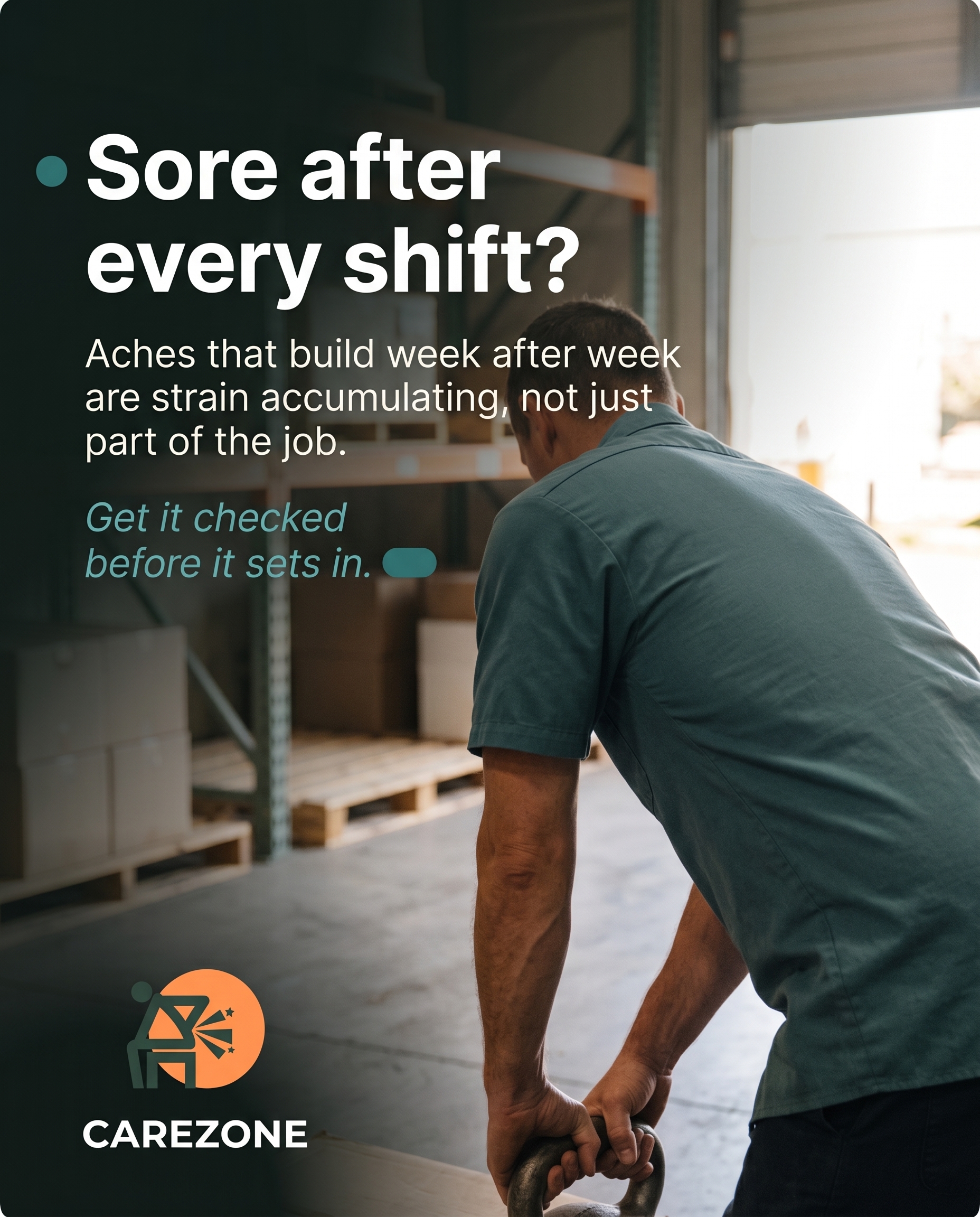
A real-world photo of someone mid-task at a physically demanding job — lifting, bending, or gripping — paired with the question of whether that recurring soreness after a shift is just 'part of the work' or an injury building quietly. The angle validates that work-related aches accumulating over weeks are a legitimate problem worth taking seriously, not something to push through.
Content: A real-world photo of someone mid-task at a physically demanding job — lifting, bending, or gripping — paired with the question of whether that recurring soreness after a shift is just 'part of the work' or an injury building quietly. The angle validates that work-related aches accumulating over weeks are a legitimate problem worth taking seriously, not something to push through.
Style: photography
2.
T2S2A2
graphic-design
Problem-aware
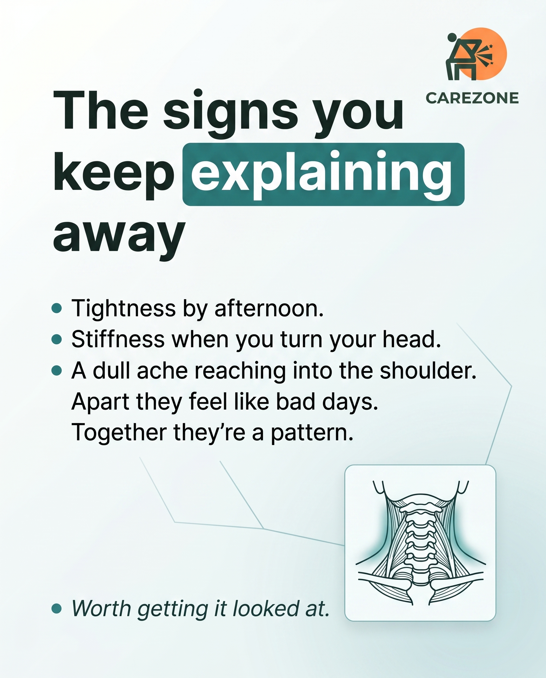
A clean graphic mapping the everyday signals of neck pain that people tend to dismiss — tightness that creeps up by afternoon, stiffness turning your head, a dull ache reaching into the shoulder. The message reframes these as a connected pattern worth attention rather than isolated bad days, answering the reader's quiet 'is this actually a problem?'
Content: A clean graphic mapping the everyday signals of neck pain that people tend to dismiss — tightness that creeps up by afternoon, stiffness turning your head, a dull ache reaching into the shoulder. The message reframes these as a connected pattern worth attention rather than isolated bad days, answering the reader's quiet 'is this actually a problem?'
Style: graphic-design
3.
T9S3A2
illustrative-3D
Problem-aware
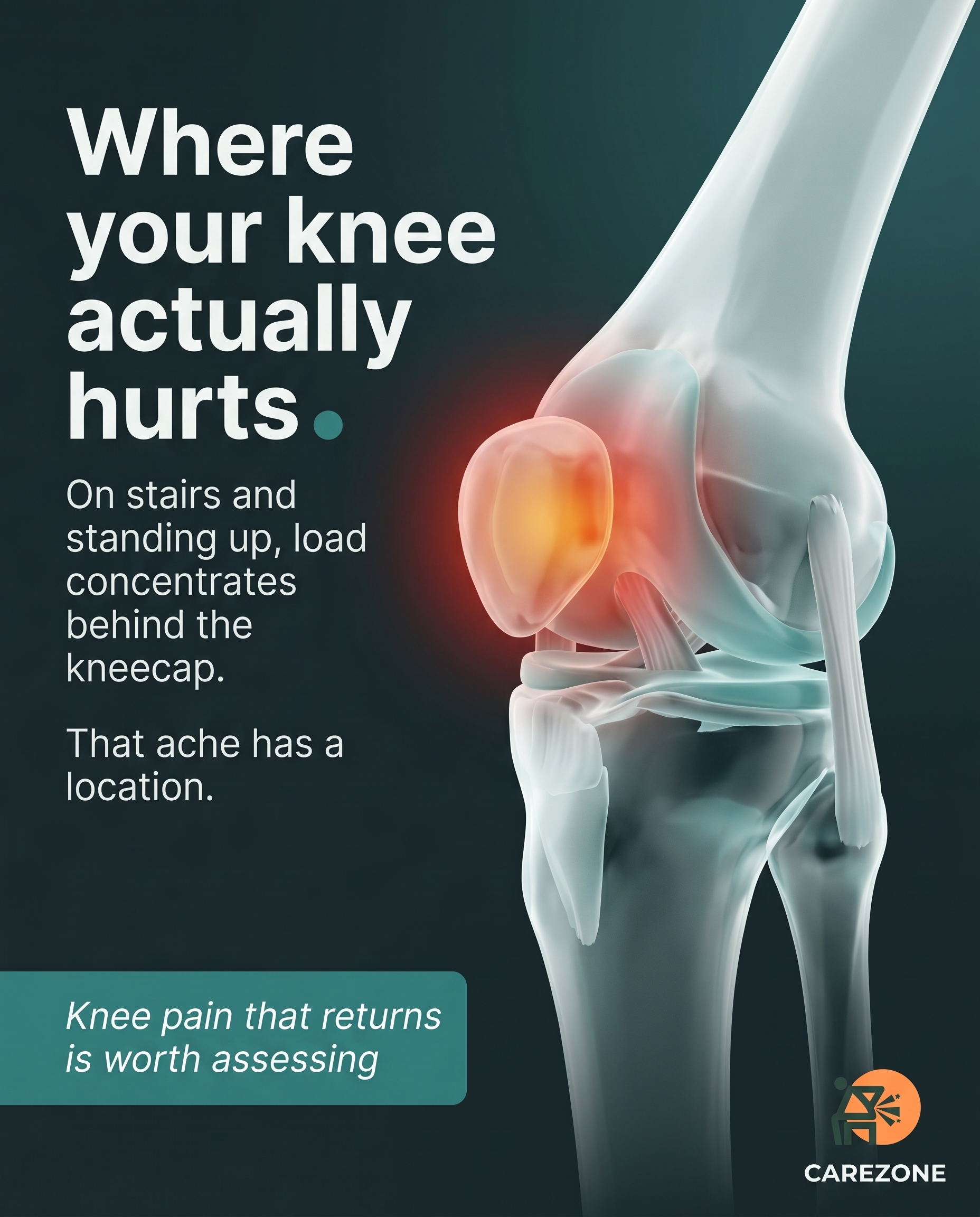
A 3D-illustrated knee showing where load and strain concentrate during stairs, squatting, or standing up — making the invisible mechanical cause of that recurring ache feel real and locatable. The angle confirms that knee discomfort showing up in specific movements is a genuine issue, not just stiffness to wait out.
Content: A 3D-illustrated knee showing where load and strain concentrate during stairs, squatting, or standing up — making the invisible mechanical cause of that recurring ache feel real and locatable. The angle confirms that knee discomfort showing up in specific movements is a genuine issue, not just stiffness to wait out.
Style: illustrative-3D
4.
C1S4
comparison-card
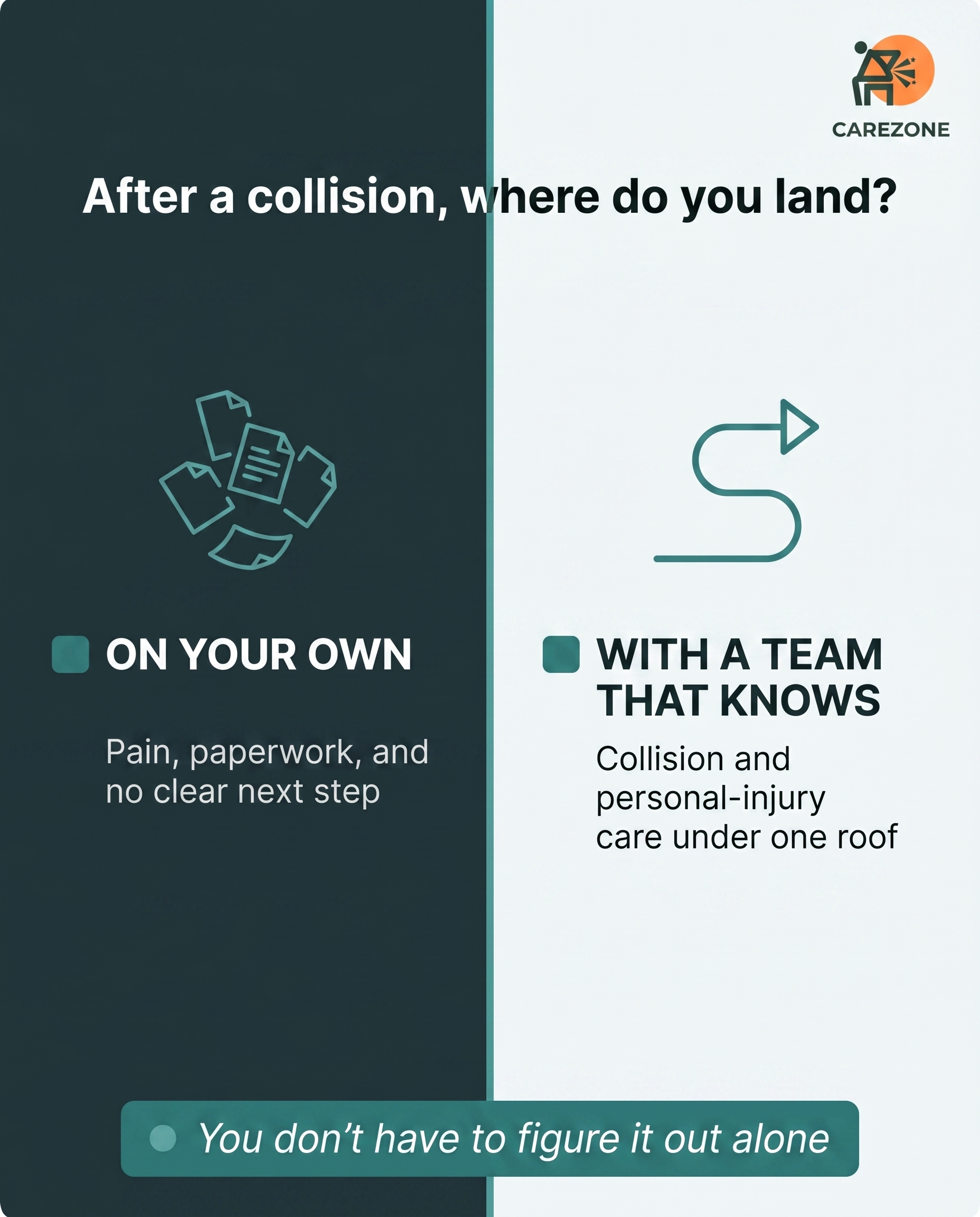
A comparison-card contrasting two states an auto-accident patient knows well: the disorientation of facing recovery, paperwork, and pain alone versus walking into a place that already understands collision and personal-injury cases. The message is belonging — this is where people coming off an accident land and feel handled, not lost.
Content: A comparison-card contrasting two states an auto-accident patient knows well: the disorientation of facing recovery, paperwork, and pain alone versus walking into a place that already understands collision and personal-injury cases. The message is belonging — this is where people coming off an accident land and feel handled, not lost.
Style: comparison-card
3
Developed Posts
4 posts · 2026-06-12T12:11
4 developed
▼
1.
T5S1A2
Rough Image Prompt
Photography-led social post for a chiropractic and rehabilitation clinic. Subject: a person mid-task during physically demanding manual work, shown from behind or focused on hands, forearms, and torso angle only, no face visible at all. Depict the moment of effort, hands gripping a load, back bent into a lift, or forearms straining, in a way that reads as honest everyday labour rather than staged stock. Generic work setting suggested through context only (a warehouse-style space, outdoor work area, or loading environment without identifiable branded equipment). Elevated, considered health-and-wellness photography with soft natural lighting and a grounded, real-world mood. The image communicates the quiet accumulation of strain over a working week. Integrate brand colour cues naturally where they fit (workwear, light, surface tones). Text overlay rendered in Inter, with Inter italic for the CTA. Text content to render: headline 'Sore after every shift?', supporting line 'Aches that build week after week are strain accumulating, not just part of the job.', CTA 'Get it checked before it sets in.'. Colour palette available (draw from, not assigned): #2C7A7B teal, #1A2E35 dark slate, #F4F7F7 off-white, #15201F near-black, #FFFFFF white, #4FA3A3 lighter teal. Logo placement varies by composition and is finalised downstream. Show the body in honest working effort, hands and posture only, with text kept clean and legible.
Text Overlay
Caption
There's a kind of soreness most people working physical jobs just learn to live with. The lower back that tightens by the end of a shift. The shoulder that aches when you grip and lift all day. You tell yourself it's part of the work.
Sometimes it is. But repetitive lifting, bending, and strain load the same areas over and over, and that's how a small problem turns into something that doesn't settle on its own. Manual work injuries rarely arrive in one big moment. They build quietly over weeks.
If the same ache keeps showing up after work, that's worth paying attention to. We treat work-related strain through chiropractic care, physical therapy, and rehab built around getting you moving properly again.
🌐 https://www.carezonecenter.com
Is there an ache you've been pushing through? Tell us where it sits.
Hashtags
#workinjury #manuallabour #backpainrelief #chiropracticcare
2.
T2S2A2
Rough Image Prompt
A typographic-led graphic-design post mapping the everyday signals of neck pain that people tend to brush off. The concept: these small daily signs are a connected pattern, not isolated bad days. Visual treatment is primarily clean, confident typography with subtle supporting accents. Include a small supporting anatomical illustration of the cervical spine and surrounding neck and upper-shoulder muscle structure, rendered in a clean editorial style with a soft accent glow tracing the path from neck into the shoulder to suggest where the tension travels. Keep the illustration small and supporting, not full-frame. Optional subtle abstract line elements or soft gradient field to connect the signs visually. Use only these brand colours drawn from the palette: #2C7A7B teal, #1A2E35 dark slate, #F4F7F7 off-white, #15201F near-black, #FFFFFF white, #4FA3A3 lighter teal tint. Typography: Inter for headline, Inter for supporting text, Inter italic for CTA. Render the following text exactly: headline "The signs you keep explaining away", supporting line "Tightness by afternoon. Stiffness when you turn your head. A dull ache reaching into the shoulder. Apart they feel like bad days. Together they're a pattern.", CTA "Worth getting it looked at.". Logo placement should vary by composition and is finalised downstream. Show clean typography, a small supporting cervical-spine illustration, brand colours only, no faces, no clinic environment, no people.
Text Overlay
Caption
You turn your head to check the mirror and it catches. By mid-afternoon the back of your neck feels tight again. The ache settles into one shoulder and you roll it out, tell yourself you slept funny, and move on.
One off day is nothing. The same thing three afternoons a week is your neck telling you something. Often it's the lower neck loading up from hours at a desk or behind the wheel, and the muscles into the shoulder picking up the slack.
We look at how the neck is actually moving, what's stiff, what's overworking, and where the ache is coming from. Chiropractic adjustment, acupuncture, and targeted exercise all have a place depending on what we find.
If this sounds like your week, don't wait for it to get loud.
🌐 https://www.carezonecenter.com
Which of these sounds most like your afternoons?
Hashtags
#NeckPain #Chiropractic #PostureHealth #DeskNeck #PainRelief
3.
T9S3A2
Rough Image Prompt
A clean, anatomically accurate 3D illustration of a human knee joint, rendered with clinical polish and a translucent, glass-like quality so the underlying structures (femur, tibia, patella, surrounding ligaments and cartilage) read clearly. Communicate the concept of mechanical load concentrating at specific points of the knee during everyday movements like climbing stairs, squatting, or standing up. Use a warm red-to-amber glow on the load-bearing contact areas behind the kneecap and along the joint surface to indicate where strain and discomfort concentrate, making the invisible mechanical cause feel real and locatable. Keep the illustration as the dominant visual subject on a calm, supporting background. Draw from these exact brand colours only: #2C7A7B teal, #1A2E35 dark slate, #F4F7F7 off-white, #15201F near-black, #FFFFFF white, #4FA3A3 lighter teal tint, with the strain glow as a red/amber accent for clinical highlighting. Typography in Inter for all text elements, Inter italic for the CTA. Render the following text cleanly: headline 'Where your knee actually hurts', supporting line 'On stairs and standing up, load concentrates behind the kneecap. That ache has a location.', and CTA 'Knee pain that returns is worth assessing'. Logo placement should vary by composition and is finalised downstream. Show the joint with realistic anatomical detail, intentional editorial lighting, and a representation that signals this is an illustration of the mechanism, not a depiction of treatment.
Text Overlay
Caption
Knee discomfort that only shows up on certain movements isn't random. Climbing stairs, squatting down, getting up from a chair, these all load the joint behind the kneecap in a specific way. When that area is already irritated, the movement finds it every time.
A lot of people wait it out and assume it's just stiffness. Sometimes it settles. Often it comes back, because the mechanical cause is still there. The ache has a location, and that location tells us something.
Knee pain is one of the conditions we work with directly, through chiropractic care, physical therapy, and targeted rehab to rebuild how the joint loads. Finding where the strain sits is the first step.
If your knee keeps flaring on the same movements, that's worth looking at.
🌐 https://www.carezonecenter.com
Which movement sets yours off?
Hashtags
#KneePain #ChiropracticCare #JointHealth #PainRelief #MovementMatters
4.
C1S4
Rough Image Prompt
A comparison-card contrasting two emotional states an auto-accident patient experiences: navigating recovery, paperwork, and pain alone versus arriving somewhere that already understands collision and personal-injury cases. Build it as a typographic-led comparison with two distinct sides of equal weight. Components: a short framing headline, two content-derived side labels reading 'ON YOUR OWN' and 'WITH A TEAM THAT KNOWS', a short supporting line under each side, and a CTA. Use small supporting accent elements only, such as simple line icons (a scattered-papers or maze icon for one side, a steady directional or pathway icon for the other) rendered in brand colours. Keep the visual character typographic and clean, no clinic interiors, no treatment rooms, no faces, no practitioner-patient scenes. Brand palette to draw from: teal/healing green #2C7A7B, dark slate #1A2E35, off-white #F4F7F7, near-black #15201F, white #FFFFFF, lighter teal tint #4FA3A3. Typography: Inter for the headline, Inter for the side labels and supporting lines, Inter italic for the CTA. Text content to render: headline 'After a collision, where do you land?'; left label 'ON YOUR OWN'; left supporting line 'Pain, paperwork, and no clear next step'; right label 'WITH A TEAM THAT KNOWS'; right supporting line 'Collision and personal-injury care under one roof'; CTA 'You don't have to figure it out alone'. Logo placement should vary by composition and is finalised downstream.
Text Overlay
Caption
The days after a car accident are loud. The pain shows up, then the paperwork shows up, and you're supposed to handle both while your neck still won't turn properly. Most people try to manage it alone for a while. They wait, they hope it settles, they lose time.
Walking into a place that already handles collision cases changes that. We see whiplash, back pain, and accident injuries every week. Chiropractic care, acupuncture, massage, and rehab sit under one roof, so you're not chasing five different appointments across town.
You come in hurt and unsure. You leave with a plan and people who know what comes next.
If you've been in a collision recently, don't wait for it to settle on its own. Early care matters.
🌐 https://www.carezonecenter.com
Been putting off getting checked after an accident? Tell us what's holding you back.
Hashtags
#AutoAccidentRecovery #WhiplashCare #ChiropracticCare #PersonalInjury #CollisionCare
4
Refined Image Prompts
4 prompts · 2026-06-12T12:13
4 prompts refined
▼
1.
T5S1A2
Refined Image Prompt
A grounded, documentary-style health and wellness photograph for a chiropractic and rehabilitation clinic, shot in the manner of considered editorial photography rather than staged stock. The subject is a person mid-task during physically demanding manual work, captured from behind and cropped to show only hands, forearms, and the angle of the torso bent into effort, with no face visible at any point. Frame the moment of strain honestly: hands gripping a heavy load, the back curved into a lift, forearms tensed and braced. The setting is a generic warehouse-style interior with concrete flooring, neutral storage shelving, and soft daylight falling through a large side opening, no identifiable branded equipment or signage anywhere. Soft natural lighting wraps the body, with a warm directional glow from one side creating gentle shadow on the back and shoulders, communicating the quiet accumulation of strain across a working week. The overall register is clean clinical injury-recovery with warm grounded tones. Workwear and surface cues lean into the brand palette where natural: a muted teal #2C7A7B work shirt or apron, dark slate #1A2E35 surrounding shadow tones, with the daylight keeping the scene calm and credible.
Composition: the working figure occupies the lower and right portion of the frame, leaving clean negative space in the upper left for text. Lay a soft graduated scrim over the upper left area, deepening the underlying image toward #15201F near-black at low opacity so the text reads cleanly while the photograph remains visible beneath.
Text overlay all rendered in Inter. Headline "Sore after every shift?" set large in the upper left in #FFFFFF white, positioned as the dominant element. Directly beneath it, the supporting line "Aches that build week after week are strain accumulating, not just part of the job." in a smaller size in #F4F7F7 off-white, set in a comfortable measure of two to three lines. Below the supporting text, the CTA "Get it checked before it sets in." rendered in Inter italic in #4FA3A3 lighter teal tint, with a slight rounded solid block accent of #2C7A7B teal sitting behind or beside it as a small pill marker, corners rounded to 4px. Place a single small solid dot marker of #2C7A7B teal directly to the left of the headline as an accent cue.
Maintain consistent slight corner rounding of 3 to 6px on every rectangular surface, scrim edge, and accent block. Keep all text crisp, high contrast against its backing, and clearly legible.
Place the provided logo file in the bottom left corner at a modest, balanced scale, set against the darker grounded area of the image for contrast. Preserve the logo exactly as supplied: do not redraw, recolour, restyle, distort, or regenerate it, render it faithfully at clean resolution.
Constraints: keep the subject's face entirely out of frame, showing only hands, forearms, and torso angle in honest working effort. Keep the environment generic and unbranded. Maintain a real-world, credible documentary mood rather than a posed or polished commercial look. Keep all text sharp, correctly spelled, and uncluttered.
2.
T2S2A2
Refined Image Prompt
A typographic-led graphic design composition built around clean, confident editorial type that maps the everyday signals of neck pain people tend to brush off. The concept reads as a connected pattern, not isolated bad days. The overall register is clean clinical injury-recovery with warm orange accents, calm and reassuring rather than alarming.
Surface is a full off-white field in #F4F7F7 with a very subtle soft vertical gradient drifting toward a barely-perceptible cooler tone near the lower right, giving quiet depth without distraction. Keep the layout airy with generous breathing room.
The headline anchors the upper-left to upper-centre region, set large and dominant in Inter, in near-black #15201F: "The signs you keep explaining away". Let it span two to three lines, left-aligned, with the word "explaining" subtly emphasised by a solid teal block highlight in #2C7A7B sitting behind it like a marker swatch, the text reversing to #FFFFFF where it crosses that block. Apply a 4px corner radius to the block.
Below the headline, in the mid section, set the supporting line in Inter in #1A2E35, left-aligned, at a comfortable readable size with relaxed line spacing: "Tightness by afternoon. Stiffness when you turn your head. A dull ache reaching into the shoulder. Apart they feel like bad days. Together they're a pattern." Precede each of the first three symptom phrases with a small solid teal dot marker in #2C7A7B aligned to the left margin, so they read as a connected list of signals. Keep the final two sentences as flowing body text without dots, distinguishing the pattern conclusion from the individual signs.
In the lower-right region, place a small supporting anatomical illustration of the cervical spine with surrounding neck and upper-shoulder muscle structure, rendered in a clean editorial line-and-fill style using #1A2E35 line work over a soft #FFFFFF inset. Keep it compact and supporting, occupying roughly a quarter of the frame, not full-frame. Trace a soft accent glow in #4FA3A3 following the path from the base of the neck down into the upper shoulder, suggesting where the tension travels. Set the illustration inside a subtle card with a 5px corner radius and a faint lighter teal tint #4FA3A3 outline.
Add a few subtle abstract thin line elements in low-opacity #4FA3A3 connecting the dot-marked signs toward the illustration, reinforcing the idea that the signals form one connected pattern. Keep these lines delicate and secondary.
Place the CTA near the lower-left, set in Inter italic in #2C7A7B: "Worth getting it looked at." Keep it understated and confident, sitting on a clean line with a single small teal dot marker preceding it.
Position the attached logo in the top-right corner at a modest, balanced scale with clear margin around it. Preserve the logo exactly as supplied, with no recolouring, redrawing, distortion, or alteration of its proportions or lettering.
Lighting is soft, even, and editorial with no dramatic shadows. All rectangular surfaces, cards, blocks and markers use a consistent slight corner radius between 3px and 5px.
Constraints: use only the brand colours #2C7A7B, #1A2E35, #F4F7F7, #15201F, #FFFFFF, and #4FA3A3. Keep the cervical-spine illustration small and supporting. Show clean typography on an uncluttered field. No faces, no people, no clinic environment. Maintain generous white space and a calm, reassuring tone.
3.
T9S3A2
Refined Image Prompt
A clean, anatomically accurate 3D medical illustration of a human knee joint positioned as the dominant visual subject, occupying the central-right portion of the composition. The joint is rendered with clinical polish and a translucent, glass-like quality so the underlying structures (femur, tibia, patella, surrounding ligaments and cartilage) read clearly through softly refractive surfaces. The bone and cartilage forms are modelled in cool clinical tones drawn from #F4F7F7 off-white and #4FA3A3 lighter teal tint, with deeper structural shadows in #1A2E35 dark slate to give anatomical depth and separation.
Communicate the concept of mechanical load concentrating at specific points of the knee during everyday movements. A warm red-to-amber glow blooms on the load-bearing contact areas directly behind the kneecap and along the joint surface, fading from a hot amber core to a soft red halo, making the invisible mechanical strain feel real and locatable. This warm glow is the only warm accent in the frame and should read as a clinical highlight, not decoration.
The background is a calm, supporting #15201F near-black surface with a subtle teal-undertoned gradient deepening toward the lower edges, giving the illustration editorial separation and clarity. Intentional editorial lighting falls from the upper left, catching the translucent edges of the joint and producing soft, controlled specular highlights that reinforce the glass-like material. The overall register is clean clinical injury-recovery with warm accent restraint, calm and precise.
Layout uses a left-aligned text column occupying the left third of the composition, balanced against the knee illustration on the right. All text is in Inter.
Headline reads "Where your knee actually hurts" set large in #FFFFFF white, positioned in the upper left, with a small solid #2C7A7B teal dot marker placed just before or beneath it as an accent.
Supporting text reads "On stairs and standing up, load concentrates behind the kneecap. That ache has a location." set in a smaller size in #FFFFFF white at slightly reduced opacity for hierarchy, placed directly below the headline with comfortable line spacing.
The CTA reads "Knee pain that returns is worth assessing" in Inter italic, set inside a slim solid #2C7A7B teal block with slightly rounded 4px corners, placed in the lower left. The CTA text sits in #FFFFFF white for clean contrast against the teal block.
Maintain generous negative space around all text so the layout feels uncluttered and clinical. Every rectangular element, including the CTA block, uses slight 3-6px rounded corners applied uniformly. Accent attention is drawn using solid #2C7A7B teal dot markers and the solid teal CTA block only.
Place the attached logo file in the bottom right corner at a small, restrained scale, with clear spacing from the illustration. Reproduce the logo exactly as supplied, preserving its original colours, proportions, and lettering without recolouring, redrawing, or distorting it.
Constraints: keep the illustration reading as an anatomical illustration of the mechanism, not a depiction of treatment, with no clinicians, hands, needles, or medical procedures shown. Use only the exact brand hex values listed plus the red-to-amber strain glow. Keep all warm tones confined to the load-glow on the joint. Render all text crisply and legibly with accurate spelling.
4.
C1S4
Refined Image Prompt
A clean typographic comparison-card composition built as two vertical halves of equal weight, divided by a thin vertical line down the centre. The overall register is clean clinical injury-recovery with warm orange accents, calm and reassuring, with generous breathing space and no clutter.
The left half uses a muted, heavier surface in dark slate #1A2E35 to convey the harder, lonelier state. The right half uses an off-white #F4F7F7 surface to convey clarity and arrival. The two halves meet at a precise central vertical divider line in lighter teal tint #4FA3A3, 2px wide, running the full height of the card.
At the very top, spanning the full width across both halves on a slim banner strip, the framing headline reads "After a collision, where do you land?" in Inter, centred, set in white #FFFFFF where it crosses the dark slate left half and in near-black #15201F where it crosses the off-white right half, sitting cleanly above the divide. Give the headline comfortable margins and let it breathe as the dominant top element.
Left half content, vertically centred within its column: a small simple line icon of scattered, overlapping sheets of paper drifting in disarray, rendered in lighter teal tint #4FA3A3 line strokes, roughly 64px tall, positioned above the label. Below the icon, the side label "ON YOUR OWN" in Inter, centred, in white #FFFFFF, with a small solid block marker, a 6px square in teal #2C7A7B with slightly rounded 4px corners, sitting just to the left of the label as an accent. Beneath the label, the supporting line "Pain, paperwork, and no clear next step" in Inter, centred, in a softened white at slightly reduced presence, set smaller than the label across two lines if needed.
Right half content, vertically centred within its column and mirrored in structure: a small simple line icon of a single clear directional pathway or forward arrow following a smooth route, rendered in teal #2C7A7B line strokes, roughly 64px tall, positioned above the label. Below the icon, the side label "WITH A TEAM THAT KNOWS" in Inter, centred, in dark slate #1A2E35, with a small solid block marker, a 6px square in teal #2C7A7B with 4px rounded corners, sitting just to the left of the label. Beneath the label, the supporting line "Collision and personal-injury care under one roof" in Inter, centred, in near-black #15201F at slightly reduced presence, set smaller than the label across two lines if needed.
At the bottom, spanning the full width across both halves, a slim CTA strip in teal #2C7A7B with slight 5px rounded corners, set as a contained pill-like block centred horizontally with margin on both sides. Inside it, the CTA "You don't have to figure it out alone" in Inter italic, centred, in white #FFFFFF. Place a small dot marker, a 5px solid circle in lighter teal tint #4FA3A3, immediately before the CTA text as an accent.
All rectangular surfaces, cards, the CTA strip and the block markers carry consistent slight rounded corners of 3 to 6px. Lighting is flat, even and bright with no shadows, a clean clinical studio feel. Composition is balanced and symmetrical left to right, typographic-led, with clear hierarchy flowing from headline to side labels to supporting lines to CTA.
Place the supplied logo file in the top corner of the off-white right half, sized small and unobtrusive with clear margin. Preserve the logo exactly as supplied, do not redraw, recolour, distort, or regenerate it, keep its original proportions and detail intact.
Constraints: keep the design purely typographic and graphic, no clinic interiors, no treatment rooms, no faces, no practitioner or patient scenes, no photographic people. Use only the brand colours specified. Keep all text legible and correctly spelled. Maintain even spacing and clean alignment throughout.
5
Rendered Images
4 rendered · 2026-06-12T12:15
4 rendered
▼
T5S1A2
1856×2304
T2S2A2
1856×2304
T9S3A2
1856×2304
C1S4
1856×2304