Draw — 10 posts
1
Coordinates
10 coordinates
10 selected
▼
| # | Code | Theme | Subject | Style | Awareness | Source |
|---|---|---|---|---|---|---|
| 1 | L4S1A1 | lifestyle | L4 — Improper lifting and repetitive overuse | photography | A1 — Unaware | CURATED |
| 2 | T2S2A4 | treatments | T2 — Neck Pain | graphic-design | A4 — Product-aware | CURATED |
| 3 | L2S3A2 | lifestyle | L2 — Sedentary desk work and inactive lifestyle | illustrative-3D | A2 — Problem-aware | CURATED |
| 4 | T11S4A2 | treatments | T11 — Peripheral Neuropathy | comparison-card | A2 — Problem-aware | CURATED |
| 5 | T5S5A3 | treatments | T5 — Herniated / Bulging Discs | qa-card | A3 — Solution-aware | CURATED |
| 6 | T9S6A2 | treatments | T9 — Plantar Fasciitis & Foot Pain | myth-buster | A2 — Problem-aware | CURATED |
| 7 | T12S7A2 | treatments | T12 — Sports Injuries | list-tips | A2 — Problem-aware | CURATED |
| 8 | T6S8A3 | treatments | T6 — Whiplash & Auto Accident Injuries | stat-card | A3 — Solution-aware | CURATED |
| 9 | C2S9 | clinic | C2 — Recreational and competitive athletes | checklist | — | CURATED |
| 10 | T8S4A4 | treatments | T8 — Knee Pain | comparison-card | A4 — Product-aware | CURATED |
2
Content Briefs
10 briefs · 2026-06-03T09:45
10 briefs generated
▼
1.
L4S1A1
photography
Unaware
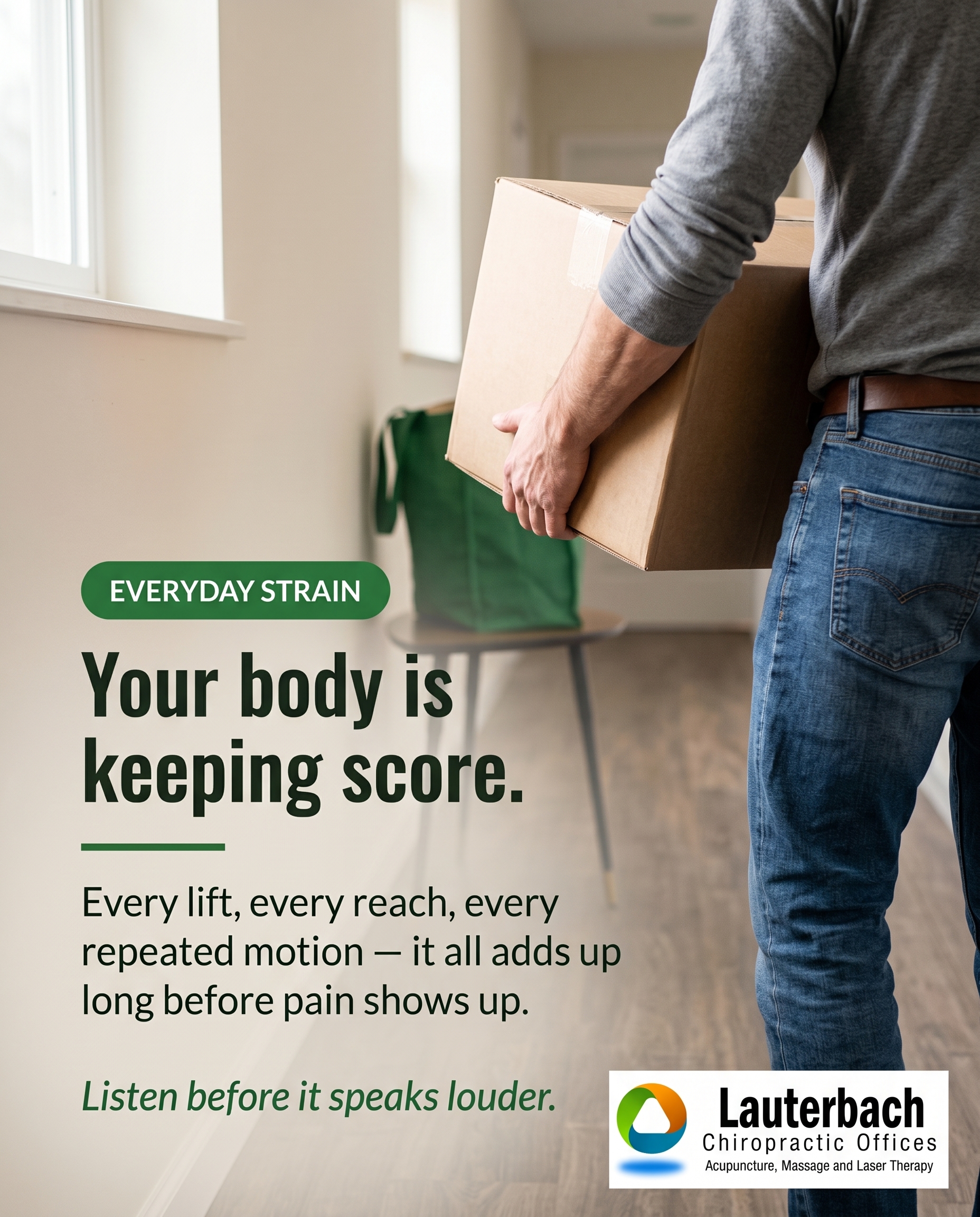
A documentary-style photo of an ordinary moment — lifting a box, hauling groceries, or repeating the same motion at work — paired with the quiet observation that the body keeps a tally of these small strains long before pain shows up. The goal is to make the reader notice a habit they've never thought twice about, not to sell anything yet.
Content: A documentary-style photo of an ordinary moment — lifting a box, hauling groceries, or repeating the same motion at work — paired with the quiet observation that the body keeps a tally of these small strains long before pain shows up. The goal is to make the reader notice a habit they've never thought twice about, not to sell anything yet.
Style: photography
2.
T2S2A4
graphic-design
Product-aware
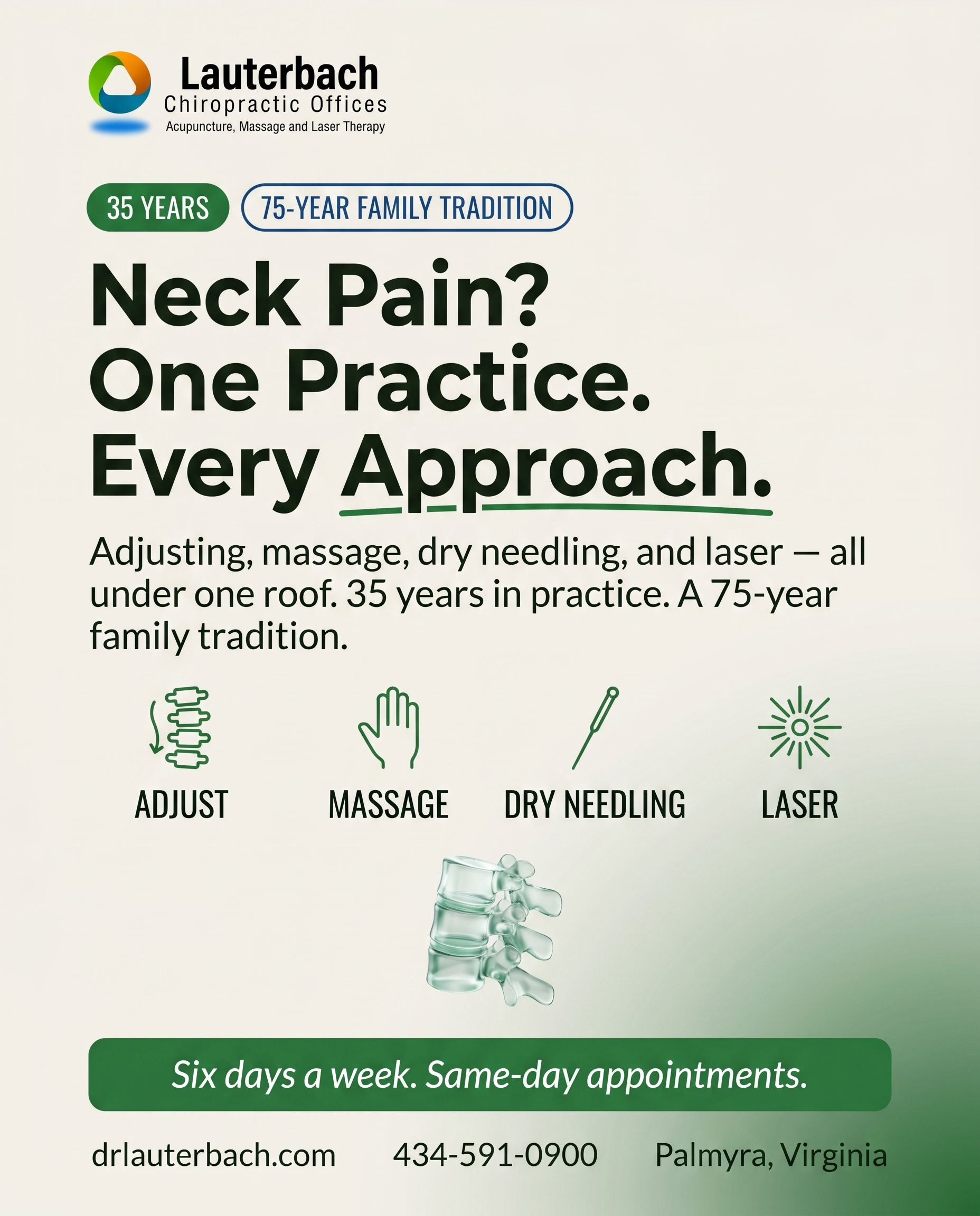
For someone already weighing where to take their neck pain, position the practice on its strongest credibility: 35 years in practice, a 75-year family tradition, and multiple services for neck pain under one roof — adjusting, massage, dry needling, and laser — so they aren't bounced between providers. The why-you is the depth of experience and the convenience of finding the right approach in one place, six days a week with same-day appointments.
Content: For someone already weighing where to take their neck pain, position the practice on its strongest credibility: 35 years in practice, a 75-year family tradition, and multiple services for neck pain under one roof — adjusting, massage, dry needling, and laser — so they aren't bounced between providers. The why-you is the depth of experience and the convenience of finding the right approach in one place, six days a week with same-day appointments.
Style: graphic-design
3.
L2S3A2
illustrative-3D
Problem-aware
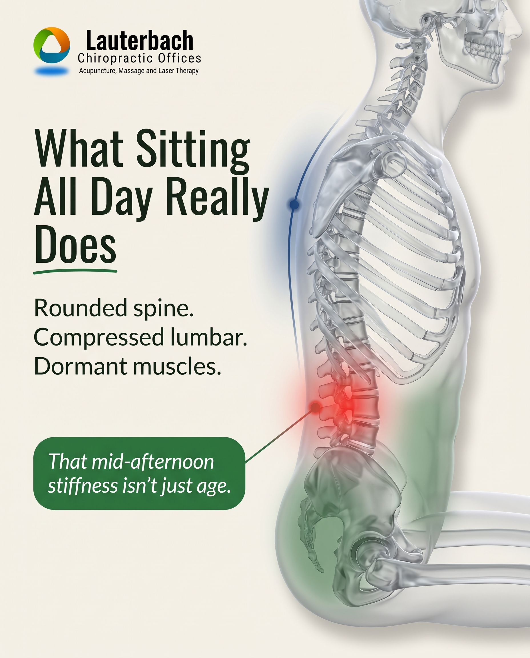
An illustrative depiction of what hours of desk-sitting actually does to the spine and hips — rounded posture, compressed lower back, dormant muscles — to confirm for the reader that the stiffness they feel by mid-afternoon isn't 'just getting older,' it's a real and traceable problem. The message validates the suspicion that sitting is quietly working against them.
Content: An illustrative depiction of what hours of desk-sitting actually does to the spine and hips — rounded posture, compressed lower back, dormant muscles — to confirm for the reader that the stiffness they feel by mid-afternoon isn't 'just getting older,' it's a real and traceable problem. The message validates the suspicion that sitting is quietly working against them.
Style: illustrative-3D
4.
T11S4A2
comparison-card
Problem-aware
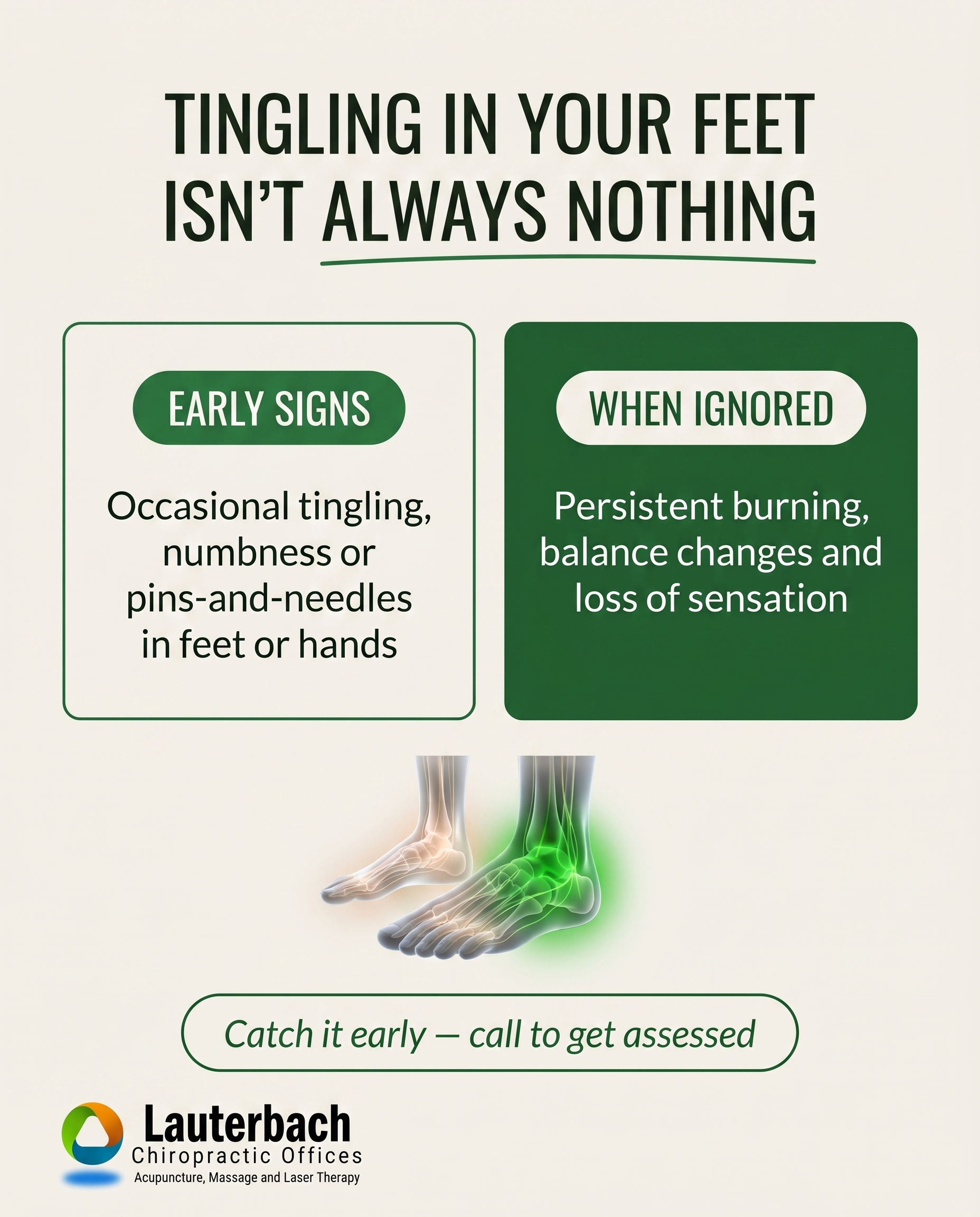
A comparison-card contrasting the easy-to-dismiss early signs of peripheral neuropathy (occasional tingling, numbness, 'pins and needles' in the feet or hands) against what they can escalate into when ignored, helping the reader decide whether what they're feeling deserves attention. The aim is recognition: this pattern is a real condition, not a passing oddity.
Content: A comparison-card contrasting the easy-to-dismiss early signs of peripheral neuropathy (occasional tingling, numbness, 'pins and needles' in the feet or hands) against what they can escalate into when ignored, helping the reader decide whether what they're feeling deserves attention. The aim is recognition: this pattern is a real condition, not a passing oddity.
Style: comparison-card
5.
T5S5A3
qa-card
Solution-aware
A Q&A-format card answering the question a herniated-disc sufferer is actually asking: 'What can actually be done about this without surgery?' Walk through the conservative, non-surgical options available under one roof — chiropractic adjusting, decompression-style care, therapeutic modalities, and corrective exercise — framed as a structured path rather than a single fix.
Content: A Q&A-format card answering the question a herniated-disc sufferer is actually asking: 'What can actually be done about this without surgery?' Walk through the conservative, non-surgical options available under one roof — chiropractic adjusting, decompression-style care, therapeutic modalities, and corrective exercise — framed as a structured path rather than a single fix.
Style: qa-card
6.
T9S6A2
myth-buster
Problem-aware
A myth-buster correcting the common belief that heel and foot pain will simply 'go away on its own' or that you just need new shoes — reframing plantar fasciitis as a genuine, treatable problem that tends to worsen when ignored. The post helps the reader take their morning foot pain seriously rather than walking it off.
Content: A myth-buster correcting the common belief that heel and foot pain will simply 'go away on its own' or that you just need new shoes — reframing plantar fasciitis as a genuine, treatable problem that tends to worsen when ignored. The post helps the reader take their morning foot pain seriously rather than walking it off.
Style: myth-buster
7.
T12S7A2
list-tips
Problem-aware
A short list of warning signs that a sports injury is more than ordinary post-game soreness — swelling that lingers, pain that returns with the same movement, weakness or instability — so the active reader can tell a real problem from normal training fatigue. The angle is self-assessment, not treatment.
Content: A short list of warning signs that a sports injury is more than ordinary post-game soreness — swelling that lingers, pain that returns with the same movement, weakness or instability — so the active reader can tell a real problem from normal training fatigue. The angle is self-assessment, not treatment.
Style: list-tips
8.
T6S8A3
stat-card
Solution-aware
A stat-card built around how often whiplash and auto-accident injuries surface days or even weeks after the crash, used to introduce what care addresses them — chiropractic adjusting, muscle stimulation, and soft-tissue therapy to manage the injury early. The message answers 'what fixes this?' for someone who's been in an accident and isn't sure delayed symptoms are connected.
Content: A stat-card built around how often whiplash and auto-accident injuries surface days or even weeks after the crash, used to introduce what care addresses them — chiropractic adjusting, muscle stimulation, and soft-tissue therapy to manage the injury early. The message answers 'what fixes this?' for someone who's been in an accident and isn't sure delayed symptoms are connected.
Style: stat-card
9.
C2S9
checklist
A checklist that quietly says 'this is your place' to recreational and competitive athletes — recovering between events, keeping joints moving, addressing strains before they sideline a season — with multiple therapies available under one roof six days a week. The job is belonging and recognition, signaling that active people who want to stay active come here.
Content: A checklist that quietly says 'this is your place' to recreational and competitive athletes — recovering between events, keeping joints moving, addressing strains before they sideline a season — with multiple therapies available under one roof six days a week. The job is belonging and recognition, signaling that active people who want to stay active come here.
Style: checklist
10.
T8S4A4
comparison-card
Product-aware
A comparison-card for the knee-pain sufferer choosing between providers, contrasting a single-modality approach against finding manual therapy, laser, muscle stimulation, custom orthotics, and corrective exercise under one roof — backed by 35 years of experience. The why-you is breadth of options and the longevity to match the right combination to the knee.
Content: A comparison-card for the knee-pain sufferer choosing between providers, contrasting a single-modality approach against finding manual therapy, laser, muscle stimulation, custom orthotics, and corrective exercise under one roof — backed by 35 years of experience. The why-you is breadth of options and the longevity to match the right combination to the knee.
Style: comparison-card
3
Developed Posts
10 posts · 2026-06-03T09:50
10 developed
▼
1.
L4S1A1
Rough Image Prompt
Documentary-style health and lifestyle photography capturing an ordinary, unremarkable everyday moment of physical strain — a pair of hands and forearms lifting a cardboard moving box, or hauling grocery bags, the torso angled mid-lift, weight visibly shifting through the lower back and shoulders. Show the body from behind or focus on hands, forearms, and torso only — absolutely no face visible, no profile, no back-of-head with side-of-face. Generic everyday setting: a home hallway, a kitchen counter with paper grocery bags, or a doorway with neutral light — no clinic, no medical context, no identifiable branded objects. Natural soft window light, calm and grounded mood, considered editorial composition that elevates the mundane into something worth noticing. The image should feel quietly observational, as if catching a habit the person has never thought twice about. Integrate brand colour cues naturally where they fit (a warm off-white wall, a green grocery bag or fabric detail) drawn from the palette: #2C7A3F green, #1B4D8F blue, #F4F1EA warm off-white, #1A2A1E near-black, #FFFFFF white, #1F5C2E deeper green. Text overlay using Oswald for the headline and Lato for supporting text, Lato italic for the CTA. Headline text: "Your body is keeping score." Supporting text: "Every lift, every reach, every repeated motion — it all adds up long before pain shows up." CTA: "Listen before it speaks louder." Keep text minimal and clean against the photography. Logo placement varies by composition and is finalised downstream.
Text Overlay
Caption
You probably didn't think twice about it this morning. Lifting the box. Hauling the groceries in one trip. Reaching for the same thing the same way you have a thousand times before.
Here's the part most people miss: your body keeps a quiet tally of these small strains. A little tightness here. A twinge there. None of it loud enough to stop you — yet.
Pain rarely shows up out of nowhere. It's usually the body finally raising its voice after months of being asked to absorb the same motion, the same posture, the same overuse without complaint.
The good news? When you learn to notice the early signals, you get the chance to act before they turn into something that slows you down. Thirty-five years of practice has taught us that the people who catch it early are the ones who stay moving.
What's the one daily motion you've never thought twice about?
📞 434-591-0900
🌐 https://drlauterbach.com
✉️ Chirodoc4u2@gmail.com
Hashtags
#ChiropracticCare #PalmyraVA #BackPainRelief #ListenToYourBody #SpinalHealth
2.
T2S2A4
Rough Image Prompt
Typographic-led graphic-design post communicating deep credibility and convenience for neck pain care. Concept: one trusted family practice with decades of experience and multiple neck pain treatments available under one roof, so the patient isn't bounced between providers. Components required: headline text, supporting text, a small cluster of icon accents representing the range of in-house neck pain approaches (a spine/adjustment glyph, a hand/massage glyph, a fine needle glyph for dry needling, a light-beam glyph for laser therapy), and a CTA. A small, supporting anatomical illustration of cervical spine vertebrae rendered in a clean translucent glass-like editorial style may serve as an accent element, kept small and supporting rather than full-frame. Optional subtle credibility badge motifs for '35 Years' and '75-Year Family Tradition' as compact typographic accents. Brand colour palette to draw from: #2C7A3F green, #1B4D8F blue, #F4F1EA warm off-white, #1A2A1E near-black with green undertone, #FFFFFF white, #1F5C2E deeper green. Typography: Oswald for headline, Lato for supporting text, Lato italic for CTA. Text content to render: headline 'Neck Pain? One Practice. Every Approach.' ; supporting text 'Adjusting, massage, dry needling, and laser — all under one roof. 35 years in practice. A 75-year family tradition.' ; icon labels 'ADJUST', 'MASSAGE', 'DRY NEEDLING', 'LASER' ; CTA 'Six days a week. Same-day appointments.'. Keep the composition richly designed and intentional, typographic in character with clean icon accents. Logo placement varies by composition and is finalised downstream. Show a confident, credible, calm wellness register using brand colours throughout.
Text Overlay
Caption
When neck pain has you weighing where to go, the question isn't just who can help — it's who can help without sending you somewhere else.
Here, the right approach is already under one roof. Diversified adjusting, massage therapy, dry needling, and cold laser — all available in one place, so you're never bounced from provider to provider while your neck keeps aching.
Behind that is something you can't fast-track: 35 years in practice and a 75-year family tradition of caring for this community across generations. That depth means we can match the approach to your neck, not your neck to one approach.
Open six days a week, with same-day appointments when you need them most.
Still deciding where to take your neck pain? This is a good place to start.
📞 434-591-0900
🌐 https://drlauterbach.com
✉️ Chirodoc4u2@gmail.com
Hashtags
#NeckPainRelief #ChiropracticCare #PalmyraVA #LakeMonticello #OneRoofCare
3.
L2S3A2
Rough Image Prompt
An anatomically accurate 3D illustrative render of the human spine and pelvis shown in a prolonged seated posture — depicting rounded upper back, forward-tipped head, a compressed and flexed lower spine, and a dormant, deactivated state in the gluteal and core muscle regions. Translucent, glass-like clinical rendering style with clean clinical polish, the body shown in side profile of the torso skeleton and hip structure only (no head detail, no face, no full figure). Use a soft red glow to indicate the compressed lower lumbar region and tension points, and a muted or faded green tone over the dormant glute and core muscles to signal under-activation. Background is a clean neutral field drawn from the brand palette. Available brand colours (use only these exact hex values): #2C7A3F green, #1B4D8F blue, #F4F1EA warm off-white, #1A2A1E near-black, #FFFFFF white, #1F5C2E deep green. Typography: Oswald for the headline, Lato for supporting text, Lato italic for the CTA. Render the following text cleanly: headline 'What Sitting All Day Really Does', supporting text 'Rounded spine. Compressed lumbar. Dormant muscles.', and CTA 'That mid-afternoon stiffness isn't just age.' Logo placement varies by composition and is finalised downstream. Show clear, intentional anatomical labelling using colour-distinct glow accents rather than crowded text.
Text Overlay
Caption
By mid-afternoon, your lower back feels tight, your hips feel locked, and your shoulders have crept forward toward the screen. It's easy to write that off as just getting older. It usually isn't.
Hours of sitting round the upper spine, compress the lower back, and let the glutes and core muscles switch off. The longer that posture holds, the more the body adapts to it — and the stiffness you feel is the result, not random aging.
The good news is it's traceable, and it responds. Adjustments, corrective exercises, and the right movement habits can wake those dormant muscles back up and take the pressure off your lower back.
With 35 years in practice, we see this pattern every single day. Same-day appointments are available, six days a week.
📞 434-591-0900
🌐 https://drlauterbach.com
✉️ Chirodoc4u2@gmail.com
Does your back tighten up by the afternoon? Tell us when it hits hardest.
Hashtags
#ChiropracticCare #PalmyraVA #DeskPosture #BackPainRelief #SpineHealth
4.
T11S4A2
Rough Image Prompt
A comparison-card graphic for a chiropractic and neuropathy care practice, contrasting the easy-to-dismiss early signs of peripheral neuropathy against what those signs can escalate into when left unaddressed. Two distinct content sides of equal visual weight: one side labelled 'EARLY SIGNS' presenting the subtle, easy-to-ignore symptoms, the other labelled 'WHEN IGNORED' presenting the escalated pattern. The concept communicates recognition — that these sensations form a real condition pattern, not a passing oddity worth dismissing. Typographic-led design with a small supporting anatomical illustration accent: a clean 3D-style translucent rendering of a foot and lower leg with subtle nerve pathways, with gentle warm-toned glow indicating early tingling on one association and a more saturated highlight indicating intensified nerve irritation on the other. Anatomical accent is small and supporting, not full-frame. Brand colours to draw from: green #2C7A3F, deeper green #1F5C2E, blue #1B4D8F, warm off-white #F4F1EA, near-black with green undertone #1A2A1E, white #FFFFFF. Typography: Oswald for headline and side labels, Lato for supporting text, Lato italic for CTA. Headline text: 'TINGLING IN YOUR FEET ISN'T ALWAYS NOTHING'. Side label one: 'EARLY SIGNS' with supporting line 'Occasional tingling, numbness or pins-and-needles in feet or hands'. Side label two: 'WHEN IGNORED' with supporting line 'Persistent burning, balance changes and loss of sensation'. CTA text: 'Catch it early — call to get assessed'. Editorial, clinical-polish illustration style on a clean brand-colour field. Logo placement varies by composition and is finalised downstream.
Text Overlay
Caption
That occasional tingling in your feet or hands? The pins-and-needles you shrug off because it passes? It's easy to write off as nothing — a foot that fell asleep, a strange one-off.
But peripheral neuropathy rarely announces itself loudly. It starts quiet. Occasional numbness. A faint burning. Sensations that come and go just often enough to ignore.
Left unchecked, that pattern can shift — from occasional to constant, from mild to disruptive, affecting balance, sensation and daily comfort.
The good news: recognising it early changes the conversation. The sooner it's assessed, the more options you have. With 35 years in practice and multiple therapies under one roof, we look at what's actually driving the symptoms — not just the symptoms themselves.
If the early column sounds familiar, it's worth a closer look. Same-day appointments are available, and we're open six days a week here in Palmyra.
📞 434-591-0900
🌐 https://drlauterbach.com
✉️ Chirodoc4u2@gmail.com
Have you noticed any of these early signs? It's worth paying attention.
Hashtags
#PeripheralNeuropathy #ChiropracticCare #PalmyraVA #NerveHealth #FootHealth
5.
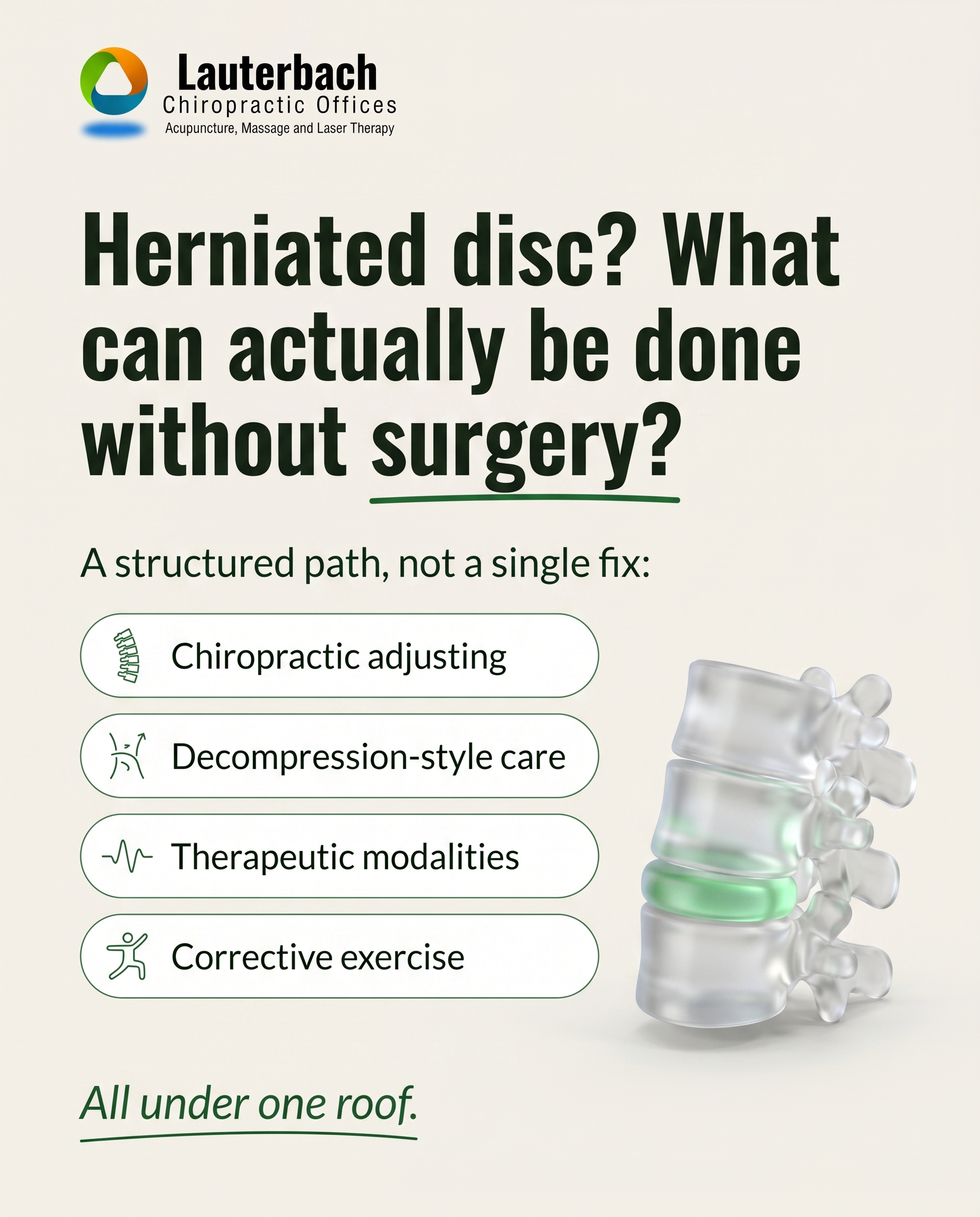
T5S5A3
Rough Image Prompt
A clean, typographic Q&A card for a chiropractic practice answering what can be done about a herniated disc without surgery. The composition is typography-led with a supporting anatomical accent: a small, editorial 3D illustration of a lumbar spine segment with one intervertebral disc subtly highlighted, rendered in a translucent glass-like style on a neutral surface — illustrative, not documentary, no clinic environment. Components: a clear question heading, a structured answer presented as a short sequence of conservative non-surgical options, and a CTA. Brand colour palette to draw from: #2C7A3F (green), #1B4D8F (blue), #F4F1EA (warm off-white), #1A2A1E (near-black with green undertone), #FFFFFF (white), #1F5C2E (deeper green). Typography: Oswald for the headline and question, Lato for supporting and answer text, Lato italic for the CTA. Text to render: question — "Herniated disc? What can actually be done without surgery?"; answer framing line — "A structured path, not a single fix:"; four short answer points — "Chiropractic adjusting", "Decompression-style care", "Therapeutic modalities", "Corrective exercise"; CTA — "All under one roof." Use small icon accents beside each answer point where natural. Logo placement varies by composition and is finalised downstream. Show calm, credible, clinical-but-warm visual character with the anatomical accent supporting the typography rather than competing with it.
Text Overlay
Caption
It's the question nearly everyone asks first: do I really need surgery for this? For most herniated and bulging discs, the answer is not yet — and often, not at all. Conservative care is the place to start, and it works best as a path rather than a single quick fix.
Here's what that path can look like under one roof: chiropractic adjusting to restore proper movement, decompression-style care to take pressure off the disc, therapeutic modalities like laser, ultrasound, and muscle stimulation to calm the area, and corrective exercise to rebuild support so it lasts.
With 35 years in practice and a 75-year family tradition, we've helped a lot of people in the Palmyra area get moving again without going under the knife. The earlier you start, the more options you have.
Wondering if your back pain is disc-related? Reach out — same-day appointments are available, six days a week.
📞 434-591-0900
🌐 https://drlauterbach.com
✉️ Chirodoc4u2@gmail.com
What would getting back to normal mean for you? Tell us below.
Hashtags
#HerniatedDisc #ChiropracticCare #PalmyraVA #BackPainRelief #NonSurgicalCare
6.
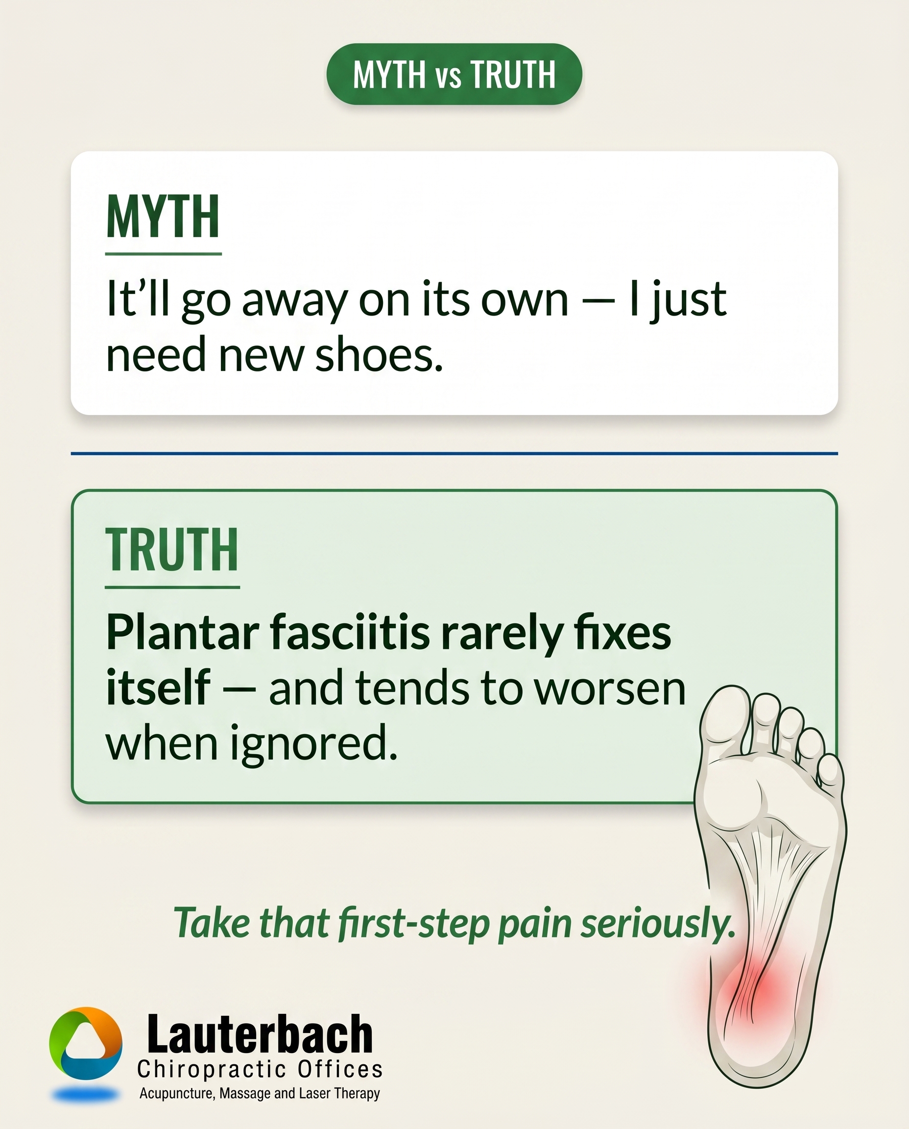
T9S6A2
Rough Image Prompt
A myth-buster graphic for a chiropractic practice correcting the belief that heel and foot pain resolves on its own or just needs new shoes. Typographic-led design with bold contrast between a MYTH statement and a TRUTH statement. Include a small supporting anatomical illustration of the underside of a foot showing the plantar fascia along the arch and heel, with a subtle red glow at the heel and arch to indicate inflammation and strain. The anatomical element is an accent, not full-frame. Render in a clean, editorial, clinical-polish style on a neutral surface. Brand palette to draw from: #2C7A3F green, #1B4D8F blue, #F4F1EA warm off-white, #1A2A1E near-black with green undertone, #FFFFFF white, #1F5C2E deeper green. Typography: Oswald for the MYTH and TRUTH labels and headline, Lato for supporting text, Lato italic for the CTA. Text to render: 'MYTH' label, 'It'll go away on its own — I just need new shoes.' as the myth statement, 'TRUTH' label, 'Plantar fasciitis rarely fixes itself — and tends to worsen when ignored.' as the truth statement, and CTA 'Take that first-step pain seriously.' Logo placement varies by composition and is finalised downstream. Show clean typographic hierarchy with the supporting foot illustration as a calm, credible accent.
Text Overlay
Caption
You know the feeling — that sharp stab in your heel with the very first steps out of bed. Most people shrug it off, blame their shoes, and wait for it to settle. Here's the honest truth: plantar fasciitis rarely just goes away on its own.
New shoes might take the edge off, but they don't address the underlying strain in the tissue along your arch and heel. Left alone, that first-step ache often becomes a daily one — and the longer it's ignored, the longer it tends to take to settle.
The good news? It's a genuine, treatable problem. With the right approach — hands-on care, supportive therapies, and custom orthotics where they help — that pain doesn't have to be your normal.
For 35 years and across two generations, we've helped people in the Lake Monticello area get back on their feet — comfortably.
📞 434-591-0900
🌐 https://drlauterbach.com
✉️ Chirodoc4u2@gmail.com
Does your first step out of bed hurt? Tell us below.
Hashtags
#PlantarFasciitis #HeelPain #PalmyraVA #FootHealth #ChiropracticCare
7.
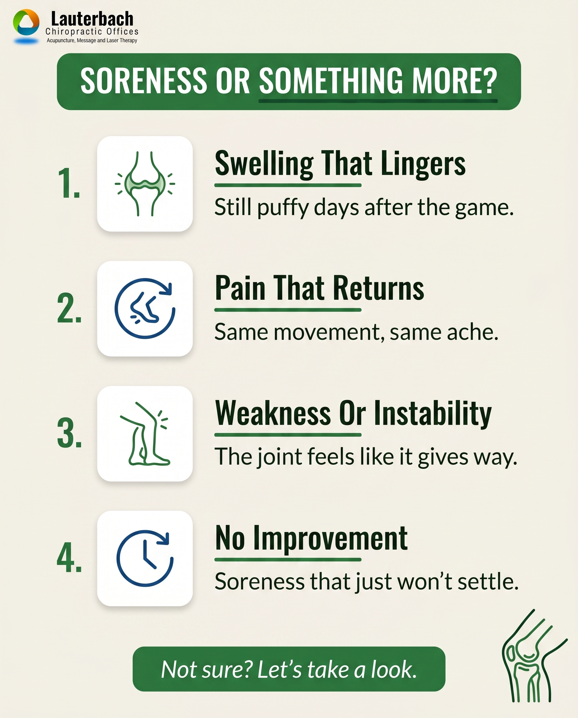
T12S7A2
Rough Image Prompt
A clean, typographic-led list-tips graphic for a chiropractic and sports injury practice, communicating the difference between ordinary post-game soreness and warning signs that point to a real sports injury. The concept is self-assessment for active people — recognising when training fatigue crosses into something that needs attention. Components: a header introducing the list, four numbered list items each with a short custom icon, a short heading line, and a one-line explanation, plus a closing CTA line. Custom illustrated icons that feel native to the content, drawn in a simple clean line or flat style: a swelling/inflammation icon (a joint with a subtle glow or swell indicator), a returning-pain icon (a circular arrow over a body movement symbol), a weakness/instability icon (an off-balance or buckling leg symbol), and a duration/clock icon for lingering symptoms. Optional small supporting anatomical accent — a simplified knee or ankle joint illustration rendered with clinical polish — kept small and supporting, not full-frame. Typographic in character throughout. Brand colours to draw from: green #2C7A3F, blue #1B4D8F, warm off-white #F4F1EA, near-black with green undertone #1A2A1E, white #FFFFFF, deeper green #1F5C2E. Typography: Oswald for headline and item headings, Lato for supporting text, Lato italic for the CTA. Text to render — header: 'SORENESS OR SOMETHING MORE?', item 1 heading: 'Swelling That Lingers', item 1 line: 'Still puffy days after the game', item 2 heading: 'Pain That Returns', item 2 line: 'Same movement, same ache', item 3 heading: 'Weakness Or Instability', item 3 line: 'The joint feels like it gives way', item 4 heading: 'No Improvement', item 4 line: 'Soreness that just won't settle', CTA: 'Not sure? Let's take a look.' Logo placement varies by composition and is finalised downstream. Bright, confident, credible health-brand styling that reads as intentional and on-brand.
Text Overlay
Caption
After a hard game or a big training session, some soreness is normal. Your body worked hard and it's letting you know. But there's a line between ordinary fatigue and a real problem — and knowing the difference protects you from a small issue turning into a long one.
Watch for these signs:
Swelling that's still there days later. Pain that comes back every time you make the same movement. A joint that feels weak or like it might give way. Soreness that simply won't settle no matter how much you rest.
Normal training fatigue eases. A true injury keeps reminding you. If any of these sound familiar, don't wait it out and hope — that's how a small twinge becomes a chronic one.
We've helped active people in the Lake Monticello and Fluvanna area stay in the game for 35 years. Same-day appointments are available, six days a week.
📞 434-591-0900
🌐 https://drlauterbach.com
✉️ Chirodoc4u2@gmail.com
Which one have you ignored before?
Hashtags
#SportsInjury #ChiropracticCare #PalmyraVA #StayInTheGame #InjuryPrevention
8.
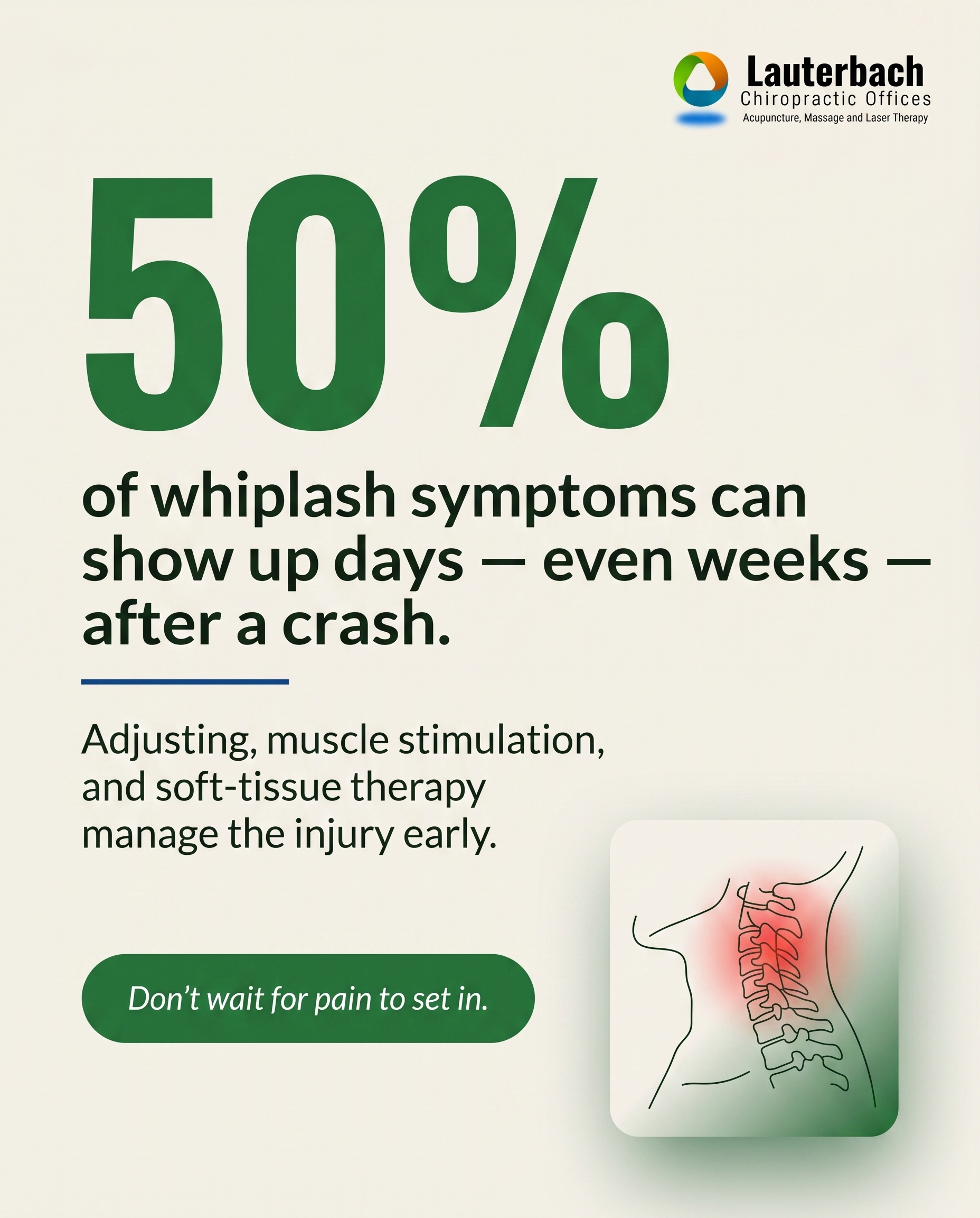
T6S8A3
Rough Image Prompt
A stat-card for a chiropractic and wellness practice communicating that whiplash and auto-accident injuries frequently surface days or weeks after a crash, and that early care addresses them. The composition is typography-led, with one striking statistic as the dominant visual anchor. Primary statistic to render large: '50%'. Short context line beneath: 'of whiplash symptoms can show up days — even weeks — after a crash.'. A short supporting line introducing what care addresses it: 'Adjusting, muscle stimulation, and soft-tissue therapy manage the injury early.'. CTA: 'Don't wait for pain to set in.'. Optional small supporting accent element: a subtle anatomical illustration of the cervical spine (neck vertebrae) rendered cleanly on a neutral or gradient background, with a soft red glow indicating tension or strain in the neck region — kept small and supporting, not full-frame. Use brand colours drawn from this palette: #2C7A3F green, #1B4D8F blue, #F4F1EA warm off-white, #1A2A1E near-black with green undertone, #FFFFFF white, #1F5C2E deeper green. Typography: Oswald for the statistic and headline, Lato for supporting text, Lato italic for the CTA. Logo placement should vary by composition and is finalised downstream. Keep the design intentional, clean, and credible — the statistic should dominate, with the anatomical accent reinforcing the neck-injury subject. No faces, no clinic interiors, no treatment scenes — typographic and illustrative only.
Text Overlay
Caption
You walked away from the accident feeling fine. Then a few days later, your neck is stiff, your shoulders ache, and the headaches start. That delay is normal — whiplash and auto-injury symptoms often surface days or even weeks after the crash, once the adrenaline fades and the soft tissue settles into the strain.
The trouble is, many people don't connect the two. They wait. And waiting lets a manageable injury turn into a chronic one.
That's where early care matters. Chiropractic adjusting restores proper motion, interferential muscle stimulation calms the irritated tissue, and soft-tissue therapy works through the tightness left behind. Several approaches under one roof, aimed at the injury before it digs in.
If you've been in an accident recently — even a minor one — get checked. Same-day appointments are available, six days a week.
📞 434-591-0900
🌐 https://drlauterbach.com
✉️ Chirodoc4u2@gmail.com
Were you in an accident and only noticed the aches later? You're not imagining it.
Hashtags
#WhiplashRecovery #AutoInjuryCare #PalmyraVA #ChiropracticCare #NeckPainRelief
9.
C2S9
Rough Image Prompt
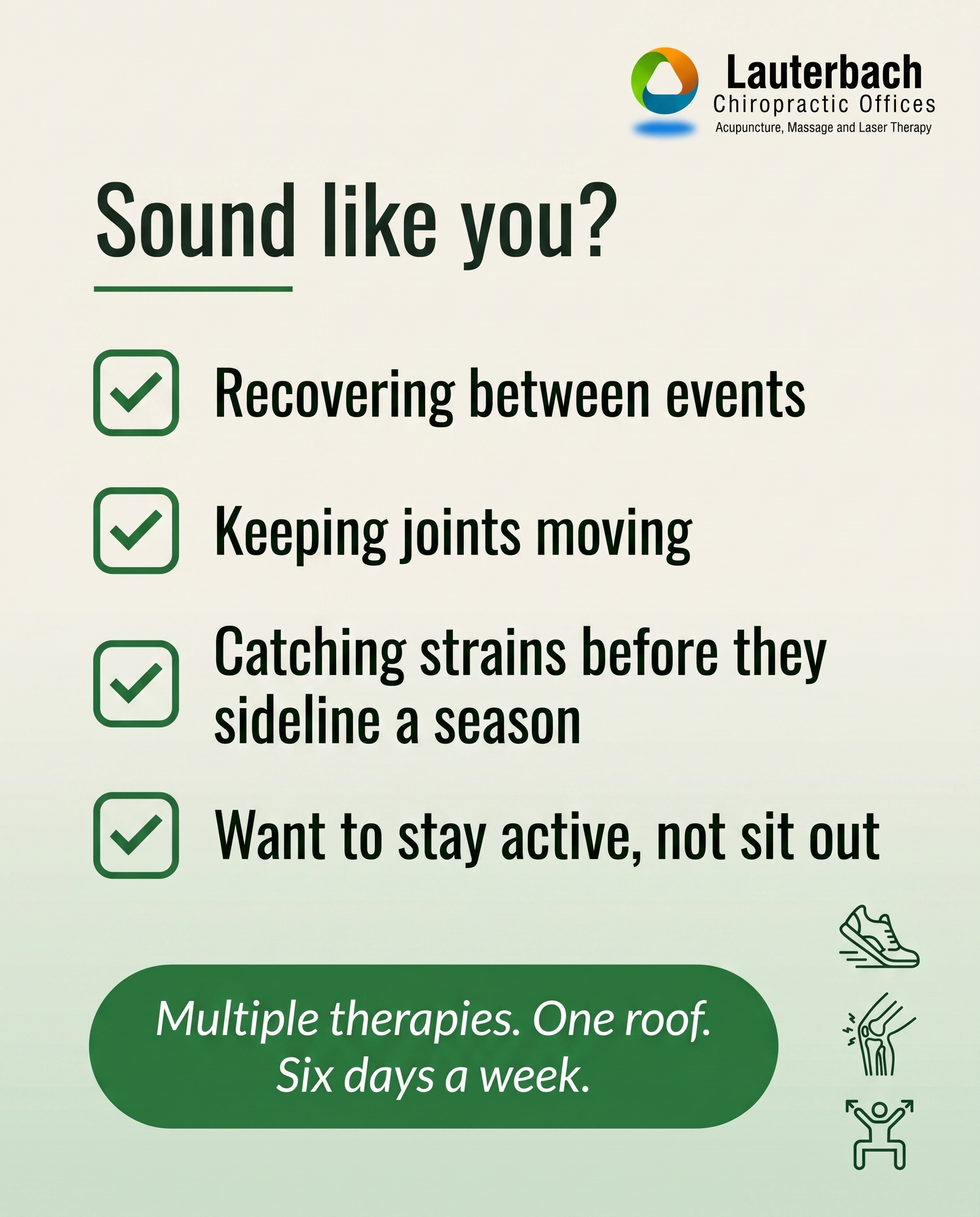
Checklist-style graphic-design post for a chiropractic and sports recovery practice, speaking directly to recreational and competitive athletes who want to stay active. Typographic-led composition with checkbox graphics as the primary visual device. Include a framing question line, four short checklist items each paired with a clean checkbox graphic, and a soft CTA. Supporting accent: a small, editorial-style symbolic icon set relating to athletic recovery — a simple line or solid representation of a running shoe, a flexing joint or knee, and a recovery/stretch motion — kept minimal and supporting, not full-frame, no faces, no clinic environment. Subtle gradient background drawn from the brand palette. Use only these brand colours: #2C7A3F (green), #1B4D8F (blue), #F4F1EA (warm off-white), #1A2A1E (near-black with green undertone), #FFFFFF (white), #1F5C2E (deeper green). Typography: Oswald for headline and checklist item titles, Lato for supporting lines, Lato italic for the CTA. Text to render: framing line 'Sound like you?', checklist items 'Recovering between events', 'Keeping joints moving', 'Catching strains before they sideline a season', 'Want to stay active, not sit out', and CTA 'Multiple therapies. One roof. Six days a week.' Keep checkbox graphics clean and consistent. Logo placement varies by composition and is finalised downstream.
Text Overlay
Caption
For the runners, the lifters, the weekend competitors and the ones who just refuse to slow down — this one's for you. Active people who want to stay active come here. We see athletes recovering between events, keeping joints moving through a long season, and catching strains early before they turn into time on the sidelines. The advantage is everything under one roof: chiropractic adjusting, dry needling, massage therapy, cupping, laser, corrective exercise and more, all working together to get you back to what you love. Open six days a week including Saturdays, with same-day appointments when something flares up and you can't wait. 35 years in practice. A 75-year family tradition of keeping our community moving. If staying in the game matters to you, you've found your place.
📞 434-591-0900
🌐 https://drlauterbach.com
✉️ Chirodoc4u2@gmail.com
What keeps you active — and what's been trying to slow you down lately?
Hashtags
#SportsChiropractic #PalmyraVA #AthleteRecovery #StayInTheGame #LakeMonticello
10.
T8S4A4
Rough Image Prompt
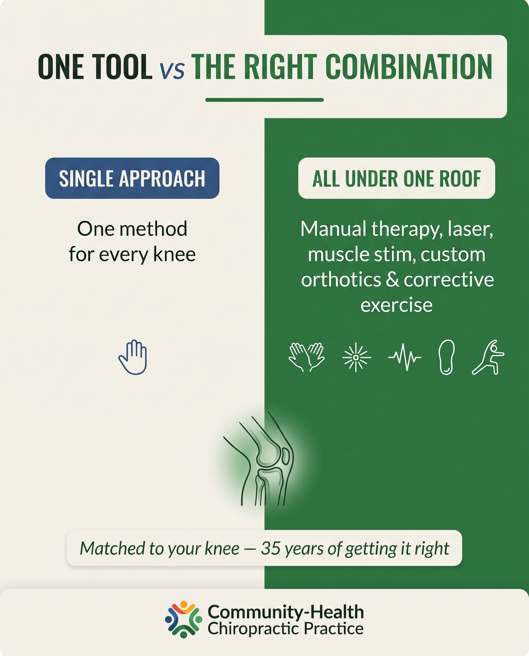
A comparison-card graphic for a chiropractic practice contrasting two approaches to knee pain care. Two distinct sides of equal visual weight. One side represents a SINGLE-MODALITY approach (limited options, one tool for every knee). The other side represents an ALL UNDER ONE ROOF approach showing breadth of options matched to the individual knee. Typographic-led design with small supporting accent elements. Use a clean anatomical illustration of a knee joint as a small supporting accent — translucent, clinical, side or front view — with a subtle green glow indicating focus on the joint. Optional small icons may accent the multi-modality side (hands for manual therapy, a laser beam symbol, a muscle-stim wave, an orthotic insole shape, a stretch/exercise figure) kept minimal and short. Brand palette to draw from: #2C7A3F green, #1B4D8F blue, #F4F1EA warm off-white, #1A2A1E near-black with green undertone, #FFFFFF white, #1F5C2E deeper green. Typography: Oswald for headline and side labels, Lato for supporting text, Lato italic for CTA. Headline text: 'ONE TOOL vs THE RIGHT COMBINATION'. Left side label: 'SINGLE APPROACH'. Left side supporting text: 'One method for every knee'. Right side label: 'ALL UNDER ONE ROOF'. Right side supporting text: 'Manual therapy, laser, muscle stim, custom orthotics & corrective exercise'. CTA text: 'Matched to your knee — 35 years of getting it right'. Logo placement varies by composition and is finalised downstream. Editorial, intentional, credible design that signals representation rather than a clinical scene.
Text Overlay
Caption
Not every knee responds to the same thing. That is the part most people miss when they are choosing where to go.
Some offices have one tool, and every knee gets the same plan. Here, knee pain gets options — manual therapy, cold laser, muscle stimulation, custom Foot Levelers orthotics, and corrective exercise, all under one roof. The right combination depends on YOUR knee, not on what happens to be available.
Thirty-five years in practice and a 75-year family tradition mean we have seen a lot of knees, and we know how to match the approach to the problem instead of forcing the problem to fit the approach.
We are open six days a week including Saturdays, with same-day appointments when you need them.
What have you tried for your knee so far?
📞 434-591-0900
🌐 https://drlauterbach.com
✉️ Chirodoc4u2@gmail.com
Hashtags
#KneePain #PalmyraVA #ChiropracticCare #LakeMonticello #PainRelief
4
Refined Image Prompts
10 prompts · 2026-06-03T09:51
10 prompts refined
▼
1.
L4S1A1
Refined Image Prompt
Documentary-style health and lifestyle photograph capturing an ordinary, unremarkable everyday moment of physical strain. The frame focuses on a pair of hands and forearms lifting a sturdy cardboard moving box, the torso angled mid-lift with weight visibly shifting through the lower back and shoulders. The body is shown from behind and cropped to hands, forearms, and torso only — no face visible, no profile, no side-of-face, no back-of-head with any facial features. The setting is a quiet home hallway with a warm off-white #F4F1EA painted wall catching natural soft window light from the left, calm and grounded in mood. A folded green fabric tote in #2C7A3F rests on a side table in the background, integrating the brand colour naturally. The composition is considered and editorial, quietly observational, elevating the mundane into something worth noticing — as if catching a habit the person has never thought twice about. Soft daylight, gentle shadows, muted natural tones, shallow depth of field that keeps the lifting motion sharp and the background softly blurred. No clinic, no medical context, no identifiable branded objects in the scene.
The overall register is clean, approachable, community-health chiropractic — warm, human, unintrusive.
Text overlay sits in the lower-left third of the frame, positioned over the softer, less detailed area of the wall for maximum legibility. Above the headline, a soft pill-shaped tag with slightly rounded 4px corners filled with #2C7A3F holds a short eyebrow label in Lato, text reading "EVERYDAY STRAIN" in #FFFFFF, letter-spaced and small. Below it, the headline in Oswald reads "Your body is keeping score." in #1A2A1E, set in two lines, large and grounded. A thin underline accent in #2C7A3F sits directly beneath the headline, short and left-aligned, drawing the eye. Below the underline, supporting text in Lato reads "Every lift, every reach, every repeated motion — it all adds up long before pain shows up." in #1A2A1E at a comfortable readable size, wrapped across two to three lines. Beneath the supporting text, the CTA in Lato italic reads "Listen before it speaks louder." in #2C7A3F, set apart with a little breathing room.
In the lower-right corner, place the attached logo at a modest, balanced size. Preserve the logo exactly as provided — do not recolour, redraw, distort, crop, or regenerate it; maintain its original proportions, colours, and detail with clear padding around it.
Constraints: keep all text crisp and minimal against the photography; maintain generous negative space; ensure no face, profile, or facial features appear anywhere in the frame; keep the setting generic and domestic with no clinic, medical equipment, or recognisable brand logos in the scene; apply slight 3-6px rounded corners consistently to the pill tag and any rectangular surfaces; render natural soft window light with calm, grounded tones throughout.
2.
T2S2A4
Refined Image Prompt
A typographic-led graphic-design composition for a community-health chiropractic practice, clean and approachable in register, conveying decades of trusted credibility and convenience for neck pain care. Light scheme with a warm off-white surface in #F4F1EA filling the full canvas, giving an airy, calm wellness feel. A subtle, very faint deeper-green tonal wash in #1F5C2E at extremely low opacity sits in the lower-right corner for gentle depth, never overpowering the off-white field.
Layout is vertically structured and intentional. In the upper region, a compact credibility row of two small typographic badge accents sits side by side, each rendered as a soft pill shape with slight 4px rounded corners. The first pill has a #2C7A3F green fill with the text "35 YEARS" centred inside it in Oswald, coloured #FFFFFF. The second pill has a thin #1B4D8F blue outline on the off-white surface with the text "75-YEAR FAMILY TRADITION" inside it in Oswald, coloured #1B4D8F. These badges are small and supporting.
Below the badges, the primary headline dominates the upper-middle of the composition, set in Oswald, coloured #1A2A1E, reading on three balanced lines: "Neck Pain?" then "One Practice." then "Every Approach." The phrase "Every Approach." is emphasised with a thin underline accent in #2C7A3F running directly beneath it.
Beneath the headline sits the supporting text in Lato, coloured #1A2A1E, kept to a comfortable measure across two or three lines, reading: "Adjusting, massage, dry needling, and laser — all under one roof. 35 years in practice. A 75-year family tradition."
In the middle band, a horizontal cluster of four clean, minimal line icons evenly spaced, each rendered in #2C7A3F green with a consistent thin stroke weight and a calm geometric feel. The first icon is a simplified spine and adjustment glyph, the second a gentle hand and massage glyph, the third a single fine needle glyph for dry needling, the fourth a light-beam glyph for laser therapy. Directly under each icon is its label in Oswald, coloured #1A2A1E, reading "ADJUST", "MASSAGE", "DRY NEEDLING", and "LASER" respectively, each label centred under its icon.
As a small supporting accent positioned to one side in the lower-middle area, a clean translucent glass-like editorial illustration of cervical spine vertebrae, rendered with soft refractive highlights and a faint green-blue tint drawn from #2C7A3F and #1B4D8F, kept small, elegant, and supporting rather than full-frame, with the off-white surface visible around it.
At the lower region, a CTA strip rendered as a soft pill with slight 5px rounded corners filled in #2C7A3F green, containing the text "Six days a week. Same-day appointments." in Lato italic, coloured #FFFFFF, centred within the pill.
Beneath the CTA, in a quiet footer line, the website "drlauterbach.com" and phone "434-591-0900" in Lato, coloured #1A2A1E, small and unobtrusive, with "Palmyra, Virginia" alongside.
All rectangular and pill surfaces carry consistent slight rounded corners between 3 and 6px. Soft pills and thin underlines are the only attention-drawing devices, used consistently across badges, icon group, and CTA. The brand logo, supplied as an attached reference image, is placed in the top-left corner at a modest, balanced size. Render the logo exactly as supplied, preserving its precise colours, proportions, and lettering without recolouring, redrawing, or distorting it.
Lighting is even, bright, and editorial, evoking a clean, confident, calm community-health mood. Composition is generously spaced with clear breathing room, balanced typographic hierarchy, and intentional alignment throughout.
Constraints: keep all text legible and correctly spelled exactly as quoted, maintain generous margins around every edge, keep the cervical spine illustration small and supporting, use only the specified hex colours, and keep the overall feel clean, trustworthy, and approachable.
3.
L2S3A2
Refined Image Prompt
An anatomically accurate 3D illustrative render of the human spine and pelvis shown in a prolonged seated posture, occupying the right two-thirds of the composition. The torso skeleton and hip structure are shown in clean side profile only — no head detail, no face, no full figure — depicting a rounded upper back, forward-tipped cervical curve, a compressed and flexed lower lumbar spine, and a dormant, deactivated state across the gluteal and core muscle regions. The rendering style is translucent, glass-like clinical polish with smooth refractive surfaces and a soft realistic clinical sheen. A soft red glow concentrates over the compressed lower lumbar region and tension points along the spine, while a muted, faded green tone (#2C7A3F at low opacity) washes over the dormant glute and core muscles to signal under-activation. Anatomical regions are indicated using colour-distinct glow accents and thin pointer lines rather than crowded text labels — a faint blue (#1B4D8F) marker on the upper back curve, the red glow on the lumbar compression, the faded green over the deactivated muscles.
The setting is a clean neutral studio field in warm off-white #F4F1EA, with soft directional lighting from the upper left casting gentle, diffused clinical shadows beneath and behind the skeletal structure, giving the glass render depth and dimension. The overall register is clean, approachable community-health chiropractic — calm, trustworthy, and editorial rather than alarming.
The left third holds the text column on the #F4F1EA surface. The headline "What Sitting All Day Really Does" in Oswald, set in near-black #1A2A1E, stacked across two or three lines in the upper-left area, with a thin underline accent in green #2C7A3F beneath the final word. Below it, the supporting text "Rounded spine. Compressed lumbar. Dormant muscles." in Lato, near-black #1A2A1E, set in a tidy block with comfortable line spacing. Near the lower-left, the CTA "That mid-afternoon stiffness isn't just age." in Lato italic, white #FFFFFF text inside a soft pill-shaped container filled with green #2C7A3F, corners rounded to 4px.
All rectangular surfaces and containers use slight 4px rounded corners. Attention is drawn using soft pills and thin underlines consistently throughout. Maintain generous breathing room around every text element.
Place the brand logo in the top-left corner at a modest, balanced scale on the #F4F1EA surface. Render the logo exactly as supplied in the attached logo file — preserve its precise proportions, colours, spacing, and lettering without recolouring, distorting, regenerating, or altering it in any way.
Constraints: use only these exact hex values — #2C7A3F green, #1B4D8F blue, #F4F1EA warm off-white, #1A2A1E near-black, #FFFFFF white, #1F5C2E deep green, plus the soft red glow reserved solely for indicating lumbar compression. Keep the anatomical render side-profile and partial — torso skeleton and hip structure only. Keep labelling minimal and glow-based. Keep all text crisp, legible, and correctly spelled. Maintain a calm, professional, educational tone throughout.
4.
T11S4A2
Refined Image Prompt
A clean, editorial comparison-card graphic for a community-health chiropractic and neuropathy care practice, built on a warm off-white surface field of #F4F1EA. The composition embodies a clean, approachable, clinical-polish register: calm, balanced, trustworthy, with generous breathing room and confident typographic structure.
Layout structure from top to bottom. A centred headline band occupies the upper portion of the canvas. The headline reads "TINGLING IN YOUR FEET ISN'T ALWAYS NOTHING" set in Oswald, in near-black with a faint green undertone #1A2A1E, in a confident condensed display arrangement broken across two lines, with the words "ISN'T ALWAYS NOTHING" carrying a thin underline accent in green #2C7A3F sitting just beneath the final line. Ample margin above and around the headline.
Below the headline, two equal-width comparison panels sit side by side, divided by a slim vertical gap of clean off-white space. Both panels are equal in visual weight and height, with slight 4px rounded corners.
The left panel is a soft warm off-white card #F4F1EA with a thin 1px border outline in green #2C7A3F and slight 4px rounded corners. At its top sits a soft pill label in green #2C7A3F with slight rounded ends, containing the text "EARLY SIGNS" set in Oswald in white #FFFFFF, centred. Beneath the pill, supporting body text reads "Occasional tingling, numbness or pins-and-needles in feet or hands" set in Lato in near-black #1A2A1E, comfortably spaced and left-aligned within the card.
The right panel is a deeper green card #1F5C2E with slight 4px rounded corners. At its top sits a soft pill label in warm off-white #F4F1EA with slight rounded ends, containing the text "WHEN IGNORED" set in Oswald in deeper green #1F5C2E, centred. Beneath the pill, supporting body text reads "Persistent burning, balance changes and loss of sensation" set in Lato in white #FFFFFF, comfortably spaced and left-aligned within the card.
A small supporting anatomical illustration sits between or below the two panels as an accent, not full-frame: a clean 3D-style translucent rendering of a foot and lower leg shown in soft clinical detail, with subtle glowing nerve pathways tracing through it. On the early-signs association the nerve glow is gentle and warm-toned, a soft faint highlight indicating mild tingling; on the when-ignored association the same nerve pathways glow with a more saturated, intensified highlight in green #2C7A3F indicating escalated nerve irritation. The anatomical accent is small, refined and supporting, occupying a modest portion of the lower composition with clean negative space around it.
Across the lower band, centred, the CTA reads "Catch it early — call to get assessed" set in Lato italic in green #2C7A3F, sitting inside a soft pill shape in warm off-white #F4F1EA with a thin green #2C7A3F outline and slight rounded ends.
Place the brand logo in the bottom-left corner at a modest, balanced scale with clear surrounding space. Render the logo exactly as supplied in the attached reference image, preserving its exact proportions, colours, lettering and layout without recolouring, redrawing, or distorting it.
Lighting is soft, even and clean, with gentle realistic glow only on the anatomical illustration. Editorial clinical-polish style, crisp typographic hierarchy, generous margins, balanced symmetry between the two comparison panels.
Constraints: keep all rectangular surfaces at a consistent slight 4px corner radius. Keep the colour palette strictly to #F4F1EA, #2C7A3F, #1F5C2E, #1B4D8F, #1A2A1E and #FFFFFF. Keep the anatomical illustration small and supporting rather than dominant. Maintain clean, open negative space throughout. Render all text exactly as quoted with correct spelling. Keep the logo unaltered and clearly legible.
5.
T5S5A3
Refined Image Prompt
A clean, typography-led Q&A card for a chiropractic practice, calm and credible with a clinical-but-warm community-health character. Editorial layout on a warm off-white surface in #F4F1EA, generous whitespace, balanced and approachable.
Composition is vertical and structured. The upper portion is dedicated to the question heading, set in Oswald in #1A2A1E, reading "Herniated disc? What can actually be done without surgery?" positioned in the upper-left, large and confident, breaking across two or three lines with comfortable leading. Beneath the word "surgery" place a thin underline accent in #2C7A3F spanning roughly the width of that final word, a clean horizontal stroke drawing the eye.
Below the heading, a framing line set in Lato in #1F5C2E reading "A structured path, not a single fix:" positioned left-aligned, smaller and quieter than the heading, acting as a bridge into the answer.
Under the framing line, present a vertical stack of four answer points, each inside its own soft pill container with slightly rounded corners (4px), filled in #FFFFFF with a faint #2C7A3F outline, evenly spaced. Each pill holds a small minimal line icon in #2C7A3F on its left edge followed by Lato text in #1A2A1E. The four points read, top to bottom: "Chiropractic adjusting" with a small spine icon, "Decompression-style care" with a gentle stretch or traction icon, "Therapeutic modalities" with a soft wave or pulse icon, "Corrective exercise" with a simple movement or figure icon. Keep icons consistent in weight and editorial, never literal or busy.
On the right side of the composition, occupying roughly the lower-right third, place a small editorial 3D illustration of a lumbar spine segment showing three to four vertebrae with one intervertebral disc subtly highlighted. Render it in a translucent glass-like material with soft refraction and gentle internal light, the highlighted disc glowing faintly in #2C7A3F while the surrounding vertebrae stay neutral and luminous. The illustration sits on the off-white surface with a soft contact shadow, illustrative and clean rather than documentary, no clinic environment, no labels, no graphic medical detail. It supports the typography and never competes with it.
Near the lower edge, set the CTA in Lato italic in #2C7A3F reading "All under one roof." positioned left-aligned, understated and warm, with a thin underline accent in #2C7A3F beneath it.
Lighting is soft, even and natural, mimicking diffused daylight with gentle shadows that keep the glass spine illustration dimensional while the typographic surface stays flat and crisp. The overall register is clean, credible and approachable.
Place the provided logo in the top-left corner at a modest, balanced scale with clear margin around it. Render the logo exactly as supplied, preserving its original colours, proportions, lettering and layout without recolouring, distorting, regenerating or restyling it in any way.
Constraints: keep the composition uncluttered with deliberate whitespace; render all text exactly as quoted with correct spelling; use only the specified hex colours; keep all rectangular surfaces and pills at a consistent slight corner radius of 3 to 6px; keep the spine illustration editorial and translucent rather than clinical or anatomical-textbook; maintain clear separation between every element so the layout reads cleanly at a glance.
6.
T9S6A2
Refined Image Prompt
A clean, editorial myth-buster graphic for a community-health chiropractic practice, rendered in a clinical-polish style with an approachable register. The composition uses a warm off-white surface (#F4F1EA) filling the full background, giving an airy, credible, neutral foundation.
The layout is split into two stacked horizontal zones with generous breathing room. At the top, a small soft pill badge in green (#2C7A3F) with white (#FFFFFF) text reading "MYTH vs TRUTH" set in Oswald, sitting as a quiet header anchor centred near the top. This pill has slightly rounded corners (4px).
Below the header, the upper content zone holds the MYTH block. A label "MYTH" in Oswald, rendered in deeper green (#1F5C2E), sits left-aligned with a thin underline accent in green (#2C7A3F) beneath it. Directly under the label, the myth statement "It'll go away on its own — I just need new shoes." is set in Lato in near-black with green undertone (#1A2A1E), left-aligned, at a calm readable size. This entire myth block sits inside a soft container card in white (#FFFFFF) with slightly rounded 5px corners and a faint subtle shadow for separation.
A clean thin divider line in blue (#1B4D8F) separates the MYTH and TRUTH zones horizontally across the composition.
The lower content zone holds the TRUTH block, given visual priority. A label "TRUTH" in Oswald rendered in green (#2C7A3F), left-aligned, with a thin underline accent in green beneath it. Below, the truth statement "Plantar fasciitis rarely fixes itself — and tends to worsen when ignored." in Lato, near-black with green undertone (#1A2A1E), left-aligned, slightly larger and more prominent than the myth text. This block sits inside a soft green-tinted container card with a subtle green (#2C7A3F) accent edge and slightly rounded 5px corners, signalling it as the credible, authoritative statement.
In the lower right area, occupying roughly a quarter of the frame as a calm accent rather than full-frame, a clean anatomical illustration of the underside of a single foot. The plantar fascia is shown as a defined band running along the arch and connecting at the heel. A subtle soft red glow highlights the heel and arch region to indicate inflammation and strain, kept restrained and clinical, not alarming. The illustration uses muted line-work in near-black (#1A2A1E) and soft tonal fills, integrated gently into the off-white surface so it reads as a supporting credible accent.
At the bottom of the composition, the CTA "Take that first-step pain seriously." set in Lato italic in green (#2C7A3F), centred, sitting on its own line with comfortable spacing as a warm closing prompt.
The practice logo is placed in the bottom-left corner at a modest, balanced scale with clear padding around it. Render the logo EXACTLY as supplied in the attached logo file — preserve its precise proportions, colours, lettering, and spacing without recolouring, redrawing, distorting, or altering it in any way.
Lighting is soft, even, and editorial with no harsh shadows. Composition is balanced with strong typographic hierarchy, ample whitespace, and a calm clinical-polish mood. All rectangular surfaces — cards, badge, container blocks — use consistent slight rounding of 3 to 6px corners. Accents are limited to soft pills and thin underlines drawn from the brand green and blue.
Constraints: keep the surface clean and uncluttered, maintain accurate spelling in all text exactly as quoted, keep the red inflammation glow subtle and restrained, keep the foot illustration as a small accent and not full-frame, preserve the locked Oswald and Lato fonts throughout, and keep the logo unmodified.
7.
T12S7A2
Refined Image Prompt
A clean, typographic-led list-tips graphic for a chiropractic and sports injury practice, presented as a self-assessment checklist that helps active people tell ordinary post-game soreness from genuine warning signs of a sports injury. The layout is a single vertical composition built on a warm off-white surface in #F4F1EA, with a calm clinical sense of order, generous breathing room, and a clean approachable community-health register throughout.
At the top, a header band sits as a soft pill shape filled in green #2C7A3F with slightly rounded 4px corners, spanning most of the width and centred near the top third margin. Inside it, the header text "SORENESS OR SOMETHING MORE?" is set in Oswald in white #FFFFFF, centred, in confident clean capitals. A thin underline accent in deeper green #1F5C2E sits just beneath the pill, short and centred, as a subtle visual anchor.
Below the header, four numbered list items stack vertically with even spacing, each occupying its own horizontal row. Each row has a small custom illustrated icon on the left, drawn in a simple clean flat line style with a consistent 2px stroke, contained in a soft rounded square chip in white #FFFFFF with a slight 4px corner radius and a faint shadow. To the right of each icon sits a short heading in Oswald in near-black #1A2A1E, and directly beneath it a one-line explanation in Lato in a softer tone of #1A2A1E. Each item is prefixed by its number, rendered in Oswald in green #2C7A3F, sitting just left of or above the icon chip.
Item 1 icon: a joint with a subtle glow or swell indicator suggesting swelling and inflammation, line drawn in green #2C7A3F. Heading "Swelling That Lingers". Line "Still puffy days after the game."
Item 2 icon: a circular arrow looping over a simple body-movement symbol, suggesting returning pain, drawn in blue #1B4D8F. Heading "Pain That Returns". Line "Same movement, same ache."
Item 3 icon: an off-balance buckling leg symbol suggesting weakness and instability, drawn in green #2C7A3F. Heading "Weakness Or Instability". Line "The joint feels like it gives way."
Item 4 icon: a simple clock or duration symbol suggesting lingering symptoms, drawn in blue #1B4D8F. Heading "No Improvement". Line "Soreness that just won't settle."
A thin underline accent in green #2C7A3F sits beneath each item heading, kept short and tidy, reinforcing the soft-pill-and-underline accent system consistently.
A small supporting anatomical accent — a simplified knee or ankle joint illustration rendered with clinical polish in clean line work using green #2C7A3F and #1F5C2E — sits subtly in the lower corner area, kept small and supporting rather than full-frame, adding credibility without crowding the type.
At the bottom, a closing CTA band sits as a soft pill in green #2C7A3F with slightly rounded 4px corners, centred. Inside it, the CTA text "Not sure? Let's take a look." is set in Lato italic in white #FFFFFF, centred.
The attached logo is placed small and clean in the top-left corner with clear margin around it, or alternatively centred just above the bottom CTA band. Preserve the logo exactly as supplied — do not recolour, redraw, distort, re-letter, or alter its proportions in any way; reproduce it faithfully at a tasteful supporting size.
Lighting is bright, even, and confident, giving the surface a soft warmth and the white chips a subtle lift. The overall styling reads as intentional, credible, and on-brand: a polished community-health chiropractic aesthetic with clean typography, balanced spacing, and consistent slight 4px corner rounding across every rectangular element.
Constraints: keep all rectangular surfaces — pills, chips, bands, the logo margin area — at a consistent slight 4px corner rounding. Maintain strong contrast between text and surface for full legibility. Keep icons simple, uniform in stroke weight, and clearly distinct from one another. Keep the anatomical accent small and supporting. Use only the specified hex colours. Render all text exactly as quoted with correct spelling and punctuation.
8.
T6S8A3
Refined Image Prompt
A typography-led stat-card for a chiropractic and wellness practice, rendered in a clean, approachable community-health style. The composition is built on a warm off-white surface in #F4F1EA, calm and credible, with generous breathing room and intentional spacing.
The dominant visual anchor is a massive statistic reading "50%" set in Oswald, rendered in deep green #2C7A3F, positioned in the upper-left quadrant and scaled to command the frame as the clear focal point. Directly beneath the statistic sits a short context line in Lato reading "of whiplash symptoms can show up days — even weeks — after a crash." in near-black #1A2A1E, neatly left-aligned and constrained to a comfortable column width.
Below the context line, separated by a thin underline accent in blue #1B4D8F spanning a short fixed width, a supporting line in Lato reads "Adjusting, muscle stimulation, and soft-tissue therapy manage the injury early." in near-black #1A2A1E at a smaller size, calm and informative.
The CTA "Don't wait for pain to set in." is rendered in Lato italic in white #FFFFFF, sitting inside a soft pill-shaped button filled with green #2C7A3F, with slightly rounded 4px corners, positioned in the lower-left area with comfortable padding around the text.
In the lower-right region, kept small and supporting rather than full-frame, a clean anatomical illustration of the cervical spine showing the neck vertebrae is rendered in a minimal line-and-form style, sitting on a subtle soft gradient blending from #F4F1EA into a faint deeper green #1F5C2E tint. A soft diffuse red glow emanates from the upper neck region indicating tension and strain, kept subtle and muted so it reinforces the subject without overwhelming the palette. The illustration is contained within a softly rounded frame with slight 4px corners, balancing the heavy statistic on the opposite side of the layout.
All rectangular surfaces — the CTA pill, the illustration frame, any container blocks — carry consistent slight rounded corners of 3 to 6px. Lighting across the composition is soft and even, flat editorial illustration lighting with no harsh shadows, giving a credible medical-wellness feel.
Place the attached logo file small in the top-right corner with clear margin around it. Preserve the logo exactly as supplied — do not redraw, recolour, distort, or regenerate it; reproduce it faithfully at modest scale.
Constraints: keep the statistic the unmistakable dominant element; maintain a clean, uncluttered, credible layout with strong negative space; render text crisply and legibly; keep the anatomical accent small and supporting. No faces, no clinic interiors, no treatment scenes, no people — typographic and illustrative only.
9.
C2S9
Refined Image Prompt
A clean, typographic-led checklist graphic for a chiropractic and sports recovery practice, speaking directly to active athletes, with a calm, approachable community-health register. The composition is vertical and structured, built on a generous grid with comfortable margins and clear breathing room between elements.
Background is a subtle vertical gradient drawn from the brand palette, flowing from warm off-white #F4F1EA at the top into a very soft, barely perceptible tint of green #2C7A3F toward the lower third, keeping the overall surface light, clean, and uncluttered. No texture or noise, just a smooth gentle transition.
At the upper area, a framing question line reading "Sound like you?" set in Oswald, in near-black with green undertone #1A2A1E, sized as the dominant headline and positioned with confident left alignment. Directly beneath the headline sits a thin underline accent in green #2C7A3F, short and clean, drawing the eye without heaviness.
Below the headline, a vertical stack of four checklist rows, evenly spaced, each row consisting of a clean square checkbox graphic on the left paired with text on the right. Each checkbox is a small rounded-corner square with 4px corners, outlined in green #2C7A3F with a crisp green check mark inside, rendered consistently and identically across all four rows. The four checklist item titles are set in Oswald in near-black with green undertone #1A2A1E, each reading in order: "Recovering between events", "Keeping joints moving", "Catching strains before they sideline a season", "Want to stay active, not sit out". Each line is left aligned and vertically centred against its checkbox. Keep the checkboxes uniform in size, spacing, and stroke weight.
Toward the lower portion, a soft pill-shaped callout container with 5px rounded corners, filled in solid green #2C7A3F, holding the CTA text "Multiple therapies. One roof. Six days a week." set in Lato italic in white #FFFFFF, centred within the pill. The pill spans a comfortable width, not edge to edge, with even padding around the text.
As a supporting accent, a small minimal editorial-style icon set placed subtly in the lower right or beside the CTA area: a simple line representation of a running shoe, a flexing knee joint, and a stretch or recovery motion symbol, each rendered as light clean line icons in deeper green #1F5C2E or blue #1B4D8F, kept small and supporting, never dominating the frame. No faces, no people, no clinic environment, no equipment beyond these minimal symbolic icons.
Place the attached logo cleanly in the top right corner at modest scale with clear surrounding space, preserving its exact original colours, proportions, and lettering without recolouring, distorting, regenerating, or altering it in any way.
Lighting is flat, even, and bright throughout, consistent with a clean flat graphic design layout. All rectangular surfaces, containers, and the CTA pill use slight 3 to 6px rounded corners applied uniformly. Accents are limited to soft pills and thin underlines as specified.
Constraints: use only these brand colours #2C7A3F, #1B4D8F, #F4F1EA, #1A2A1E, #FFFFFF, #1F5C2E. Keep all four checkboxes identical and consistent. Keep icons minimal and supporting, not full-frame. Maintain generous whitespace and a clean, approachable, uncluttered layout. Headline and checklist titles in Oswald, supporting lines in Lato, CTA in Lato italic. No faces, no clinic interiors, no photographic imagery.
10.
T8S4A4
Refined Image Prompt
A clean editorial comparison-card graphic for a community-health chiropractic practice, split into two vertical halves of equal visual weight by a thin centre divider line in #2C7A3F green. The overall register is clean, approachable and credible — typographic-led, intentional, signalling representation rather than a clinical scene.
Top centre headline band spanning the full width: the headline "ONE TOOL vs THE RIGHT COMBINATION" set in Oswald, centred, with "ONE TOOL" in #1A2A1E near-black and "THE RIGHT COMBINATION" in #2C7A3F green, the word "vs" set smaller in Lato italic in muted #1B4D8F blue between them. A thin underline accent in #2C7A3F green sits beneath the headline, kept short and centred.
Left half — the SINGLE-MODALITY side — rests on a warm off-white #F4F1EA surface. Near the top, a soft pill badge with slightly rounded 4px corners filled in muted #1B4D8F blue containing the label "SINGLE APPROACH" in Oswald, #FFFFFF white, centred inside the pill. Below it, supporting text "One method for every knee" in Lato, #1A2A1E near-black, centred. A single small, minimal line icon of an open hand in #1B4D8F blue sits beneath the text, deliberately spare to signal limited options. Generous empty space around it reinforces the sense of restriction.
Right half — the ALL UNDER ONE ROOF side — rests on a #2C7A3F green surface for contrast and emphasis. Near the top, a soft pill badge with 4px rounded corners filled in warm off-white #F4F1EA containing the label "ALL UNDER ONE ROOF" in Oswald, #2C7A3F green text, centred. Below it, supporting text "Manual therapy, laser, muscle stim, custom orthotics & corrective exercise" in Lato, #FFFFFF white, centred, comfortably set. Beneath the text, a tidy horizontal row of five minimal line icons in #FFFFFF white, evenly spaced: a pair of hands for manual therapy, a simple laser beam symbol, a muscle-stim waveform, an orthotic insole shape, and a small stretching figure. Each icon is short, clean and uniform in stroke weight, signalling breadth of options.
Centred at the lower third, bridging both halves, a clean translucent anatomical illustration of a knee joint, clinical side view, rendered in soft #1F5C2E deeper green linework with a subtle green glow around the joint indicating focus. It floats above the divider as a shared focal accent, small in scale, not dominating the composition.
Below the knee illustration, a CTA line "Matched to your knee — 35 years of getting it right" in Lato italic, centred, in #1A2A1E near-black on the left portion and #FFFFFF white where it crosses onto the green right portion — or, to keep legibility clean, set it within a slim warm off-white #F4F1EA pill with 4px rounded corners spanning the centre, text in #2C7A3F green.
Place the provided logo in the bottom centre, small and balanced, sitting on a clean warm off-white area or its own subtle off-white footer strip so it reads clearly against both halves. Preserve the logo exactly as supplied — do not redraw, recolour, distort, restyle or alter its proportions, text or any element; reproduce it faithfully at appropriate scale.
All rectangular surfaces, pills, badges and containers carry consistent slight rounding of 4px corners. Lighting is even and flat with a soft clinical glow only on the knee joint. Composition is balanced, symmetrical, breathable and intentional.
Constraints: keep the design typographic-led and editorial; render no real people, no photographic clinical scenes, no treatment rooms; keep icons minimal and uniform; maintain clear contrast and legibility on both the off-white and green halves; use only the specified hex colours; keep all corners consistently at the slight 4px treatment; reproduce the supplied logo faithfully without modification.
5
Rendered Images
10 rendered · 2026-06-03T09:51
10 rendered
▼
L4S1A1
1856×2304
T2S2A4
1856×2304
L2S3A2
1856×2304
T11S4A2
1856×2304
T5S5A3
1856×2304
T9S6A2
1856×2304
T12S7A2
1856×2304
T6S8A3
1856×2304
C2S9
1856×2304
T8S4A4
1856×2304