Draw — 10 posts
1
Coordinates
10 coordinates
10 selected
▼
| # | Code | Theme | Subject | Style | Awareness | Source |
|---|---|---|---|---|---|---|
| 1 | T9S1A3 | treatments | T9 — Knee, Hip & Lower Back Pain (from foot mechanics) | photography | A3 — Solution-aware | CURATED |
| 2 | L1S2A1 | lifestyle | L1 — Ramping up activity too quickly (sudden increase in walking/running after inactivity) | graphic-design | A1 — Unaware | CURATED |
| 3 | L3S3A4 | lifestyle | L3 — Prolonged standing on hard surfaces (work, prayer) | illustrative-3D | A4 — Product-aware | CURATED |
| 4 | T6S4A2 | treatments | T6 — Athlete's Foot (Fungal Skin) | comparison-card | A2 — Problem-aware | CURATED |
| 5 | C3S5 | clinic | C3 — Older adults & those managing diabetes-related foot risk | qa-card | — | CURATED |
| 6 | T3S6A3 | treatments | T3 — Fungal Nail Infections | myth-buster | A3 — Solution-aware | CURATED |
| 7 | T2S7A2 | treatments | T2 — Ingrowing Toenails | list-tips | A2 — Problem-aware | CURATED |
| 8 | T12S8A1 | treatments | T12 — Sweaty Feet & Foot Odour | stat-card | A1 — Unaware | CURATED |
| 9 | T8S9A3 | treatments | T8 — Sports Injuries (Lower Limb) | checklist | A3 — Solution-aware | CURATED |
| 10 | T5S1A1 | treatments | T5 — Verrucae | photography | A1 — Unaware | CURATED |
2
Content Briefs
10 briefs · 2026-06-05T09:39
10 briefs generated
▼
1.
T9S1A3
photography
Solution-aware
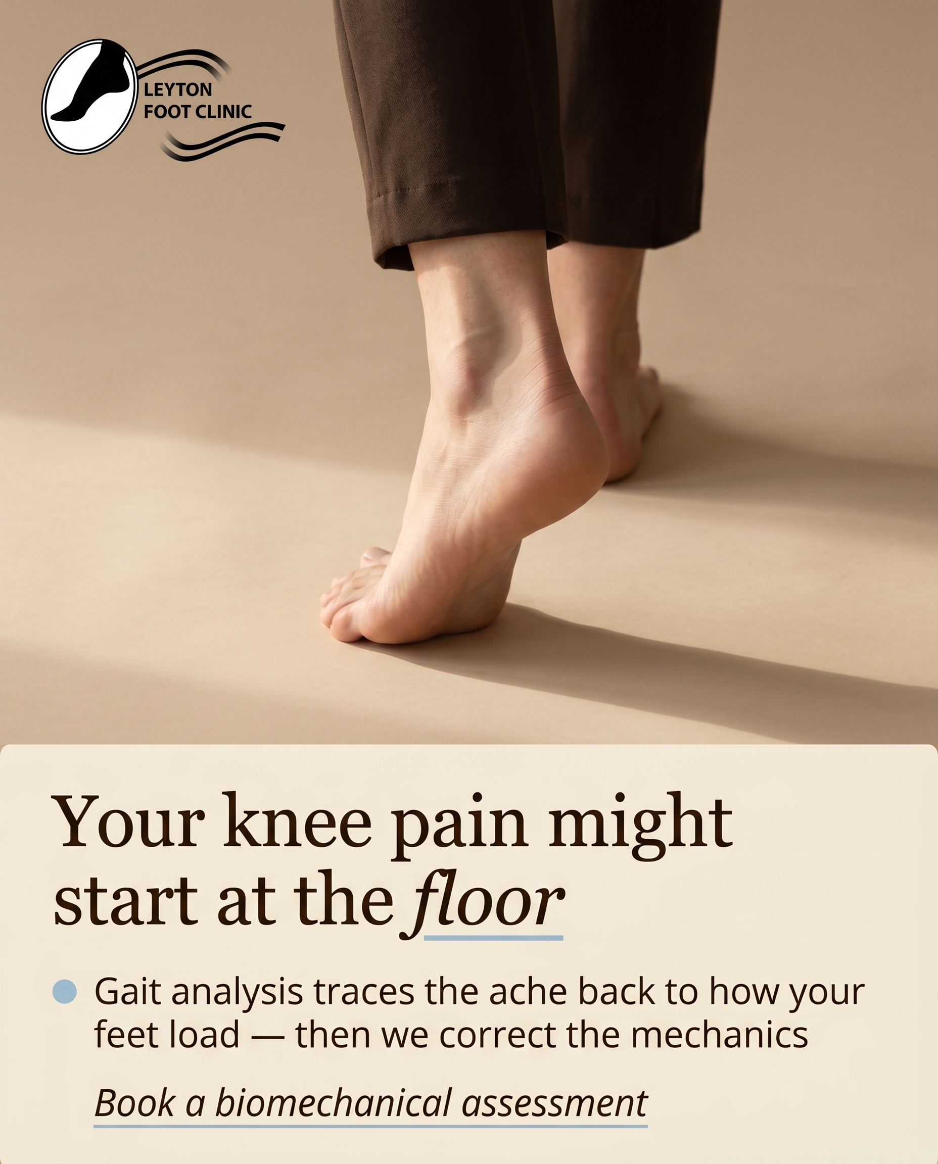
A photographic post showing how a biomechanical assessment and gait analysis traces nagging knee, hip and lower back aches back to the way the feet load the ground. The angle: for the reader who already knows their pain may be foot-driven, this is the treatment pathway — assessment first, then custom orthotics or Foot Mobilisation Techniques to correct the mechanics.
Content: A photographic post showing how a biomechanical assessment and gait analysis traces nagging knee, hip and lower back aches back to the way the feet load the ground. The angle: for the reader who already knows their pain may be foot-driven, this is the treatment pathway — assessment first, then custom orthotics or Foot Mobilisation Techniques to correct the mechanics.
Style: photography
2.
L1S2A1
graphic-design
Unaware
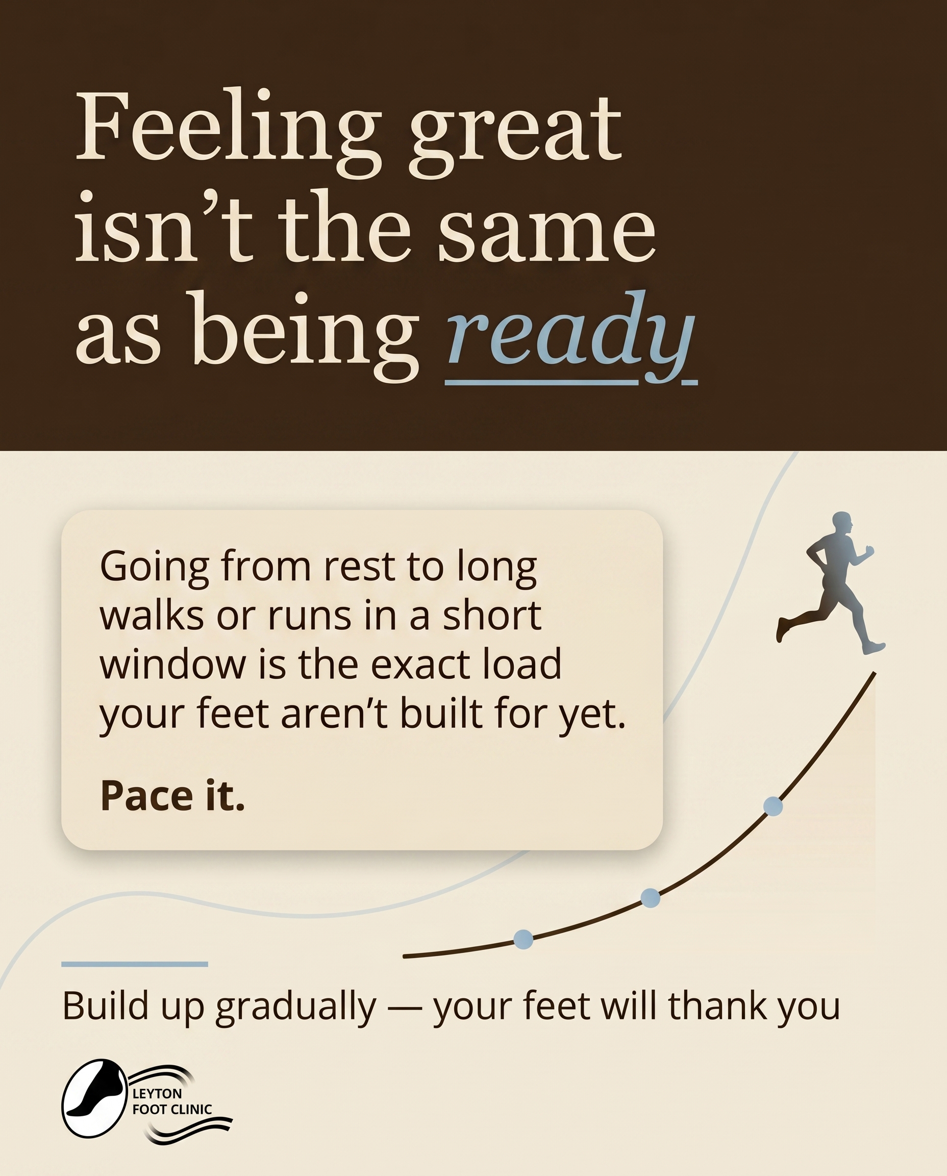
A clean graphic-design piece aimed at someone who feels great about finally getting active again and has no idea there's a risk to flag. The message gently reframes that burst of enthusiasm: going from inactivity to long walks or runs in a short window is exactly the load pattern feet aren't ready for — planting the idea that pacing matters before any pain ever shows up.
Content: A clean graphic-design piece aimed at someone who feels great about finally getting active again and has no idea there's a risk to flag. The message gently reframes that burst of enthusiasm: going from inactivity to long walks or runs in a short window is exactly the load pattern feet aren't ready for — planting the idea that pacing matters before any pain ever shows up.
Style: graphic-design
3.
L3S3A4
illustrative-3D
Product-aware
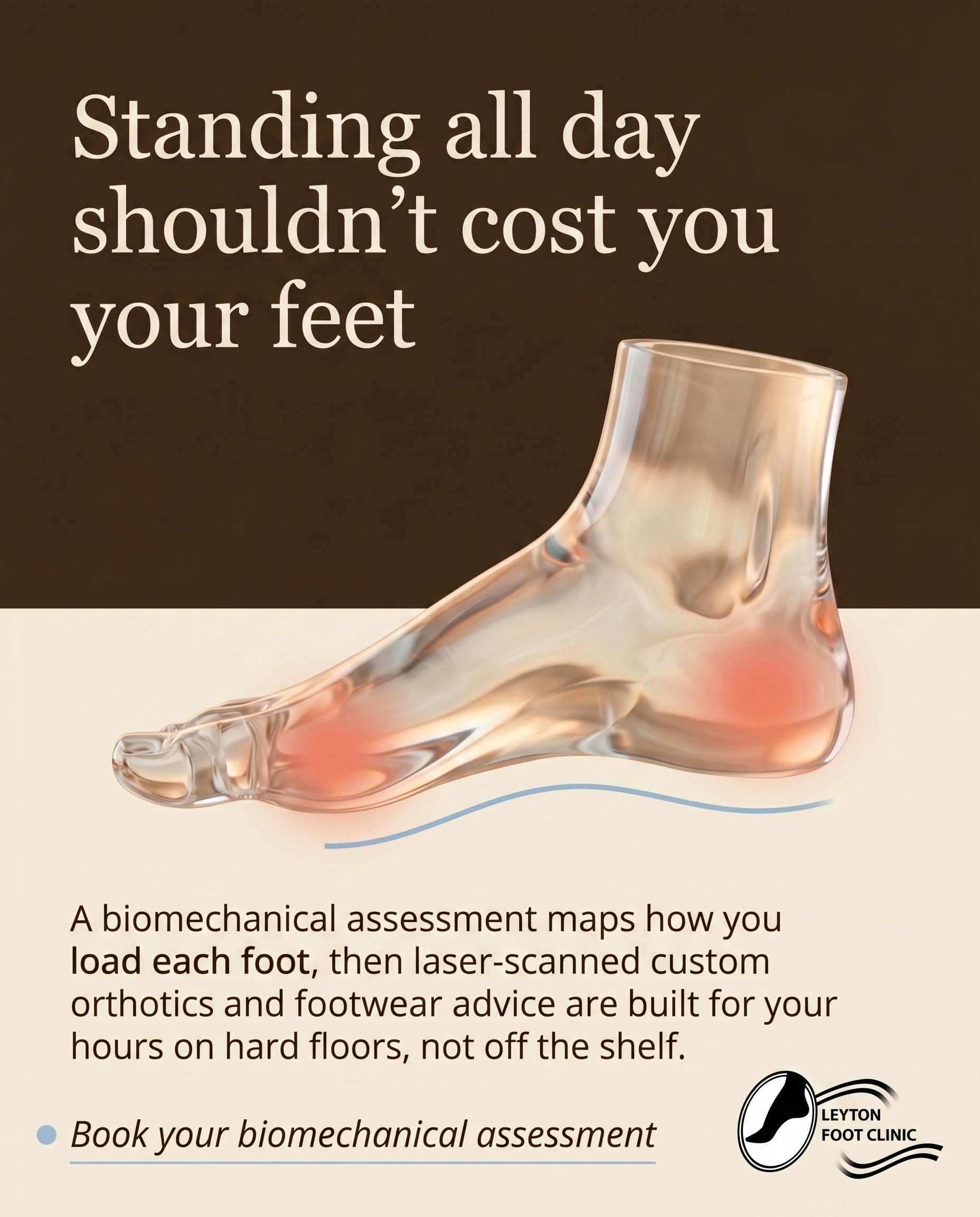
An illustrative-3D post for someone who stands all day on hard floors for work or prayer and already knows it leaves their feet aching — now weighing where to turn. The angle answers 'why here': a biomechanical assessment to understand the load, paired with custom laser-scanned orthotics and footwear advice tailored to long hours on hard surfaces, rather than generic insoles.
Content: An illustrative-3D post for someone who stands all day on hard floors for work or prayer and already knows it leaves their feet aching — now weighing where to turn. The angle answers 'why here': a biomechanical assessment to understand the load, paired with custom laser-scanned orthotics and footwear advice tailored to long hours on hard surfaces, rather than generic insoles.
Style: illustrative-3D
4.
T6S4A2
comparison-card
Problem-aware
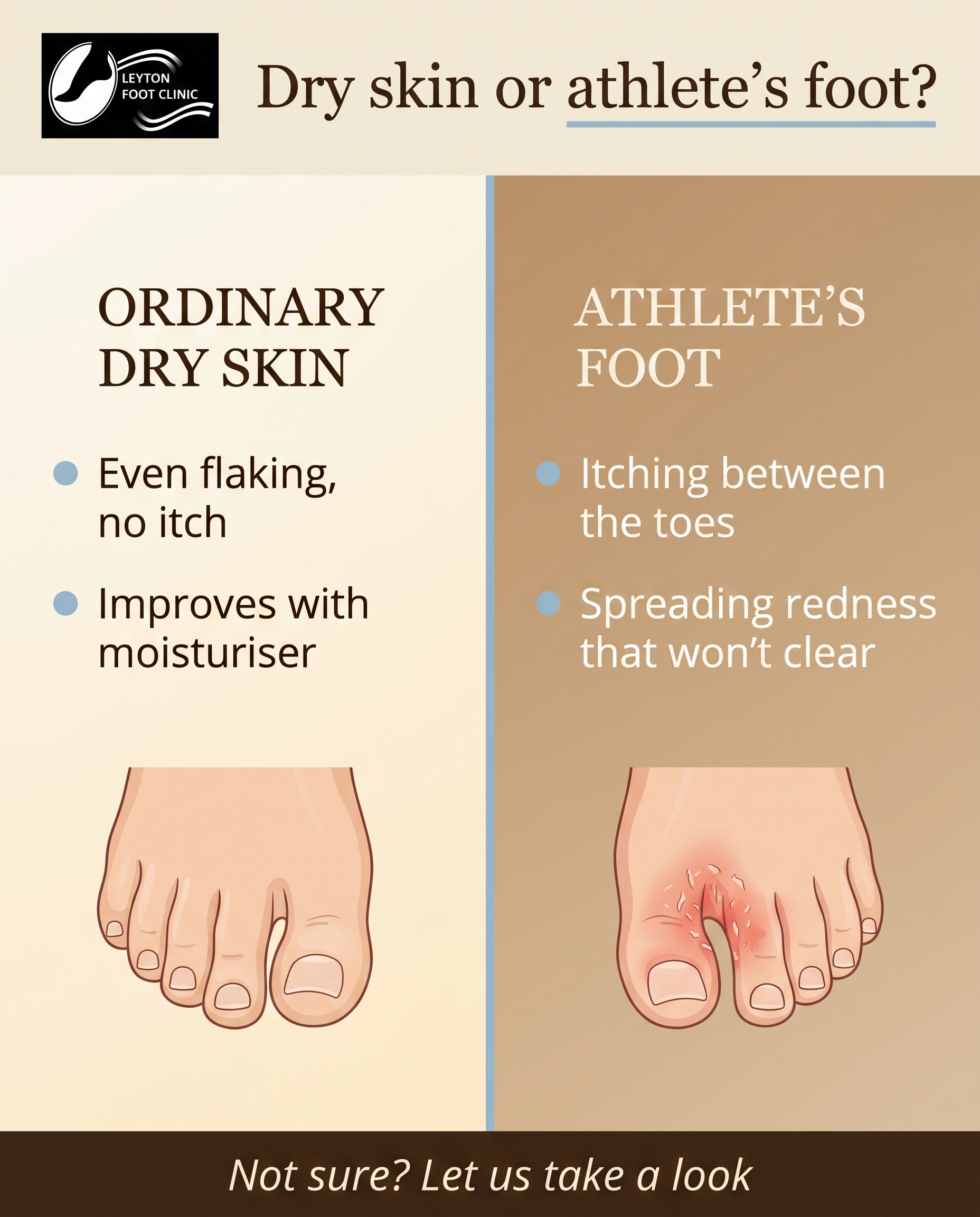
A comparison-card contrasting ordinary dry or sweaty skin against the tell-tale signs of athlete's foot — itching, flaking between the toes, redness that spreads. The angle confirms for the suspicious reader that what they're seeing is a real fungal problem worth treating, not just irritated skin that will clear on its own.
Content: A comparison-card contrasting ordinary dry or sweaty skin against the tell-tale signs of athlete's foot — itching, flaking between the toes, redness that spreads. The angle confirms for the suspicious reader that what they're seeing is a real fungal problem worth treating, not just irritated skin that will clear on its own.
Style: comparison-card
5.
C3S5
qa-card
A Q&A-card that signals belonging for older adults and those managing diabetes-related foot risk: the kind of careful, unhurried foot care where checking circulation, skin and nails is treated as routine, not an afterthought. The message: people who need their feet watched closely come here and are looked after with that in mind.
Content: A Q&A-card that signals belonging for older adults and those managing diabetes-related foot risk: the kind of careful, unhurried foot care where checking circulation, skin and nails is treated as routine, not an afterthought. The message: people who need their feet watched closely come here and are looked after with that in mind.
Style: qa-card
6.
T3S6A3
myth-buster
Solution-aware
A myth-buster correcting the belief that a chemist's bottle of paint-on lacquer reliably clears a fungal nail. The angle for the solution-seeking reader: stubborn fungal nails usually need a proper podiatry approach — reducing and clearing the infected nail and, where suitable, low-level laser therapy — rather than months of over-the-counter guesswork.
Content: A myth-buster correcting the belief that a chemist's bottle of paint-on lacquer reliably clears a fungal nail. The angle for the solution-seeking reader: stubborn fungal nails usually need a proper podiatry approach — reducing and clearing the infected nail and, where suitable, low-level laser therapy — rather than months of over-the-counter guesswork.
Style: myth-buster
7.
T2S7A2
list-tips
Problem-aware
A list-tips post helping the reader judge whether that sore, red corner of a toenail is genuinely an ingrowing toenail and a real problem — tenderness on pressure, swelling, repeated catching, the urge to dig at it. The angle validates the worry and signals it's worth acting on before it becomes infected, rather than self-treating at home.
Content: A list-tips post helping the reader judge whether that sore, red corner of a toenail is genuinely an ingrowing toenail and a real problem — tenderness on pressure, swelling, repeated catching, the urge to dig at it. The angle validates the worry and signals it's worth acting on before it becomes infected, rather than self-treating at home.
Style: list-tips
8.
T12S8A1
stat-card
Unaware
A stat-card for someone who's never considered sweaty feet anything more than a minor nuisance, using a striking figure about how much the feet sweat to make them pause. The angle: this is a treatable condition with real knock-on effects on odour and skin health — worth caring about, not just tolerating.
Content: A stat-card for someone who's never considered sweaty feet anything more than a minor nuisance, using a striking figure about how much the feet sweat to make them pause. The angle: this is a treatable condition with real knock-on effects on odour and skin health — worth caring about, not just tolerating.
Style: stat-card
9.
T8S9A3
checklist
Solution-aware
A checklist for the reader nursing a lower-limb sports injury and asking what actually fixes it. The angle walks through the recovery pathway — biomechanical assessment to find the cause, RockTape or kinesiology taping for support, and a prescribed stretching and strengthening plan — so they see structured rehab rather than just resting and hoping.
Content: A checklist for the reader nursing a lower-limb sports injury and asking what actually fixes it. The angle walks through the recovery pathway — biomechanical assessment to find the cause, RockTape or kinesiology taping for support, and a prescribed stretching and strengthening plan — so they see structured rehab rather than just resting and hoping.
Style: checklist
10.
T5S1A1
photography
Unaware
A photographic post for someone who'd shrug off a small rough patch on the sole as a callus, not realising it could be a verruca. The angle simply raises awareness that these can spread and linger — enough to make the reader look twice and care, without yet pushing a treatment.
Content: A photographic post for someone who'd shrug off a small rough patch on the sole as a callus, not realising it could be a verruca. The angle simply raises awareness that these can spread and linger — enough to make the reader look twice and care, without yet pushing a treatment.
Style: photography
3
Developed Posts
10 posts · 2026-06-05T09:42
10 developed
▼
1.
T9S1A3
Rough Image Prompt
Elevated health and wellness lifestyle photography exploring how foot mechanics shape pain felt higher up the body. Depict a person mid-stride from behind or from the knees down only, bare feet or socked feet making contact with the ground, the weight visibly loading through the foot — focus on the foot, ankle and lower leg as the point where the body meets the floor. No face shown at all. Person cropped at the neck, or shown limbs-only, or from behind. Generic, calm setting — soft natural daylight on a neutral floor surface, a quiet home or outdoor moment rather than any clinical environment. Convey the concept of tracing a chain upward: the way the foot strikes and loads the ground connects to knee, hip and lower back. Warm, considered composition, soft natural lighting, calm and grounded atmosphere. Integrate brand colour cues naturally through wardrobe, surfaces and light. Include clean text overlay rendered in Georgia for the headline and Open Sans for supporting text, with Open Sans italic for the CTA. Headline text: 'Your knee pain might start at the floor'. Supporting text: 'Gait analysis traces the ache back to how your feet load — then we correct the mechanics'. CTA text: 'Book a biomechanical assessment'. Brand colour palette to draw from: espresso brown #3F2A18, warm cream #F2EAD8, warm sand #E5D6BA, warm tan #CDB593, dusty muted blue #9EBED2 used sparingly for small accents only, and warm near-white for reversed text on deep surfaces. Backgrounds remain warm — cream, sand or tan — never grey, never cool, never pure white. Logo placement varies by composition and is finalised downstream.
Text Overlay
Caption
You already suspect it. The knee that grumbles on the stairs. The hip that tightens after a long walk. The lower back that never quite settles. And a quiet feeling that it might all start further down — at your feet.
You could be right. Every step you take loads through the foot first, and if that loading is off, the strain has to go somewhere. Often it travels up.
That is where a biomechanical assessment and gait analysis come in. We watch how you actually move, how your feet strike and load the ground, and trace the ache back to its source. From there the pathway is clear — custom orthotics to support the mechanics, or Foot Mobilisation Techniques to restore movement where it is stuck.
Assessment first. Then we correct the cause, not just chase the symptom.
If your knees, hips or back have been talking to you, it may be worth looking at your feet.
📞 02085199477
🌐 https://www.leytonfootclinic.co.uk
✉️ info@leytonfootclinic.co.uk
Where do you feel it most — knees, hips or back? Tell us below.
Hashtags
#Podiatry #LeytonLondon #GaitAnalysis #FootMechanics #KneePainRelief
2.
L1S2A1
Rough Image Prompt
Create a warm, editorial graphic-design social post about pacing a return to activity to protect the feet. The concept communicates gentle reframing: the burst of enthusiasm when someone finally gets active again is real and good, but going from inactivity to long walks or runs in a short window is the exact load pattern feet are not yet ready for. Typographic-led composition with a calm, considered, premium feel. Optional small supporting accent element: a simple line-style illustration suggesting a rising load curve or a subtle gradient arc that builds upward, kept small and supporting (not full-frame, not competing with the type). Backgrounds must always be warm — warm cream, warm sand, or warm tan, never grey, never cool, never pure white. Two-tone warm splits are acceptable. Brand palette to draw from (exact hex): #3F2A18 espresso brown for text or deep surface, #F2EAD8 warm cream lightest surface, #E5D6BA warm sand mid surface, #CDB593 warm tan deep surface, #9EBED2 dusty muted blue used sparingly for a single accent line or italic emphasis only (never a large area, never the headline). Do not use coral in this post — coral is reserved exclusively for anatomical illustration. Typography: Georgia for the headline, Open Sans for supporting text, Georgia italic permitted for a single emphasised phrase. Text to render exactly: headline 'Feeling great isn't the same as being ready', supporting text 'Going from rest to long walks or runs in a short window is the exact load your feet aren't built for yet. Pace it.', CTA 'Build up gradually — your feet will thank you'. Keep text crisp and clean with no duplicated or invented characters. Include the practice logo, with placement varied and finalised downstream.
Text Overlay
Caption
That first burst of motivation when you finally get moving again? Hold onto it — it's brilliant. But here's the part nobody flags early enough.
Your feet don't measure enthusiasm. They measure load. And going from weeks of rest to long walks or back-to-back runs in a short window is exactly the pattern they aren't ready for yet. The tissues, the tendons, the arch — they all adapt, but they adapt slowly.
The good news is this is one of the easiest things to get right. Add distance and intensity in small steps. Give yourself rest days. Listen for tightness or soreness before it turns into anything that forces you to stop.
Pacing isn't slowing down. It's making sure you're still going in three months' time.
If you're ramping up activity and want to build the right way for your feet, the team in Leyton can help you plan it.
📞 02085199477
🌐 https://www.leytonfootclinic.co.uk
✉️ info@leytonfootclinic.co.uk
What's your current activity goal? Tell us below.
Hashtags
#FootHealth #LeytonLondon #RunningInjuryPrevention #PaceYourself #PodiatryUK
3.
L3S3A4
Rough Image Prompt
An illustrative-3D anatomical render communicating how the foot absorbs load during long hours of standing on hard surfaces, and how tailored support redistributes that pressure. Subject: a clean, anatomically accurate 3D illustration of a human foot shown in a translucent, glass-like rendering style, revealing internal structure (arch, heel, ball of foot) where pressure concentrates. Highlight indicators: soft coral #E5816B glow at the heel and ball of the foot to indicate strain and inflammation from prolonged standing; a dusty muted blue #9EBED2 accent line or subtle contour beneath the arch to suggest tailored support and redistributed load. The render should read as illustrative and editorial, isolated on a warm background (cream #F2EAD8, sand #E5D6BA, or tan #CDB593), no environmental context, no clinic setting. Components: the anatomical foot illustration as the visual anchor, plus text overlay. Brand colours available to draw from: #3F2A18 espresso brown, #F2EAD8 warm cream, #E5D6BA warm sand, #CDB593 warm tan, #9EBED2 dusty muted blue (small accent only), #E5816B soft coral (anatomical pain/strain highlight only), warm near-white for reversed text on deep surfaces. Typography: Georgia for headline, Open Sans for supporting text, Open Sans italic for CTA. Text content to render: headline 'Standing all day shouldn't cost you your feet', supporting text 'A biomechanical assessment maps how you load each foot, then laser-scanned custom orthotics and footwear advice are built for your hours on hard floors, not off the shelf.', CTA 'Book your biomechanical assessment'. Logo placement should vary by composition and is finalised downstream. Keep the rendering warm-toned throughout, backgrounds always warm, never grey, never cool, never pure white.
Text Overlay
Caption
If you stand for a living, or stand long hours in prayer, that deep ache by the end of the day isn't something you just have to accept. Hard floors give nothing back. Every step sends the load straight up through your heel and the ball of your foot, hour after hour.
Generic insoles guess. We don't. A biomechanical assessment shows us exactly how you load each foot and where the pressure builds. From there, the podiatrist fits laser-scanned custom orthotics built for your feet and your routine, plus footwear advice tailored to long hours on hard surfaces.
It's the difference between a quick cushion and understanding why your feet ache in the first place.
Feet sore after a long shift or a day on your feet? Let's get to the root of it.
📞 02085199477
🌐 https://www.leytonfootclinic.co.uk
✉️ info@leytonfootclinic.co.uk
What does your day on your feet look like?
Hashtags
#FootPain #CustomOrthotics #LeytonPodiatry #OnYourFeetAllDay #FootHealth
4.
T6S4A2
Rough Image Prompt
A comparison-card for a podiatry clinic contrasting two distinct skin conditions on the foot, helping a suspicious reader tell the difference between everyday skin irritation and a genuine fungal infection. Two equal-weight sides, each with a concrete label and supporting points. One side represents ORDINARY DRY SKIN, the other represents ATHLETE'S FOOT. Visual character is typographic-led with small supporting anatomical illustration accents — clean editorial renders of skin between the toes, one side showing calm normal skin texture, the other showing flaking and spreading redness between the toes (use soft coral #E5816B exclusively to indicate the inflamed/affected area on the athlete's foot side anatomical accent). Body part isolated, no environmental context, no faces, no clinic setting. Warm backgrounds only drawn from the palette: warm cream #F2EAD8, warm sand #E5D6BA, warm tan #CDB593, with espresso brown #3F2A18 for text and dusty muted blue #9EBED2 as a sparing accent for the dividing line and italic emphasis. Use warm-tinted near-white #F2EAD8 for any reversed text on deep surfaces. Typography: Georgia for headline and side labels, Open Sans for supporting text, Open Sans italic for the CTA. Text to render: headline 'Dry skin or athlete's foot?', side label 'ORDINARY DRY SKIN', side label 'ATHLETE'S FOOT', supporting points 'Even flaking, no itch', 'Improves with moisturiser', supporting points 'Itching between the toes', 'Spreading redness that won't clear', and CTA 'Not sure? Let us take a look'. Logo placement varies by composition and is finalised downstream.
Text Overlay
Caption
Dry skin and athlete's foot can look similar at first glance — but they behave very differently. Ordinary dry skin tends to flake evenly, doesn't itch much, and settles down once you moisturise. Athlete's foot is more stubborn. It usually starts with itching between the toes, flaking that doesn't improve, and redness that quietly spreads rather than clears.
The tell-tale sign? If it keeps coming back no matter what you put on it, it's worth treating properly. Fungal skin infections rarely clear on their own — and left alone they can spread to the nails, which are far trickier to shift.
If you've been second-guessing what you're looking at, you don't have to keep wondering. A quick check will tell you exactly what's going on and what will actually work.
📞 02085199477
🌐 https://www.leytonfootclinic.co.uk
✉️ info@leytonfootclinic.co.uk
Seeing any of these signs? Let us know in the comments or book a check.
Hashtags
#AthletesFoot #FootHealth #PodiatristLondon #Leyton #HealthyFeet
5.
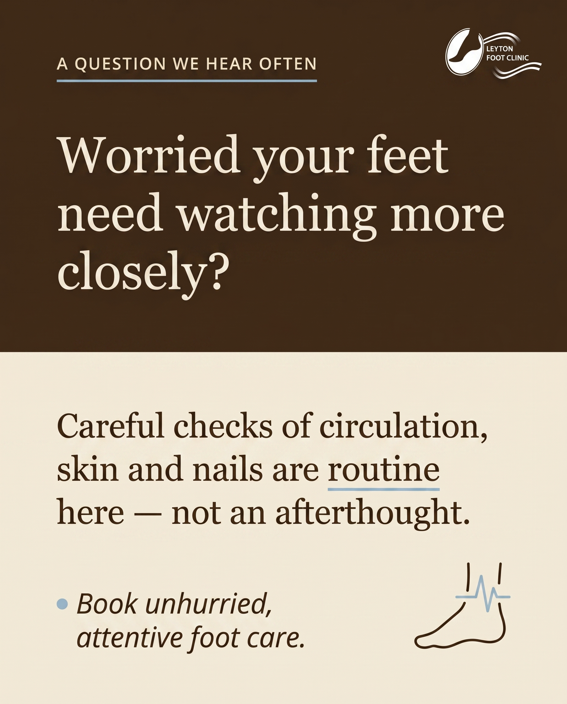
C3S5
Rough Image Prompt
A clean, reassuring Q&A-card in a warm, editorial style for a podiatry clinic, communicating that careful, unhurried foot care for older adults and people managing diabetes-related foot risk is treated as routine here. Style: typographic-led graphic design with a small supporting accent element. Components required: a clear question text element, an answer text element, a CTA text element, and a small symbolic accent (a simple line-style icon suggesting attentive foot-and-circulation care — for example a foot outline with a soft pulse or check motif, kept small and supporting, not full-frame). No people, no faces, no clinic interior, no treatment scene. Backgrounds must be warm — cream, sand, or tan — never grey, cool, or pure white. Brand colour palette to draw from: espresso brown #3F2A18, warm cream #F2EAD8, warm sand #E5D6BA, warm tan #CDB593, dusty muted blue #9EBED2 (small accent only, never large areas, never the headline, never a button), warm near-white for reversed text on deep surfaces. Dusty blue may be used sparingly for a decorative line or a single accent detail. Coral is not used here. Typography: Georgia for the question and answer headline text, Open Sans for supporting text, Open Sans italic for the CTA. Text content to render: Question — "Worried your feet need watching more closely?". Answer — "Careful checks of circulation, skin and nails are routine here — not an afterthought.". CTA — "Book unhurried, attentive foot care.". Logo placement should vary by composition and is finalised downstream. The overall feel should be calm, warm, trustworthy, and considered — care that takes its time.
Text Overlay
Caption
Some feet need watching more closely than others — and they deserve the time it takes to do it properly.
If you're managing diabetes, or simply finding that circulation, skin and nail changes are harder to keep on top of, this is exactly the kind of care we're here for. Checking how the skin is holding up, how the circulation is doing, how the nails are growing — none of it is rushed, and none of it is treated as an afterthought.
The earlier small changes are spotted, the easier they are to manage. That's why careful, unhurried checks are simply part of the routine here, not an add-on.
If this sounds like the kind of attention your feet have been needing, come and see us in Leyton.
📞 02085199477
🌐 https://www.leytonfootclinic.co.uk
✉️ info@leytonfootclinic.co.uk
Is there anything you wish your feet got checked for more often? Let us know below.
Hashtags
#Podiatry #LeytonLondon #DiabeticFootCare #FootHealth #FootCare
6.
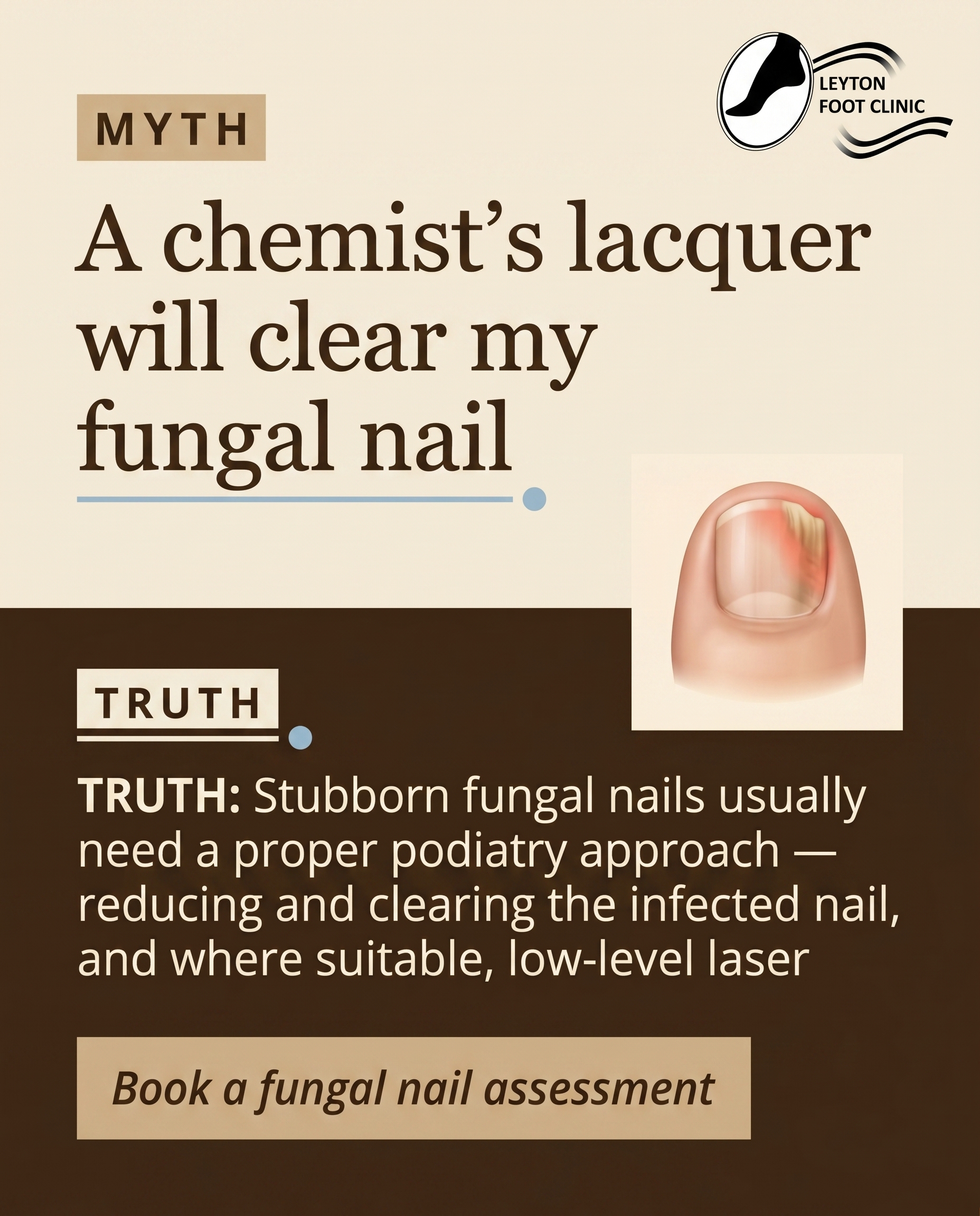
T3S6A3
Rough Image Prompt
A myth-buster style graphic for a podiatry clinic, correcting the belief that over-the-counter paint-on lacquer reliably clears a fungal nail infection. Typographic-led design with bold contrast between a MYTH statement and a TRUTH statement. Components: a 'MYTH' label, the myth line 'A chemist's lacquer will clear my fungal nail', a 'TRUTH' label, the truth line 'Stubborn fungal nails usually need a proper podiatry approach', and a CTA. Optional small supporting accent: a clean editorial-style 3D anatomical illustration of a single toenail showing fungal discolouration, isolated on a neutral warm background — supporting, not full-frame. Use only these exact brand colours: espresso brown #3F2A18, warm cream #F2EAD8, warm sand #E5D6BA, warm tan #CDB593, dusty muted blue #9EBED2 used sparingly for small accents and decorative lines only, and soft coral #E5816B reserved exclusively for indicating affected/infected areas on the anatomical nail illustration. Backgrounds must be warm (cream, sand, or tan) — never grey, never cool, never pure white. Typography: Georgia for headline and labels, Open Sans for supporting text, Open Sans italic for the CTA. Render this exact text: 'MYTH', 'A chemist's lacquer will clear my fungal nail', 'TRUTH', 'Stubborn fungal nails usually need a proper podiatry approach', 'Book a fungal nail assessment'. Logo placement should vary by composition and is finalised downstream. Keep the design clean, intentional, and editorial with strong typographic hierarchy.
Text Overlay
Caption
If you have been painting on a lacquer for months and the nail still looks thick, discoloured or crumbly, you are not doing anything wrong — the bottle is just rarely strong enough on its own.
Here is the honest version. Over-the-counter lacquers struggle to reach the infection living deep in and under the nail. By the time most people come to see us, they have spent months on guesswork while the nail kept changing.
A proper podiatry approach is different. We reduce and clear the infected nail so treatment can actually reach where it needs to, and where it suits the nail, we use low-level laser therapy as part of the plan. No promises of overnight miracles — just a clear, structured way forward.
Still not sure if it is fungal at all? That is worth checking too, because plenty of thick or discoloured nails are not fungal.
📞 02085199477
🌐 https://www.leytonfootclinic.co.uk
✉️ info@leytonfootclinic.co.uk
How long have you been battling that one stubborn nail? Tell us below.
Hashtags
#FungalNail #Podiatry #LeytonLondon #FootHealth #NailCare
7.
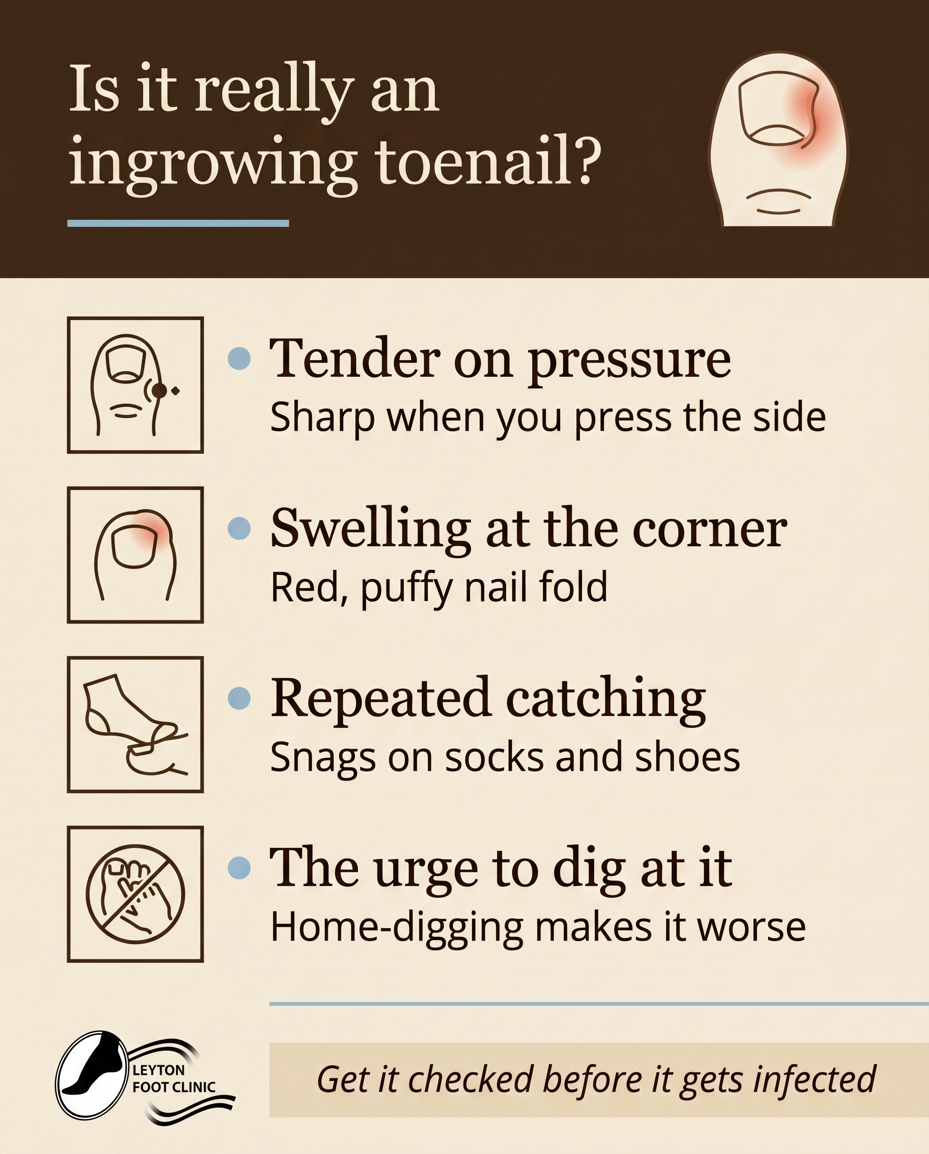
T2S7A2
Rough Image Prompt
A list-tips graphic-design post for a podiatry clinic, helping the reader recognise the early signs of an ingrowing toenail and judge whether that sore toe corner is a real problem. Typographic-led composition with custom illustrated icons accompanying each tip. Warm, calm, editorial health-brand character. Header text introduces the list, followed by four short, clearly distinguished tip items, each with a small custom icon (a tender toe with a small pressure indicator, a swollen rounded toe shape, a sock or shoe catching graphic, a hand-near-toe 'don't dig' deterrent symbol). Optional small supporting anatomical illustration of a toe with the nail-edge corner subtly highlighted. Use only these brand colours: espresso brown #3F2A18, warm cream #F2EAD8, warm sand #E5D6BA, warm tan #CDB593, dusty muted blue #9EBED2 for small accents only, soft coral #E5816B reserved exclusively for the anatomical illustration to indicate tenderness/inflammation at the nail edge. Backgrounds always warm (cream, sand, or tan), never grey, never cool, never pure white. Typography: Georgia for headline and item titles, Open Sans for supporting lines, Open Sans italic for the CTA. Text content to render: header 'Is it really an ingrowing toenail?', item titles 'Tender on pressure', 'Swelling at the corner', 'Repeated catching', 'The urge to dig at it', supporting lines 'Sharp when you press the side', 'Red, puffy nail fold', 'Snags on socks and shoes', 'Home-digging makes it worse', and CTA 'Get it checked before it gets infected'. Keep all text crisp and clean within the listed strings only. Logo placement should vary by composition and is finalised downstream. Clean, intentional, custom-feeling icons; no clinic interior, no treatment scene, no faces.
Text Overlay
Caption
That sore, red corner of your toenail? It might be more than a passing twinge.
An ingrowing toenail usually gives you a few honest warning signs before it becomes a real problem. Here's what to look for:
Tender on pressure — it feels sharp when you press the side of the nail.
Swelling at the corner — the skin around the nail fold looks red and puffy.
Repeated catching — it snags on your socks and shoes.
The urge to dig at it — and yes, digging at it at home almost always makes it worse.
If a couple of these ring true, it's worth acting now rather than waiting. Caught early, an ingrowing toenail is straightforward to sort. Left to its own devices, it can get infected — and that's a harder, more painful path.
No dramatic home surgery needed. Just a proper look from someone who does this every day.
📞 02085199477
🌐 https://www.leytonfootclinic.co.uk
✉️ info@leytonfootclinic.co.uk
Noticed any of these? Don't tough it out — get it seen.
Hashtags
#IngrowingToenail #FootCare #LeytonPodiatry #HealthyFeet #PodiatryLondon
8.
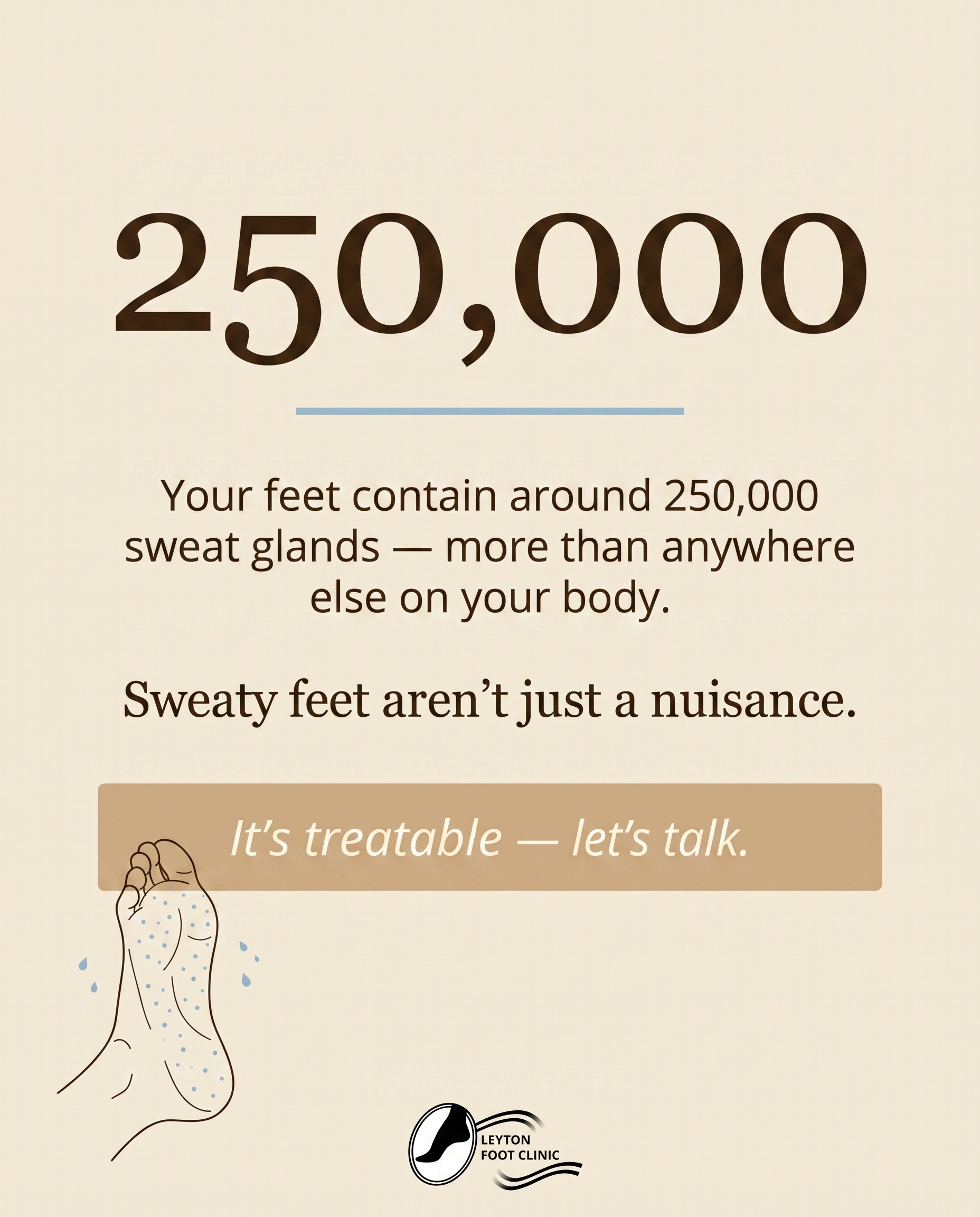
T12S8A1
Rough Image Prompt
A stat-card built around one striking figure about how much the human feet sweat in a single day, designed to make the viewer pause and reconsider sweaty feet as a treatable condition rather than a minor nuisance. The composition is typography-led with the statistic as the dominant visual anchor. A small supporting anatomical or symbolic accent relating to foot sweat glands (a clean, editorial illustration of the underside of a foot with subtle sweat-gland indication, kept small and supporting, not full-frame) sits as a quiet accent element. Backgrounds must be warm and never grey, cool, or pure white. Draw from these exact brand colours: espresso brown #3F2A18, warm cream #F2EAD8, warm sand #E5D6BA, warm tan #CDB593, dusty muted blue #9EBED2 (small accents only — never large areas, never on the headline), warm near-white for reversed text on deep surfaces. The dusty blue may add a single small accent such as a fine decorative line or droplet motif. Typography: Georgia for the statistic and headline, Open Sans for supporting text, Open Sans italic for the CTA. Render this text exactly: the dominant stat '250,000' as the visual anchor, the context line 'Your feet contain around 250,000 sweat glands — more than anywhere else on your body.', the framing line 'Sweaty feet aren't just a nuisance.', and the CTA 'It's treatable — let's talk.'. Logo placement should vary by composition and is finalised downstream. Clean, intentional, editorial design that reads as a considered health-clinic stat-card.
Text Overlay
Caption
Here's a number that surprises most people: your feet hold around 250,000 sweat glands — more than any other part of your body.
So if your feet feel damp by lunchtime, you're not imagining it. But here's the part worth knowing — sweaty feet (the proper term is hyperhidrosis) aren't something you just have to put up with.
Left unmanaged, all that moisture creates the perfect environment for odour, fungal skin issues like athlete's foot, and softened, vulnerable skin. The good news? It's a treatable condition, not a personality trait.
From simple footwear and skin-care changes to clinical treatments for stubborn cases, there's plenty we can do to keep your feet drier, fresher and healthier.
If you've been quietly tolerating sweaty feet for years, this is your nudge to stop tolerating and start treating.
📞 02085199477
🌐 https://www.leytonfootclinic.co.uk
✉️ info@leytonfootclinic.co.uk
How surprised were you by that number? Let us know below.
Hashtags
#SweatyFeet #PodiatryLondon #FootHealth #LeytonFootClinic #Hyperhidrosis
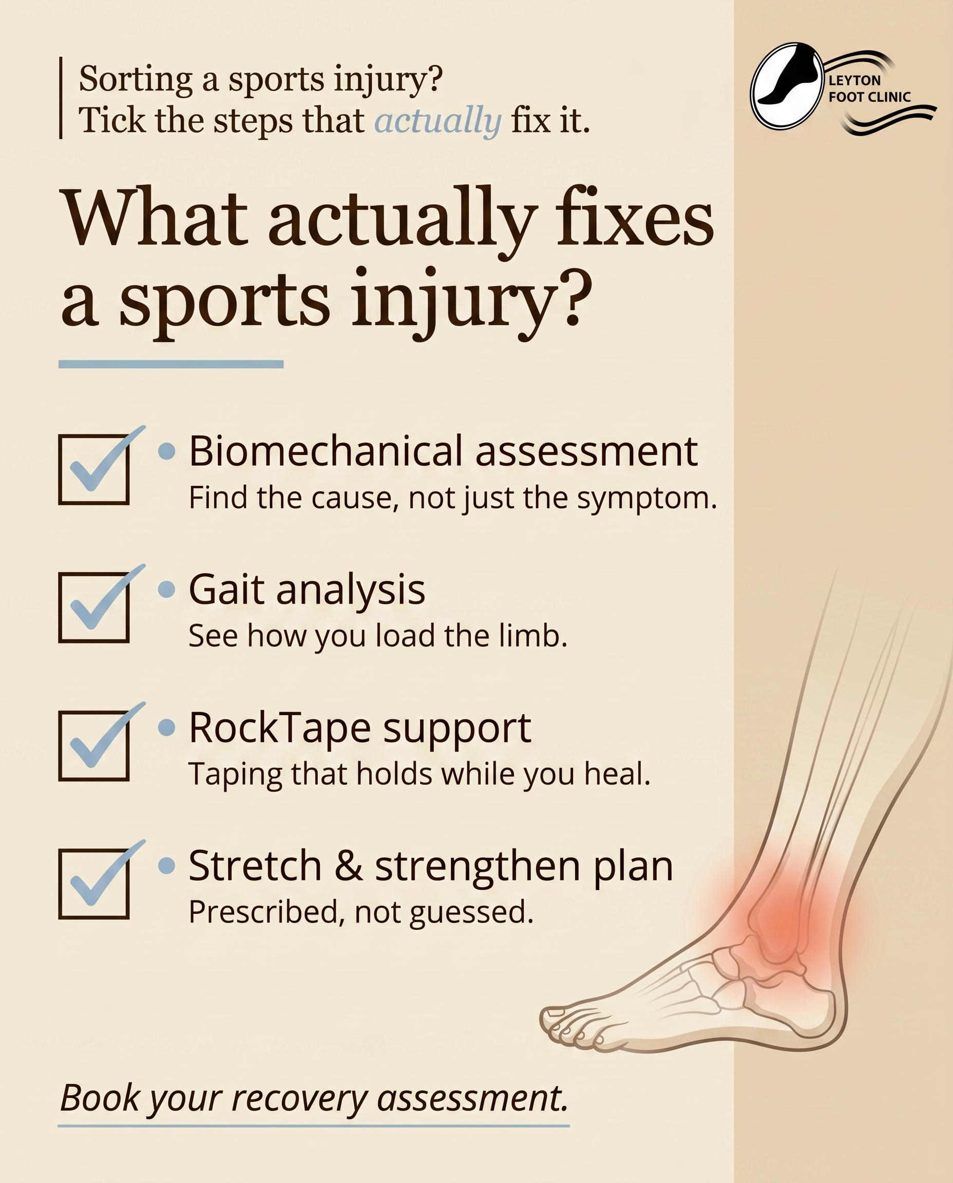
9.
T8S9A3
Rough Image Prompt
A typographic-led checklist post for a podiatry clinic addressing lower-limb sports injury recovery, framed around what structured rehab actually involves rather than rest-and-hope. Warm, considered editorial design. Components: a framing line at the top, four checklist items each with a clean checkbox graphic and a short title plus one supporting line, and a soft CTA. Include a small supporting anatomical accent — a subtle illustrated lower limb (lower leg, ankle, foot) rendered in a clean translucent style, used as a quiet supporting element, not full-frame. Typography: Georgia for the headline and framing line, Open Sans for checklist item titles and supporting lines, Open Sans italic for the CTA. Text content to render: framing line 'Sorting a sports injury? Tick the steps that actually fix it.'; checklist items 'Biomechanical assessment — find the cause, not just the symptom', 'Gait analysis — see how you load the limb', 'RockTape support — taping that holds while you heal', 'Stretch & strengthen plan — prescribed, not guessed'; CTA 'Book your recovery assessment.' Brand colours available (warm palette only, never grey, never cool, never pure white): espresso brown #3F2A18, warm cream #F2EAD8, warm sand #E5D6BA, warm tan #CDB593, dusty muted blue #9EBED2 used sparingly for small accents and checkbox ticks or decorative lines only, soft coral #E5816B reserved exclusively for the anatomical illustration to indicate an area of strain or inflammation. Backgrounds warm cream or sand or tan. Clean checkbox graphics, generous spacing, intentional editorial composition. Logo placement varies by composition and is finalised downstream.
Text Overlay
Caption
Resting and hoping is not a recovery plan. If you have a lower-limb sports injury that keeps flaring up the moment you get going again, the issue usually is not the pain itself — it is what is causing it.
Here is what structured rehab actually looks like. First, a biomechanical assessment and gait analysis to find the cause, not just chase the symptom. Then RockTape or kinesiology taping for support that holds while the area settles. And finally a prescribed stretching and strengthening plan — built for your limb, not guessed at.
That is the difference between waiting for an injury to fade and giving it a reason to. Ignoring early warning signs only pushes the recovery further down the road.
Nursing something that keeps coming back? Let's find out why.
📞 02085199477
🌐 https://www.leytonfootclinic.co.uk
✉️ info@leytonfootclinic.co.uk
What is the injury that keeps interrupting your training?
Hashtags
#SportsInjury #Podiatry #LeytonLondon #RunningRecovery #FootHealth
10.
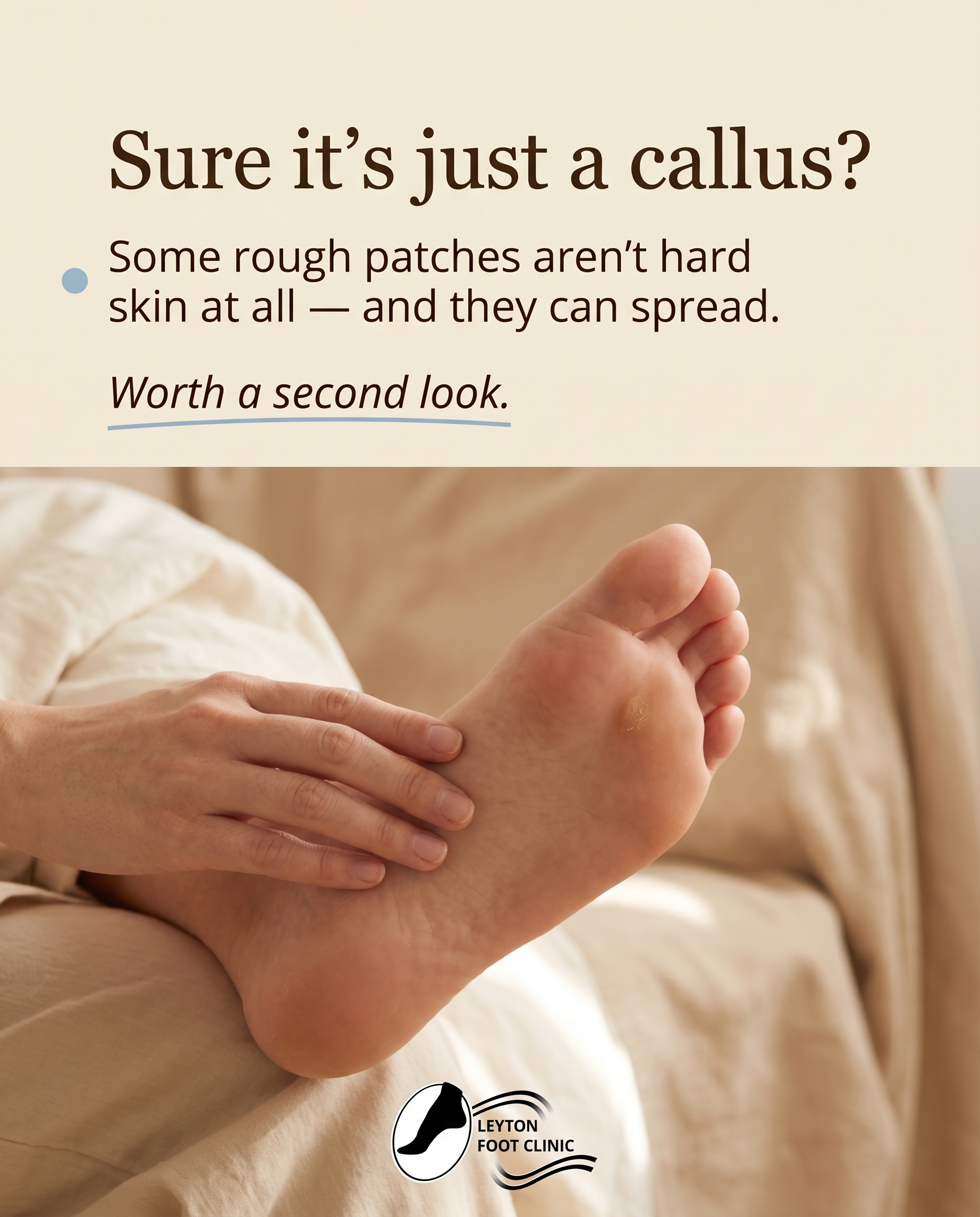
T5S1A1
Rough Image Prompt
Elevated wellness photography for a podiatry awareness post. Subject: a close-up of a bare foot shown sole-side, focusing only on the underside of the foot and heel — no face, no full body, just the foot and lower ankle resting naturally as someone sits and inspects their own sole, fingertips lightly touching the skin to draw the eye to a small rough patch on the ball of the foot. Generic, warm, neutral home setting (soft daylight, a corner of a bed or a chair, no clinic context, no medical decor). Calm, considered, editorial mood with soft natural lighting. The composition should subtly draw attention to one small textured spot on the sole — the quiet detail the reader might otherwise overlook. Warm, inviting tone, not clinical or alarming. Integrate brand warmth through cream and sand tones in the surrounding fabric and light. Available brand colour palette (draw from, do not force): #3F2A18 espresso brown, #F2EAD8 warm cream, #E5D6BA warm sand, #CDB593 warm tan, #9EBED2 dusty muted blue for sparing accent, warm near-white #F2EAD8 for reversed text. Backgrounds always warm, never grey, never cool, never pure white. Typography: Georgia for headline, Open Sans for supporting text, Open Sans italic for the CTA. Text content to render: headline 'Sure it's just a callus?', supporting text 'Some rough patches aren't hard skin at all — and they can spread.', CTA 'Worth a second look.' Logo placement varies by composition and is finalised downstream.
Text Overlay
Caption
It's easy to glance at a small rough patch on the sole and write it off as hard skin. Most of the time, life carries on and you forget it's there.
But not every rough patch is a callus. Some are verrucae — and unlike hard skin, they can linger, multiply and spread to other parts of the foot, or to other people in the house.
The giveaway is often in the detail. Tiny black dots, a slightly grainy texture, or tenderness when you pinch from the sides rather than press straight down. Callus tends to feel different under the same squeeze.
We're not saying panic. We're saying look twice. Catching the difference early makes everything simpler down the line.
Next time you're sitting down, turn the foot over and have a proper look. If something doesn't quite add up, it's worth getting a trained eye on it.
📞 02085199477
🌐 https://www.leytonfootclinic.co.uk
✉️ info@leytonfootclinic.co.uk
Callus or verruca — could you tell the difference?
Hashtags
#FootHealth #Verruca #LeytonPodiatry #FootCareTips #HealthyFeet
4
Refined Image Prompts
10 prompts · 2026-06-05T10:00
10 prompts refined
▼
1.
T9S1A3
Refined Image Prompt
Elevated health and wellness lifestyle photograph occupying the full canvas, exploring how foot mechanics shape pain felt higher up the body. A person shown from the knees down only, captured from behind mid-stride, bare feet making firm contact with a neutral floor surface, body weight visibly loading through the foot, ankle and lower leg as the point where the body meets the ground. No face anywhere in the frame, the figure cropped well below the neck so only the lower legs and feet are visible. The setting is calm and generic — a quiet home interior or soft outdoor moment, never a clinical environment, with warm natural daylight raking gently across the scene and grounding the figure. The mood is warm editorial clinical foot-health: considered, calm, grounded, quietly authoritative. Brand colour cues are woven naturally into the photograph — warm cream #F2EAD8 and warm sand #E5D6BA in the floor surface and ambient light, warm tan #CDB593 in shadow and wardrobe tones, espresso brown #3F2A18 in deeper grounding shadows. The entire palette stays warm — never grey, never cool, never pure white. A small, sparing touch of dusty muted blue #9EBED2 may appear as a single quiet wardrobe detail such as a sock cuff or a fabric edge, used minimally.
The lower portion of the image carries a solid espresso brown #3F2A18 band occupying roughly the bottom 42 percent of the canvas as a deliberate two-tone split, its top edge a clean sharp horizontal line with 0-2px crispness, anchoring the photograph above. Within this espresso band the text is set in warm near-white #F2EAD8 for strong contrast.
The headline reads "Your knee pain might start at the floor" set in Georgia, large and confident, left-aligned within the espresso band, sitting in the upper area of the band with comfortable margins.
Directly beneath the headline a single thin horizontal underline in dusty muted blue #9EBED2 spans a short width, separating headline from supporting text as the primary accent.
The supporting text reads "Gait analysis traces the ache back to how your feet load — then we correct the mechanics" set in Open Sans, warm near-white #F2EAD8, left-aligned below the underline at a calm readable size.
A small dot marker in dusty muted blue #9EBED2 precedes the CTA, which reads "Book a biomechanical assessment" set in Open Sans italic, warm near-white #F2EAD8, left-aligned at the lower area of the espresso band.
All rectangular surfaces, edges and the band itself use sharp 0-2px corners throughout.
Place the attached logo in the top-left corner of the photograph area, sized small and unobtrusive, sitting cleanly against the warm daylight surface with generous clearance. Render the logo exactly as supplied — preserve its original colours, proportions, lettering and shapes without recolouring, redrawing, distorting or altering it in any way.
Constraints: keep all backgrounds and surfaces warm in tone using only cream, sand, tan or espresso; show no face or any identifiable person; keep the setting non-clinical; use dusty muted blue only as small sparing accents and never in headlines, buttons or large areas; do not introduce coral anywhere as there is no anatomical illustration in this composition; avoid grey, cool tones and pure white; keep all corners sharp; maintain clean generous margins and an uncluttered, editorial layout.
2.
L1S2A1
Refined Image Prompt
A warm editorial clinical graphic-design social post built around a typographic-led layout on a strong two-tone vertical split. The lower 55 percent of the canvas is warm cream #F2EAD8 forming the primary surface, and the upper 45 percent is espresso brown #3F2A18 forming a full-weight header block, the two meeting at a clean sharp horizontal seam with no rounding. The composition feels calm, considered, and premium with generous breathing room and a quiet sense of intentional pacing.
In the upper espresso block, the headline reads "Feeling great isn't the same as being ready" set in Georgia in warm cream #F2EAD8, left-aligned, large and confident, occupying the left two-thirds of the header with comfortable line breaks across three lines. The single word "ready" is set in Georgia italic in dusty muted blue #9EBED2 as the only coloured emphasis in the headline. A thin dusty muted blue #9EBED2 underline, roughly 2px, sits directly beneath the word "ready" as a precise accent marker.
In the lower cream block, the supporting text reads "Going from rest to long walks or runs in a short window is the exact load your feet aren't built for yet. Pace it." set in Open Sans in espresso brown #3F2A18, left-aligned, at a calm readable size, occupying the left portion of the lower surface with clean wrapping. The closing phrase "Pace it." sits slightly separated for emphasis.
Toward the lower right of the cream block sits a small supporting line-style illustration: a simple thin rising load curve sweeping gently upward from lower left to upper right, drawn as a single fine stroke in espresso brown #3F2A18, with three small dusty muted blue #9EBED2 dot markers spaced evenly along its rising path to suggest gradual incremental build-up. The illustration is small and supporting, no more than a quarter of the canvas width, never competing with the type.
Beneath the supporting text, the CTA reads "Build up gradually — your feet will thank you" set in Open Sans in espresso brown #3F2A18 at a smaller size, preceded by a short thin dusty muted blue #9EBED2 underline accent that draws the eye to the call to action.
Place the practice logo in the lower left corner of the cream block at a small, restrained scale with clear margin around it. Render the logo exactly as supplied in the attached logo file, preserving its proportions, colours, and lettering precisely, without recolouring, redrawing, or distorting it.
Lighting and finish are flat, even, and editorial with no gloss, no shadows, and no texture noise, giving a premium print-quality feel. All rectangular surfaces and the surface split use sharp 0-2px corners throughout. The overall register is warm editorial clinical foot-health: composed, reassuring, and professional.
Constraints: keep all text crisp and clean exactly as quoted with no duplicated, invented, or misspelled characters. Backgrounds remain warm throughout — warm cream, warm sand, warm tan, and espresso brown only, never grey, never cool, never pure white. Use dusty muted blue #9EBED2 only as a small sparing accent on the italic word, underlines, and dot markers, never as a large area or on the headline body. Do not use coral anywhere in this post. Keep the load-curve illustration small and supporting, never full-frame.
3.
L3S3A4
Refined Image Prompt
A warm editorial clinical composition built as a strong two-tone vertical split, with the upper 45 percent in espresso brown #3F2A18 and the lower 55 percent in warm cream #F2EAD8, the dividing line clean and horizontal with sharp edges throughout.
The visual anchor is a clean, anatomically accurate 3D illustration of a single human foot rendered in a translucent, glass-like material that reveals internal structure — the arch, heel, and ball of the foot where load concentrates. The foot is shown in profile, isolated with no environmental context, no clinic setting, no floor. It sits centred on the cream lower section, large and editorial, slightly overlapping the espresso-to-cream dividing line so it bridges both tonal zones. The translucent material catches warm light, with soft internal refraction in warm tones, never cool, never grey.
Pressure and strain indicators: a soft coral #E5816B glow concentrated at the heel and at the ball of the foot, reading as warm inflammation hotspots from prolonged standing, diffuse and luminous within the glass material. A thin dusty muted blue #9EBED2 contour line curves beneath the arch, tracing the underside to suggest tailored support and redistributed load — a single restrained accent, never filling large areas.
In the espresso upper section, the headline reads "Standing all day shouldn't cost you your feet" set in Georgia, in warm cream near-white #F2EAD8, left-aligned with generous margin, occupying the upper-left zone with calm editorial spacing across two or three lines.
In the cream lower section, beneath and to the side of the foot illustration, the supporting text reads "A biomechanical assessment maps how you load each foot, then laser-scanned custom orthotics and footwear advice are built for your hours on hard floors, not off the shelf." set in Open Sans, in espresso brown #3F2A18, left-aligned in a tidy column with comfortable line spacing.
Below the supporting text, the CTA reads "Book your biomechanical assessment" set in Open Sans italic in espresso brown #3F2A18, with a single thin dusty muted blue #9EBED2 underline beneath the phrase as the primary attention accent. A small dusty muted blue #9EBED2 dot marker sits to the left of the CTA as a supporting accent.
The attached logo is placed in the lower-right corner on the cream surface, sized modestly and balanced against the text column. Render the logo exactly as supplied, preserving its proportions, colours, and lettering without redrawing, recolouring, or altering it in any way.
All rectangular elements — any text container, divider edge, or marker — use sharp 0 to 2px corners. Lighting is soft, warm, and directional, giving the glass foot gentle dimensional depth. The overall register is warm editorial clinical foot-health: composed, premium, and restrained.
Constraints: keep all backgrounds warm at all times; use only the espresso brown and cream tones specified for surfaces; reserve coral strictly for the anatomical strain glow; keep the dusty blue confined to the arch contour, CTA underline, and dot marker as small accents only; keep the foot rendering translucent and warm-toned throughout; maintain a clean isolated illustration with no environmental detail.
4.
T6S4A2
Refined Image Prompt
A vertical comparison-card composition for a podiatry clinic, contrasting two foot skin conditions side by side in a warm editorial clinical style. The canvas is a strong two-tone vertical split at 50/50 proportions: the left half is warm cream #F2EAD8, the right half is warm tan #CDB593. A single thin vertical dividing line in dusty muted blue #9EBED2 runs down the exact centre, separating the two sides cleanly.
Across the top, spanning the full width on a warm cream #F2EAD8 header band, the headline "Dry skin or athlete's foot?" is set in Georgia, in espresso brown #3F2A18, large and centred, with a thin dusty muted blue #9EBED2 underline beneath the word "athlete's foot" only. All rectangular surfaces in the composition use sharp corners (0-2px).
On the left cream side, the side label "ORDINARY DRY SKIN" is set in Georgia in espresso brown #3F2A18, upper area, left-aligned with comfortable margin. Below it sit two supporting points in Open Sans in espresso brown #3F2A18, each preceded by a small dusty muted blue #9EBED2 dot marker: "Even flaking, no itch" and "Improves with moisturiser". Beneath the points, a small clean editorial anatomical illustration of skin between two toes rendered in calm warm tones, smooth even normal skin texture, no redness, isolated on the cream surface with no environmental context, no faces, no clinic setting.
On the right tan side, the side label "ATHLETE'S FOOT" is set in Georgia in warm-tinted near-white #F2EAD8, upper area, left-aligned with comfortable margin. Below it sit two supporting points in Open Sans in warm-tinted near-white #F2EAD8, each preceded by a small dusty muted blue #9EBED2 dot marker: "Itching between the toes" and "Spreading redness that won't clear". Beneath the points, a small clean editorial anatomical illustration of skin between two toes showing flaking and spreading redness, with soft coral #E5816B used exclusively to indicate the inflamed and affected area between the toes, isolated on the tan surface with no environmental context, no faces, no clinic setting.
Across the bottom, spanning the full width on an espresso brown #3F2A18 footer band, the CTA "Not sure? Let us take a look" is set in Open Sans italic in warm-tinted near-white #F2EAD8, centred.
The attached logo is placed in the top-left corner of the cream header band at small, restrained scale. Preserve the logo exactly as supplied — do not redraw, recolour, distort, or restyle it; keep its proportions and original colours intact.
Lighting is soft and even with a warm editorial clinical mood throughout. Overall register: warm editorial clinical foot-health — calm, trustworthy, typographic-led with restrained supporting illustration.
Constraints: backgrounds stay warm throughout, never grey, never cool, never pure white. Coral appears only within the athlete's foot anatomical illustration to mark inflammation, never in text, layout, or UI. Dusty muted blue stays small and sparing — divider line, underline, and dot markers only, never a headline, never a button, never a large area. Keep the two sides equal in weight and balance. Anatomical illustrations remain isolated body parts only.
5.
C3S5
Refined Image Prompt
A typographic-led Q&A card for a podiatry clinic in a warm editorial clinical style, calm and considered, communicating unhurried attentive foot care. The composition uses a strong two-tone vertical split at 45/55 proportions: the upper 45 percent is a solid espresso brown #3F2A18 block, and the lower 55 percent is warm cream #F2EAD8. The two surfaces meet on a clean horizontal line with no gradient or blur. All rectangular elements throughout use sharp corners (0-2px).
In the upper espresso brown zone, a small eyebrow label sits in the top-left in Open Sans, warm near-white, reading "A QUESTION WE HEAR OFTEN" in compact letter-spaced capitals, with a single thin dusty muted blue #9EBED2 underline rule directly beneath it spanning a short fixed width. Below this, set generously and reversed in warm near-white, the question headline in Georgia reads "Worried your feet need watching more closely?" — left-aligned, large, occupying the visual weight of the upper block, with comfortable line breaks across two or three lines.
In the lower warm cream zone, the answer text sits left-aligned in Georgia, espresso brown #3F2A18, reading "Careful checks of circulation, skin and nails are routine here — not an afterthought." — set at a calm mid-scale below the headline scale, with relaxed line spacing. The phrase "routine here" carries a thin dusty muted blue #9EBED2 underline beneath those two words only, kept fine and editorial.
Beneath the answer, with clear breathing space, the CTA in Open Sans italic, espresso brown #3F2A18, reads "Book unhurried, attentive foot care." — preceded by a small dusty muted blue #9EBED2 dot marker to its left as a quiet accent.
A small supporting line-style icon sits in the lower-right area of the cream zone: a simple thin-stroke foot outline with a soft pulse or heartbeat motif crossing it, suggesting attentive circulation care, drawn in espresso brown #3F2A18 line work with a single dusty muted blue #9EBED2 pulse line as the only colour accent. Kept small and supporting, never full-frame, with generous negative space around it.
The supplied logo is placed small in the top-right corner of the upper espresso brown zone, scaled modestly to sit comfortably against the dark surface. Preserve the logo exactly as supplied — do not redraw, recolour, distort, restyle, or regenerate it; render it faithfully at high fidelity.
Lighting is flat, even, and editorial with no shadows or texture. Composition is clean, spacious, and grid-aligned with generous margins.
Constraints: warm backgrounds only, espresso and cream as used — never grey, never cool-toned, never pure white. No people, no faces, no clinic interior, no treatment scene. Coral is not used anywhere. Dusty muted blue appears only as the small underline, dot marker, and single pulse accent — never as a large area, never in the headline, never as a button. Georgia for question and answer text, Open Sans for the eyebrow label, Open Sans italic for the CTA.
6.
T3S6A3
Refined Image Prompt
A vertical two-tone split-surface myth-buster graphic for a warm editorial clinical foot-health brand. The composition divides into an upper zone and a lower zone with a clean horizontal seam at roughly 45/55 proportion. The upper zone is warm cream #F2EAD8. The lower zone is espresso brown #3F2A18 carrying meaningful canvas weight. All rectangular elements — labels, callout blocks, the CTA button, the image frame — have sharp 0-2px corners.
In the upper cream zone, a small solid label block in warm tan #CDB593 sits in the top-left with the text "MYTH" in Georgia, espresso brown #3F2A18, letter-spaced and compact. Directly beneath it, the myth line "A chemist's lacquer will clear my fungal nail" set in Georgia, espresso brown #3F2A18, large and left-aligned across two or three lines as a confident editorial headline. A thin dusty muted blue #9EBED2 underline sits beneath the final word of the myth line as a decorative accent marker, paired with a single small dusty blue #9EBED2 dot to its right.
In the lower espresso zone, a small label in Georgia reading "TRUTH" appears in warm cream #F2EAD8, top-left of this zone, accented with a thin warm cream underline and a single dusty muted blue #9EBED2 dot marker. Beneath it, the supporting text "TRUTH: Stubborn fungal nails usually need a proper podiatry approach — reducing and clearing the infected nail, and where suitable, low-level laser therapy" set in Open Sans, warm-tinted near-white #F2EAD8, left-aligned, comfortably leaded, occupying the main body of the espresso zone.
In the lower-right corner of the upper cream zone, straddling the seam, a small clean editorial-style 3D anatomical illustration of a single toenail isolated on a warm cream #F2EAD8 background, supporting and modest in scale rather than full-frame. The nail shows realistic fungal discolouration and thickening rendered with soft coral #E5816B applied only to the affected and infected portion of the nail plate to indicate the infection, with the healthy nail and surrounding skin in natural warm neutral tones. Soft directional lighting from the upper left, gentle shadow grounding the illustration.
Near the bottom of the espresso zone, a CTA button with sharp corners filled in warm sand #CDB593 containing the text "Book a fungal nail assessment" in Open Sans italic, espresso brown #3F2A18, centred within the button.
Place the provided logo file in the top-right corner of the upper cream zone, sized small and balanced against the MYTH label. Render the logo exactly as supplied without altering its colours, proportions, lettering, or layout, preserving it precisely as provided.
Overall mood is warm, editorial, calm and clinical with strong typographic hierarchy and clear contrast between the cream myth zone and the espresso truth zone. Backgrounds remain warm throughout. Constraints: keep all backgrounds warm cream, sand, tan or espresso only — no grey, no cool tones, no pure white. Keep soft coral confined strictly to the affected area of the anatomical nail illustration and out of all text, layout and UI. Keep dusty muted blue limited to thin underlines and small dot markers only — never on headlines, never on buttons, never as large areas. Keep all rectangular corners sharp.
7.
T2S7A2
Refined Image Prompt
A typographic-led list-tips graphic for a podiatry clinic, warm editorial clinical foot-health register, calm and intentional with a custom-designed feel. Two-tone split composition with meaningful canvas weight: the top 40 percent is a full espresso brown #3F2A18 header band, and the lower 60 percent is warm cream #F2EAD8. All rectangular surfaces, cards, badges and dividers use sharp corners at 0-2px.
In the espresso header band, the headline reads "Is it really an ingrowing toenail?" in Georgia, set in warm near-white #F2EAD8, left-aligned with generous margin, occupying two lines. Beneath the headline sits a short thin underline accent in dusty muted blue #9EBED2 spanning roughly a third of the text width. To the right side of the header band, a small supporting anatomical illustration of a single toe shown from above, rendered in clean warm line work, with the nail-edge corner subtly highlighted and a soft coral #E5816B blush at the nail fold indicating tenderness and inflammation. Coral appears nowhere else.
The cream lower section holds four clearly distinguished tip items arranged in a stacked vertical list with even spacing, each item left-aligned. Every item leads with a small custom illustrated icon drawn in espresso brown line work on the cream surface, sitting in its own square icon zone with sharp corners.
Item one icon: a tender toe with a small pressure indicator dot pressing the side. Item title "Tender on pressure" in Georgia, espresso brown #3F2A18, with supporting line "Sharp when you press the side" beneath it in Open Sans, espresso brown.
Item two icon: a swollen rounded toe shape suggesting puffiness at the corner. Item title "Swelling at the corner" in Georgia espresso brown, supporting line "Red, puffy nail fold" in Open Sans espresso brown.
Item three icon: a sock-or-shoe edge catching against a toe. Item title "Repeated catching" in Georgia espresso brown, supporting line "Snags on socks and shoes" in Open Sans espresso brown.
Item four icon: a hand-near-toe deterrent symbol suggesting do-not-dig. Item title "The urge to dig at it" in Georgia espresso brown, supporting line "Home-digging makes it worse" in Open Sans espresso brown.
Each item title carries a small dusty muted blue #9EBED2 dot marker placed to its left as the accent device, kept small and sparing. A thin dusty blue #9EBED2 divider line separates the list from the CTA below.
At the base, a slim warm sand #E5D6BA callout strip with sharp corners holds the CTA "Get it checked before it gets infected" in Open Sans italic, espresso brown #3F2A18, centred.
The clinic logo, provided as a separate attached file, is placed in the lower-left corner of the cream section at modest scale. Reproduce the supplied logo exactly as provided, preserving its proportions, colours and detail without redrawing, distorting or restyling it.
Lighting is flat, even and clean as befits a print-quality editorial graphic. Backgrounds remain warm throughout. Constraints: keep all rendered text to exactly the strings listed; backgrounds stay warm cream, sand, tan or espresso only, never grey, never cool, never pure white; use warm-tinted near-white rather than pure white for reversed text; reserve coral exclusively for the anatomical toe illustration; keep dusty blue confined to small accents, underlines and dots only, never on headlines, large areas or buttons; no clinic interior, no treatment scene, no faces.
8.
T12S8A1
Refined Image Prompt
A typography-led editorial stat-card for a foot-health clinic, built as a strong two-tone vertical split. The upper sixty percent of the canvas is a solid espresso brown #3F2A18 field; the lower forty percent is warm cream #F2EAD8, divided by a crisp clean horizontal edge with sharp 0-2px transition. The composition is calm, considered, and clinically warm — an editorial register that treats a striking statistic with quiet authority.
In the espresso brown upper field, the dominant statistic "250,000" is set in Georgia, very large, in warm near-white tinted cream #F2EAD8, positioned centred horizontally and sitting confidently in the upper portion as the unmistakable visual anchor. Directly beneath the figure, a single thin horizontal underline in dusty muted blue #9EBED2 spans a short measured width, centred, as a fine decorative accent line. Below that line, the framing phrase "Sweaty feet aren't just a nuisance." is set in Georgia in warm cream #F2EAD8, centred, at a modest supporting size.
In the cream lower field, the context line "Your feet contain around 250,000 sweat glands — more than anywhere else on your body." is set in Open Sans in espresso brown #3F2A18, centred, with comfortable line spacing and generous left and right margins, sitting in the upper area of the cream band. Beneath it, the call-to-action "It's treatable — let's talk." is set in Open Sans italic in espresso brown #3F2A18, centred, slightly smaller, preceded or accompanied by a small dusty blue #9EBED2 dot marker as a quiet accent.
To the lower right of the cream field sits a small, clean editorial line illustration of the underside of a single human foot, drawn in fine espresso brown #3F2A18 linework, with subtle scattered sweat-gland indication shown as a small cluster of tiny dusty muted blue #9EBED2 droplet dots across the sole. The illustration is kept small and supporting, never full-frame, anchored as a quiet corner accent that balances the typography.
Lighting is even and soft like clean studio editorial print, no harsh shadows, no gradients on the flat colour fields. All surfaces, any text containers, and the central dividing edge use sharp 0-2px corners throughout.
Place the attached logo small in the top-left corner of the espresso brown upper field, reproduced exactly as supplied with its original colours, proportions, and lettering fully preserved and legible against the dark surface — do not redraw, recolour, restyle, or regenerate the logo in any way.
Constraints: keep all backgrounds warm — espresso brown and cream only, never grey, never cool-toned, never pure white. Keep dusty blue #9EBED2 confined to the thin underline, the small dot marker, and the droplet indications only — never on the headline, never as a large area. Keep the statistic "250,000" as the single dominant element with clear breathing space around it. Maintain generous margins and an uncluttered, intentional editorial layout that reads as a considered health-clinic stat-card.
9.
T8S9A3
Refined Image Prompt
A warm editorial clinical composition for a podiatry clinic, built as a typographic-led checklist with a quiet supporting anatomical accent. The layout is a strong two-tone vertical split: the upper 42 percent is a full block of espresso brown #3F2A18, and the lower 58 percent is warm cream #F2EAD8, the two surfaces meeting along a clean horizontal edge with sharp 0-2px transition. The overall mood is warm, considered, editorial and clinical — composed, unhurried, and trustworthy.
In the upper espresso block, set the headline in Georgia, in warm near-white cream #F2EAD8, reading "What actually fixes a sports injury?" positioned left-aligned with generous margin, occupying two lines. Directly beneath the headline, set the framing line in Georgia italic, in dusty muted blue #9EBED2, reading "Sorting a sports injury? Tick the steps that actually fix it." Place a single thin horizontal underline in dusty muted blue #9EBED2 sitting just below the framing line, short and deliberate, acting as a quiet accent marker.
In the lower cream area, arrange four checklist items stacked vertically with generous even spacing between them, all left-aligned. Each item begins with a clean square checkbox graphic with sharp 0-2px corners, outlined in espresso brown #3F2A18, containing a tidy tick mark rendered in dusty muted blue #9EBED2. To the right of each checkbox, set the item title in Open Sans, in espresso brown #3F2A18, followed on the next line by its supporting line in Open Sans, in espresso brown #3F2A18 at a slightly lighter visual weight and smaller size. The four items read:
"Biomechanical assessment" with supporting line "find the cause, not just the symptom"
"Gait analysis" with supporting line "see how you load the limb"
"RockTape support" with supporting line "taping that holds while you heal"
"Stretch & strengthen plan" with supporting line "prescribed, not guessed"
Beneath the final checklist item, place the CTA in Open Sans italic, in espresso brown #3F2A18, reading "Book your recovery assessment." preceded by a small solid dot marker in dusty muted blue #9EBED2.
In the lower right region of the cream area, render a subtle supporting anatomical illustration of a lower limb — lower leg, ankle, and foot — drawn in a clean translucent line-illustration style using espresso brown #3F2A18 outlines at reduced opacity, sitting quietly behind and beside the text without dominating the composition. Within this illustration, indicate a single area of strain at the ankle or calf using a soft translucent wash of soft coral #E5816B, used only here to mark inflammation, never on text or layout elements.
Place the attached logo cleanly within the upper espresso block, positioned top-right with comfortable margin, scaled modestly so it reads clearly against the dark surface. Preserve the logo exactly as supplied — do not redraw, recolour, distort, or regenerate it; keep its proportions, lettering, and detail fully intact.
Lighting is soft, even, and editorial with no harsh shadows. Composition is intentional, generously spaced, and balanced with clear visual hierarchy from headline to checklist to CTA. All rectangular elements use sharp 0-2px corners.
Constraints: keep all backgrounds warm — only cream, sand, tan, or espresso — never grey, never cool-toned, never pure white; use warm-tinted near-white for any light text. Keep dusty muted blue #9EBED2 confined to small accents only — tick marks, the thin underline, the dot marker, and the italic framing line — never as a large area, headline, or button. Reserve soft coral #E5816B exclusively for the anatomical inflammation marker. Keep the anatomical illustration quiet and supporting, never full-frame. Maintain clean, legible typography throughout with the espresso-over-cream split carrying meaningful canvas weight.
10.
T5S1A1
Refined Image Prompt
A warm editorial wellness photograph forming the lower two-thirds of the composition, with a clean text panel occupying the upper portion in a deliberate 40/60 split layout.
Subject and photography: a close-up, sole-side view of a single bare foot and lower ankle, photographed from a natural inspecting angle as if the person is seated and turning their own foot to examine it. Only the underside of the foot and heel are visible — no face, no full body, no leg above the lower ankle. Fingertips of one hand rest lightly against the skin near the ball of the foot, gently drawing the eye toward one small, subtly textured rough patch on the sole. The skin tone is natural and healthy. The setting is a soft, generic, warm home corner — a fold of cream and sand fabric, the edge of a bed or upholstered chair — with no clinic context, no medical decor, no clinical instruments. Soft natural daylight falls across the foot from one side, calm and considered, creating gentle shadow gradients and a quiet editorial mood that is inviting rather than alarming. The surrounding fabric and ambient light carry warm cream #F2EAD8 and warm sand #E5D6BA tones throughout, never grey, never cool, never pure white.
Layout and surface: the top 40 percent of the canvas is a solid warm cream #F2EAD8 text panel with sharp 0-2px corners, transitioning cleanly into the photograph below. All text sits within this cream panel.
Text rendering:
Headline in Georgia, espresso brown #3F2A18, set large and confident in the upper area of the cream panel, reading "Sure it's just a callus?" — positioned left-aligned with generous breathing room.
Supporting text in Open Sans, espresso brown #3F2A18, smaller, set directly beneath the headline, reading "Some rough patches aren't hard skin at all — and they can spread."
CTA in Open Sans italic, espresso brown #3F2A18, reading "Worth a second look." placed below the supporting text, with a single thin dusty muted blue #9EBED2 underline beneath the CTA phrase as the primary accent.
Accents: keep accents minimal and editorial — one thin dusty muted blue #9EBED2 underline beneath the CTA, and a small dusty blue #9EBED2 dot marker placed to the left of the supporting text line as a quiet secondary accent. Accents remain small and sparing, never large blocks, never on the headline.
Logo: place the supplied logo file small in the lower corner of the photograph area, sitting over a softly lit, uncluttered region of warm fabric so it remains clearly legible. Preserve the logo exactly as supplied — do not redraw, recolour, restyle, or alter its proportions, lettering, or marks in any way.
Overall register: warm editorial clinical foot-health — composed, soft, considered, trustworthy, with full warm tonal range and natural daylight.
Constraints: keep all rectangular surfaces with sharp 0-2px corners; keep backgrounds warm at all times, never grey, never cool, never pure white; show only the foot and lower ankle with no face and no full body; keep the mood calm and reassuring, not clinical or alarming, with no medical instruments or clinic decor; reserve coral entirely out of this composition as no anatomical illustration is present; keep dusty blue confined to the thin underline and single dot marker only.
5
Rendered Images
10 rendered · 2026-06-05T10:22
10 rendered
▼
T9S1A3
1856×2304
L1S2A1
v5
1856×2304
L3S3A4
v2
1856×2304
T6S4A2
v4
1856×2304
C3S5
v2
1856×2304
T3S6A3
v2
1856×2304
T2S7A2
v3
1856×2304
T12S8A1
1856×2304
T8S9A3
1856×2304
T5S1A1
v2
1856×2304