Draw — 30 posts
1
Coordinates
30 coordinates
30 selected
▼
Hybrid draw — overflow posts present.
This draw requested 30 posts but the curated index only covers 18 unique subjects.
12 posts (marked OVERFLOW) were drawn from the master pool with subject re-use allowed.
These posts have no brand-fit curation guarantee — re-run Stage 4 to refine their image prompts before rendering.
| # | Code | Theme | Subject | Style | Awareness | Source |
|---|---|---|---|---|---|---|
| 1 | T11S1A2 | treatments | T11 — Trapped / Nerve Pain (arm & leg) | photography | A2 — Problem-aware | CURATED |
| 2 | T3S2A2 | treatments | T3 — Disc Herniation / Disc Bulge | graphic-design | A2 — Problem-aware | CURATED |
| 3 | L5S3A3 | lifestyle | L5 — Inadequate post-exertion recovery (rushing back to sport, poor sleep and hydration) | illustrative-3D | A3 — Solution-aware | CURATED |
| 4 | T6S4A4 | treatments | T6 — Shoulder Pain | comparison-card | A4 — Product-aware | CURATED |
| 5 | T4S5A2 | treatments | T4 — Spinal Stenosis | qa-card | A2 — Problem-aware | CURATED |
| 6 | T7S6A4 | treatments | T7 — Sports Injuries | myth-buster | A4 — Product-aware | CURATED |
| 7 | T8S7A4 | treatments | T8 — Degenerative Disc Disease | list-tips | A4 — Product-aware | CURATED |
| 8 | T10S8A2 | treatments | T10 — Muscle Strains & Sprains | stat-card | A2 — Problem-aware | CURATED |
| 9 | T9S9A3 | treatments | T9 — Plantar Fasciitis | checklist | A3 — Solution-aware | CURATED |
| 10 | T12S6A4 | treatments | T12 — Tendon Injuries | myth-buster | A4 — Product-aware | CURATED |
| 11 | T1S1A1 | treatments | T1 — Back Pain | photography | A1 — Unaware | CURATED |
| 12 | T5S9A1 | treatments | T5 — Neck Pain | checklist | A1 — Unaware | CURATED |
| 13 | T2S4A2 | treatments | T2 — Sciatica | comparison-card | A2 — Problem-aware | CURATED |
| 14 | L4S2A2 | lifestyle | L4 — Movement avoidance / reduced activity during busy or stressful periods | graphic-design | A2 — Problem-aware | CURATED |
| 15 | L1S8A4 | lifestyle | L1 — Prolonged desk/seated work and poor posture ("to-do list" posture, chin-forward, slouching) | stat-card | A4 — Product-aware | CURATED |
| 16 | L2S5A3 | lifestyle | L2 — Training load mismanagement (skipping taper, "one more session", high running mileage) | qa-card | A3 — Solution-aware | CURATED |
| 17 | C3S7 | clinic | C3 — People with chronic or recurring spinal pain seeking a surgery-avoiding alternative | list-tips | — | CURATED |
| 18 | C1S3 | clinic | C1 — Recreational endurance runners (half-marathon and race-focused amateurs) | illustrative-3D | — | CURATED |
| 19 | L4S6A3 | lifestyle | L4 — Movement avoidance / reduced activity during busy or stressful periods | myth-buster | A3 — Solution-aware | OVERFLOW |
| 20 | T6S5A3 | treatments | T6 — Shoulder Pain | qa-card | A3 — Solution-aware | OVERFLOW |
| 21 | T2S9A1 | treatments | T2 — Sciatica | checklist | A1 — Unaware | OVERFLOW |
| 22 | T1S7A3 | treatments | T1 — Back Pain | list-tips | A3 — Solution-aware | OVERFLOW |
| 23 | C2S1 | clinic | C2 — Desk-bound professionals managing posture-driven neck and shoulder pain | photography | — | OVERFLOW |
| 24 | T9S1A3 | treatments | T9 — Plantar Fasciitis | photography | A3 — Solution-aware | OVERFLOW |
| 25 | L5S6A2 | lifestyle | L5 — Inadequate post-exertion recovery (rushing back to sport, poor sleep and hydration) | myth-buster | A2 — Problem-aware | OVERFLOW |
| 26 | L2S5A1 | lifestyle | L2 — Training load mismanagement (skipping taper, "one more session", high running mileage) | qa-card | A1 — Unaware | OVERFLOW |
| 27 | T10S3A2 | treatments | T10 — Muscle Strains & Sprains | illustrative-3D | A2 — Problem-aware | OVERFLOW |
| 28 | T5S2A3 | treatments | T5 — Neck Pain | graphic-design | A3 — Solution-aware | OVERFLOW |
| 29 | T2S3A1 | treatments | T2 — Sciatica | illustrative-3D | A1 — Unaware | OVERFLOW |
| 30 | T7S2A2 | treatments | T7 — Sports Injuries | graphic-design | A2 — Problem-aware | OVERFLOW |
2
Content Briefs
30 briefs · 2026-06-08T10:21
30 briefs generated
▼
1.
T11S1A2
photography
Problem-aware
A lifestyle photo of someone shaking out a tingling arm or rubbing a leg, with a callout naming the signs of trapped nerve pain — pins and needles, shooting sensations, numbness that travels. The angle validates that this radiating discomfort isn't 'just' a dead arm; it's a nerve signalling a real problem worth taking seriously.
Content: A lifestyle photo of someone shaking out a tingling arm or rubbing a leg, with a callout naming the signs of trapped nerve pain — pins and needles, shooting sensations, numbness that travels. The angle validates that this radiating discomfort isn't 'just' a dead arm; it's a nerve signalling a real problem worth taking seriously.
Style: photography
2.
T3S2A2
graphic-design
Problem-aware
A clean graphic framing the everyday signals of a herniated or bulging disc — pain that worsens bending or sitting, discomfort radiating into a limb, soreness that lingers past a few days. The message reassures the reader that what they're feeling has a name and a cause, moving them from vague worry to recognition.
Content: A clean graphic framing the everyday signals of a herniated or bulging disc — pain that worsens bending or sitting, discomfort radiating into a limb, soreness that lingers past a few days. The message reassures the reader that what they're feeling has a name and a cause, moving them from vague worry to recognition.
Style: graphic-design
3.
L5S3A3
illustrative-3D
Solution-aware
A 3D anatomical illustration showing muscle and tissue under recovery stress, paired with what actually rebuilds it after hard sessions. The angle positions structured recovery — recovery programming, stretching prescription, and proper rest — as the fix for the soreness that lingers when you rush back too soon.
Content: A 3D anatomical illustration showing muscle and tissue under recovery stress, paired with what actually rebuilds it after hard sessions. The angle positions structured recovery — recovery programming, stretching prescription, and proper rest — as the fix for the soreness that lingers when you rush back too soon.
Style: illustrative-3D
4.
T6S4A4
comparison-card
Product-aware
A split-screen comparison card contrasting a generic 'rest and hope' route against a structured shoulder plan combining manual therapy and sports exercise rehabilitation. The angle answers why this clinic's hands-on, rehab-led approach gets the shoulder moving again rather than just masking the ache.
Content: A split-screen comparison card contrasting a generic 'rest and hope' route against a structured shoulder plan combining manual therapy and sports exercise rehabilitation. The angle answers why this clinic's hands-on, rehab-led approach gets the shoulder moving again rather than just masking the ache.
Style: comparison-card
5.
T4S5A2
qa-card
Problem-aware
A Q&A card answering 'Why does my back ease when I lean on a trolley or sit down?' — the hallmark pattern of spinal stenosis. The angle helps the reader recognise that their relief-on-bending pattern points to a specific, real problem rather than ordinary age-related stiffness.
Content: A Q&A card answering 'Why does my back ease when I lean on a trolley or sit down?' — the hallmark pattern of spinal stenosis. The angle helps the reader recognise that their relief-on-bending pattern points to a specific, real problem rather than ordinary age-related stiffness.
Style: qa-card
6.
T7S6A4
myth-buster
Product-aware
A myth-buster correcting 'you just need to rest a sports injury until it stops hurting' against the reality that guided rehabilitation restores strength and prevents recurrence. The angle frames the clinic's sports and exercise therapy as the reason athletes return stronger, not just pain-free.
Content: A myth-buster correcting 'you just need to rest a sports injury until it stops hurting' against the reality that guided rehabilitation restores strength and prevents recurrence. The angle frames the clinic's sports and exercise therapy as the reason athletes return stronger, not just pain-free.
Style: myth-buster
7.
T8S7A4
list-tips
Product-aware
A list of what a structured plan for degenerative disc disease actually involves — manual therapy, targeted strengthening, and IDD Therapy decompression where appropriate. The angle answers 'why come here' by showing a non-surgical, structured pathway for managing a condition people assume they must simply live with.
Content: A list of what a structured plan for degenerative disc disease actually involves — manual therapy, targeted strengthening, and IDD Therapy decompression where appropriate. The angle answers 'why come here' by showing a non-surgical, structured pathway for managing a condition people assume they must simply live with.
Style: list-tips
8.
T10S8A2
stat-card
Problem-aware
A stat card surfacing how common — and how commonly underestimated — muscle strains and sprains are, including how often they recur when rushed. The angle nudges the reader to see their 'minor' tweak as a genuine injury that deserves proper attention.
Content: A stat card surfacing how common — and how commonly underestimated — muscle strains and sprains are, including how often they recur when rushed. The angle nudges the reader to see their 'minor' tweak as a genuine injury that deserves proper attention.
Style: stat-card
9.
T9S9A3
checklist
Solution-aware
A checklist of what effective plantar fasciitis treatment includes — stretching and strengthening prescription, manual therapy, and load management. The angle answers 'what actually fixes this heel pain' with a clear, structured set of steps rather than another insole recommendation.
Content: A checklist of what effective plantar fasciitis treatment includes — stretching and strengthening prescription, manual therapy, and load management. The angle answers 'what actually fixes this heel pain' with a clear, structured set of steps rather than another insole recommendation.
Style: checklist
10.
T12S6A4
myth-buster
Product-aware
A myth-buster tackling 'tendon pain just needs time off' against the evidence that progressive loading and manual therapy rebuild a tendon. The angle positions the clinic's structured rehab approach as the reason tendon injuries resolve rather than flaring back up.
Content: A myth-buster tackling 'tendon pain just needs time off' against the evidence that progressive loading and manual therapy rebuild a tendon. The angle positions the clinic's structured rehab approach as the reason tendon injuries resolve rather than flaring back up.
Style: myth-buster
11.
T1S1A1
photography
Unaware
A full-bleed lifestyle photo of an ordinary moment — lifting a child, loading the car, standing at a desk — with a quiet line about how the back you ignore today shapes the years ahead. The angle plants a reason to care before any symptom or solution is mentioned.
Content: A full-bleed lifestyle photo of an ordinary moment — lifting a child, loading the car, standing at a desk — with a quiet line about how the back you ignore today shapes the years ahead. The angle plants a reason to care before any symptom or solution is mentioned.
Style: photography
12.
T5S9A1
checklist
Unaware
A checklist of small daily habits silently loading the neck — screen height, phone angle, pillow, how long you hold one position. The angle isn't about neck pain treatment; it's about getting an unaware reader to notice how routinely they put their neck under strain.
Content: A checklist of small daily habits silently loading the neck — screen height, phone angle, pillow, how long you hold one position. The angle isn't about neck pain treatment; it's about getting an unaware reader to notice how routinely they put their neck under strain.
Style: checklist
13.
T2S4A2
comparison-card
Problem-aware
A split comparison card contrasting ordinary back ache against true sciatica — pain that travels down the leg, past the knee, often with tingling or numbness. The angle helps the reader tell whether what they have is a localised twinge or a nerve problem that warrants action.
Content: A split comparison card contrasting ordinary back ache against true sciatica — pain that travels down the leg, past the knee, often with tingling or numbness. The angle helps the reader tell whether what they have is a localised twinge or a nerve problem that warrants action.
Style: comparison-card
14.
L4S2A2
graphic-design
Problem-aware
A graphic illustrating how cutting back on movement during busy or stressful stretches quietly stiffens and weakens the body. The angle validates that the growing tightness and aches they're feeling during a hectic period are a real consequence, not just tiredness.
Content: A graphic illustrating how cutting back on movement during busy or stressful stretches quietly stiffens and weakens the body. The angle validates that the growing tightness and aches they're feeling during a hectic period are a real consequence, not just tiredness.
Style: graphic-design
15.
L1S8A4
stat-card
Product-aware
A stat card on the daily hours desk workers spend in chin-forward, slouched posture and the cumulative load it places on the spine. The angle pivots from that number to why a structured, rehab-led posture programme — strengthening and manual therapy — is the answer for desk-driven pain.
Content: A stat card on the daily hours desk workers spend in chin-forward, slouched posture and the cumulative load it places on the spine. The angle pivots from that number to why a structured, rehab-led posture programme — strengthening and manual therapy — is the answer for desk-driven pain.
Style: stat-card
16.
L2S5A3
qa-card
Solution-aware
A Q&A card answering 'I keep getting sore from training — how do I fix it without stopping?' for runners who skip tapers and add 'one more session.' The angle offers load management, recovery programming, and strengthening prescription as the practical fix for overtraining aches.
Content: A Q&A card answering 'I keep getting sore from training — how do I fix it without stopping?' for runners who skip tapers and add 'one more session.' The angle offers load management, recovery programming, and strengthening prescription as the practical fix for overtraining aches.
Style: qa-card
17.
C3S7
list-tips
A list-style post speaking to people who've been told surgery is the only option for recurring spinal pain — showing the structured, non-surgical pathway others in their position have followed here. The message is recognition: this is a place for people determined to exhaust the conservative route first.
Content: A list-style post speaking to people who've been told surgery is the only option for recurring spinal pain — showing the structured, non-surgical pathway others in their position have followed here. The message is recognition: this is a place for people determined to exhaust the conservative route first.
Style: list-tips
18.
C1S3
illustrative-3D
A 3D anatomical illustration tuned to runners, framing the clinic as the place amateur endurance athletes come to keep training and recover between races. The message is belonging — runners chasing a half-marathon goal see themselves and their priorities reflected here.
Content: A 3D anatomical illustration tuned to runners, framing the clinic as the place amateur endurance athletes come to keep training and recover between races. The message is belonging — runners chasing a half-marathon goal see themselves and their priorities reflected here.
Style: illustrative-3D
19.
L4S6A3
myth-buster
Solution-aware
A myth-buster correcting 'rest until it settles' for people who've gone still during stressful periods, against the reality that guided, gradual movement is what actually eases the stiffness. The angle presents structured exercise therapy as the fix rather than more avoidance.
Content: A myth-buster correcting 'rest until it settles' for people who've gone still during stressful periods, against the reality that guided, gradual movement is what actually eases the stiffness. The angle presents structured exercise therapy as the fix rather than more avoidance.
Style: myth-buster
20.
T6S5A3
qa-card
Solution-aware
A Q&A card answering 'what actually helps a painful, restricted shoulder?' — combining manual therapy, dry needling, and progressive strengthening. The angle lays out the treatment route clearly for someone who knows the problem and wants to know the fix.
Content: A Q&A card answering 'what actually helps a painful, restricted shoulder?' — combining manual therapy, dry needling, and progressive strengthening. The angle lays out the treatment route clearly for someone who knows the problem and wants to know the fix.
Style: qa-card
21.
T2S9A1
checklist
Unaware
A checklist of easy-to-dismiss sensations — a buttock that aches when seated, a leg that tingles on stairs, a foot that occasionally feels heavy. The angle gets an unaware reader to simply notice these signals exist, without yet naming sciatica or selling a fix.
Content: A checklist of easy-to-dismiss sensations — a buttock that aches when seated, a leg that tingles on stairs, a foot that occasionally feels heavy. The angle gets an unaware reader to simply notice these signals exist, without yet naming sciatica or selling a fix.
Style: checklist
22.
T1S7A3
list-tips
Solution-aware
A list of what genuinely relieves persistent back pain — manual therapy, targeted strengthening, and IDD Therapy decompression where indicated. The angle answers 'what actually fixes this' with a structured set of options for someone ready to move beyond painkillers.
Content: A list of what genuinely relieves persistent back pain — manual therapy, targeted strengthening, and IDD Therapy decompression where indicated. The angle answers 'what actually fixes this' with a structured set of options for someone ready to move beyond painkillers.
Style: list-tips
23.
C2S1
photography
A lifestyle photo of a desk professional mid-workday — shoulders creeping up, neck forward at the screen. The message is recognition: people who carry their workday in their neck and shoulders come here and are understood.
Content: A lifestyle photo of a desk professional mid-workday — shoulders creeping up, neck forward at the screen. The message is recognition: people who carry their workday in their neck and shoulders come here and are understood.
Style: photography
24.
T9S1A3
photography
Solution-aware
A lifestyle photo of someone wincing at that first morning step, paired with what actually resolves plantar fasciitis — stretching and strengthening prescription plus manual therapy. The angle answers 'what fixes this heel pain' with a real treatment route, not another quick tip.
Content: A lifestyle photo of someone wincing at that first morning step, paired with what actually resolves plantar fasciitis — stretching and strengthening prescription plus manual therapy. The angle answers 'what fixes this heel pain' with a real treatment route, not another quick tip.
Style: photography
25.
L5S6A2
myth-buster
Problem-aware
A myth-buster challenging 'no pain, no gain — push through and recover later' against the reality that skipped recovery turns soreness into injury. The angle helps the reader recognise that their habit of rushing back is itself the problem worth addressing.
Content: A myth-buster challenging 'no pain, no gain — push through and recover later' against the reality that skipped recovery turns soreness into injury. The angle helps the reader recognise that their habit of rushing back is itself the problem worth addressing.
Style: myth-buster
26.
L2S5A1
qa-card
Unaware
A Q&A card raising a question runners rarely ask — 'how much is too much, too soon?' — without alarm, just curiosity. The angle gets an unaware reader to notice that piling on mileage and skipping tapers carries a cost, before any symptom is in view.
Content: A Q&A card raising a question runners rarely ask — 'how much is too much, too soon?' — without alarm, just curiosity. The angle gets an unaware reader to notice that piling on mileage and skipping tapers carries a cost, before any symptom is in view.
Style: qa-card
27.
T10S3A2
illustrative-3D
Problem-aware
A 3D anatomical illustration showing the difference between an overstretched muscle and a torn fibre, with a teal-to-red glow marking the strained tissue. The angle helps the reader gauge whether their tweak is a minor pull or a genuine strain needing care.
Content: A 3D anatomical illustration showing the difference between an overstretched muscle and a torn fibre, with a teal-to-red glow marking the strained tissue. The angle helps the reader gauge whether their tweak is a minor pull or a genuine strain needing care.
Style: illustrative-3D
28.
T5S2A3
graphic-design
Solution-aware
A clean graphic walking through what actually relieves stubborn neck pain — manual therapy, dry needling or medical acupuncture, and strengthening prescription. The angle answers 'what's the fix' for someone who already knows their neck is the problem.
Content: A clean graphic walking through what actually relieves stubborn neck pain — manual therapy, dry needling or medical acupuncture, and strengthening prescription. The angle answers 'what's the fix' for someone who already knows their neck is the problem.
Style: graphic-design
29.
T2S3A1
illustrative-3D
Unaware
A 3D anatomical illustration tracing the sciatic nerve from lower back down through the leg, with a subtle glow showing how far one irritated nerve can reach. The angle simply makes an unaware viewer curious about why a back issue could send pain all the way to the foot.
Content: A 3D anatomical illustration tracing the sciatic nerve from lower back down through the leg, with a subtle glow showing how far one irritated nerve can reach. The angle simply makes an unaware viewer curious about why a back issue could send pain all the way to the foot.
Style: illustrative-3D
30.
T7S2A2
graphic-design
Problem-aware
A graphic distinguishing a passing post-game ache from the early warning signs of a real sports injury — swelling, pain that worsens with use, or discomfort that won't settle. The angle helps athletes judge whether what they're feeling is something to play through or address.
Content: A graphic distinguishing a passing post-game ache from the early warning signs of a real sports injury — swelling, pain that worsens with use, or discomfort that won't settle. The angle helps athletes judge whether what they're feeling is something to play through or address.
Style: graphic-design
3
Developed Posts
30 posts · 2026-06-08T10:30
30 developed
▼
1.
T11S1A2
Rough Image Prompt
Elevated health and wellness lifestyle photography depicting trapped nerve discomfort radiating down a limb. Subject shown from behind or with focus on hands and limbs only, no face visible at all — one hand gripping and shaking out a forearm, or fingers pressing into a calf, conveying that tingling, pins-and-needles sensation. Generic neutral setting (home interior corner or soft outdoor light), calm considered composition, soft natural lighting. Integrate brand colour cues naturally where they fit — pale aqua and teal tones in clothing or environment. A clean white callout box carries the text. Concept communicates that radiating tingling and numbness is a nerve signalling a real problem, not 'just a dead arm'. Components required: lifestyle photograph (limbs and hands only, no face), white callout text box, headline text, supporting list of nerve signs, CTA. Brand colours available (use exact hex): deep navy #0F2547, bright teal #2BB3C0, vivid lime green #7DC242, white #FFFFFF, pale aqua #E8F4F6. Warm red #E74C3C reserved for anatomical pain glow only — not used here. Typography: Poppins SemiBold for headline, Helvetica Light for supporting text, Helvetica Light for CTA. Text content to render: headline 'Not just a dead arm.', supporting signs 'Pins and needles', 'Shooting sensations', 'Numbness that travels', CTA 'Get it assessed'. Logo placement varies by composition and is finalised downstream. Show clean editorial styling that reads as intentional brand photography.
Text Overlay
Caption
That tingling down your arm or leg? It's easy to shrug off as a dead arm or a leg that's 'gone to sleep'. But when the sensation keeps coming back — pins and needles, a shooting feeling, numbness that travels down the limb — that's a nerve trying to tell you something.
Trapped or irritated nerves don't usually settle on their own. The earlier it's looked at, the more options you have and the simpler it tends to be to put right. Ignoring it and hoping it fades is how a small twinge becomes a bigger problem.
If any of this sounds familiar, it's worth getting properly assessed rather than waiting it out.
🌐 https://www.clinicbodycare.com
Have you brushed off symptoms like these before? Tell us below.
Hashtags
#TrappedNerve #NervePain #Newmarket #PinsAndNeedles #BackToMovement
2.
T3S2A2
Rough Image Prompt
Typographic-led graphic-design post for a chiropractic and spinal health clinic, communicating that the everyday signals of a herniated or bulging disc have a recognisable name and cause — moving the reader from vague worry to recognition. The composition is primarily typography with a small supporting accent: a translucent 3D anatomical illustration of a lumbar spine segment showing a single bulging intervertebral disc, rendered in a clean glass-like style with a soft warm red glow (#E74C3C) isolated on the affected disc to indicate irritation. Keep the anatomical element supporting, not full-frame. Surface and accents drawn from the brand palette: deep navy #0F2547, bright teal #2BB3C0, vivid lime green #7DC242, white #FFFFFF, pale aqua #E8F4F6, with warm red #E74C3C used only for the anatomical pain glow. Typography in Poppins SemiBold for the headline, Helvetica Light for supporting text, Helvetica Light italic for the CTA. Headline text: 'Your pain has a name.' Supporting text reads as three short recognisable signals: 'Worse when you bend or sit', 'Aching that radiates into a leg or arm', 'Soreness that lingers past a few days'. CTA text: 'Understanding the cause is the first step.' Clean, calm, editorial treatment that feels reassuring and credible. Logo placement should vary by composition and is finalised downstream.
Text Overlay
Caption
That ache when you bend to tie your shoes. The discomfort that creeps into your leg after a long sit. The soreness that just won't settle after a few days. It's easy to wave these signals away — until they start running your day.
When the symptoms line up like this, there's often a clear reason behind them. A herniated or bulging disc can press on nearby nerves, sending pain beyond the spine itself and into a limb. What feels like vague, frustrating discomfort usually has a name and a cause.
And here's the reassuring part: recognising what you're feeling is the first step towards doing something about it. You don't have to just put up with it, and surgery isn't the only path forward.
If any of these sound familiar, the team at Body Care in Newmarket can help you understand what's going on.
🌐 https://www.clinicbodycare.com
Which of these signals do you notice most? Let us know below.
Hashtags
#BackPainRelief #HerniatedDisc #NewmarketSuffolk #SpineHealth #BodyCareClinic
3.
L5S3A3
Rough Image Prompt
A 3D anatomical illustration of a leg muscle group (quadriceps and hamstring fibres) rendered in a translucent, glass-like style showing muscle and connective tissue under recovery stress after hard training. Use a warm red glow (#E74C3C) concentrated through the fatigued, micro-stressed muscle fibres to communicate post-session soreness and tissue strain, with a cooler teal accent glow (#2BB3C0) building back through the same fibres to signal repair and adaptation. The illustration sits on a clean light surface (white #FFFFFF or pale aqua tint #E8F4F6) so the anatomy breathes, with room for typography alongside. Brand palette to draw from: deep navy #0F2547, bright teal #2BB3C0, vivid lime green #7DC242, white #FFFFFF, pale aqua #E8F4F6, warm red #E74C3C reserved exclusively for the anatomical pain glow. Typography: Poppins SemiBold for the headline, Helvetica Light for supporting text, Helvetica Light for the CTA. Text content to render: headline 'SORENESS THAT LINGERS ISN'T WEAKNESS — IT'S TISSUE STILL REBUILDING', supporting line 'Rush back too soon and you interrupt the repair. Structured recovery is what rebuilds it stronger.', and CTA 'Build your recovery plan'. Anatomically accurate, clinical polish, editorial illustrative register — not documentary. Logo placement varies by composition and is finalised downstream.
Text Overlay
Caption
That soreness three days after a hard session? It's not a sign you're soft. It's tissue still doing the work — rebuilding, adapting, getting stronger.
The problem is what most people do next. One more session. Skip the rest. Push through the tightness and hope it settles. That's usually the moment a manageable ache turns into something that lingers for weeks.
Recovery isn't the thing you do when there's time left over. It's part of the training. Structured recovery programming, the right stretching prescription, and proper rest aren't optional extras — they're what lets the rebuild actually finish.
If you keep rushing back and the soreness keeps coming back, that's worth looking at properly.
We'll build a recovery plan around how you train, not against it.
🌐 https://www.clinicbodycare.com
What's your go-to recovery routine after a hard session? Tell us below 👇
Hashtags
#SportsTherapy #RunningRecovery #NewmarketSuffolk #MuscleRepair #TrainSmart
4.
T6S4A4
Rough Image Prompt
A typographic comparison-card contrasting two approaches to recovering from shoulder pain. Two clearly distinct sides with content-derived labels: one side labelled 'REST & HOPE' representing the passive, do-nothing route, the other labelled 'STRUCTURED PLAN' representing the clinic's hands-on, rehab-led approach combining manual therapy and sports exercise rehabilitation. Each side carries equal visual weight and short supporting text. Optional small supporting accent: a translucent 3D anatomical illustration of a shoulder joint (glenohumeral joint and surrounding muscle) rendered in clean editorial style with a subtle teal glow on the active-recovery side, kept small and supporting so typography leads. Brand palette to draw from: deep navy #0F2547, bright teal #2BB3C0, vivid lime green #7DC242, pure white #FFFFFF, pale aqua #E8F4F6. Warm red #E74C3C reserved only for anatomical pain glow if used, never on text or UI. Typography: Poppins SemiBold for headline and side labels, Helvetica Light for supporting text, Helvetica Light for CTA. Headline text: 'Two ways to handle a stiff shoulder.' Side label one: 'REST & HOPE'. Supporting text one: 'Wait it out. The ache fades, then comes straight back when you load it.' Side label two: 'STRUCTURED PLAN'. Supporting text two: 'Hands-on manual therapy plus targeted rehab to get the joint moving and strong.' CTA: 'Book a shoulder assessment'. Logo placement varies by composition and is finalised downstream. Typographic-led layout with anatomical accent only; no clinic interiors, no treatment scenes, no faces, no practitioner-patient depiction.
Text Overlay
Caption
A sore shoulder rarely sorts itself out. Rest takes the edge off for a while, but the moment you reach, lift or load it again, that same ache is waiting for you. Masking the discomfort is not the same as fixing what is driving it.
The structured route looks different. Hands-on manual therapy to settle the joint and free up movement, paired with sports exercise rehab to rebuild the strength and control the shoulder actually needs to hold up. One side waits and hopes. The other has a plan with a finish line.
If your shoulder keeps flaring up every time you push it, that is your cue to do something about it rather than wait it out.
🌐 https://www.clinicbodycare.com
Which route does your shoulder need right now?
Hashtags
#ShoulderPain #Newmarket #SportsRehab #ManualTherapy #MoveBetter
5.
T4S5A2
Rough Image Prompt
A clean, typographic Q&A card for a chiropractic and spinal decompression clinic, communicating the hallmark relief-on-bending pattern of spinal stenosis. The post poses a clear question and delivers a reassuring, educational answer that helps the reader recognise their symptom pattern points to a specific, real condition rather than ordinary age-related stiffness. Question-and-answer hierarchy with a small supporting 3D anatomical illustration of the lower lumbar spine in cross-section, rendered in a translucent glass-like style with a soft teal glow accent on the spinal canal to suggest narrowing — anatomically accurate, clinical polish, sitting as a supporting accent rather than full-frame. Typographic-led design with the anatomical render as a supporting element. Use only these brand colours: deep navy #0F2547, bright teal #2BB3C0, vivid lime green #7DC242, pure white #FFFFFF, pale aqua tint #E8F4F6, and warm red #E74C3C reserved strictly for anatomical pain glow only. Typography: Poppins SemiBold for the question and answer headline, Helvetica Light for supporting text, Helvetica Light italic for the CTA. Text to render: 'Why does my back ease when I lean on a trolley or sit down?', 'It's often a hallmark of spinal stenosis — bending forward opens the space around compressed nerves, easing pressure.', 'Sound familiar? Let's get it properly assessed.' Logo placement varies by composition and is finalised downstream. Show a confident, clean, editorial medical-education aesthetic.
Text Overlay
Caption
Ever noticed your back feels better the moment you lean on a shopping trolley? Or that sitting down brings instant relief, but standing tall for too long brings the ache straight back?
That pattern isn't random. Leaning forward gently opens up the space around the nerves in your lower spine — and when that space has narrowed, easing the pressure is exactly what brings relief. It's one of the clearest signs of spinal stenosis.
Here's the important bit: this is a specific, real problem — not just ordinary age-related stiffness you have to live with. Recognising the pattern is the first step to doing something about it.
If this sounds familiar, it's worth getting properly assessed rather than waiting to see if it settles on its own. Understanding what's going on means we can build a plan around it.
🌐 https://www.clinicbodycare.com
Does the trolley trick sound familiar to you? Let us know in the comments.
Hashtags
#SpinalStenosis #BackPainRelief #NewmarketSuffolk #SpineHealth #ClinicBodyCare
6.
T7S6A4
Rough Image Prompt
Myth-buster style post for a sports injury and spinal clinic, correcting the belief that resting a sports injury until pain stops is enough. Typographic-led design with bold contrast between a MYTH side and a REALITY side. Include a small supporting accent element: a translucent 3D anatomical illustration of a knee or lower-leg muscle and tendon structure rendered in a glass-like style, with a subtle warm red glow (#E74C3C) indicating the injured area transitioning toward a green accent glow (#7DC242) suggesting strengthened, restored tissue. The illustration is a supporting accent only, not full-frame. Available brand colours to draw from: deep navy #0F2547, bright teal #2BB3C0, vivid lime green #7DC242, white #FFFFFF, pale aqua #E8F4F6, and warm red #E74C3C reserved for the anatomical pain glow only. Typography: Poppins SemiBold for the MYTH and REALITY labels and headline statements, Helvetica Light for supporting text, Helvetica Light italic for the CTA. Text to render: MYTH label 'MYTH', myth statement 'Just rest it until it stops hurting.', REALITY label 'REALITY', reality statement 'Guided rehab rebuilds strength so it doesn't come back.', CTA 'Return stronger, not just pain-free.' Logo placement varies by composition and is finalised downstream. Clean, bold, editorial contrast between the two sides; anatomical accent rendered as a clear representation, not a clinical scene.
Text Overlay
Caption
Here's the thing nobody tells you after a sports injury: when the pain stops, the work isn't finished.
Rest has its place. It settles the angry phase. But rest alone leaves you with a quieter version of the same weakness — and the moment you load it again, the ache comes straight back.
That's where guided rehabilitation changes everything. Sports and exercise therapy rebuilds the strength, control and capacity around the injured area, so the tissue isn't just calm — it's robust. That's the difference between an athlete who keeps re-tweaking the same spot and one who comes back stronger than before.
Pain-free is the start. Resilient is the goal.
Thinking about getting back to training the right way? Send us a message and let's build a plan that lasts.
🌐 https://www.clinicbodycare.com
What injury keeps coming back for you? Tell us below.
Hashtags
#SportsInjuryRecovery #SportsRehab #NewmarketSuffolk #ReturnStronger #ExerciseTherapy
7.
T8S7A4
Rough Image Prompt
A typographic list-tips graphic communicating that degenerative disc disease can be managed through a structured, non-surgical pathway — not just something you 'live with'. The concept reassures and answers 'why come here' by showing a clear plan. Header introduces the list, followed by four numbered items each with a small custom illustrated icon: a hands/manual therapy icon, a strengthening/dumbbell-and-spine icon, a spinal decompression/traction icon, and a progress-checklist icon. Small supporting 3D translucent anatomical accent of a lumbar spine segment with a soft teal glow on a vertebral disc can sit as a subtle accent element, not full-frame. Typographic-led composition with icon accents on a clean brand surface. Brand colour palette to draw from: deep navy #0F2547, bright teal #2BB3C0, vivid lime green #7DC242, white #FFFFFF, pale aqua #E8F4F6, and warm red #E74C3C reserved exclusively for anatomical pain glow if used. Typography: Poppins SemiBold for the headline and item titles, Helvetica Light for supporting lines, Helvetica Light italic for the CTA. Headline text: 'A Plan For Degenerative Disc Disease'. Sub-line: 'Not something you just live with'. Item titles and lines as specified in the text overlay. CTA: 'A structured pathway, built for you'. Logo placement varies by composition and is finalised downstream. Keep the layout clean and intentional with consistent treatment across all four items.
Text Overlay
Caption
Degenerative disc disease often comes with a sentence attached: just learn to live with it. We see it differently. For most people, it isn't about one fix — it's about a structured plan that addresses the whole picture.
Here's what that can look like:
Manual therapy to ease stiffness and get the spine moving more freely. Targeted strengthening to build genuine support around the affected area. IDD Therapy decompression, where appropriate, to create gentle space and relieve pressure without surgery. And regular reviews, so the plan adapts as you do.
No two spines are the same, so no two plans should be either. The aim is simple — less discomfort, more capability, and a clear path forward rather than a vague instruction to rest.
If you've been told to simply manage it, it may be worth a second look.
🌐 https://www.clinicbodycare.com
What's the one activity you'd love to get back to comfortably?
Hashtags
#DegenerativeDiscDisease #BackPainRelief #IDDTherapy #Newmarket #NonSurgicalCare
8.
T10S8A2
Rough Image Prompt
A stat-card style social post for a sports injury and spinal clinic, communicating how common muscle strains and sprains are and how often they recur when people rush back too soon — nudging the reader to treat a 'minor tweak' as a genuine injury that deserves proper attention. Typographic-led composition where one striking statistic dominates as the visual anchor. Include a supporting accent element: a small, clean 3D anatomical illustration of a translucent muscle group (calf or hamstring) with a soft warm red glow (#E74C3C) highlighting the strained fibres — supporting and not full-frame, letting the statistic lead. Draw from this exact brand palette: deep navy #0F2547, bright teal #2BB3C0, vivid lime green #7DC242, pure white #FFFFFF, pale aqua tint #E8F4F6, and warm red #E74C3C reserved only for the anatomical pain glow. Typography: Poppins SemiBold for the headline statistic and label, Helvetica Light for supporting text, Helvetica Light italic for the CTA. Text content to render: the large stat 'Up to 1 in 3', supporting line 'muscle strains recur when you return to training too soon', context line 'A tweak is still an injury — it deserves real recovery time', and CTA 'Recover it properly'. Keep the statistic visually dominant and the anatomical glow subtle. Logo placement varies by composition and is finalised downstream. Clean, editorial, intentional design.
Text Overlay
Caption
That 'minor tweak' you're walking off? It's still an injury.
Muscle strains and sprains are some of the most common problems we see — and some of the most underestimated. The ache fades after a few days, you feel fine, so you rush back to training. Then it goes again. Up to 1 in 3 strains recur when they're not given proper recovery time.
The early stage is exactly when the right rehab makes the biggest difference. Manual therapy, targeted strengthening, and a sensible return-to-sport plan turn a recurring problem into a one-off.
Don't let a small twinge become a season-long frustration. If something's been grumbling for more than a few days, it's worth a proper look.
Based in Newmarket, Suffolk — we help runners and athletes get back to training the right way.
🌐 https://www.clinicbodycare.com
Ever rushed back too soon and paid for it later? Tell us below 👇
Hashtags
#SportsInjuryClinic #Newmarket #MuscleStrain #InjuryRecovery #RunnersHealth
9.
T9S9A3
Rough Image Prompt
A checklist-style graphic-design social post for a sports injury and spinal clinic, answering what genuinely effective plantar fasciitis treatment includes — beyond yet another insole recommendation. Typographic-led composition with checkbox graphics for each item. Include a small supporting anatomical accent element: a translucent 3D illustration of a foot showing the plantar fascia along the arch and heel, rendered with a warm red glow (#E74C3C) at the heel and arch to indicate the pain area, kept small and supporting rather than full-frame. Components: framing header line, four checklist items each with a checkbox graphic and a short title plus one short supporting line, and a CTA. Text content to render exactly: framing header 'What actually fixes plantar fasciitis?'; item 1 title 'Targeted stretching' with line 'Calf and plantar fascia mobility'; item 2 title 'Strengthening prescription' with line 'Building load tolerance in the foot'; item 3 title 'Hands-on manual therapy' with line 'Releasing tight tissue around the heel'; item 4 title 'Load management' with line 'Managing what aggravates it day to day'; CTA 'Book an assessment'. Typography: Poppins SemiBold for the header and item titles, Helvetica Light for supporting lines, Helvetica Light italic for the CTA. Brand colour palette to draw from: deep navy #0F2547, bright teal #2BB3C0, vivid lime green #7DC242, white #FFFFFF, pale aqua #E8F4F6, and warm red #E74C3C reserved exclusively for the anatomical pain glow on the foot illustration. Clean, structured, intentional layout with clear checkbox graphics. Logo placement should vary by composition and is finalised downstream.
Text Overlay
Caption
Another insole isn't a treatment plan. If your heel pain keeps coming back, it's usually because the underlying issue was never properly addressed. Plantar fasciitis responds best when you tackle it from a few angles at once. Targeted stretching to restore mobility through the calf and fascia. A strengthening prescription so the foot can actually tolerate load again. Hands-on manual therapy to release the tight tissue pulling on the heel. And load management — knowing what to ease off and what to keep doing day to day. That combination is what shifts things, not a single quick fix. If you've been limping through those first painful steps in the morning for weeks, it's worth getting it properly assessed. Based in Newmarket, Suffolk, we'll build a plan around your foot, not a generic one. Have you been battling heel pain for a while? Tell us how long it's been going on.
🌐 https://www.clinicbodycare.com
Hashtags
#PlantarFasciitis #HeelPain #SportsInjuryClinic #Newmarket #RunningInjury
10.
T12S6A4
Rough Image Prompt
Myth-buster style typographic post for a sports injury and spinal clinic, communicating that tendon pain does NOT just need rest — progressive loading and manual therapy rebuild the tendon. Bold typographic impact with a clear contrast between a MYTH statement and a TRUTH statement. Include a small supporting 3D anatomical illustration of a tendon (translucent, glass-like rendering with a subtle teal #2BB3C0 highlight glow showing the tendon strengthening and healing rather than a red pain glow) as an accent element, not full-frame. Typography: Poppins SemiBold for the MYTH and TRUTH labels and main statements, Helvetica Light for the supporting line, Helvetica Light italic for the CTA. Brand palette to draw from: deep navy #0F2547, bright teal #2BB3C0, vivid lime green #7DC242, white #FFFFFF, pale aqua #E8F4F6. Text content to render: MYTH label 'MYTH', myth statement 'Tendon pain just needs time off.', TRUTH label 'TRUTH', truth statement 'A tendon rebuilds through progressive loading — not rest alone.', supporting line 'Structured rehab restores capacity so it heals stronger, not weaker.', CTA 'Book your tendon rehab assessment'. Logo placement varies by composition and is finalised downstream. Clean, confident, clinical-but-warm editorial treatment. Typography leads; anatomical render supports.
Text Overlay
Caption
Resting a sore tendon feels like the safe option. But rest alone rarely fixes it — and often sets up the same flare a few weeks later.
Here's what the evidence actually shows: tendons respond to load. Take all the load away, and the tissue loses capacity, then complains the moment you ask it to work again. The way back is a structured plan — progressive loading paired with manual therapy — that rebuilds the tendon so it can handle what your sport or your day demands.
That's the difference between settling and resolving. Time off quiets the symptom. Loading rebuilds the structure.
If a tendon has been grumbling for weeks and keeps coming back every time you push, it's a sign it needs guided loading, not more waiting.
Our team builds the plan around where your tendon is now and where you need it to get to.
🌐 https://www.clinicbodycare.com
Have you been resting a tendon that just won't settle? Tell us where it's holding you back.
Hashtags
#TendonRehab #SportsInjuryClinic #Newmarket #LoadNotRest #ClinicBodyCare
11.
T1S1A1
Rough Image Prompt
Full-bleed lifestyle sports-and-daily-life photography for a spinal and sports injury clinic. Depict an ordinary, relatable everyday moment that quietly carries spinal load — an adult lifting a young child upward, shown from behind or focused on the torso, arms and lower body only, no faces visible at all. Elevated, considered composition with soft natural lighting and a calm, warm domestic-outdoor atmosphere (driveway, garden, or open daylight space — generic, non-clinical). The scene should feel like a real, unposed slice of life rather than stock imagery. A clean white callout box floats over the image carrying the text. Brand palette to draw from: deep navy #0F2547, bright teal #2BB3C0, vivid lime green #7DC242, white #FFFFFF, pale aqua #E8F4F6. Typography: Poppins SemiBold for the headline, Helvetica Light for supporting text, Helvetica Light italic for the CTA. Headline text: "The back you ignore today shapes the years ahead." Supporting text: "Everyday moments add up. Your spine remembers all of them." CTA: "Look after it now." Logo placement varies by composition and is finalised downstream. Keep the human subject anonymous via cropping at the neck or framing from behind, integrate brand colour cues naturally where they suit the scene, and keep the overall feel authentic and editorial.
Text Overlay
Caption
It's never the dramatic moment that catches up with you. It's the everyday stuff. Lifting the kids. Loading the car. Standing at the desk a little too long, a little too often. None of it feels like much at the time. But your spine keeps the tally. The back you ignore today is the back you'll be living in for the next thirty years. You don't have to wait for a sharp twinge or a morning you can't bend to start caring about it. Small, steady attention now is what keeps you moving freely later. Think of it as looking after the version of you that's still got a lot of lifting, walking and living to do. How does your back feel after an ordinary day? Worth a moment's thought.
🌐 https://www.clinicbodycare.com
Hashtags
#BackHealth #SpinalCare #Newmarket #HealthySpine #MoveWell
12.
T5S9A1
Rough Image Prompt
Typographic-led checklist graphic for a chiropractic and spinal health brand, communicating the concept that small everyday habits silently load the neck without the reader noticing. The visual character is clean, editorial, and typographic, with checkbox graphics as the dominant structural element and a small supporting anatomical accent. Include a framing line, five short checklist items each paired with a checkbox graphic, and a soft CTA. As a supporting accent (small, not full-frame), include a translucent 3D anatomical illustration of the cervical spine and neck vertebrae in a glass-like render, with a subtle teal glow indicating the area under everyday strain. Components: framing line, five checklist items with checkboxes, anatomical neck accent, soft CTA. Brand colour palette to draw from: deep navy #0F2547, bright teal #2BB3C0, vivid lime green #7DC242, pure white #FFFFFF, pale aqua tint #E8F4F6, and warm red #E74C3C reserved exclusively for an anatomical pain glow if used. Typography: Poppins SemiBold for the framing headline and checklist item titles, Helvetica Light for supporting lines, Helvetica Light italic for the CTA. Text content to render — framing line: "How many of these is your neck doing right now?"; checklist items: "Screen below eye level", "Looking down at your phone", "Pillow too high or too flat", "Same position for hours", "Shoulders creeping upward"; CTA: "Notice it. Reset it.". Logo placement varies by composition and is finalised downstream. Keep the composition typographic and uncluttered, checkboxes clean and consistent, anatomical accent supporting rather than competing.
Text Overlay
Caption
Your neck rarely complains all at once. It builds up quietly, one small habit at a time.
The screen sitting a little too low. The phone held down by your waist. The pillow that's never quite right. The hours spent in one position without a single shift.
None of these feel like much on their own. Together, they're a daily load your neck carries without you ever noticing.
The good news is that the same small habits work in reverse. Lift the screen. Bring the phone up. Change position more often than you think you need to. Small resets, repeated, take the pressure off.
Have a quick look at the list. How many were you doing as you read this?
📞 Not publicly listed
🌐 https://www.clinicbodycare.com
Drop a number in the comments — we're curious how many it was.
Hashtags
#NeckHealth #PostureMatters #DeskWorkLife #NewmarketSuffolk #SpinalHealth
13.
T2S4A2
Rough Image Prompt
A typographic comparison-card contrasting two distinct conditions: localised back ache versus true sciatica. Two clearly distinct sides, each with equal visual weight. One side represents LOCAL BACK ACHE — pain that stays around the lower back, dull and contained. The other side represents SCIATICA — nerve pain travelling down through the buttock and leg, past the knee, with tingling or numbness. Include a small supporting 3D anatomical illustration: a translucent glass-like lower spine and pelvis with one nerve pathway running down the leg, rendered with a warm red glow (#E74C3C) tracing the sciatic nerve route on the sciatica side, and a contained soft glow at the lower back on the ache side. The anatomical render should be supporting, not full-frame. Typographic-led design. Use Poppins SemiBold for headline and side labels, Helvetica Light for supporting text, Helvetica Light italic for the CTA. Brand palette to draw from: deep navy #0F2547, bright teal #2BB3C0, vivid lime green #7DC242, white #FFFFFF, pale aqua #E8F4F6, with warm red #E74C3C reserved exclusively for the anatomical nerve glow. Text to render: headline 'ACHE OR SCIATICA?', side labels 'LOCAL BACK ACHE' and 'TRAVELLING NERVE PAIN', supporting line under the first 'Dull, stays around the lower back', supporting line under the second 'Shoots past the knee, tingling or numbness', and CTA 'Know the difference — book an assessment'. Logo placement varies by composition and is finalised downstream. Clean editorial illustration register, no clinical environment, no people, no faces.
Text Overlay
Caption
Not all back pain is the same — and telling them apart matters.
A local back ache tends to stay put. It's dull, it sits around the lower back, and it usually settles with movement and time. Annoying, but contained.
Sciatica is different. It travels. It runs from the lower back through the buttock and down the leg — often past the knee — and can bring tingling, numbness or that sharp electric feeling. That's a nerve being irritated, not just a tight muscle.
Why does it matter? Because nerve pain rarely fixes itself by waiting it out. The earlier it's assessed, the more options you have — and the less likely it is to become a long-term problem.
If your pain is heading down your leg, don't write it off as a twinge. Get it looked at properly.
🌐 https://www.clinicbodycare.com
Pain in the back, or pain down the leg? Tell us which sounds more like you.
Hashtags
#Sciatica #BackPain #NewmarketSuffolk #NervePain #SpinalHealth
14.
L4S2A2
Rough Image Prompt
A typographic-led graphic-design social post communicating that reducing movement during busy or stressful stretches quietly stiffens and weakens the body — validating that the growing tightness and aches felt during a hectic period are a real physical consequence, not just tiredness. Visual register: pure typographic design with a small supporting accent element — a translucent 3D anatomical illustration of a human spine and surrounding back musculature rendered in a glass-like style, with a subtle warm red glow (#E74C3C) suggesting tightness and stiffness building along the spine. The accent should support, not dominate — typography leads. Use only these brand colours: deep navy #0F2547, bright teal #2BB3C0, vivid lime green #7DC242, white #FFFFFF, pale aqua tint #E8F4F6, and warm red #E74C3C reserved exclusively for the anatomical pain glow. Typography: Poppins SemiBold for headline, Helvetica Light for supporting text, Helvetica Light italic for the CTA. Headline text: 'When life gets busy, your body gets stiff.' Supporting text: 'Less movement means tighter muscles and weaker support — those aches are real, not just tiredness.' CTA text: 'Keep moving, even a little.' Logo placement should vary by composition and is finalised downstream. Clean, intentional, editorial design with generous space for the typography to breathe.
Text Overlay
Caption
Notice how the tightness creeps in when life gets hectic? You're not imagining it. When the days fill up and movement drops off, your muscles shorten, your joints stiffen, and the support around your spine quietly weakens. That growing ache across your back and shoulders isn't just tiredness — it's a real, physical response to doing less. The good news: it doesn't take much to turn it around. A few minutes of stretching, a short walk, standing and resetting your posture every hour — small, consistent movement keeps everything supple and supported, even when you can't find time for a full session. Busy periods are exactly when your body needs movement most, not least. What's the one stretch you reach for when the days get long? Let us know below.
🌐 https://www.clinicbodycare.com
Hashtags
#BackPainRelief #NewmarketSuffolk #StayMoving #PostureMatters #ClinicBodyCare
15.
L1S8A4
Rough Image Prompt
A stat-card in the brand's dark scheme communicating how many hours desk workers spend each day in chin-forward, slouched posture and the cumulative spinal load this creates. One striking statistic dominates the composition as the visual anchor: '8.5 HRS'. Supporting context line explains the consequence; a short framing line pivots to the solution. Style is typographic-led on a deep navy field, with a small supporting accent element only: a translucent 3D anatomical illustration of the cervical and upper thoracic spine shown in side profile in chin-forward / slouched alignment, rendered in glass-like translucency with a warm red glow (#E74C3C) highlighting the loaded vertebrae at the base of the neck. The anatomical element stays small and supporting — the number leads. Available brand colours to draw from: deep navy #0F2547, bright teal #2BB3C0, vivid lime green #7DC242, pure white #FFFFFF, pale aqua #E8F4F6, and warm red #E74C3C reserved strictly for the anatomical pain glow. Typography: Poppins SemiBold for the headline statistic and labels, Helvetica Light for supporting text, Helvetica Light italic for the CTA. Text to render: headline '8.5 HRS', supporting line 'The average desk day spent chin-forward and slouched — load your spine carries shift after shift', framing line 'The fix is structured, not a new chair', CTA 'Ask about our rehab-led posture programme'. Keep the design clean and intentional with the statistic as the clear focal point. Logo placement varies by composition and is finalised downstream.
Text Overlay
Caption
Eight and a half hours. That's the rough daily stretch a desk worker spends chin-forward and slouched — and your spine feels every minute of it.
Here's the thing most people get wrong: it isn't really about the chair. A new chair won't undo the load that's built up over months of leaning into the screen. The neck and upper back stiffen, the deep stabilising muscles switch off, and that low-grade ache becomes the background noise of your working week.
What actually shifts it is structure. A rehab-led posture programme — targeted strengthening to wake up the muscles holding you upright, paired with manual therapy to free off the tightness — addresses the cause, not just the symptom.
If you finish most days with a tight, achy neck, it's worth doing something deliberate about it.
🌐 https://www.clinicbodycare.com
Does this sound like your working day? Tell us in the comments.
Hashtags
#PostureMatters #DeskPosture #NeckPain #Newmarket #BackHealth
16.
L2S5A3
Rough Image Prompt
A clean, typographic Q&A card for a chiropractic and sports therapy clinic, communicating that training soreness from overtraining can be fixed without stopping completely through smarter load management, recovery programming, and strengthening. Style: qa-card with a clear question-and-answer hierarchy. Components required: a question text element, an answer text element, a short CTA, and a small supporting accent element. Use a small editorial-style 3D anatomical illustration of a leg or calf muscle structure as a supporting accent (translucent rendering with a soft teal #2BB3C0 glow on the muscle to signal focus, not pain) sitting alongside the typography — keep it small and supporting, not full-frame. Optional alternative accent: a small object close-up of a foam roller or running shoe on a neutral background. Brand colours available to draw from: deep navy #0F2547, bright teal #2BB3C0, vivid lime green #7DC242, pure white #FFFFFF, pale aqua tint #E8F4F6. Warm red #E74C3C is reserved for anatomical pain glow only and is not needed here. Typography: Poppins SemiBold for the question and headline emphasis, Helvetica Light for the answer and supporting text, Helvetica Light italic for the CTA. Text content to render: question 'Q: I keep getting sore from training — how do I fix it without stopping?', answer 'A: You don't have to stop — you have to train smarter. Managing load, programming proper recovery, and building strength resolves most training soreness.', CTA 'Book a load assessment'. Logo placement should vary by composition and is finalised downstream. Typographic-led composition with a small anatomical or object accent — no clinic interiors, no treatment rooms, no faces, no practitioner-patient scenes.
Text Overlay
Caption
The classic runner's dilemma: you're sore from training, but the last thing you want to hear is "stop running."
Good news — most training soreness isn't a sign to stop. It's a sign to train smarter.
The soreness usually creeps in when load outpaces recovery. Skipping the taper. Squeezing in "one more session". Adding mileage faster than the body can adapt. The ache is feedback, not failure.
Here's the practical fix:
• Load management — building volume gradually so the tissue keeps pace
• Recovery programming — structured rest, sleep and hydration that actually let you adapt
• Strengthening prescription — targeted work so the body handles training stress instead of absorbing it
Done right, you keep moving and the soreness settles. No forced break required.
If training aches keep showing up in the same spot, that's worth a proper look before it turns into something that does sideline you.
🌐 https://www.clinicbodycare.com
What's your go-to recovery habit on a heavy training week? Tell us below.
Hashtags
#SportsTherapy #RunningInjury #LoadManagement #NewmarketSuffolk #TrainSmarter
17.
C3S7
Rough Image Prompt
A typographic-led list-tips graphic for a chiropractic and sports injury clinic, speaking to people told surgery is their only option for recurring spinal pain. The post outlines a structured non-surgical pathway in numbered steps. Typographic in character with a small supporting accent element: a translucent 3D anatomical illustration of a lower spine segment rendered with a soft teal glow, kept small and supporting, not full-frame. Components: a header line introducing the conservative pathway, four numbered steps each with a custom-illustrated icon, a short heading per step, and a one-line explanation per step, plus a CTA. Step icons should feel custom to the content (assessment icon, decompression/spine icon, manual therapy hands icon, rehab/movement icon). Use only these brand colours: deep navy #0F2547, bright teal #2BB3C0, vivid lime green #7DC242, white #FFFFFF, pale aqua #E8F4F6, and warm red #E74C3C reserved exclusively for anatomical pain glow if used. Typography: Poppins SemiBold for headline and step headings, Helvetica Light for supporting text, Helvetica Light italic for the CTA. Headline text: 'Told surgery is your only option?'. Step 1 heading: 'Full assessment', supporting: 'Understand what's actually driving the pain.' Step 2 heading: 'Targeted decompression', supporting: 'IDD Therapy to offload the affected disc.' Step 3 heading: 'Hands-on therapy', supporting: 'Manual therapy and dry needling to settle symptoms.' Step 4 heading: 'Rebuild and strengthen', supporting: 'A rehab plan to keep you moving long-term.' CTA text: 'Exhaust the conservative route first.'. Logo placement varies by composition and is finalised downstream. Clean, structured, editorial design that reads as intentional and credible.
Text Overlay
Caption
Being told surgery is the only way forward can feel like the end of the road. For a lot of people with recurring spinal pain, it isn't.
There's a structured, non-surgical pathway that plenty of people in your position have followed first. It starts with a proper assessment to understand what's actually driving the pain, not just where you feel it. From there, targeted IDD Therapy works to decompress and offload the affected disc, while manual therapy and dry needling help settle the symptoms day to day. Then we rebuild, with a rehab plan that keeps you moving for the long term.
This is a place for people determined to exhaust the conservative route before committing to anything irreversible. If that's you, you're in the right company.
Have you been told surgery is your only option? It might be worth a conversation first.
🌐 https://www.clinicbodycare.com
Hashtags
#SpinalPain #IDDTherapy #NonSurgical #NewmarketSuffolk #BackPainRelief
18.
C1S3
Rough Image Prompt
A 3D anatomical illustration tuned to recreational endurance runners, communicating belonging and the message that this is the place where amateur half-marathon athletes come to keep training and recover between races. Depict a translucent, glass-like 3D render of the lower limb musculoskeletal anatomy in a dynamic running stride — calf, achilles, hamstring, and knee joint visible — with a subtle teal #2BB3C0 and green #7DC242 glow tracing the muscle and tendon groups that take the load during distance running. The render should read as anatomically accurate, clinically polished, and intentionally illustrative (representation, not documentary). Pair with a runner-focused motion cue suggested through the stride angle and energy of the limb, no faces, no full figure. Typography uses Poppins SemiBold for the headline and Helvetica Light for supporting text and CTA, Helvetica Light italic for the CTA. Text to render: headline 'Built for runners between races', supporting line 'Keep training while you recover — anatomy-led care for endurance athletes', CTA 'Train. Recover. Repeat.' Draw colours from this brand palette only: deep navy #0F2547, bright teal #2BB3C0, vivid lime green #7DC242, white #FFFFFF, pale aqua #E8F4F6, with warm red #E74C3C reserved strictly for any anatomical strain glow if used. Logo placement should vary by composition and is finalised downstream. Show clean, breathing space around the anatomical render so the illustration leads.
Text Overlay
Caption
Half-marathon in the calendar? You don't have to choose between chasing the goal and looking after your body.
The runners who train with us aren't trying to stop — they're trying to keep going. The ache in the calf, the tight hamstring, the achilles that grumbles after a long run — these are the things we work with, so your training block doesn't fall apart three weeks out.
We build recovery around your mileage, not the other way round. Anatomy-led, runner-aware, and focused on getting you to the start line ready.
This is the place amateur endurance athletes come to keep training and recover between races. If that sounds like you, you're already one of us.
Where are you in your training block right now? Tell us in the comments.
🌐 https://www.clinicbodycare.com
Hashtags
#RunnersOfNewmarket #HalfMarathonTraining #SportsTherapy #RunningRecovery #EnduranceRunning
19.
L4S6A3
Rough Image Prompt
Myth-buster style post for a spinal and sports injury clinic, correcting the belief that resting until pain settles is the right approach during busy or stressful periods, against the reality that guided, gradual movement is what eases stiffness. Typographic-led composition with a clear MYTH versus REALITY contrast. Components: a 'MYTH' label, the myth statement, a 'REALITY' label, the reality statement, and a CTA. Include a small supporting accent element of a translucent 3D anatomical illustration of a lower spine and lumbar region with a soft teal glow indicating an area gently engaging and loosening through movement (small, supporting, not full-frame). Draw from the brand palette using exact hex values: deep navy #0F2547, bright teal #2BB3C0, vivid lime green #7DC242, pure white #FFFFFF, pale aqua tint #E8F4F6. Use red glow #E74C3C only if a pain area on the anatomy needs indicating, never on text or UI. Typography: Poppins SemiBold for headline and labels, Helvetica Light for supporting text, Helvetica Light italic for the CTA. Text to render: 'MYTH', 'Rest until it settles', 'REALITY', 'Guided, gradual movement is what eases the stiffness', and CTA 'Book a movement plan that actually helps'. Bold typographic impact with clear contrast between the two sides. Logo placement varies by composition and is finalised downstream.
Text Overlay
Caption
When life gets busy, the easy answer is to go still and wait for it to settle. We get it. But for most aches and stiffness, more rest is rarely the fix.
Prolonged stillness lets muscles tighten, joints stiffen and the whole area get more sensitive, not less. What actually helps is guided, gradual movement — the right amount, in the right order, built around where you are right now.
That is the difference between avoidance and a plan. Structured exercise therapy gives the body a reason to loosen, rebuild and feel like yours again, without rushing or guessing.
If you have quietly slowed down over a stressful stretch and the tightness is hanging around, that is your cue to move with a bit of guidance rather than wait it out.
🌐 https://www.clinicbodycare.com
Resting it out or moving it through — which camp have you been in lately?
Hashtags
#SpinalHealth #ExerciseTherapy #BackPainRelief #NewmarketSuffolk #MoveBetter
20.
T6S5A3
Rough Image Prompt
A clean, typographic Q&A card for a chiropractic and sports injury clinic answering what genuinely helps a painful, restricted shoulder. The post communicates a clear, confident treatment route — combining hands-on manual therapy, dry needling, and progressive strengthening — for someone who already knows their shoulder is the problem and wants to understand the fix. Visual register is typographic-led with a supporting 3D anatomical illustration of a shoulder joint (glenohumeral joint, rotator cuff region) rendered in a translucent, glass-like style with a soft teal glow accent highlighting the joint, sitting alongside the text rather than full-frame. The question reads as the visual anchor, with the answer broken into three clear treatment elements. Brand colours available: deep navy #0F2547, bright teal #2BB3C0, vivid lime green #7DC242, pure white #FFFFFF, pale aqua tint #E8F4F6, and warm red #E74C3C reserved exclusively for anatomical pain glow if used. Typography: Poppins SemiBold for the question and headline, Helvetica Light for supporting answer text and treatment element descriptors, Helvetica Light italic for the CTA. Text to render: question 'What actually helps a stiff, painful shoulder?' Treatment elements: 'Manual therapy — restore movement and ease the joint', 'Dry needling — release tight, guarded muscle', 'Progressive strengthening — rebuild and protect'. CTA: 'A clear route back to a shoulder that works.' Logo placement should vary by composition and is finalised downstream. Show clean editorial composition with the anatomical shoulder as a supporting accent, polished and intentional, signalling a representation rather than a clinical scene.
Text Overlay
Caption
A painful, restricted shoulder rarely fixes itself by waiting it out. The good news is the route back is clearer than most people think. It usually comes down to three things working together. Manual therapy to restore movement and settle the joint. Dry needling to release the tight, guarded muscle that keeps holding everything stiff. Then progressive strengthening to rebuild the shoulder so it can take load again without flaring up. The order matters, and so does doing all three rather than just one. Ease the discomfort, free up the movement, then make it resilient. That is how you turn a shoulder that aches every time you reach overhead into one you stop thinking about. If your shoulder has been stiff or sore for weeks, it is worth getting it looked at properly rather than guessing.
🌐 https://www.clinicbodycare.com
Reaching overhead, lying on it, behind-the-back movements — which one bothers your shoulder most?
Hashtags
#ShoulderPain #SportsInjuryClinic #NewmarketSuffolk #DryNeedling #StrengthAndRehab
21.
T2S9A1
Rough Image Prompt
A typographic-led checklist post for a sports injury and spinal care clinic, designed to help readers simply NOTICE small overlooked body signals — no diagnosis, no fix being sold, just gentle awareness. Format is checklist with clean checkbox graphics beside each item. Components: a framing line at the top, five short checklist items each with a checkbox graphic, and a soft closing line. As a small supporting accent (not full-frame, not a background), include a translucent 3D anatomical illustration of the lower body and leg — glute, hip, and leg pathway — rendered in glass-like style with a subtle teal glow tracing down through the buttock and leg to suggest the path these sensations travel. Keep the illustration small and supporting so the typography leads. Brand colours to draw from: deep navy #0F2547, bright teal #2BB3C0, vivid lime green #7DC242, white #FFFFFF, pale aqua #E8F4F6. A warm red #E74C3C glow may be used only on the anatomical illustration if a pain point is indicated, never on text or UI. Typography: Poppins SemiBold for the framing line and headline, Helvetica Light for the checklist items, Helvetica Light italic for the closing line. Text content to render: framing line 'Do any of these feel familiar?', checklist items 'An ache in one buttock when you sit too long', 'A faint tingle down the leg on the stairs', 'A foot that sometimes feels heavy', 'Tightness that eases when you stand and move', 'A dull line of discomfort you keep ignoring', closing line 'Worth noticing. Not worth ignoring.' Use clean checkbox graphics, generous spacing, and a calm considered layout. Logo placement varies by composition and is finalised downstream.
Text Overlay
Caption
Some signals are easy to talk yourself out of.
A buttock that aches after a long sit. A faint tingle down the leg on the stairs. A foot that feels oddly heavy now and then. None of it stops you. None of it feels urgent. So you carry on.
We're not here to put a name on it today, or hand you a fix. Just to ask you to notice. The body tends to whisper before it raises its voice, and the small stuff is often the body's way of flagging that something further up the chain wants attention.
So this week, pay attention to the quiet ones. Where do you feel it? When does it show up? When does it ease?
Noticing is the first step. Everything else can wait until you've simply listened.
🌐 https://www.clinicbodycare.com
Which of these have you been quietly ignoring? 👇
Hashtags
#SportsInjuryClinic #NewmarketSuffolk #ListenToYourBody #SpinalHealth #LegPain
22.
T1S7A3
Rough Image Prompt
A typographic-led list-tips post for a chiropractic and sports injury clinic, answering 'what actually relieves persistent back pain' with a clean, structured set of evidence-based options for someone ready to move beyond painkillers. Header introduces the list, followed by four numbered items, each with a small custom illustrated icon, a short title line, and one supporting line. The four items: manual therapy (icon: hands working on spine, abstract), targeted strengthening (icon: simple dumbbell or flexing form), IDD Therapy decompression (icon: stylised spine with gentle separation arrows), movement and recovery (icon: figure mid-stretch, no face). Visual treatment is primarily typography with small supporting illustrated icons and a subtle brand-colour gradient field — no photography background, no clinic interior, no practitioner-patient scene. A small translucent 3D anatomical spine render with a soft teal glow may sit as a supporting accent element, not full-frame. Brand palette to draw from: deep navy #0F2547, bright teal #2BB3C0, vivid lime green #7DC242, white #FFFFFF, pale aqua #E8F4F6 (warm red #E74C3C reserved only for anatomical pain glow if a spine accent is used). Typography: Poppins SemiBold for headline and item titles, Helvetica Light for supporting lines, Helvetica Light italic for CTA. Text content to render: headline 'WHAT ACTUALLY RELIEVES PERSISTENT BACK PAIN', item 1 'Manual therapy' with 'Hands-on work to restore movement', item 2 'Targeted strengthening' with 'Build support around the spine', item 3 'IDD Therapy' with 'Decompression where indicated', item 4 'Move and recover' with 'Gentle activity beats total rest', and CTA 'Ready to move past painkillers?'. Logo placement should vary by composition and is finalised downstream. Keep icons clean, custom, and consistent in style across all four items.
Text Overlay
Caption
Painkillers quiet the ache. They don't fix what's causing it.
If your back pain keeps coming back, here's what genuinely makes a difference:
1. Manual therapy — hands-on work to restore movement where things have stiffened up.
2. Targeted strengthening — building real support around the spine so it stops flaring.
3. IDD Therapy — gentle, controlled decompression for the discs, where it's indicated.
4. Move and recover — total rest rarely helps. The right activity, at the right time, does.
None of these are quick fixes. But together, with the right plan for your back, they address the cause rather than masking the symptom.
The team here will work out which combination actually fits your situation — not a one-size-fits-all protocol.
🌐 https://www.clinicbodycare.com
Which of these have you already tried? Tell us below.
Hashtags
#BackPainRelief #IDDTherapy #NewmarketSuffolk #SpinalHealth
23.
C2S1
Rough Image Prompt
Elevated health and wellness lifestyle photography for a chiropractic and spinal care clinic. Depict a desk-based professional captured mid-workday in a recognisable posture of accumulated tension — shoulders creeping up toward the ears, neck pushed forward toward an unseen screen, upper back rounding. Show the subject from behind or from a torso-and-shoulders angle only, focusing on the curve of the neck, the lift of the shoulders, and the line of the upper back. Absolutely no face visible — no profile, no side-of-face, no partial face. Generic neutral home-office or workspace context implied softly through warm natural lighting and a calm, slightly muted atmosphere — no identifiable branded equipment, no clinic decor, no treatment setting. The mood is one of quiet recognition: this is what carrying your workday in your body looks like. Integrate brand colour cues naturally where they fit (a soft teal or pale aqua tone in clothing, fabric, or ambient light). Text floats in a clean callout box over the image. Available brand palette (draw from, do not assign positions): deep navy #0F2547, bright teal #2BB3C0, vivid lime green #7DC242, white #FFFFFF, pale aqua #E8F4F6. Typography: Poppins SemiBold for the headline, Helvetica Light for supporting text, Helvetica Light italic for the CTA. Headline text: "You carry your workday in your neck and shoulders." Supporting text: "We see it every day — and we know what to do about it." CTA: "Book an assessment." Logo placement varies by composition and is finalised downstream.
Text Overlay
Caption
Shoulders inching up toward your ears. Neck creeping forward at the screen. By 3pm the tightness has set in, and you've stopped noticing it's even there.
If you spend your days at a desk, your body keeps the score. The chin-forward posture, the rounded upper back, the slow build of tension across the shoulders — none of it is in your head. It's in your neck.
The good news? It responds well to the right approach. Through manual therapy, dry needling, and a few targeted stretches you can actually keep up with, that desk-bound tightness doesn't have to be your default setting.
You don't have to wait until it turns into something worse. Come in, get assessed, and let's work out what your neck and shoulders are trying to tell you.
🌐 https://www.clinicbodycare.com
Does this sound like your workday? Tell us where you feel it most.
Hashtags
#NeckAndShoulderPain #DeskPosture #Newmarket #ChiropracticCare #BackToYourBest
24.
T9S1A3
Rough Image Prompt
Lifestyle sports-recovery photography depicting the very first step out of bed in the morning, focused entirely on a bare foot and lower leg in the moment of heel-pain discomfort — toes pressing into the floor, weight shifting to the front of the foot, heel lifted in a guarded wince. Show the person from the lower leg down only, body part focus, no face, no full figure. Natural, neutral home setting suggested through soft morning light and a plain floor surface — no identifiable decor. The mood is honest and relatable: that sharp first-step ache before the body warms up. Composition should leave clean negative space for a text overlay in a white callout box. Brand palette available: deep navy #0F2547, bright teal #2BB3C0, vivid lime green #7DC242, white #FFFFFF, pale aqua #E8F4F6 — integrate brand colour cues naturally (e.g. a teal or pale-aqua tone in light, fabric, or callout box). Warm red #E74C3C reserved only for anatomical pain glow, not used here. Typography: Poppins SemiBold for headline, Helvetica Light for supporting text, Helvetica Light italic for CTA. Headline text to render: "That first-step heel pain isn't random." Supporting text to render: "Plantar fasciitis responds to a real route — not another quick tip." CTA text to render: "Book an assessment". Soft natural lighting, calm relatable atmosphere, elevated wellness photography feel. Logo placement varies by composition and is finalised downstream.
Text Overlay
Caption
You know the one. That first step out of bed, when your heel feels like it's splitting before you've even had a chance to wake up.
Plantar fasciitis loves the early morning. After a night of rest, the tissue tightens, and that first load of bodyweight is where it bites hardest.
Here's the honest bit: it rarely settles on its own, and another stretch you found online isn't a treatment plan. What actually shifts it is a proper route — manual therapy to ease the tension and restore movement, paired with a stretching and strengthening prescription built around your foot, your load, and your goals.
That combination is what gets people back to walking, training, and racing without dreading the first step of the day.
If your heel has been talking to you each morning, don't wait for it to get louder.
🌐 https://www.clinicbodycare.com
What does your first step feel like in the morning? Let us know below.
Hashtags
#PlantarFasciitis #HeelPain #NewmarketSuffolk #RunnersRecovery #FootHealth
25.
L5S6A2
Rough Image Prompt
Myth-buster style post for a sports injury and spinal health clinic challenging the 'no pain, no gain — push through and recover later' training mindset. Typographic-led design with bold contrast between a MYTH statement and a REALITY statement. Components: a 'MYTH' label, the myth statement 'No pain, no gain — push through now, recover later', a 'REALITY' label, the reality statement 'Skipping recovery is how soreness turns into injury', and a CTA. Include a small supporting accent element — a translucent 3D anatomical illustration of an overloaded muscle or tendon (calf or hamstring) with a subtle warm red glow #E74C3C indicating strain, kept small and supporting rather than full-frame. Draw from these exact brand colours: deep navy #0F2547, bright teal #2BB3C0, vivid lime green #7DC242, pure white #FFFFFF, pale aqua tint #E8F4F6, and warm red #E74C3C reserved only for the anatomical pain glow. Typography: Poppins SemiBold for the labels and statements, Helvetica Light for supporting text, Helvetica Light italic for the CTA. Render all text cleanly: 'MYTH', 'No pain, no gain — push through now, recover later', 'REALITY', 'Skipping recovery is how soreness turns into injury', 'Book a recovery review'. Logo placement varies by composition and is finalised downstream. Keep the visual clearly typographic with a single small anatomical accent — bold, clinical, intentional.
Text Overlay
Caption
We hear it all the time — push through now, recover later. One more session, skip the taper, ignore the ache. But that ache is feedback, not weakness.
Here's the part most people miss: the habit of rushing back IS the problem. Soreness is the body asking for a beat of recovery. Push through it often enough and that twinge quietly becomes a strain, then a proper injury that costs you weeks instead of days.
Recovery isn't the soft option. It's the part of training that keeps you in the game. Smart loading, proper rest, and listening to early signs are what let runners and athletes keep showing up week after week.
If you keep rushing back and paying for it later, that pattern is worth a look before it becomes something bigger.
🌐 https://www.clinicbodycare.com
What's the one recovery habit you always skip? Tell us below.
Hashtags
#SportsInjuryClinic #Newmarket #RecoveryMatters #RunnerHealth #TrainSmart
26.
L2S5A1
Rough Image Prompt
A typographic-led Q&A card for a sports injury and spinal clinic, posing a thoughtful question that runners rarely stop to ask themselves about training load. Visual character: clean, editorial, calm and curious in tone — not alarmist. Typography leads the composition with a clear question-and-answer hierarchy. Components required: a question element, an answer element, and a CTA. Supporting accent: a small, editorial-style anatomical illustration of a translucent lower leg or Achilles/calf structure with a subtle teal glow to suggest tissue under load, OR a small object close-up of a single running shoe on a neutral surface — keep it supporting and not full-frame so the typography remains dominant. Brand colour palette to draw from: deep navy #0F2547, bright teal #2BB3C0, vivid lime green #7DC242, white #FFFFFF, pale aqua tint #E8F4F6. Typography: Poppins SemiBold for the question and answer headline, Helvetica Light for supporting text, Helvetica Light italic for the CTA. Text content to render: question reads 'How much is too much, too soon?', answer reads 'Your body keeps the score before symptoms ever show.', supporting line reads 'Big mileage jumps and skipped tapers add up quietly.', CTA reads 'Train smart, recover smarter.' Logo placement should vary by composition and is finalised downstream. Keep the composition typographic, intentional, and breathable, with one supporting accent element only.
Text Overlay
Caption
Here's a question most runners never stop to ask: how much is too much, too soon?
It rarely feels like a problem in the moment. One more session, a few extra miles, skipping the taper because you feel good. Each decision seems small. But your body keeps a running total long before any twinge or ache shows up.
The cost of piling on load isn't always obvious early. Tightness you brush off. Recovery that takes a little longer than it used to. These are quiet signals, not dramatic ones.
Noticing them early is the whole point. You don't need a symptom to start training smarter. Build mileage gradually, respect the taper, and give recovery the same attention you give the hard sessions.
What does your typical week of mileage look like right now? Have a think before your next big jump.
🌐 https://www.clinicbodycare.com
Hashtags
#RunningInjuryPrevention #NewmarketRunners #TrainingLoad #RunSmart
27.
T10S3A2
Rough Image Prompt
A clean, clinically polished 3D anatomical illustration of a skeletal muscle group, translucent glass-like rendering, isolated on a light or split background, no clinic environment. The illustration communicates the difference between an overstretched muscle (fibres intact but pulled taut, marked with a calm teal glow) and a torn muscle fibre (visible fibre disruption, marked with a warm red pain glow). Two distinct states of the same muscle shown for comparison so the viewer can gauge whether their issue is a minor pull or a genuine strain. Use exact brand colours: deep navy #0F2547, bright teal #2BB3C0, vivid lime green #7DC242, white #FFFFFF, pale aqua #E8F4F6, and warm red #E74C3C reserved strictly for the torn-tissue anatomical pain glow. Maximum 4 short labels distinguishing the two states; if more distinction is needed use colour and glow instead of extra text. Typography: Poppins SemiBold for the headline, Helvetica Light for supporting text, Helvetica Light for the CTA. Headline text to render: 'Overstretch or Tear?'. Supporting text: 'Knowing the difference tells you whether to rest or get it checked'. Label one state 'OVERSTRETCHED' and the other 'TORN FIBRE'. CTA: 'Not sure which? Get it assessed'. Logo placement varies by composition and is finalised downstream. The overall feel is anatomically accurate, editorial, and intentional — a representation, not a documentary clinic scene.
Text Overlay
Caption
That sudden twinge mid-run or mid-lift — is it a minor pull or something that needs proper care?
An overstretched muscle is taut and sore, but the fibres are still intact. It usually settles with sensible rest and gradual movement. A torn fibre is different — there's actual disruption in the tissue, often a sharper pain, weakness, or that unmistakable 'something went' feeling.
The tricky part is that both can feel alarming in the moment. The angle here helps you gauge what you're dealing with, but if you're unsure, that's exactly when it's worth getting it looked at. Pushing through a genuine strain is how a few days' recovery turns into a few weeks.
If you've picked up a tweak and you're second-guessing it, don't sit on it.
🌐 https://www.clinicbodycare.com
Minor pull or proper strain — which have you dealt with before?
Hashtags
#SportsInjury #MuscleStrain #NewmarketSuffolk #InjuryRecovery #StayMoving
28.
T5S2A3
Rough Image Prompt
Graphic-design post answering 'what actually relieves stubborn neck pain' as a clean, typographic-led layout naming three real fixes the clinic uses. Components required: a leading headline, a short framing line, three concise labelled fix-items (manual therapy / dry needling or medical acupuncture / strengthening prescription), and a CTA. Use a small supporting 3D anatomical illustration of the cervical spine (neck vertebrae) rendered in a translucent, glass-like clinical style with a subtle teal glow on the upper neck region — kept as a supporting accent, not full-frame, so the typography leads. Keep the visual register typographic with anatomical accent; no clinic interiors, no treatment tables, no practitioner-patient scenes, no faces. Brand colours available (draw from, do not assign positions): deep navy #0F2547, bright teal #2BB3C0, vivid lime green #7DC242, white #FFFFFF, pale aqua #E8F4F6; warm red #E74C3C reserved for anatomical pain glow only — not used here unless as a faint cervical pain indicator. Typography: Poppins SemiBold for headline and fix-item titles, Helvetica Light for framing line and supporting lines, Helvetica Light italic for CTA. Text to render: headline 'WHAT ACTUALLY EASES STUBBORN NECK PAIN', framing line 'You already know it's your neck. Here's the fix.', three item titles 'MANUAL THERAPY', 'DRY NEEDLING OR MEDICAL ACUPUNCTURE', 'STRENGTHENING PRESCRIPTION', each with a short supporting line, and CTA 'Book your neck assessment'. Small custom line icons may accompany each fix-item. Logo placement varies by composition and is finalised downstream. Clean, intentional, richly-designed look that signals clinical credibility.
Text Overlay
Caption
Stubborn neck pain rarely fixes itself with one stretch and a hopeful shrug. If you already know your neck is the problem, the real question is what actually moves the needle.
Here's how the team approaches it:
Manual therapy to release the tight tissue and restore movement.
Dry needling or medical acupuncture to calm the deep, knotted muscles that keep flaring up.
A strengthening prescription so the surrounding muscles do their job and the pain stops returning.
It's not about chasing the ache for a day or two. It's about working out why it keeps coming back and building something that holds. Most desk-bound necks need all three, in the right order.
If your neck has been grumbling for weeks and you're done waiting it out, that's exactly the point to get it looked at properly.
🌐 https://www.clinicbodycare.com
Which of these three have you tried so far? Let us know below.
Hashtags
#NeckPainRelief #Newmarket #DryNeedling #PostureHealth #ClinicBodyCare
29.
T2S3A1
Rough Image Prompt
Illustrative-3D anatomical post for a chiropractic and spinal therapy clinic. Subject: a translucent, glass-like 3D rendering of the human sciatic nerve traced from the lower back, through the buttock and down the back of the leg toward the foot — anatomically accurate, clinical polish, semi-transparent body region with the nerve pathway as the clear hero element. Apply a soft warm red glow (#E74C3C) along the irritated nerve pathway to show how far one compressed nerve can send pain (anatomical pain glow only). Use a teal accent glow (#2BB3C0) or green accent (#7DC242) to draw the eye along the length of the pathway. Let the anatomy breathe on a clean light surface or a soft white-to-pale-aqua treatment. Brand palette to draw from: deep navy #0F2547, bright teal #2BB3C0, vivid lime green #7DC242, white #FFFFFF, pale aqua #E8F4F6, warm red #E74C3C (anatomy glow only — never on text or shapes). Typography: Poppins SemiBold for headline, Helvetica Light for supporting text, Helvetica Light for CTA. Text to render: headline 'One nerve. From your back to your foot.' Supporting text 'This is why a lower-back problem can be felt all the way down your leg.' CTA 'Trace the source — book an assessment'. Components: translucent 3D nerve illustration, pain glow indicator along the pathway, headline, supporting line, CTA. Logo placement varies by composition and is finalised downstream. Keep it editorial and intentional — a representation of the nerve pathway, not a clinical scene.
Text Overlay
Caption
Ever wondered why a problem in your lower back can send pain shooting all the way down to your foot? Meet the sciatic nerve — the longest nerve in your body. It starts in your lower back, runs through the buttock, and travels right down the back of the leg. So when it gets irritated or compressed near the spine, the ache, tingling or sharpness can show up far from where the trouble actually begins. That's why chasing the symptom in your calf or foot often gets you nowhere. The source is usually higher up. If you've been putting up with leg pain, tingling or numbness and can't work out where it's coming from, it's worth getting the root cause assessed properly rather than guessing. Understanding the pathway is the first step to calming it down.
🌐 https://www.clinicbodycare.com
Does your pain travel down one leg? Tell us where you feel it most.
Hashtags
#SciaticaRelief #BackPain #SpinalHealth #NewmarketSuffolk #SciaticNerve
30.
T7S2A2
Rough Image Prompt
Typographic-led graphic-design post for a sports injury and spinal clinic, helping athletes tell the difference between a normal post-game ache and the early warning signs of a real sports injury. The post should feel clear, confident, and reassuring — a quick judgement guide an athlete can save. Typography hierarchy is the dominant visual element. Use Poppins SemiBold for the headline and supporting headings, Helvetica Light for supporting text and the CTA. Headline text: 'Ache or injury?'. Supporting framing line: 'Know what to play through and what to address'. Two short clusters of cue text rendered as compact typographic groups with small custom icons — one cluster labelled 'Usually settles' with cues 'Eases within 24-48 hours' and 'No swelling, fades with rest'; one cluster labelled 'Worth checking' with cues 'Swelling that lingers', 'Pain worsens with use' and 'Discomfort that won't settle'. CTA text: 'Not sure? Get it assessed'. Optional supporting accent: a small translucent 3D anatomical illustration of a knee or ankle joint with a soft teal glow on one side and a subtle warm red glow indicating an irritated area — kept small and supporting, not full-frame. Brand colours to draw from: deep navy #0F2547, bright teal #2BB3C0, vivid lime green #7DC242, white #FFFFFF, pale aqua tint #E8F4F6, and warm red #E74C3C used ONLY as an anatomical pain glow (never on text, icons, or layout). Use teal to lead headline emphasis and green for the CTA. Clean, intentional, richly designed typographic composition on brand surfaces. Logo placement should vary by composition and is finalised downstream. No faces, no clinic interiors, no treatment scenes, no practitioner figures — typography and a small anatomical accent only.
Text Overlay
Caption
After a big game, some soreness is part of the deal. Your body worked hard and a bit of next-day stiffness is normal. The trick is knowing the difference between an ache that fades and an early warning sign worth listening to.
A passing ache usually eases within a day or two, settles with rest, and doesn't bring swelling along for the ride. The ones to pay attention to behave differently — swelling that lingers, pain that gets worse the more you use it, or discomfort that just won't settle no matter how much rest you give it.
Playing through that second group is how a small problem becomes a sidelined season. Catching it early almost always means a quicker, simpler return to training.
Not sure which one you're dealing with? It's always worth getting it checked before your next session.
🌐 https://www.clinicbodycare.com
Which camp is your current ache in — settling or worth checking? Let us know below.
Hashtags
#SportsInjury #NewmarketSuffolk #InjuryPrevention #RunnersOfInstagram #StayInTheGame
4
Refined Image Prompts
30 prompts · 2026-06-08T10:43
30 prompts refined
▼
1.
T11S1A2
Refined Image Prompt
Elevated health and wellness lifestyle photograph occupying the full frame, depicting trapped nerve discomfort radiating down a limb. The subject is shown from behind or cropped so that only the hands and forearms are visible, with absolutely no face in frame. One hand grips and squeezes the opposite forearm, fingers pressing into the muscle, conveying a tingling pins-and-needles sensation. The setting is a calm neutral home interior corner with soft diffused natural daylight falling from a window to the side, gentle shadows, shallow depth of field keeping the gripping hands in sharp focus. Brand colour cues integrated naturally into the scene: the subject wears a pale aqua #E8F4F6 long-sleeve top with a soft bright teal #2BB3C0 detail, and the background carries muted teal and aqua undertones in the wall and soft furnishings. The overall register is clean clinical sports-physio, confident and approachable, with intentional editorial styling that reads as deliberate brand photography rather than stock imagery.
A clean white #FFFFFF callout box sits in the lower-left third of the composition, with moderate 10px rounded corners and a soft subtle drop shadow lifting it off the photograph. Inside the box, left-aligned, the headline reads "Not just a dead arm." in Poppins SemiBold in deep navy #0F2547, set large as the dominant text element. Directly beneath the headline sits a thin bright teal #2BB3C0 underline accent spanning roughly the width of the word "just".
Below the underline, in Helvetica Light deep navy #0F2547 at a smaller supporting size, an intro line reads "Signs of a trapped nerve:" followed by three soft pill labels arranged in a neat row or stacked column, each pill filled with pale aqua #E8F4F6 background and moderate fully-rounded corners, containing in Helvetica Light bright teal #2BB3C0 text: "Pins and needles", "Shooting sensations", "Numbness that travels".
At the base of the callout box, a CTA pill rendered as a solid vivid lime green #7DC242 button with moderate 10px rounded corners contains the text "Get it assessed" in Helvetica Light white #FFFFFF, centred within the button.
Place the attached logo in the top-left corner of the photograph at a small, tasteful scale, with comfortable padding from the edges. Render the logo exactly as supplied, preserving its original colours, proportions, lettering and spacing without recolouring, distorting, cropping or redrawing it in any way.
Composition is calm and considered with generous breathing room, soft natural lighting throughout, and a cohesive palette drawn from pale aqua, teal, navy, white and a single lime green accent. Keep the photograph entirely free of any visible face, keep all warm red tones out of the image, keep text crisp and legible, and ensure every rectangular surface carries consistent moderate 10px rounded corners.
2.
T3S2A2
Refined Image Prompt
A clean, editorial typographic graphic-design composition for a chiropractic and spinal health clinic, primarily typography with a single supporting anatomical accent. The mood is clean clinical sports-physio — confident, approachable, calm and credible, with generous breathing space and an uncluttered editorial layout.
Background is a deep navy #0F2547 surface filling the full frame, giving a premium clinical depth. The upper third holds a soft pill-shaped label, moderately rounded corners at 10px, filled in bright teal #2BB3C0, containing the small kicker reading "RECOGNISE THE SIGNALS" set in Poppins SemiBold in deep navy #0F2547, letter-spaced and centred within the pill.
Below the pill, the primary headline "Your pain has a name." is set large and dominant in Poppins SemiBold in white #FFFFFF, left-aligned, occupying the upper-centre of the composition with confident spacing between lines if it wraps. A single thin underline accent in vivid lime green #7DC242, roughly two pixels thick, sits beneath the word "name" to draw attention without clutter.
In the centre-left region, three short recognisable signals are stacked vertically, each on its own line, set in Helvetica Light in pale aqua #E8F4F6, left-aligned with comfortable line spacing. Each line is preceded by a small soft dot marker in bright teal #2BB3C0. The three lines read exactly: "Worse when you bend or sit", "Aching that radiates into a leg or arm", "Soreness that lingers past a few days".
On the right side of the composition, occupying roughly the right third and kept supporting rather than full-frame, sits a translucent 3D anatomical illustration of a lumbar spine segment showing several stacked vertebrae and a single bulging intervertebral disc. Render it in a clean glass-like style with subtle refraction and soft highlights, in cool teal and pale aqua glass tones that harmonise with the navy background. A soft warm red glow in #E74C3C is isolated only on the single affected bulging disc to indicate irritation, with the glow gentle and focused, not bleeding across the whole spine. The illustration is lit with soft directional studio lighting that creates clean specular highlights and a calm, credible clinical feel.
Near the lower portion of the composition, the CTA "Understanding the cause is the first step." is set in Helvetica Light italic in bright teal #2BB3C0, left-aligned, given clear separation from the signal lines above with ample whitespace.
The clinic logo is placed in the bottom-left corner with comfortable margin, kept small and clean against the navy surface. Render the logo exactly as supplied in the attached logo file, preserving its original colours, proportions, lettering and layout without alteration, recolouring, or redrawing.
All rectangular surfaces, pills, and any callout containers use moderately rounded corners between 8 and 12 pixels, applied uniformly. Attention is drawn only through soft pills, thin underlines, and small dot markers — no heavy boxes or harsh outlines. Composition is balanced and airy with strong left-aligned typographic hierarchy and a single anatomical focal accent on the right.
Constraints: keep the warm red #E74C3C confined strictly to the bulging disc glow and nowhere else in the design. Keep the anatomical illustration supporting and partial, never full-frame. Maintain generous negative space and a calm editorial rhythm. Preserve the supplied logo precisely without modification. Keep all colours drawn from the specified palette only.
3.
L5S3A3
Refined Image Prompt
A clean editorial anatomical illustration composition for a sports physiotherapy social post, set on a calm light background. The surface is a soft gradient from white #FFFFFF at the top into pale aqua tint #E8F4F6 toward the lower third, giving the anatomy room to breathe and leaving clear negative space for typography on the left.
On the right side of the frame sits a 3D anatomical illustration of a leg muscle group, the quadriceps and hamstring fibres, rendered in a translucent glass-like style that reveals muscle striations and connective tissue beneath the surface. The fibres are shown under recovery stress after hard training. A warm red glow #E74C3C is concentrated through the fatigued, micro-stressed muscle fibres to communicate post-session soreness and tissue strain. A cooler teal glow #2BB3C0 builds back through the same fibres to signal repair and adaptation, the two glows meeting and transitioning naturally through the tissue. The illustration is anatomically accurate with clinical polish and an editorial illustrative finish, lit with soft even studio lighting and gentle ambient occlusion so the glass material catches subtle highlights. The warm red #E74C3C is reserved exclusively for the anatomical pain glow and appears nowhere else in the composition.
Typography is arranged in the left and lower-left negative space, vertically balanced against the illustration. The headline reads "SORENESS THAT LINGERS ISN'T WEAKNESS — IT'S TISSUE STILL REBUILDING" set in Poppins SemiBold in deep navy #0F2547, large and confident, stacked across three to four lines with tight, readable line spacing. Directly beneath the headline a thin teal #2BB3C0 underline accent spans a short width to draw the eye and anchor the type block.
Below the headline the supporting line reads "Rush back too soon and you interrupt the repair. Structured recovery is what rebuilds it stronger." set in Helvetica Light in deep navy #0F2547 at a comfortable smaller size with relaxed leading.
In the lower-left the call to action "Build your recovery plan" is set in Helvetica Light in white #FFFFFF inside a soft pill-shaped button filled with bright teal #2BB3C0, the pill fully rounded with 10px equivalent softness at its ends, generously padded.
All rectangular surfaces and containers in the layout carry moderate rounded corners of 8 to 12px for a clean, approachable feel. The overall register is clean clinical sports-physio, confident and approachable, polished but not documentary.
Place the brand logo in the top-left corner at a modest, legible scale with clear margin around it. Render the supplied logo exactly as provided, preserving its original colours, proportions, and lettering without recolouring, redrawing, or distorting it.
Constraints: keep the warm red glow strictly on the anatomical fibres; maintain generous negative space around the type so the layout stays uncluttered; keep all text crisp, correctly spelled, and fully legible; hold the colour palette to deep navy #0F2547, bright teal #2BB3C0, vivid lime green #7DC242 as an optional minor accent only, white #FFFFFF, and pale aqua #E8F4F6, with warm red #E74C3C reserved for the pain glow alone.
4.
T6S4A4
Refined Image Prompt
A clean clinical sports-physio comparison card with a confident, approachable register, built as a vertical split-screen typographic layout contrasting two approaches to shoulder recovery.
The background is divided into two equal vertical halves. The left half is a muted, recessive surface in deep navy #0F2547 representing the passive route. The right half is a brighter, more energetic surface in pale aqua #E8F4F6 representing the clinic's active approach. A thin clean vertical divider line in bright teal #2BB3C0 runs down the centre seam between the two halves.
Across the top, spanning the full width over both halves, sits a centred headline band. The headline reads "Two ways to handle a stiff shoulder." in Poppins SemiBold, large and confident. On the navy left half the headline text is pure white #FFFFFF; where it crosses onto the aqua right half it sits in deep navy #0F2547, so the word breaks read cleanly against each side. Beneath the headline is a short thin underline accent in bright teal #2BB3C0, centred.
On the left half, positioned in the upper-middle area, a soft pill badge with moderate 10px rounded corners filled in bright teal #2BB3C0 holds the side label "REST & HOPE" in Poppins SemiBold, pure white #FFFFFF text inside the pill. Below it, the supporting text "Wait it out. The ache fades, then comes straight back when you load it." in Helvetica Light, pale aqua #E8F4F6, set in a comfortable column width with generous line spacing.
On the right half, mirrored at the same vertical height, a soft pill badge with moderate 10px rounded corners filled in vivid lime green #7DC242 holds the side label "STRUCTURED PLAN" in Poppins SemiBold, deep navy #0F2547 text inside the pill. Below it, the supporting text "Hands-on manual therapy plus targeted rehab to get the joint moving and strong." in Helvetica Light, deep navy #0F2547, in a matching column width and line spacing for equal visual weight.
On the right half, behind and slightly below the supporting text as a small supporting accent, a translucent 3D anatomical illustration of a shoulder joint showing the glenohumeral joint and surrounding muscle, rendered in clean editorial style, semi-transparent so it reads as a subtle background detail. A soft teal glow in bright teal #2BB3C0 surrounds the joint to signal active recovery. Keep this illustration small and supporting so the typography clearly leads. Do not let it overlap or obscure any text.
Across the bottom, a centred CTA element: a soft pill button with moderate 10px rounded corners filled in vivid lime green #7DC242, containing the text "Book a shoulder assessment" in Helvetica Light, deep navy #0F2547, centred within the pill.
Place the supplied logo in the top-left corner over the navy half, scaled small and legible with clear padding around it. Preserve the logo exactly as supplied — do not alter, recolour, redraw, distort, or regenerate it; render it faithfully at the specified position.
Lighting is bright, even and clean with a crisp editorial finish. All rectangular surfaces, pills, badges and the button use consistent moderate 8 to 12px rounded corners. Composition is balanced, generous in negative space, and typographically led.
Constraints: keep both halves equal in visual weight; render all text crisply and legibly; reserve warm red #E74C3C only for an anatomical pain glow if used and never on any text or UI element. Show no clinic interiors, no treatment scenes, no faces, no practitioner or patient figures, and no depiction of hands-on treatment — typography and the small anatomical accent only.
5.
T4S5A2
Refined Image Prompt
A clean, editorial medical-education Q&A card for a chiropractic and spinal decompression clinic, typographic-led with a supporting 3D anatomical illustration. The composition embodies a clean clinical sports-physio register that feels confident and approachable.
Background is a deep navy #0F2547 field for grounded clinical authority, with a subtle large-scale soft radial glow of bright teal #2BB3C0 emanating gently from the lower right, fading into the navy for depth. The overall layout is vertical with a clear question-and-answer hierarchy occupying the upper two-thirds, and the anatomical render anchored as a supporting accent in the lower right region.
In the upper left, a small soft pill badge with moderate 10px rounded corners filled with bright teal #2BB3C0, containing the short label "PATIENT QUESTION" in Poppins SemiBold, pure white #FFFFFF, small and tracked, sitting as the attention-drawing accent.
Directly beneath, the question headline reads "Why does my back ease when I lean on a trolley or sit down?" set in Poppins SemiBold, pure white #FFFFFF, large and confident, left-aligned, generous line spacing, occupying prominent space at the top. A thin underline accent in vivid lime green #7DC242 sits beneath the final line of the question, drawing the eye and signalling the transition to the answer.
Below the underline, in the central region, a soft pale aqua callout block with moderate 10px rounded corners filled with pale aqua tint #E8F4F6, holding the answer text "It's often a hallmark of spinal stenosis — bending forward opens the space around compressed nerves, easing pressure." set in Helvetica Light, deep navy #0F2547, medium size, left-aligned, comfortable reading rhythm. The phrase "spinal stenosis" is given subtle emphasis with a thin bright teal #2BB3C0 underline.
Toward the lower portion, the CTA "Sound familiar? Let's get it properly assessed." set in Helvetica Light italic, bright teal #2BB3C0, medium size, left-aligned, sitting as an inviting closing line with comfortable breathing room above it.
In the lower right, a supporting 3D anatomical illustration of the lower lumbar spine shown in cross-section, rendered in a translucent glass-like style with smooth clinical polish — vertebrae and disc structures visible with realistic anatomical accuracy. A soft warm red #E74C3C glow is reserved strictly for the narrowed spinal canal to indicate nerve compression, with a gentle bright teal #2BB3C0 ambient highlight around the surrounding tissue. The render is sized as a supporting accent, roughly a third of the frame width, not full-frame, integrated cleanly against the navy background with soft contact shadow.
Lighting is soft, even, and editorial — a clean studio quality that keeps text crisp and the glass render luminous without harsh contrast.
Place the provided logo file in the top right corner at modest scale with clear padding. Reproduce the logo exactly as supplied without altering its colours, proportions, letterforms, or layout — preserve it faithfully as the original asset.
Constraints: keep all rectangular surfaces, pills, badges, and callout blocks at consistent moderate 10px rounded corners. Use only these colours: deep navy #0F2547, bright teal #2BB3C0, vivid lime green #7DC242, pure white #FFFFFF, pale aqua tint #E8F4F6, and warm red #E74C3C used strictly and only for the anatomical pain glow on the spinal canal. Keep generous negative space, maintain a calm confident editorial balance, ensure all text is sharp and legible, and keep the anatomical render as a supporting element rather than the dominant subject.
6.
T7S6A4
Refined Image Prompt
A typographic-led myth-buster composition for a sports injury and spinal clinic, split vertically into two contrasting halves with a clean editorial register that feels clinical, confident, and approachable.
The left half is a MYTH zone rendered in a deep navy field (#0F2547). At its upper area sits a soft pill badge with moderately rounded corners (10px radius), filled in warm red (#E74C3C) at reduced presence, containing the word "MYTH" in Poppins SemiBold, white (#FFFFFF), letter-spaced. Below the badge, the myth statement "Just rest it until it stops hurting." appears in Poppins SemiBold, white (#FFFFFF), set large and left-aligned across two or three lines, with a slightly muted, deflated feel.
The right half is a REALITY zone rendered in a bright field of pale aqua (#E8F4F6). At its upper area sits a soft pill badge with moderately rounded corners (10px radius), filled in vivid lime green (#7DC242), containing the word "REALITY" in Poppins SemiBold, white (#FFFFFF), letter-spaced. Below it, the reality statement "Guided rehab rebuilds strength so it doesn't come back." appears in Poppins SemiBold, deep navy (#0F2547), set large and left-aligned, confident and grounded.
A clean vertical divider in bright teal (#2BB3C0) separates the two halves, with a thin teal underline accent (#2BB3C0) beneath each statement to anchor the key phrase on its side.
Positioned as a supporting accent only, not full-frame, place a translucent glass-like 3D anatomical illustration of a knee or lower-leg muscle and tendon structure, rendered in a clear crystalline style with smooth refractive surfaces. It sits in the lower-central region bridging both halves. On the MYTH side, the injured region carries a subtle warm red glow (#E74C3C); on the REALITY side, the structure transitions toward a healthy green accent glow (#7DC242), visually suggesting strengthened, restored tissue. The illustration reads as a clear stylised representation, occupying roughly a third of the composition, not a clinical scene.
In a lower band spanning the width, the supporting text "Pain-free isn't the same as healed. Rest calms the symptom — rehab restores the strength that stops it returning." appears in Helvetica Light, deep navy (#0F2547) over the aqua region and white (#FFFFFF) where it crosses navy, centred and quiet beneath the structure.
At the base, the CTA "Return stronger, not just pain-free." appears in Helvetica Light italic, bright teal (#2BB3C0), centred, inside a soft pill outline with moderately rounded corners (10px radius) and a thin teal stroke.
Place the attached logo in the top-centre of the composition, sitting cleanly across the divider on a neutral clear zone, scaled small and balanced. Preserve the logo exactly as supplied — do not redraw, recolour, distort, or regenerate it; keep its proportions and detail intact.
Lighting is even and editorial with soft studio clarity, allowing the glass anatomical accent to catch gentle refractive highlights. Composition is balanced, generous in negative space, and visually unified through the moderate corner rounding on all pills and containers, the soft-pill and thin-underline accent system, and the clean clinical sports-physio personality.
Constraints: keep the warm red (#E74C3C) reserved exclusively for the anatomical pain glow and the MYTH badge tint, never for general text or backgrounds; render the anatomy as a clear stylised glass representation rather than a realistic clinical or surgical scene; maintain crisp legible typography with strong contrast on both halves; keep all rectangular surfaces consistently rounded at the moderate radius.
7.
T8S7A4
Refined Image Prompt
A clean, typographic list-tips graphic with a confident clinical sports-physio register, designed on a portrait surface with a calm, reassuring and structured feel. The background is a smooth pale aqua #E8F4F6 surface, giving an airy clinical lightness that feels approachable rather than sterile.
Composition flows vertically and intentionally from top to bottom with generous breathing room. At the top, a header zone holds the headline "A Plan For Degenerative Disc Disease" in Poppins SemiBold, deep navy #0F2547, set in two or three balanced lines, left-aligned with comfortable margins. Directly beneath the headline sits the sub-line "Not something you just live with." in Helvetica Light, bright teal #2BB3C0, in a smaller size. A thin teal #2BB3C0 underline accent sits below the sub-line, drawing the eye and separating the header from the list.
Below the header, four numbered list items are stacked vertically with even, consistent spacing. Each item sits inside its own soft horizontal card with moderate rounded corners of 10px, rendered in white #FFFFFF with a very soft drop shadow for gentle separation from the aqua background. Every card follows the same internal layout for visual unity: on the left, a small soft pill badge with moderate 10px rounded corners filled in vivid lime green #7DC242 containing the item number in Poppins SemiBold white #FFFFFF. Beside the number, a small custom illustrated icon rendered in a clean line-and-fill style using deep navy #0F2547 line work with bright teal #2BB3C0 accents. To the right of each icon, the item title in Poppins SemiBold deep navy #0F2547 sits on the first line, with its supporting description directly beneath in Helvetica Light, a softer slate navy tone.
Item one icon: a pair of hands performing manual therapy, suggesting gentle hands-on treatment. Title "Manual Therapy" with supporting line "easing stiffness and restoring movement."
Item two icon: a stylised dumbbell paired with a simplified spine, suggesting strengthening. Title "Targeted Strengthening" with supporting line "building support around the spine."
Item three icon: a spinal decompression and traction motif with subtle directional arrows indicating gentle separation. Title "IDD Therapy Decompression" with supporting line "gentle, non-surgical disc relief where appropriate."
Item four icon: a progress checklist with ticked items. Title "Progress Reviews" with supporting line "adjusting your plan as you improve."
As a subtle accent element, a small 3D translucent anatomical lumbar spine segment floats softly in a lower corner or beside the header, semi-transparent with a glassy quality, with one vertebral disc carrying a soft warm red #E74C3C pain glow transitioning to a gentle teal #2BB3C0 relief glow on an adjacent disc. This anatomical accent is small and supporting, never dominating the composition, reinforcing the clinical credibility without clutter.
At the bottom, the CTA "A structured pathway, built for you" is set in Helvetica Light italic, bright teal #2BB3C0, centred, with a thin teal underline accent beneath it for emphasis.
Place the provided logo file in the bottom area, centred or set neatly into a lower corner at a modest, balanced scale. Reproduce the logo exactly as supplied without altering its colours, proportions, lettering, or layout, keeping clear space around it so it reads cleanly against the pale aqua surface.
Lighting is bright, even and soft throughout, matching a clean clinical aesthetic. Composition is calm, ordered and confident with strong alignment and consistent treatment across all four list items.
Constraints: keep warm red #E74C3C reserved exclusively for the anatomical disc pain glow and nowhere else in the design. Maintain consistent moderate 10px rounded corners on all cards and pill badges. Keep the layout uncluttered with clear margins and even spacing. Ensure all text is legible with strong contrast against its background. Keep the anatomical spine accent small and subtle, not full-frame.
8.
T10S8A2
Refined Image Prompt
A typographic-led stat-card social post for a sports injury and spinal clinic, clean clinical sports-physio register, confident and approachable. The composition is anchored by one dominant statistic with a subtle supporting anatomical illustration.
Background uses a deep navy #0F2547 base with a soft, barely-there vertical gradient deepening toward the lower edge, giving the composition quiet editorial depth. Generous negative space throughout, intentional and uncrowded.
The hero statistic dominates the upper-centre of the layout: "Up to 1 in 3" rendered in Poppins SemiBold in pure white #FFFFFF, large and commanding, occupying the strongest optical weight in the frame. The phrase "1 in 3" is set noticeably larger than "Up to" which sits as a smaller lead-in line directly above, so the numeral carries the visual punch. Beneath the statistic, a thin teal #2BB3C0 underline accent stretches a short controlled width, drawing the eye and grounding the headline.
Directly below the underline, the supporting line "muscle strains recur when you return to training too soon" in Helvetica Light, pale aqua tint #E8F4F6, set at a calm readable size with comfortable line spacing.
A small soft pill sits below the supporting line containing the context line "A tweak is still an injury — it deserves real recovery time" in Helvetica Light, pure white #FFFFFF text, the pill filled with a translucent teal #2BB3C0 tint and rounded to 10px corners, compact and self-contained.
The CTA "Recover it properly" sits near the lower-centre in Helvetica Light italic, vivid lime green #7DC242, with a thin lime #7DC242 underline beneath it as a quiet secondary accent.
In the lower-right region, supporting and not full-frame, a small clean 3D anatomical illustration of a translucent calf muscle group rendered in soft pale aqua #E8F4F6 and teal #2BB3C0 tones, with a subtle warm red glow #E74C3C highlighting a localised band of strained muscle fibres. The glow is soft and restrained, reading as a gentle pain indicator rather than a dramatic element, sitting in supporting balance to the statistic and never competing with it. The illustration has a slight floating quality with a soft contact shadow.
All rectangular surfaces, pills, and containers use moderate 8-12px rounded corners applied uniformly. Lighting across the anatomical element is soft, even, and studio-clean, matching the clinical editorial mood.
The brand logo is placed in the top-left corner at a modest scale with clear surrounding space. Render the logo exactly as supplied in the attached file, preserving its proportions, colours, and lettering without alteration, recolouring, or redrawing.
Constraints: keep the statistic the clear visual anchor with the anatomical glow subtle and supporting. Reserve warm red #E74C3C exclusively for the muscle pain glow and nowhere else. Maintain generous negative space and an uncluttered, intentional layout. Keep all text crisp, legible, and correctly spelled. Use only the specified palette colours: deep navy #0F2547, bright teal #2BB3C0, vivid lime green #7DC242, pure white #FFFFFF, pale aqua tint #E8F4F6, and warm red #E74C3C.
9.
T9S9A3
Refined Image Prompt
A clean clinical sports-physio checklist social post with a confident, approachable register, built on a typographic-led vertical layout against a deep navy #0F2547 background with a subtle pale aqua #E8F4F6 tonal gradient easing in from the upper corners for depth.
At the top, a framing header line reading "What actually fixes plantar fasciitis?" set in Poppins SemiBold in white #FFFFFF, large and left-aligned with comfortable line spacing across two lines, the word "fixes" underscored with a thin bright teal #2BB3C0 underline as a soft accent marker. Beneath the header sits a short bright teal #2BB3C0 thin horizontal divider rule, slim and understated.
The central body holds four evenly spaced checklist items stacked vertically, each presented inside its own rounded card with 10px corners in a slightly lifted dark surface (a navy #0F2547 panel one shade lighter than the background) with generous internal padding. Each card leads with a checkbox graphic on the left: a rounded square checkbox with 8px corners, bright teal #2BB3C0 fill containing a clean white #FFFFFF checkmark. To the right of each checkbox, an item title in Poppins SemiBold in white #FFFFFF, and directly below it a short supporting line in Helvetica Light in pale aqua #E8F4F6 at a smaller size.
Item one title "Targeted stretching" with supporting line "Calf and plantar fascia mobility". Item two title "Strengthening prescription" with supporting line "Building load tolerance in the foot". Item three title "Hands-on manual therapy" with supporting line "Releasing tight tissue around the heel". Item four title "Load management" with supporting line "Managing what aggravates it day to day". Alternate the checkbox accent subtly using vivid lime green #7DC242 fill on the second and fourth checkmarks to add gentle rhythm while keeping bright teal #2BB3C0 as the dominant accent.
In the lower right region, a small supporting anatomical accent: a translucent 3D illustration of a human foot in profile showing the plantar fascia running along the arch and heel, rendered in soft frosted glass tones tinted with bright teal #2BB3C0, kept small and supporting at roughly one quarter of the canvas width so it never dominates the typography. A warm red #E74C3C glow blooms softly at the heel and along the arch to indicate the pain area, this warm red reserved exclusively for this anatomical glow and used nowhere else in the composition.
At the bottom, a CTA presented as a soft pill button with fully rounded ends, filled in bright teal #2BB3C0, containing the text "Book an assessment" in Helvetica Light italic in deep navy #0F2547, centred within the pill.
Place the attached logo in the top right corner at a modest, balanced scale, clearly legible against the navy background with comfortable margin. Render the logo exactly as supplied, preserving its original colours, proportions, lettering and spacing without recolouring, redrawing, distorting or altering it in any way.
Lighting is even and clean with soft ambient depth, the overall mood structured, intentional and quietly confident with clear breathing room between elements. Composition balanced and uncluttered, generous margins on all sides, every rectangular surface carrying consistent moderate rounded corners.
Constraints: keep warm red #E74C3C confined entirely to the anatomical pain glow on the foot illustration; maintain clear separation and even spacing between all four checklist cards; keep the foot illustration small and supporting rather than full-frame; render all text crisp, correctly spelled and fully legible; preserve the logo exactly as provided.
10.
T12S6A4
Refined Image Prompt
A clean clinical sports-physiotherapy myth-buster typographic post with a confident, approachable editorial register. Vertical split-tone composition built on a deep navy #0F2547 background occupying the upper portion and a pale aqua #E8F4F6 panel occupying the lower portion, divided by a clean horizontal break across the middle of the frame.
In the upper navy section, a soft pill badge sits top-left with moderate 10px rounded corners, filled bright teal #2BB3C0, containing the word "MYTH" in Poppins SemiBold in white #FFFFFF, compact and uppercase. Directly beneath it, the myth statement "Tendon pain just needs time off." rendered in Poppins SemiBold in white #FFFFFF, large and left-aligned across two lines, with a slightly muted dimmed feel suggesting this is the outdated idea.
In the lower pale aqua section, a soft pill badge sits left-aligned with moderate 10px rounded corners, filled vivid lime green #7DC242, containing the word "TRUTH" in Poppins SemiBold in white #FFFFFF, compact and uppercase. Beneath it, the truth statement "A tendon rebuilds through progressive loading — not rest alone." rendered in Poppins SemiBold in deep navy #0F2547, large, left-aligned, the dominant typographic block of the composition, with a thin teal #2BB3C0 underline accent beneath the words "progressive loading" to draw the eye.
Below the truth statement, the supporting line "Structured rehab restores capacity so it heals stronger, not weaker." in Helvetica Light in deep navy #0F2547 at a calm readable size, left-aligned and quietly confident.
At the lower edge, the CTA "Book your tendon rehab assessment" in Helvetica Light italic in bright teal #2BB3C0, sitting on a thin teal underline accent, left-aligned.
As a supporting accent element positioned in the right side of the frame spanning the navy-to-aqua transition, a small 3D anatomical illustration of a tendon rendered in a translucent glass-like material, smooth and refined, catching light with a subtle bright teal #2BB3C0 highlight glow that reads as strengthening and healing rather than pain — the fibres look organised, taut, and restored. The render is compact and decorative, not full-frame, never overlapping or obscuring the typography, layered slightly behind the text so words remain fully legible.
The supplied logo is placed in the top-right corner of the navy section at a modest scale with clear breathing room. Reproduce the logo exactly as supplied with its original colours, proportions, and lettering fully preserved and unaltered, sharp and clean against the navy background.
Lighting is soft and even with a clean editorial studio feel, a faint teal ambient glow around the tendon render, and crisp high contrast between text and background for clarity. Generous negative space, strong typographic hierarchy, balanced left-aligned layout, all rectangular surfaces and pills using consistent moderate 8 to 12px rounded corners.
Constraints: keep the tendon glow teal and healing in tone, never red or inflamed; keep typography as the dominant element with the anatomical render strictly supporting; maintain full legibility of every text line; preserve the exact hex colours specified; keep the composition clean, uncluttered, and clinically warm.
11.
T1S1A1
Refined Image Prompt
Full-bleed editorial lifestyle photograph for a spinal and sports injury clinic, capturing an ordinary, relatable everyday moment that quietly carries spinal load. An adult lifts a young child upward in a natural, unposed motion, framed from behind and focused on the torso, arms, and lower body so that no faces are visible at all — the adult cropped cleanly at the neck or shown from behind. The setting is a calm, warm domestic-outdoor space, such as an open driveway or garden in soft daylight, generic and non-clinical. The atmosphere feels like a genuine slice of real life rather than stock imagery: relaxed posture, natural clothing, gentle interaction between adult and child. Soft natural lighting falls across the scene with warm, diffused highlights and gentle shadow, lending an elevated, considered editorial quality. Shallow depth of field keeps the human subjects sharp while the background softens into pleasant ambient tones. Subtle brand colour cues appear naturally within the scene through wardrobe or environmental detail in teal #2BB3C0 and lime green #7DC242, integrated organically rather than imposed.
A clean white callout box in #FFFFFF floats over the lower-left portion of the image with moderate 10px rounded corners, sitting with a soft, weightless presence and generous internal padding. Inside the box, the headline reads "The back you ignore today shapes the years ahead." set in Poppins SemiBold in deep navy #0F2547, arranged across two or three lines with comfortable line spacing. Directly beneath, separated by a thin horizontal underline accent in bright teal #2BB3C0, the supporting text reads "Everyday moments add up. Your spine remembers all of them." set in Helvetica Light in deep navy #0F2547 at a smaller size. Below the supporting text sits the call to action "Look after it now." set in Helvetica Light italic, placed inside a soft pill-shaped container with moderate 10px rounded corners filled with pale aqua #E8F4F6, the CTA text in deep navy #0F2547.
Position the attached logo file in the top-right corner of the composition at a modest, balanced scale, sitting cleanly against the photographic background with comfortable margin from the edges. Preserve the logo exactly as supplied — do not redraw, recolour, distort, or reinterpret it in any way; reproduce its proportions, colours, and lettering precisely.
The overall register is clean and clinical sports-physio, confident and approachable: uncluttered layout, considered negative space, calm and trustworthy mood. Composition leaves the upper-right quiet for the logo and anchors the text block in the lower-left so the human moment remains the clear focal point.
Constraints: keep all human subjects anonymous through cropping at the neck or framing entirely from behind, with no faces shown. Keep the environment generic and warm, free of any clinical or medical setting. Maintain authentic, editorial photography that reads as a real unposed moment. Keep all rounded corners consistent at moderate 10px across the callout box and pill. Render every text element exactly as quoted in the specified fonts and hex colours.
12.
T5S9A1
Refined Image Prompt
A clean editorial typographic checklist graphic for a chiropractic and spinal health brand, composed with generous breathing room and a confident, approachable clinical-sports-physio register. The background is a soft vertical wash from pure white #FFFFFF at the top into a pale aqua tint #E8F4F6 toward the lower third, keeping the surface calm and uncluttered.
At the top, a framing headline set in Poppins SemiBold in deep navy #0F2547, reading "How many of these is your neck doing right now?", arranged across two lines, left-aligned, sized as the dominant typographic element. Directly beneath the headline sits a thin underline accent in bright teal #2BB3C0, short and tucked under the first few words, acting as the primary attention marker.
Below the headline, a vertical stack of five checklist rows, evenly spaced and left-aligned. Each row begins with a clean square checkbox graphic with moderately rounded corners (8-12px), drawn as a thin 2px outlined frame in deep navy #0F2547 with a pale aqua tint #E8F4F6 interior, consistent in size and stroke across all five. To the right of each checkbox sits the checklist item title in Poppins SemiBold in deep navy #0F2547. The five items read, top to bottom: "Screen below eye level", "Looking down at your phone", "Pillow too high or too flat", "Same position for hours", "Shoulders creeping upward". Keep the checkboxes empty and uniform, the spacing rhythmic and breathable.
In the lower right quadrant, as a small supporting accent that does not compete with the type, place a translucent 3D anatomical illustration of the cervical spine and neck vertebrae in a glass-like render, semi-transparent with soft refractive highlights. A subtle teal glow in bright teal #2BB3C0 radiates around the mid-cervical region to indicate the area under everyday strain, with a faint warm red #E74C3C glow #E74C3C concentrated only at one small vertebral point to suggest a pinpoint of load. Render it floating, compact, occupying roughly a quarter of the frame, angled slightly so it reads as a quiet visual companion to the checklist rather than a focal subject.
Toward the bottom, the soft CTA "Notice it. Reset it." set in Helvetica Light italic in deep navy #0F2547, enclosed within a soft pill shape with fully rounded ends, filled in bright teal #2BB3C0 at low opacity with a pale aqua tint #E8F4F6 core so the navy italic text remains legible. The pill sits left-aligned, small and understated.
Lighting is soft, even, and editorial, with gentle ambient glow around the glass anatomical accent and no harsh shadows. The overall palette stays restrained, navy and teal led, with lime green #7DC242 absent and warm red reserved strictly for the anatomical pain pinpoint.
Place the provided logo small in the top right corner, preserving its exact proportions, colours, lettering and layout precisely as supplied without recolouring, redrawing, distorting or altering it in any way.
Constraints: keep the composition typographic and uncluttered with abundant negative space; all checkboxes identical in size, stroke and corner radius; the anatomical accent supporting and secondary, never dominant; all rectangular and pill surfaces carry consistent corner treatment; text remains crisp and legible with no overlap between elements; warm red appears only as the anatomical glow and nowhere in the typography or interface.
13.
T2S4A2
Refined Image Prompt
A clean editorial typographic comparison-card with a split vertical layout dividing the composition into two equal-weight halves, set against a soft pale aqua #E8F4F6 background that gives the whole piece an airy clinical feel.
A slim vertical divider line in bright teal #2BB3C0 runs down the centre, separating the two sides with a confident but gentle presence. A subtle thin vertical gradient shift behind each half distinguishes them: the left half carries a barely-there cool tint, the right half a marginally warmer tint, keeping both restrained and balanced.
Centred at the top, the headline reads "ACHE OR SCIATICA?" in Poppins SemiBold, deep navy #0F2547, large and assured, with the word "SCIATICA?" underlined by a thin vivid lime green #7DC242 underline drawing the eye. Directly beneath the headline sits a soft pill badge in bright teal #2BB3C0 with white text in Poppins SemiBold reading "Know the difference", with moderate 10px rounded corners.
LEFT SIDE — local back ache. A side label "LOCAL BACK ACHE" in Poppins SemiBold, deep navy #0F2547, sits in a soft pill with pale white #FFFFFF fill, a thin bright teal #2BB3C0 outline, and moderate 10px rounded corners. Below it, supporting text "Dull, stays around the lower back" in Helvetica Light, deep navy #0F2547 at a softer tone, kept short and readable.
RIGHT SIDE — travelling nerve pain. A side label "TRAVELLING NERVE PAIN" in Poppins SemiBold, deep navy #0F2547, sits in a matching soft pill, pale white #FFFFFF fill, thin bright teal #2BB3C0 outline, moderate 10px rounded corners. Below it, supporting text "Shoots past the knee, tingling or numbness" in Helvetica Light, deep navy #0F2547 at a softer tone.
A single supporting 3D anatomical illustration spans the lower-central area, sized to support rather than dominate, occupying roughly the lower third. It depicts a translucent glass-like lower spine and pelvis rendered with subtle refractions and clean studio lighting, floating cleanly with no clinical environment around it. On the local ache side, a contained soft warm glow in warm red #E74C3C sits gently at the lower back region, compact and localised. On the sciatica side, a single nerve pathway in warm red #E74C3C traces the sciatic nerve route running down through the buttock and past the knee along one leg, glowing as a luminous line. Warm red #E74C3C appears nowhere else in the composition, reserved exclusively for the anatomical nerve glow.
Below the anatomical render, the CTA "Know the difference — book an assessment" in Helvetica Light italic, bright teal #2BB3C0, centred, with a thin vivid lime green #7DC242 underline beneath the words "book an assessment".
The supplied logo is placed in the top-left corner at a modest, balanced scale with clear breathing room around it. Render the logo exactly as supplied, preserving its original colours, proportions, lettering, and layout without recolouring, redrawing, or distortion.
Soft even editorial lighting, generous negative space, crisp clean typography, every rectangular surface and pill using moderate 8 to 12px rounded corners consistently. The overall register is clean clinical sports-physio, confident and approachable.
Constraints: include no people, no faces, no clinical room environment, no hospital or treatment-room background; keep the anatomical illustration supporting in scale rather than full-frame; keep warm red strictly limited to the nerve glow; maintain clean balanced spacing and legible contrast throughout.
14.
L4S2A2
Refined Image Prompt
A typographic-led editorial graphic design social post with a clean clinical sports-physio register, confident and approachable in tone. The composition is built on a deep navy #0F2547 background with generous negative space allowing the typography to breathe and lead the design.
The layout is vertically organised with strong left-alignment. In the upper-left portion, a small soft pill badge with moderate 10px rounded corners sits as a category marker, filled with bright teal #2BB3C0, containing short whitespace-padded text reading "MOVEMENT MATTERS" in Poppins, white #FFFFFF, set small and tracked.
Below the badge, the headline dominates the upper-middle of the canvas, set in Poppins, white #FFFFFF, large and confident across two or three lines: "When life gets busy, your body gets stiff." A thin underline accent in vivid lime green #7DC242 sits directly beneath the word "stiff" to draw the eye, no thicker than a few pixels and slightly shorter than the word itself.
Beneath the headline, with comfortable spacing, the supporting text is set in Helvetica Light, pale aqua tint #E8F4F6, at a calm readable size across two lines: "Less movement means tighter muscles and weaker support — those aches are real, not just tiredness."
Toward the lower-left, the CTA is set in Helvetica Light italic, bright teal #2BB3C0: "Keep moving, even a little." A thin lime green #7DC242 underline runs beneath it as a secondary accent.
On the right side of the composition, occupying the vertical mid-to-lower region without crowding the text, sits a small supporting accent element: a translucent 3D anatomical illustration of a human spine and surrounding back musculature rendered in a glass-like, frosted material style with soft refractive edges. A subtle warm red glow #E74C3C emanates from along the vertebrae, suggesting tightness and stiffness building through the spine. This element is rendered at reduced scale and partial opacity so it supports rather than dominates — typography clearly leads. The red glow is reserved exclusively for this anatomical pain indication and appears nowhere else in the design.
The overall lighting is soft and even with gentle ambient depth around the glass spine, giving it a quiet dimensional presence against the flat navy field. The aesthetic is intentional, editorial, and clinical-modern, with calm precision and ample breathing room.
Place the provided logo file in the bottom-left corner at modest scale, clearly legible against the navy background. Preserve the logo exactly as supplied — do not redraw, recolour, restyle, or alter its proportions, lettering, or marks in any way.
All rectangular surfaces including the pill badge use moderate 8 to 12px rounded corners consistently. Keep the colour palette restricted to deep navy #0F2547, bright teal #2BB3C0, vivid lime green #7DC242, white #FFFFFF, pale aqua tint #E8F4F6, and warm red #E74C3C only for the anatomical glow. Maintain crisp typographic hierarchy, accurate spelling of all text exactly as quoted, generous spacing between elements, and a balanced composition where the words carry the message and the glass spine quietly reinforces it.
15.
L1S8A4
Refined Image Prompt
A typographic-led stat card composition on a deep navy field, hex #0F2547, filling the entire background as a clean uninterrupted dark surface. The layout is vertical and intentional, with generous breathing space and a single dominant statistic acting as the clear visual anchor.
In the upper-left region, set a small soft pill badge with moderate 10px rounded corners, filled with bright teal hex #2BB3C0, containing the short label "POSTURE LOAD" in Poppins SemiBold, pure white hex #FFFFFF, small and quiet, functioning only as a category marker.
The hero element dominates the centre-upper third of the composition: the statistic "8.5 HRS" rendered very large in Poppins SemiBold, pure white hex #FFFFFF, commanding the eye as the unmistakable focal point. The "8.5" is oversized and the "HRS" sits smaller and tucked to the upper right of the number, set in vivid lime green hex #7DC242 for a confident accent contrast. Directly beneath the statistic, place a thin underline accent in bright teal hex #2BB3C0, short and precise, sitting flush under the number to draw the eye and anchor the figure.
Below the underline, the supporting context line reads "The average desk day spent chin-forward and slouched — load your spine carries shift after shift" in Helvetica Light, pale aqua hex #E8F4F6, set at a comfortable readable size across a contained width, calm and clinical in tone.
Below this, set slightly apart with breathing room, the framing pivot line "The fix is structured, not a new chair" in Poppins SemiBold, pure white hex #FFFFFF, with the word "structured" carried in vivid lime green hex #7DC242 to mark the solution beat.
Toward the lower portion, the CTA reads "Ask about our rehab-led posture programme" in Helvetica Light italic, bright teal hex #2BB3C0, quiet but legible, optionally seated within a soft pill outline with moderate 10px rounded corners drawn as a thin bright teal hex #2BB3C0 stroke.
In the lower-right region, as a small supporting accent only, place a translucent 3D anatomical illustration of the cervical and upper thoracic spine shown in side profile in a chin-forward, slouched alignment. Render it in glass-like translucency, cool and refined, with a warm red glow hex #E74C3C highlighting the loaded vertebrae at the base of the neck. This element stays small, sits in the corner, and never competes with the statistic — the number leads, the spine supports.
Lighting is even and clean with subtle depth on the translucent anatomical element, the warm red glow the only source of warmth in an otherwise cool navy and teal palette. The overall register is clean clinical sports-physio, confident and approachable, with intentional spacing and a precise, uncluttered composition.
Place the provided logo file in the bottom-left corner at a small, balanced scale with clear margin around it. Preserve the logo exactly as supplied — do not redraw, recolour, restyle, or alter its proportions, lettering, or marks in any way; reproduce it faithfully as given.
Constraints: reserve warm red hex #E74C3C strictly for the anatomical pain glow and nowhere else; keep the statistic "8.5 HRS" as the single dominant focal point; keep the anatomical illustration small and supporting; maintain all rectangular surfaces, pills, and frames at moderate 8 to 12px rounded corners consistently; keep ample negative space on the deep navy field; ensure all text is sharp, correctly spelled, and legible.
16.
L2S5A3
Refined Image Prompt
A clean, typographic Q&A card for a chiropractic and sports therapy clinic, built as a vertical editorial layout on a pale aqua tint #E8F4F6 background with generous breathing room around all elements. The composition is typographic-led, organised into a clear question-and-answer hierarchy stacked in the upper two-thirds of the frame, with a small supporting anatomical illustration anchoring the lower portion.
At the top, a soft pill-shaped badge with moderate 10px rounded corners filled in bright teal #2BB3C0, containing the short label "Q&A" in Poppins SemiBold in pure white #FFFFFF, left-aligned near the top-left margin.
Below the badge, the question renders in Poppins SemiBold in deep navy #0F2547, set as the dominant headline at a large size, left-aligned with comfortable line spacing: "Q: I keep getting sore from training — how do I fix it without stopping?" A thin underline accent in vivid lime green #7DC242 sits beneath the word "training" to draw the eye, kept slim and clean.
Beneath the question, separated by clear vertical space, the answer renders in Helvetica Light in deep navy #0F2547 at a comfortable readable size, left-aligned: "A: You don't have to stop — you have to train smarter. Managing load, programming proper recovery, and building strength resolves most training soreness."
In the lower portion of the frame, a small editorial-style 3D anatomical illustration of a human calf muscle structure sits to the right side, rendered in a translucent, semi-glassy material with a soft teal #2BB3C0 glow radiating gently from the muscle to signal focus and attention rather than pain. The illustration is kept small and supporting, occupying roughly a quarter of the lower frame, floating cleanly against the pale aqua background with a soft contact shadow beneath it.
To the lower-left, balancing the illustration, a soft pill-shaped CTA button with moderate 10px rounded corners filled in vivid lime green #7DC242, containing the text "Book a load assessment" in Helvetica Light italic in deep navy #0F2547, centred within the pill.
The brand logo is placed in the bottom-right corner at a small, restrained scale. Render the logo exactly as supplied in the attached logo file, preserving its original colours, proportions, lettering, and layout without alteration, recolouring, or redrawing.
Lighting is bright, even, and clinical with soft diffused shadows, giving the whole composition a clean clinical sports-physio register that feels confident and approachable. All rectangular and pill surfaces carry consistent moderate 8-12px rounded corners. Colour application stays restrained and purposeful, with teal and lime used only as accents against the navy typography and pale aqua field.
Constraints: keep the layout typographic-led with strong whitespace; the anatomical illustration stays small and supporting, never full-frame; no clinic interiors, no treatment rooms, no faces, no practitioner-patient scenes; no warm red anywhere in this composition; maintain crisp, legible typography with clear question-and-answer hierarchy throughout.
17.
C3S7
Refined Image Prompt
A clean, editorial typographic list-tips graphic for a chiropractic and sports injury clinic, designed to read as credible, structured and confident, with a clinical sports-physio register that is professional yet approachable.
Background is a deep navy #0F2547 field with a subtle vertical tonal gradient, slightly lighter toward the upper area to create depth. A small supporting accent element sits in the upper right region: a translucent 3D anatomical illustration of a lower lumbar spine segment, rendered in glassy pale aqua and bright teal tones with a soft teal #2BB3C0 glow radiating gently outward. Keep this spine illustration small and supporting, occupying roughly the upper right corner, never dominating the frame, with a soft warm red #E74C3C glow concentrated only on one affected disc to indicate the pain point.
At the top, a soft pill-shaped tag with a bright teal #2BB3C0 fill and moderate 10px rounded corners holds a short eyebrow label in Poppins SemiBold, deep navy #0F2547 text reading "THE CONSERVATIVE PATHWAY". Directly beneath, the headline in Poppins SemiBold, white #FFFFFF, set large and confident across two lines reading "Told surgery is your only option?", with a thin vivid lime green #7DC242 underline accent beneath the word "surgery".
Below the headline, four numbered steps are arranged in a clean vertical stack, each contained in its own card with a pale aqua #E8F4F6 fill and moderate 10px rounded corners, evenly spaced with generous breathing room. Each card contains, on the left, a circular bright teal #2BB3C0 badge holding a white #FFFFFF number, and beside it a custom-illustrated line icon in bright teal #2BB3C0 specific to that step. To the right of each icon sits the step heading in Poppins SemiBold deep navy #0F2547, with a one-line explanation directly beneath in Helvetica Light, deep navy #0F2547 at reduced opacity for hierarchy.
Step one card: a clipboard-and-magnifier assessment icon, heading "Full assessment", supporting line "Understand what's actually driving the pain."
Step two card: a spine-with-decompression-arrows icon, heading "Targeted decompression", supporting line "IDD Therapy to offload the affected disc."
Step three card: a pair of manual-therapy hands icon, heading "Hands-on therapy", supporting line "Manual therapy and dry needling to settle symptoms."
Step four card: a movement-and-rehab figure icon, heading "Rebuild and strengthen", supporting line "A rehab plan to keep you moving long-term."
At the bottom, a CTA line in Helvetica Light italic, vivid lime green #7DC242, reading "Exhaust the conservative route first." with a thin lime green #7DC242 underline running beneath it for emphasis.
Place the attached logo small in the bottom right corner, preserving its exact original colours, proportions, lettering and layout without recolouring, redrawing or distorting it in any way.
Composition is balanced and grid-aligned with clear vertical rhythm, intentional whitespace, and strong typographic hierarchy. Lighting on the 3D spine element is soft and even with a gentle teal rim glow. Every rectangular surface, card, pill and badge uses moderate 8 to 12px rounded corners consistently throughout.
Constraints: use only the brand colours deep navy #0F2547, bright teal #2BB3C0, vivid lime green #7DC242, white #FFFFFF, pale aqua #E8F4F6, and warm red #E74C3C reserved exclusively for the anatomical pain glow. Keep all text legible with strong contrast. Keep the spine illustration small and supporting. Maintain even spacing and clean alignment across all four step cards.
18.
C1S3
Refined Image Prompt
A clinically polished 3D anatomical illustration centred on a translucent, glass-like render of the lower limb musculoskeletal anatomy captured mid running stride. The render shows the calf, achilles tendon, hamstring, and knee joint in clear anatomical detail, the limb angled in a dynamic forward stride that suggests motion and energy without any face or full figure present. The anatomy reads as glass-like and translucent, internally lit, with a subtle glow in bright teal #2BB3C0 and vivid lime green #7DC242 tracing the muscle and tendon groups that carry the load during distance running. The treatment is intentionally illustrative and representational, not documentary, anatomically accurate yet refined and elegant. Warm red #E74C3C may appear only as a faint strain glow along a single tendon if needed, otherwise omitted.
Set the render against a deep navy #0F2547 background with a soft gradient lifting toward pale aqua #E8F4F6 in the lower portion, giving the anatomy clean breathing space and letting the illustration lead the composition. Position the anatomical render slightly right of centre, occupying the dominant visual weight, with generous open space on the left for typography.
In the upper left, place the headline "Built for runners between races" in Poppins SemiBold, in white #FFFFFF, set across two or three lines with comfortable leading. Beneath the headline draw a thin underline accent in bright teal #2BB3C0, set just below the final word of the headline.
Below the headline, the supporting line "Keep training while you recover — anatomy-led care for endurance athletes" in Helvetica Light, in pale aqua #E8F4F6, kept smaller and quietly secondary in scale.
Toward the lower left, render the CTA "Train. Recover. Repeat." in Helvetica Light italic, in deep navy #0F2547, seated inside a soft pill-shaped container filled with vivid lime green #7DC242, the pill with moderately rounded corners and clean even padding.
Apply moderate corner rounding of 8 to 12 pixels uniformly to every rectangular surface, container, and badge in the composition. Use soft pills and thin underlines as the only attention-drawing accents, drawn from the brand palette. Maintain a clean clinical sports-physio register throughout, confident and approachable, with crisp soft studio lighting and gentle ambient reflection on the glass anatomy.
Place the attached logo in the top right corner at a modest scale, preserving its exact proportions, colours, and detail without recolouring, distorting, or redrawing it. Keep clear margin around the logo.
Constraints: render no faces and no full human figure, keep the anatomical illustration as the leading element with ample breathing space, draw all colours strictly from the brand palette of deep navy #0F2547, bright teal #2BB3C0, vivid lime green #7DC242, white #FFFFFF, and pale aqua #E8F4F6, reserve warm red #E74C3C strictly for any anatomical strain glow, keep the anatomy illustrative rather than photographic or clinically graphic, and maintain clean uncluttered composition with consistent moderate corner rounding across all rectangular surfaces.
19.
L4S6A3
Refined Image Prompt
A clean clinical sports-physiotherapy myth-buster composition built as a vertical split layout, confident and approachable in register. The background is a deep navy #0F2547 field on the upper MYTH half and a pale aqua tint #E8F4F6 field on the lower REALITY half, divided by a clean horizontal line with a subtle bright teal #2BB3C0 thin rule running across the seam.
In the upper navy MYTH zone, a small soft pill badge with moderate 10px rounded corners sits at the top left, filled bright teal #2BB3C0 with the word "MYTH" inside it in Poppins SemiBold, pure white #FFFFFF. Beneath the badge, the myth statement "Rest until it settles" is set large in Poppins SemiBold in pure white #FFFFFF, with a thin teal #2BB3C0 underline accent stroke beneath the phrase. The text is left aligned with generous breathing room.
In the lower pale aqua REALITY zone, a small soft pill badge with moderate 10px rounded corners sits at the upper left, filled vivid lime green #7DC242 with the word "REALITY" inside it in Poppins SemiBold, deep navy #0F2547. Beneath it, the reality statement "Guided, gradual movement is what eases the stiffness" is set large in Poppins SemiBold in deep navy #0F2547, left aligned, with a thin lime green #7DC242 underline accent under the key word "movement".
In the lower right of the REALITY zone, a small supporting translucent 3D anatomical illustration of a lower spine and lumbar region floats as an accent element, rendered in soft frosted teal glass with a gentle teal #2BB3C0 glow radiating from the lumbar area to indicate it gently engaging and loosening through movement. The illustration is small and supporting, never full-frame, occupying roughly a quarter of the lower right corner with soft realistic studio lighting and clean soft shadows.
At the very bottom, a soft pill CTA container with moderate 10px rounded corners spans the lower band, filled deep navy #0F2547, with the text "Book a movement plan that actually helps" inside it in Helvetica Light italic in pure white #FFFFFF, centred.
The provided logo file is placed in the top right corner at a small, balanced scale. Render the logo EXACTLY as supplied without altering its colours, proportions, lettering, or layout, and keep clear space around it.
Overall lighting is bright, clean and clinical with soft even illumination, balanced negative space, and crisp typographic hierarchy. Maintain a confident, approachable, professional sports-physio mood throughout.
Constraints: keep the red glow #E74C3C entirely out of this composition since no pain area is being indicated, never apply any glow to text or UI elements, keep all corners consistently rounded at moderate 10px, keep the anatomical illustration small and supporting rather than dominant, render all text exactly as quoted with correct spelling, and maintain clean uncluttered spacing across both halves.
20.
T6S5A3
Refined Image Prompt
A clean editorial Q&A card for a chiropractic and sports injury clinic, typographic-led with a supporting 3D anatomical shoulder illustration, polished and intentional with a clean clinical sports-physio register that feels confident and approachable.
Background is a deep navy field of #0F2547 filling the full frame, giving the composition a premium clinical depth. The layout is split editorially: the left two-thirds carries the typography, the right third holds the supporting anatomical accent so the text remains the visual anchor.
In the upper left, the question sits as the dominant visual anchor in Poppins SemiBold, pure white #FFFFFF, large and confident across two or three lines: "What actually helps a stiff, painful shoulder?" Beneath the question, a thin horizontal underline accent in bright teal #2BB3C0, short and precise, drawing the eye downward into the answer.
Below the underline, three treatment elements stack vertically with generous spacing, each introduced by a small soft pill marker with moderate 10px rounded corners. The first pill is filled bright teal #2BB3C0, the second filled vivid lime green #7DC242, the third filled pale aqua tint #E8F4F6, each containing a short numeral or dot in contrasting tone. To the right of each pill, the descriptor text is set in Helvetica Light, pure white #FFFFFF, clean and readable:
"Manual therapy — restore movement and ease the joint"
"Dry needling — release tight, guarded muscle"
"Progressive strengthening — rebuild and protect"
Toward the lower left, the CTA sits in Helvetica Light italic, bright teal #2BB3C0, set apart with a touch of breathing room: "A clear route back to a shoulder that works."
On the right third of the composition, a 3D anatomical illustration of the glenohumeral shoulder joint and rotator cuff region, rendered in a translucent glass-like material with soft internal refraction and a polished surface, signalling a representation rather than a clinical scene. A soft teal glow of #2BB3C0 highlights the joint capsule and rotator cuff, emanating gently to draw attention to the articulation. The illustration sits cleanly alongside the text, not full-frame, floating with a subtle ambient shadow on the navy field. Any pain indication uses warm red #E74C3C strictly as a small contained anatomical glow at the joint and nowhere else.
Lighting is soft and even with a clean studio quality, gentle highlights on the glass anatomy, subtle gradient depth in the navy background, no harsh shadows. Composition is balanced, spacious, and intentional with comfortable margins on all sides.
Place the supplied logo in the top right corner at a modest, restrained scale, preserved exactly as provided with its original colours, proportions, and lettering completely intact and unaltered, sitting clearly against the navy background.
All rectangular surfaces, pills, and any containers use moderate 10px rounded corners applied uniformly. Keep the colour palette restricted to deep navy #0F2547, bright teal #2BB3C0, vivid lime green #7DC242, pure white #FFFFFF, and pale aqua tint #E8F4F6, with warm red #E74C3C reserved exclusively for the anatomical pain glow. Keep all text crisp, correctly spelled, and legible. Keep the anatomy as a supporting accent so the typography stays dominant. Maintain a clean, uncluttered, premium editorial finish throughout.
21.
T2S9A1
Refined Image Prompt
A clean, typographic-led checklist composition for a sports injury and spinal care clinic, designed with a calm clinical sports-physio register that feels confident and approachable. The background is a deep navy #0F2547 field with a subtle vertical tonal gradient deepening gently toward the lower edge, giving quiet depth without distraction.
The layout is anchored by typography running down the left and centre, with generous breathing space throughout. At the top, a soft pill-shaped tag in bright teal #2BB3C0 at low opacity holds a small white #FFFFFF dot marker, positioned upper-left. Just beneath it the framing headline reads "Do any of these feel familiar?" set in Poppins SemiBold in white #FFFFFF, sized as the largest text in the composition, with a thin teal #2BB3C0 underline tracing beneath the final word to draw the eye.
Below the headline, a vertical stack of five checklist items spaced evenly with generous gaps. Each item begins with a clean checkbox graphic on the left: a rounded square outline with moderate 10px corners, thin stroke in bright teal #2BB3C0, sitting on a pale aqua #E8F4F6 inner fill at low opacity. The checklist text sits to the right of each box in Helvetica Light in pale aqua #E8F4F6, reading top to bottom:
"An ache in one buttock when you sit too long"
"A faint tingle down the leg on the stairs"
"A foot that sometimes feels heavy"
"Tightness that eases when you stand and move"
"A dull line of discomfort you keep ignoring"
Keep these lines calm, evenly aligned, and easy to scan, each on its own row.
Beneath the checklist, separated by clear space, the closing line "Worth noticing. Not worth ignoring." set in Helvetica Light italic in bright teal #2BB3C0, smaller and gentle, with a soft thin lime green #7DC242 underline beneath it as a quiet supporting accent.
As a small supporting accent occupying the lower-right region only, a translucent 3D anatomical illustration of the lower body and leg showing the glute, hip, and leg pathway, rendered in a glass-like material with smooth refractive surfaces and soft internal highlights. A subtle teal #2BB3C0 glow traces down through the buttock and along the leg to suggest the path these sensations travel, with one faint warm red #E74C3C glow point at the upper glute region to gently indicate a pain origin. Keep this illustration small, semi-transparent, and clearly secondary so the typography leads the composition. The red glow appears only on the anatomical illustration, never on any text or UI element.
The brand logo is placed in the lower-left corner at a modest, balanced size with clear spacing around it. Render the logo exactly as supplied in the attached file, preserving its proportions, colours, and detail with no recolouring, distortion, or redrawing.
Lighting is soft and even with a clean clinical clarity. Composition is balanced and uncluttered with generous negative space. All rectangular surfaces, pills, checkboxes, and containers use consistent moderate 10px rounded corners.
Constraints: keep all text crisp, correctly spelled, and legible. Maintain the typography as the dominant element with the anatomical illustration small and supporting. Keep the warm red glow confined to the anatomical illustration only. Preserve the supplied logo exactly as provided.
22.
T1S7A3
Refined Image Prompt
A clean, typographic-led educational list post for a chiropractic and sports injury clinic, built entirely from typography, small custom illustrated icons, and a subtle brand-colour gradient field. No photography, no clinic interior, no practitioner-patient scene.
Background is a smooth diagonal gradient field flowing from deep navy #0F2547 in the upper portion down into a richer navy-teal blend, with a faint pale aqua #E8F4F6 luminosity pooling softly in the lower third to lift the composition. The overall register is clean clinical sports-physio, confident and approachable — disciplined spacing, calm authority, plenty of breathing room.
Top section holds the headline "WHAT ACTUALLY RELIEVES PERSISTENT BACK PAIN" set in Poppins SemiBold, in white #FFFFFF, left-aligned, generous leading, occupying the upper area as the clear focal point. Directly beneath the headline sits a thin teal #2BB3C0 underline accent, short and precise, drawing the eye without clutter.
Below the headline, four numbered list items stack vertically with even, comfortable spacing. Each item sits within its own subtle container card with moderate rounded corners (10px radius), a barely-there translucent white surface at low opacity over the navy, giving gentle separation without heavy boxing. Each card follows a consistent horizontal structure: a small soft pill on the left holding the item number, then a custom illustrated icon, then the title and supporting line stacked to the right.
The number pills are soft rounded pills (10px radius) filled in bright teal #2BB3C0 for items 1 and 3, and vivid lime green #7DC242 for items 2 and 4, each holding the numeral in white #FFFFFF set in Poppins SemiBold.
Each item has a small, clean, custom-illustrated line icon in a consistent minimalist style across all four, rendered in bright teal #2BB3C0 with thin uniform strokes:
Item 1 icon — abstract hands working on a stylised spine.
Item 2 icon — a simple dumbbell.
Item 3 icon — a stylised vertebral spine with gentle separation arrows indicating decompression.
Item 4 icon — a faceless figure mid-stretch.
Keep all four icons clean, geometric, and visually matched in weight and scale.
For each item, the title line is in Poppins SemiBold, white #FFFFFF, and the supporting line directly beneath is in Helvetica Light in pale aqua #E8F4F6 at a smaller size:
Item 1 title "Manual therapy" with supporting line "Hands-on work to restore movement".
Item 2 title "Targeted strengthening" with supporting line "Build support around the spine".
Item 3 title "IDD Therapy" with supporting line "Decompression where indicated".
Item 4 title "Move and recover" with supporting line "Gentle activity beats total rest".
A small translucent 3D anatomical spine render sits as a supporting accent element in the lower-right background area, partially behind the lower list cards, glowing softly with a teal #2BB3C0 halo and a faint warm red #E74C3C glow concentrated at one lower vertebra to suggest a pain point. Keep this element subtle, semi-transparent, and supporting — never full-frame and never dominating the typography.
At the bottom, the CTA "Ready to move past painkillers?" is set in Helvetica Light italic in bright teal #2BB3C0, centred and slightly larger than the supporting lines, with a thin teal underline accent beneath it.
Place the provided logo in the lower-left corner at a modest, balanced scale, with clear spacing around it so it reads cleanly against the background. Render the supplied logo exactly as provided without altering its colours, proportions, lettering, or layout — preserve it precisely.
Composition is balanced and uncluttered with consistent margins, clear vertical rhythm between the four cards, and a confident hierarchy flowing from headline to list to CTA. Lighting is soft and even with gentle glow only around the spine accent. All rectangular surfaces use moderate rounded corners at 10px radius for visual unity.
Constraints: keep all four icons consistent in style and stroke weight; reserve warm red #E74C3C exclusively for the anatomical spine pain glow and nowhere else; render all text crisply and legibly with accurate spelling; maintain generous negative space and a calm, professional, approachable tone throughout.
23.
C2S1
Refined Image Prompt
Elevated health and wellness lifestyle photography for a chiropractic and spinal care clinic. A desk-based professional captured mid-workday in a recognisable posture of accumulated tension: shoulders creeping up toward the ears, neck pushed forward toward an unseen screen, upper back gently rounding. The subject is framed from behind and from a torso-and-shoulders angle only, focusing on the curve of the neck, the lift of the shoulders, and the line of the upper back. No face is visible at all — no profile, no side-of-face, no partial face. The setting is a generic, neutral home-office or workspace implied softly through warm natural light streaming from the left, a calm and slightly muted atmosphere, and a softly blurred background free of any identifiable branded equipment, clinic decor, or treatment setting. The mood is quiet recognition — what carrying your workday in your body looks like. Brand colour cues appear naturally: a soft pale aqua #E8F4F6 tone in the subject's clothing and a faint bright teal #2BB3C0 ambient cast in the cool background shadows, balanced against the warm key light.
The composition occupies the right two-thirds of the frame with the subject, leaving breathing space on the left for text. A clean rectangular callout card with moderate 10px rounded corners sits in the lower-left third, filled with deep navy #0F2547 at full opacity with a subtle soft shadow lifting it off the image. Inside the card, the headline reads "You carry your workday in your neck and shoulders." in Poppins SemiBold, set in white #FFFFFF, left-aligned across two or three lines, with the words "neck and shoulders" underlined by a thin bright teal #2BB3C0 underline. Below the headline, the supporting text reads "We see it every day — and we know what to do about it." in Helvetica Light, white #FFFFFF at slightly reduced opacity, left-aligned. Beneath the supporting text sits a soft pill button with fully rounded ends, filled with vivid lime green #7DC242, containing the CTA "Book an assessment." in Helvetica Light italic, set in deep navy #0F2547, centred within the pill.
The attached logo is placed in the top-left corner of the image over the softly lit background, sized small and unobtrusive, with clear padding around it. Reproduce the attached logo EXACTLY as provided — do not alter, redraw, recolour, restyle, or regenerate it in any way; preserve its precise proportions, colours, and lettering.
The overall register is clean clinical sports-physio — confident and approachable: crisp edges, generous negative space, soft natural lighting, restrained colour application, and a calm professional polish.
Constraints: keep the subject's face entirely out of frame in every form; keep the environment generic and free of branded equipment, clinic interiors, or treatment furniture; keep all rectangular surfaces at a consistent 10px corner radius and all pills fully rounded; keep text legible with strong contrast; maintain warm, natural, even lighting throughout.
24.
T9S1A3
Refined Image Prompt
Lifestyle sports-recovery photography capturing the very first step out of bed in the morning, focused entirely on a bare foot and lower leg in the moment of heel-pain discomfort. Toes press into a plain wood-toned floor, weight shifts onto the front of the foot, the heel lifts in a guarded wince. Frame the person from the lower leg down only — body part focus, no face, no full figure, no upper body. The setting is a neutral home suggested through soft morning light and an uncluttered floor surface, no identifiable decor or furniture. The mood is honest and relatable, conveying that sharp first-step ache before the body warms up. Soft natural diffused morning light enters from the left, creating gentle warmth across the skin and a calm, elevated wellness atmosphere. A subtle pale aqua #E8F4F6 cast appears in the cool shadow tones and the morning light, integrating the brand palette naturally. Shoot in a clean, clinical sports-physio register that feels confident and approachable.
Compose with the foot and lower leg positioned in the lower-right third of the frame, leaving generous clean negative space across the upper-left area for a text overlay. Keep depth of field shallow with the foot crisply in focus and the background floor softly blurred.
Place a white #FFFFFF callout box in the upper-left negative space, with moderate rounded corners of 10px and a soft natural shadow giving it gentle lift off the image. Inside the callout box, arrange the text left-aligned with comfortable padding. Render the headline "That first-step heel pain isn't random." in Poppins, in deep navy #0F2547, as the dominant element at the top of the box. Directly beneath the headline, place a thin underline accent in bright teal #2BB3C0 spanning roughly two-thirds of the headline width. Below the underline, render the supporting text "Plantar fasciitis responds to a real route — not another quick tip." in Helvetica Light, in deep navy #0F2547 at a calm readable size.
At the lower portion of the callout box, place a soft pill-shaped button with moderate rounded corners, filled with bright teal #2BB3C0. Inside the pill, render the CTA "Book an assessment" in Helvetica Light italic, in white #FFFFFF, centred within the pill.
Place the provided logo in the top-right corner of the overall composition at a modest scale with clear breathing room around it. Render the logo exactly as supplied, preserving its original colours, proportions, lettering and layout without any recolouring, distortion, cropping or redrawing.
Constraints: keep the composition to the lower leg and foot only, with no face, no full figure and no upper body visible. Keep the home setting plain and anonymous with no identifiable decor. Do not use any warm red tones anywhere in this image. Maintain the white callout box, deep navy text, teal accents and pale aqua light cues exactly as described. Ensure all text is sharp, correctly spelled and cleanly legible.
25.
L5S6A2
Refined Image Prompt
A typographic-led myth-buster composition for a sports injury and spinal health clinic, split into two clearly contrasting horizontal zones stacked vertically, clean and clinical with a confident, approachable register.
The upper zone is the MYTH zone, set against a deep navy #0F2547 background filling the top 45 percent of the frame. In the top-left of this zone sits a soft pill badge with moderate 10px rounded corners, filled with warm red #E74C3C at low opacity around 20 percent with a thin warm red #E74C3C outline, containing the word "MYTH" in Poppins SemiBold, pure white #FFFFFF, letter-spaced and uppercase. Below the badge, the myth statement "No pain, no gain — push through now, recover later" is set in Poppins SemiBold in pure white #FFFFFF, large and dominant, left-aligned, spanning most of the zone width, rendered with a slightly faded, lower-emphasis treatment to read as the discredited idea.
A clean horizontal divider separates the two zones — a thin bright teal #2BB3C0 line spanning the full width.
The lower zone is the REALITY zone, set against a pale aqua tint #E8F4F6 background filling the bottom 55 percent of the frame. In the top-left of this zone sits a soft pill badge with moderate 10px rounded corners, filled solid with vivid lime green #7DC242, containing the word "REALITY" in Poppins SemiBold, pure white #FFFFFF, letter-spaced and uppercase. Below the badge, the reality statement "Skipping recovery is how soreness turns into injury" is set in Poppins SemiBold in deep navy #0F2547, large, crisp and high-emphasis, left-aligned, with the word "injury" underlined by a thin bright teal #2BB3C0 underline to draw the eye.
In the lower-right corner of the REALITY zone, supporting and small, sits a translucent 3D anatomical illustration of an overloaded calf muscle and Achilles tendon, semi-transparent and glassy, with a subtle warm red #E74C3C glow concentrated at the point of strain indicating overload. The illustration is kept small, occupying roughly a quarter of the lower zone width, clearly supporting rather than dominating the composition, with clean studio lighting and soft shadows.
Beneath the reality statement, positioned lower-left, the CTA "Book a recovery review" is set in Helvetica Light italic in bright teal #2BB3C0, set inside a soft pill button with moderate 10px rounded corners, outlined with a thin bright teal #2BB3C0 line on a pure white #FFFFFF fill.
The clinic logo is placed in the bottom-left corner of the frame, sized small and unobtrusive, with clear padding around it. Reproduce the supplied logo file exactly as provided, preserving its original colours, proportions, lettering and layout without altering, recolouring, redrawing or distorting it in any way.
Overall lighting is bright, even and clinical with soft contrast. Composition is balanced, generous in negative space, and intentionally typographic. All rectangular surfaces and pills use consistent moderate 10px rounded corners.
Constraints: keep warm red #E74C3C reserved exclusively for the anatomical strain glow and the myth badge accent, never on body text or the reality content; keep the anatomical illustration small and supporting, never full-frame; maintain clean legible spacing between all text elements; render every text string accurately and clearly; keep the colour palette limited to the specified hex values only.
26.
L2S5A1
Refined Image Prompt
A clean editorial typographic Q&A card for a sports injury and spinal clinic, calm and curious in tone with a confident, approachable clinical sports-physio register. The composition is typography-led and breathable, with generous negative space and a clear question-and-answer hierarchy.
Background is a soft pale aqua tint #E8F4F6 filling the full frame, giving an airy clinical feel. The layout is anchored to the upper-left and reads top to bottom.
In the upper-left, a small soft pill in bright teal #2BB3C0 with moderate 10px rounded corners contains the short label text "QUICK QUESTION" set in Helvetica Light in white #FFFFFF, compact and understated.
Below it, the question headline "How much is too much, too soon?" set in Poppins SemiBold in deep navy #0F2547, large and dominant, occupying the visual centre of gravity in the top third. A thin underline accent in vivid lime green #7DC242 sits directly beneath the word "soon", short and editorial, drawing the eye.
In the middle band, the answer headline "Your body keeps the score before symptoms ever show." set in Poppins SemiBold in bright teal #2BB3C0, smaller than the question but still prominent, with comfortable line spacing across two lines.
Beneath the answer, the supporting line "Big mileage jumps and skipped tapers add up quietly." set in Helvetica Light in deep navy #0F2547 at a calm reading size, single clean line of supporting text with relaxed letter spacing.
In the lower portion, the CTA "Train smart, recover smarter." set in Helvetica Light italic in deep navy #0F2547, sitting just above or beside a soft pill button in vivid lime green #7DC242 with moderate 10px rounded corners — leave the pill subtle and supporting so the typography stays dominant.
The single supporting accent element is a small editorial-style anatomical illustration of a translucent lower leg showing the Achilles and calf structure, rendered with a subtle bright teal #2BB3C0 glow to suggest tissue under load. Position it in the lower-right corner at a modest scale, semi-transparent and refined, framed within an imaginary container with moderate 10px rounded edges. Keep it clearly supporting and never full-frame, allowing the white space and type to lead.
Lighting is bright, even and clinical with soft diffusion, no harsh shadows, evoking a clean modern healthcare aesthetic. Colour application stays restrained: aqua field, navy for primary type, teal and lime as the only accent colours, white reserved for the pill label.
Place the clinic logo in the bottom-left corner at a small, balanced scale with clear surrounding space. Render the logo exactly as provided in the attached file, preserving its original colours, proportions, and lettering without recolouring, redrawing, or distorting it.
Constraints: keep the composition typographic, intentional and breathable with only one supporting accent element. Maintain calm, curious editorial energy that is reassuring rather than alarmist. Use only the specified hex colours. Apply moderate 10px rounded corners uniformly to every pill, button and framed element. Keep all text legible with strong contrast and ample breathing room around each element.
27.
T10S3A2
Refined Image Prompt
A clean, editorial split-screen anatomical comparison set on a vertical two-tone background: the left half a deep navy #0F2547 field, the right half a pale aqua #E8F4F6 field, with a soft vertical seam down the centre where the two tones meet. Centred across both halves, a single skeletal muscle group rendered as a translucent glass-like 3D illustration, anatomically accurate, photoreal soft studio lighting with gentle specular highlights and clean shadow falloff, isolated with no clinic environment, no background props.
The muscle is presented as two distinct states for direct comparison. On the left navy half, the muscle in its OVERSTRETCHED state: fibres intact but visibly pulled taut and elongated, wrapped in a calm, even teal glow in #2BB3C0 tracing the length of the fibres. On the right pale aqua half, the same muscle in its TORN FIBRE state: a clear localised disruption in the fibre bundle, frayed and separated, marked with a warm red pain glow in #E74C3C concentrated only at the rupture point — this red reserved strictly for the torn-tissue anatomical glow and used nowhere else.
Top of the composition, centred, the headline in Poppins SemiBold reading "Overstretch or Tear?", set in white #FFFFFF over the navy zone where it crosses, with a thin lime green #7DC242 underline accent beneath it, kept short and tight to the word width.
Two small soft pill labels, each with moderate 10px rounded corners, identify the states. Over the left navy half near the overstretched muscle, a pill filled teal #2BB3C0 containing "OVERSTRETCHED" in Helvetica Light, white #FFFFFF text. Over the right pale aqua half near the torn muscle, a pill outlined in warm red #E74C3C with white #FFFFFF fill containing "TORN FIBRE" in Helvetica Light, deep navy #0F2547 text.
Below the illustration, centred supporting text in Helvetica Light reading "Knowing the difference tells you whether to rest or get it checked", coloured pale aqua #E8F4F6 where it sits over navy and deep navy #0F2547 where it sits over the aqua field, kept on a single clean line or two short balanced lines.
At the bottom, a soft pill CTA button with moderate 10px rounded corners, filled lime green #7DC242, containing "Not sure which? Get it assessed" in Helvetica Light, deep navy #0F2547 text, centred horizontally.
The supplied logo file placed in the lower-left corner over the navy zone at modest scale with clear breathing room. Reproduce the logo EXACTLY as supplied — do not redraw, recolour, restyle, or alter its proportions, lettering, or marks in any way.
Overall register: clean clinical sports-physio, confident and approachable — anatomically accurate, editorial, intentional, a polished representation rather than a documentary clinic scene. All rectangular and pill surfaces carry consistent moderate 8-12px rounded corners. Attention is drawn only through soft pills and thin underlines, with colour and glow doing the work of distinction rather than extra text.
Constraints: keep total on-image text to the headline, supporting line, two state labels, and CTA only. Keep the warm red exclusive to the torn-fibre glow. Maintain generous negative space around the muscle illustration. Keep the background free of any clinic environment, furniture, or scene elements.
28.
T5S2A3
Refined Image Prompt
A clean typographic-led graphic design social media post with a clinical sports-physiotherapy register, confident and approachable. Vertical layout on a deep navy #0F2547 background with a subtle darkening gradient toward the lower edge for depth. The composition leads with typography; a supporting anatomical illustration sits as an accent.
Top section: a leading headline set in Poppins SemiBold in white #FFFFFF, reading "WHAT ACTUALLY EASES STUBBORN NECK PAIN" across two or three lines, left-aligned, generous letter spacing, occupying the upper third with strong presence. Directly beneath the headline a short framing line in Helvetica Light, pale aqua #E8F4F6, reading "You already know it's your neck. Here's the fix." A thin teal #2BB3C0 underline accent sits below the framing line, short and precise, as a primary attention marker.
Middle section: three stacked labelled fix-items, each presented in its own subtly defined container with moderate 10px rounded corners, a very faint pale aqua #E8F4F6 outline at low opacity over the navy. Each item begins with a small soft pill in bright teal #2BB3C0 containing a white numeral, followed by a custom thin line icon in teal accompanying the title. Item titles in Poppins SemiBold, white #FFFFFF, with a short supporting line directly under each in Helvetica Light, pale aqua #E8F4F6:
Item one: pill "1", title "MANUAL THERAPY", supporting line "Release the tight tissue and restore movement." Line icon of two hands or pressing motion.
Item two: pill "2", title "DRY NEEDLING OR MEDICAL ACUPUNCTURE", supporting line "Calm the deep, knotted muscles." Line icon of a fine needle.
Item three: pill "3", title "STRENGTHENING PRESCRIPTION", supporting line "Build support so it stops coming back." Line icon of a simple dumbbell or upward arrow.
Supporting anatomical accent: a small 3D illustration of the cervical spine, the neck vertebrae, rendered in a translucent glass-like clinical style with soft internal light and crisp edges. A subtle bright teal #2BB3C0 glow concentrates on the upper neck region. A very faint warm red #E74C3C indicator may sit at one upper cervical joint as a soft pain glow, kept extremely subtle. This illustration is positioned to the right side at mid-height or tucked into the upper-right corner as a supporting accent, scaled small so it never competes with the typography, partially overlapping the navy field with a gentle teal ambient halo behind it.
Bottom section: a CTA set in Helvetica Light italic, vivid lime green #7DC242, reading "Book your neck assessment", presented within or beside a soft pill with moderate 10px rounded corners. The lime acts as the secondary accent colour, drawing the eye to the action without overwhelming the teal-led palette.
Lighting is even and clean with soft studio illumination on the anatomical element, no harsh shadows, a polished editorial clinical finish. Composition is balanced, intentional, with comfortable margins and clear hierarchy from headline to fix-items to CTA.
Place the provided logo file in the lower-left corner at a small, restrained scale with clear spacing around it. Preserve the logo exactly as supplied — do not redraw, recolour, distort, restyle, or alter its proportions, lettering, or marks in any way.
Constraints: keep all rectangular surfaces, pills, containers, and the CTA button at consistent moderate 10px rounded corners. Use only the specified hex colours. Render all text accurately and legibly with correct spelling. Keep the typography leading and the anatomy as a supporting accent only. No clinic interiors, no treatment tables, no practitioner-patient scenes, no human faces. Reserve warm red strictly for a faint cervical pain glow only.
29.
T2S3A1
Refined Image Prompt
A clean clinical anatomical composition rendered in illustrative-3D style for a chiropractic and spinal therapy clinic, confident and approachable in register. The hero element is a translucent, glass-like 3D rendering of the human sciatic nerve, anatomically accurate with clinical polish, traced from the lower lumbar spine, through the buttock, and down the back of the leg toward the foot. The surrounding body region is rendered as a semi-transparent glass-like form so the nerve pathway reads as the clear hero. The nerve runs in a continuous vertical-to-diagonal sweep on the right two-thirds of the frame, giving it full length to breathe.
The setting is a clean editorial surface with a soft gradient from white #FFFFFF at the top to pale aqua #E8F4F6 toward the lower edge, no clinical scene or props — purely a representation of the nerve pathway. Soft, even studio lighting from the upper left gives the translucent anatomy gentle dimensional shading and subtle internal refraction, with soft contact shadows grounding the form.
Apply a warm red glow #E74C3C along the irritated nerve pathway, radiating softly outward to show how far one compressed nerve sends pain — this red appears ONLY as the anatomical pain glow, never on any text or shape. Layer a bright teal glow #2BB3C0 tracing the length of the nerve to draw the eye from the lower back down toward the foot, with subtle vivid lime green #7DC242 accent highlights at key points along the pathway.
Text is arranged in the left third of the frame in a clean vertical stack with generous breathing room. The headline reads "One nerve. From your back to your foot." set in Poppins, in deep navy #0F2547, positioned in the upper left. Directly beneath the headline place a thin underline accent in bright teal #2BB3C0. Below this, the supporting text reads "This is why a lower-back problem can be felt all the way down your leg." set in Helvetica Light, in deep navy #0F2547 at reduced size. Toward the lower left, the CTA reads "Trace the source — book an assessment" set in Helvetica Light in white #FFFFFF, enclosed in a soft pill-shaped button filled with bright teal #2BB3C0, with moderately rounded 10px corners.
Any rectangular surface or container in the composition carries moderately rounded corners of 8 to 12px, applied uniformly. Maintain a clean, intentional, editorial layout with strong negative space separating the text column from the anatomical illustration.
Place the attached logo in the top left corner at a modest, balanced scale. Render the logo exactly as supplied — preserve its original colours, proportions, and lettering without recolouring, distorting, redrawing, or restyling it in any way.
Constraints: keep the warm red strictly as the anatomical pain glow on the nerve, never on text, pills, or underlines. Keep the surface clean and uncluttered with no clinical room, equipment, or human figures beyond the translucent anatomical region. Maintain anatomical accuracy in the sciatic nerve pathway. Keep all text legible with clear contrast against the light background.
30.
T7S2A2
Refined Image Prompt
A typographic-led graphic-design composition for a sports injury and spinal clinic, designed as a quick judgement guide athletes can save to tell the difference between a normal post-game ache and the early warning signs of a real injury. Typography hierarchy is the dominant visual element, set on a clean deep navy #0F2547 background surface with generous negative space and an intentional, confident, approachable clinical sports-physio register.
The composition is structured as a vertical hierarchy. In the upper region, a primary headline reads "Ache or injury?" in Poppins SemiBold, large and commanding, in bright teal #2BB3C0, with the word styling drawing the main emphasis. Directly beneath the headline sits a thin teal #2BB3C0 underline accent, short and precise, anchoring the headline. Below this, a supporting framing line reads "Know what to play through and what to address" in Helvetica Light, in pale aqua tint #E8F4F6, smaller and calm, sitting in the breathing space below the underline.
The mid-section holds two side-by-side typographic clusters, each contained in its own card surface with 10px rounded corners. The left card uses a subtle pale aqua tint #E8F4F6 surface. At its top sits a soft pill badge with 10px rounded corners in bright teal #2BB3C0 containing the label "Usually settles" in Poppins SemiBold in white #FFFFFF. Below the badge, two cue lines in Helvetica Light in deep navy #0F2547, each preceded by a small clean custom line icon in teal #2BB3C0: "Eases within 24-48 hours" and "No swelling, fades with rest".
The right card uses a slightly deeper surface that reads against the navy, with the same 10px rounded corners. At its top sits a soft pill badge with 10px rounded corners in vivid lime green #7DC242 containing the label "Worth checking" in Poppins SemiBold in deep navy #0F2547. Below the badge, three cue lines in Helvetica Light in white #FFFFFF, each preceded by a small clean custom line icon in vivid lime green #7DC242: "Swelling that lingers", "Pain worsens with use" and "Discomfort that won't settle".
A small translucent 3D anatomical illustration of a knee joint sits as a supporting accent in the lower-right region, kept compact and not full-frame, rendered semi-transparent with a soft bright teal #2BB3C0 glow on one side and a subtle warm red #E74C3C glow indicating one irritated area. The warm red appears only as this anatomical pain glow and nowhere else in the composition.
In the lower region, a CTA sits inside a soft pill button with 10px rounded corners in vivid lime green #7DC242, containing the text "Not sure? Get it assessed" in Helvetica Light in deep navy #0F2547, centred and clearly legible.
The supplied logo is placed small in the top-left corner with clear surrounding padding. Preserve the logo exactly as provided — do not redraw, recolour, distort, or alter its proportions, lettering, or details in any way.
Lighting is even and clean with crisp typographic edges and a richly designed, intentional layout. All rectangular surfaces, cards, badges, and buttons use consistent 10px rounded corners. Accent attention is drawn only through soft pills and thin underlines.
Constraints: include no faces, no clinic interiors, no treatment scenes, and no practitioner figures. Keep the composition to typography and the single small anatomical accent only. Use warm red #E74C3C solely as the anatomical pain glow and never on text, icons, pills, underlines, or layout surfaces. Keep all text legible with strong contrast against its surface.
5
Rendered Images
30 rendered · 2026-06-08T11:37
30 rendered
▼
T11S1A2
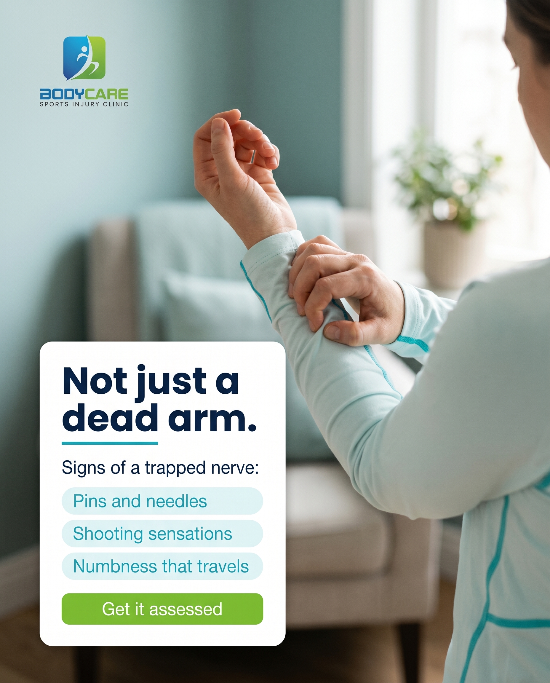
1856×2304
T3S2A2
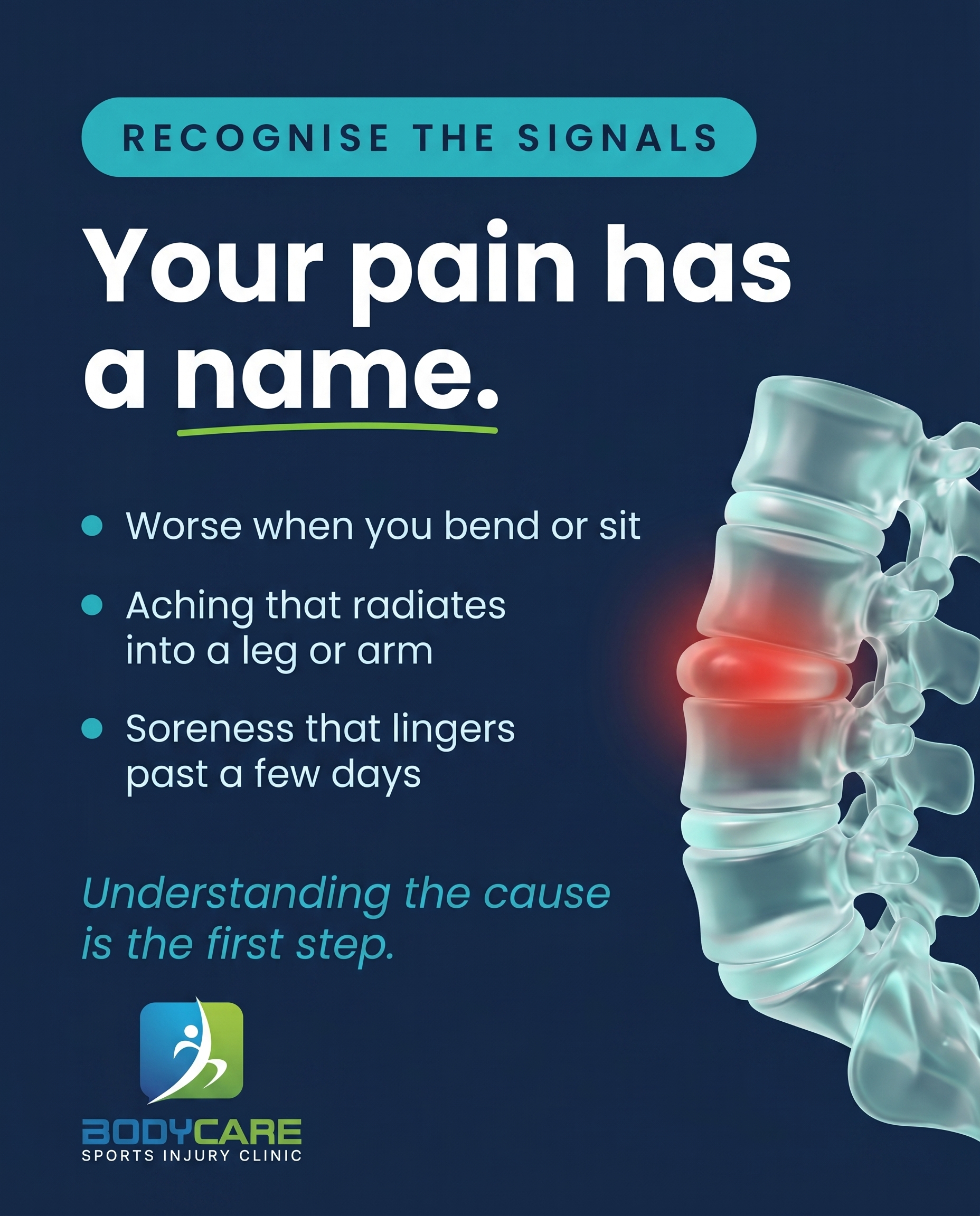
1856×2304
L5S3A3
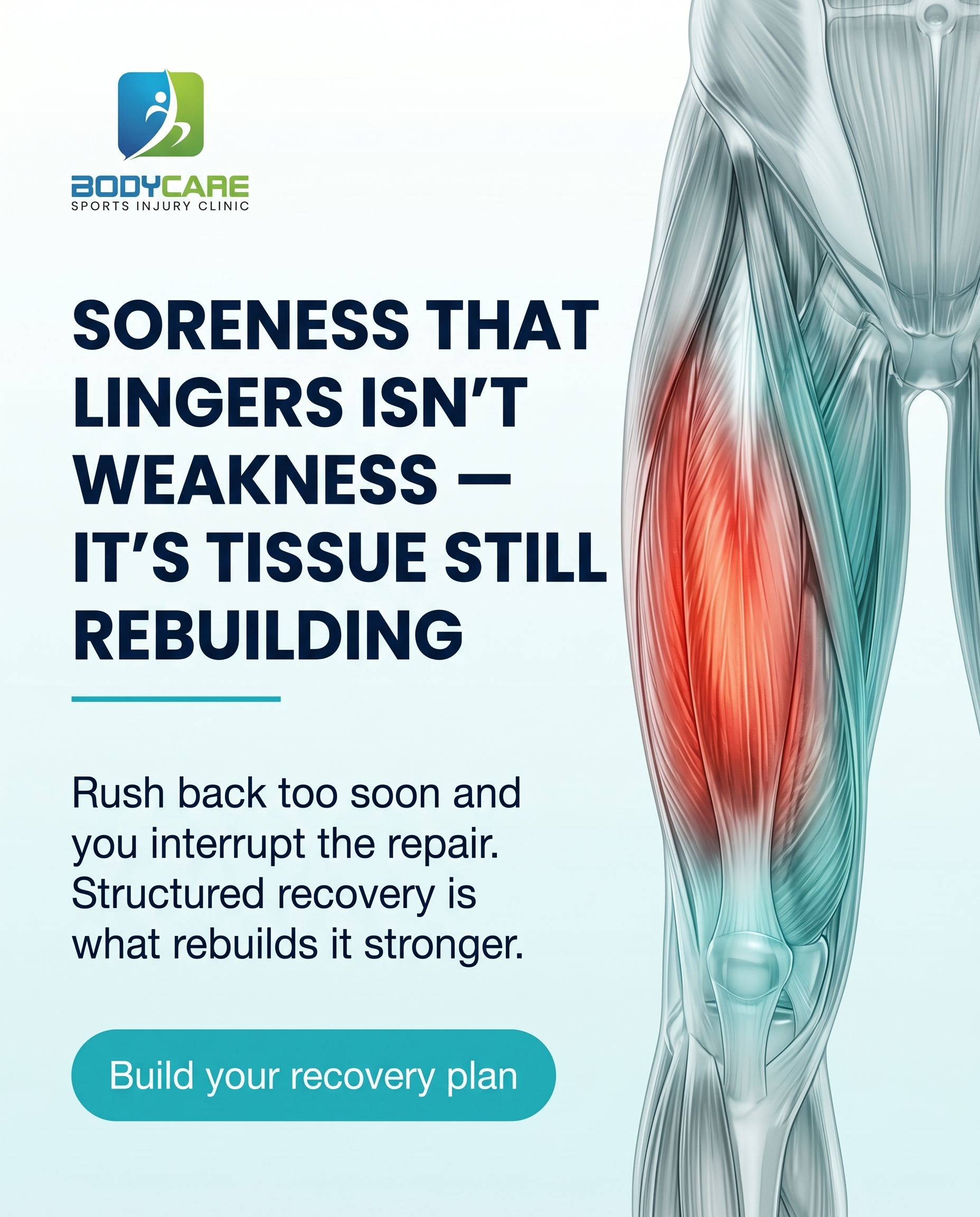
1856×2304
T6S4A4
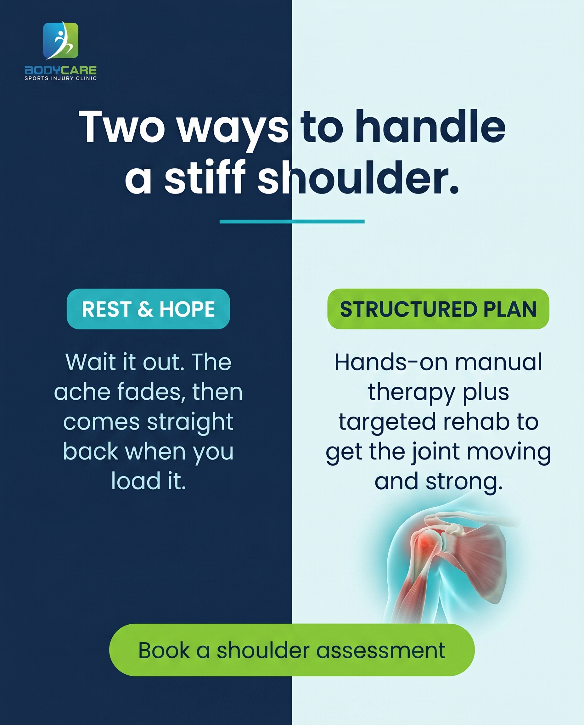
1856×2304
T4S5A2
v2
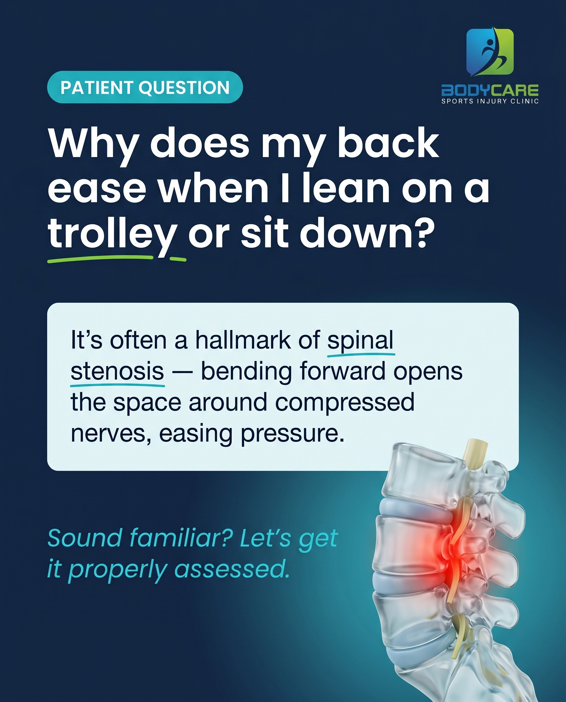
1856×2304
T7S6A4
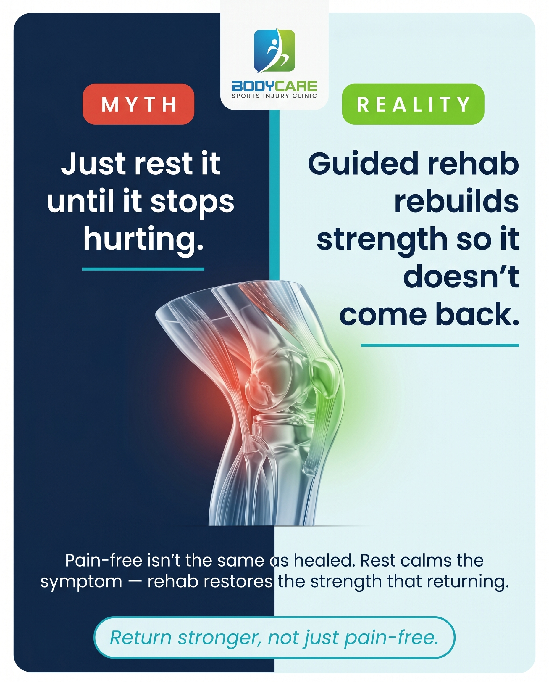
1856×2304
T8S7A4
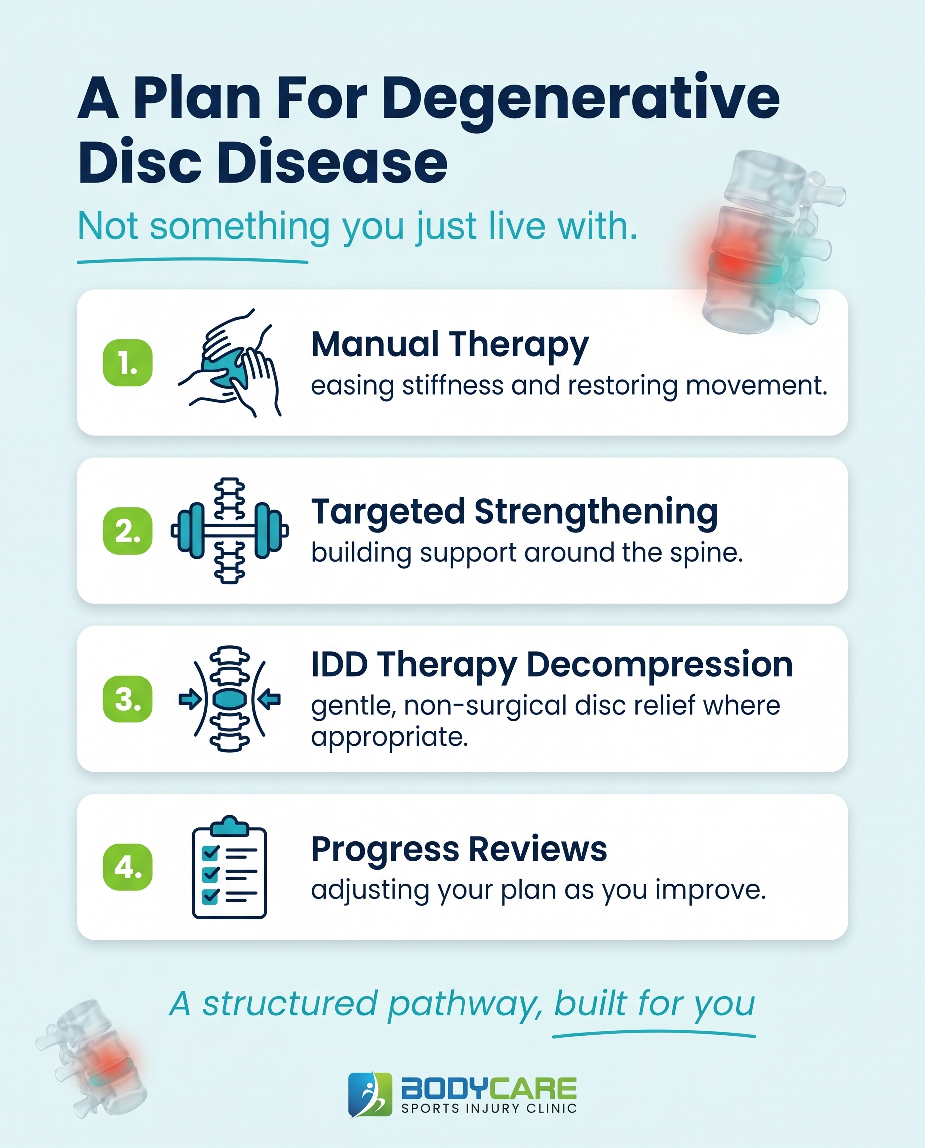
1856×2304
T10S8A2
v2
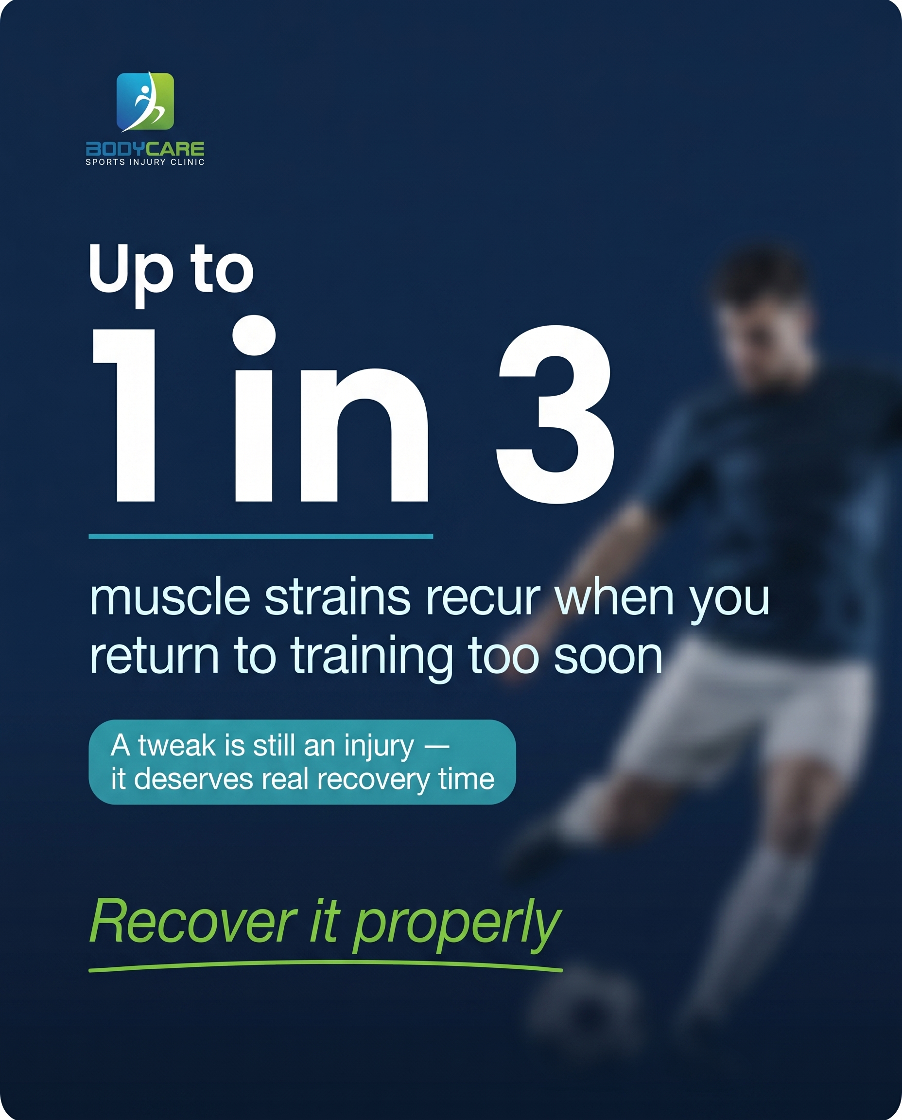
1856×2304
T9S9A3
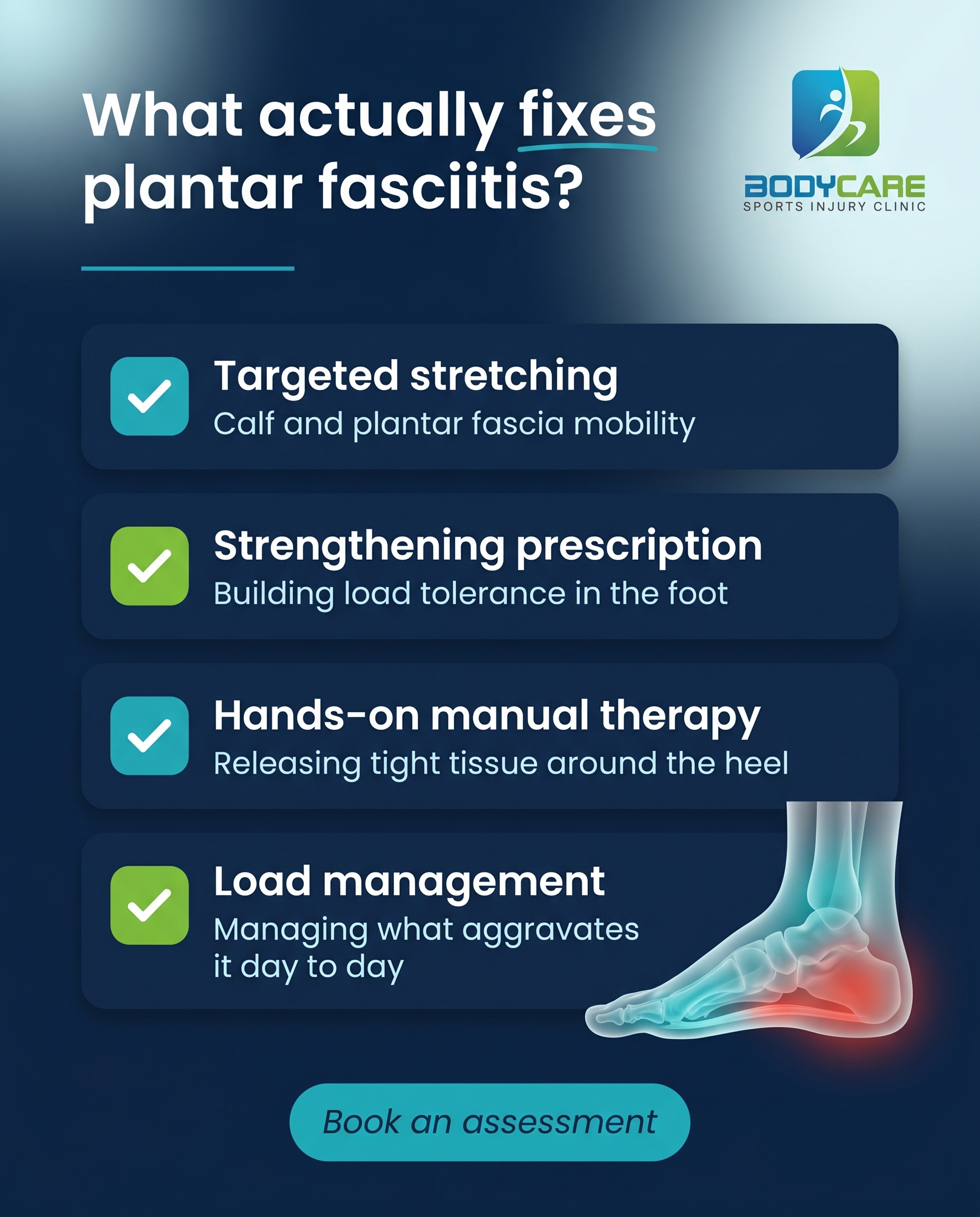
1856×2304
T12S6A4
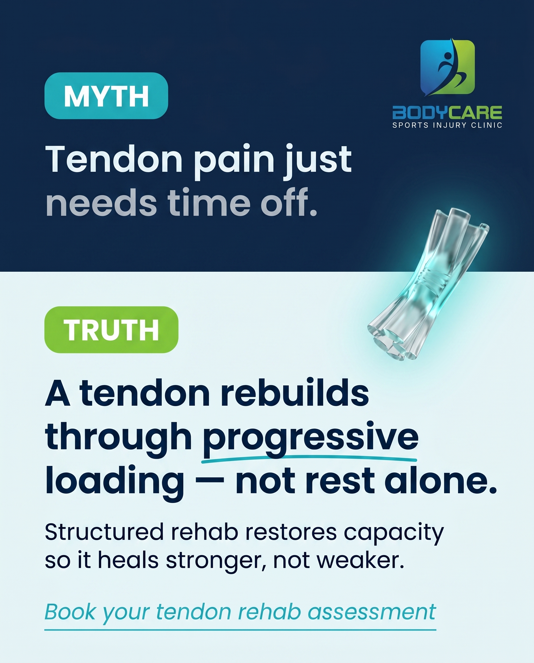
1856×2304
T1S1A1
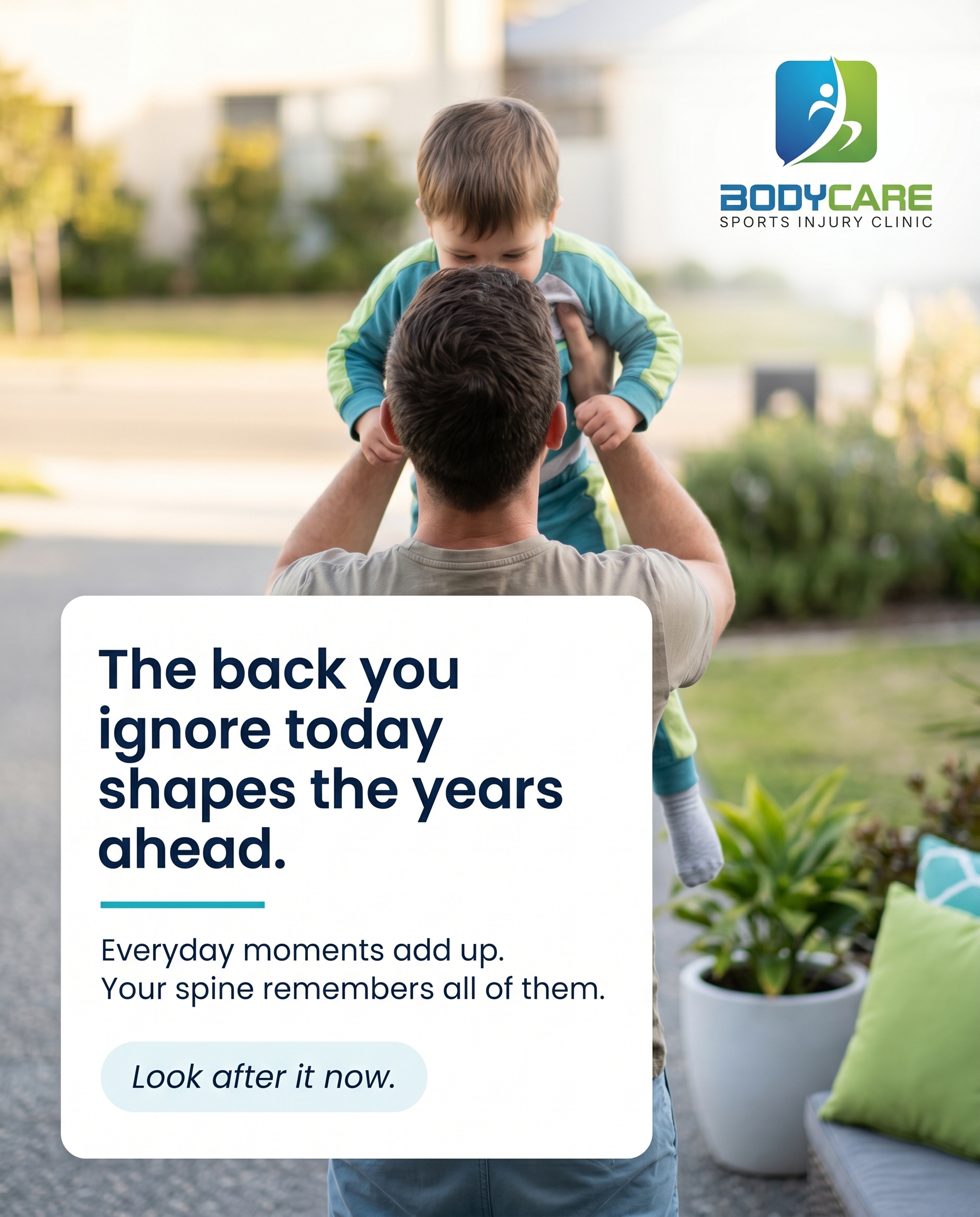
1856×2304
T5S9A1
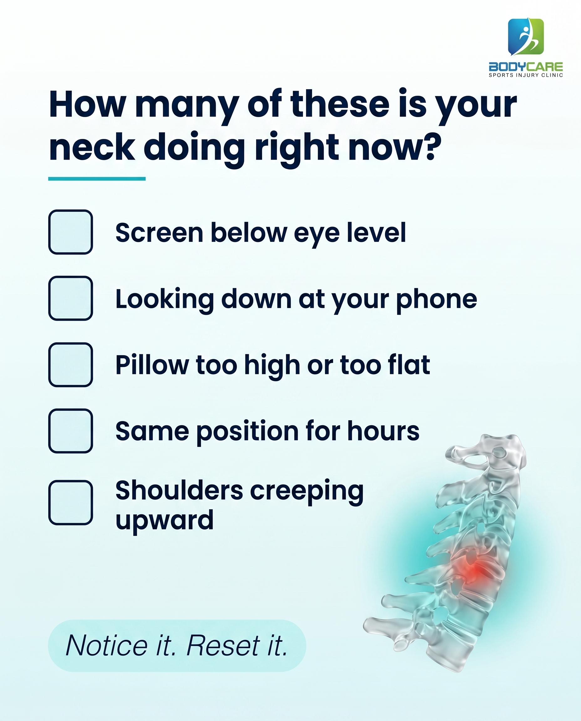
1856×2304
T2S4A2
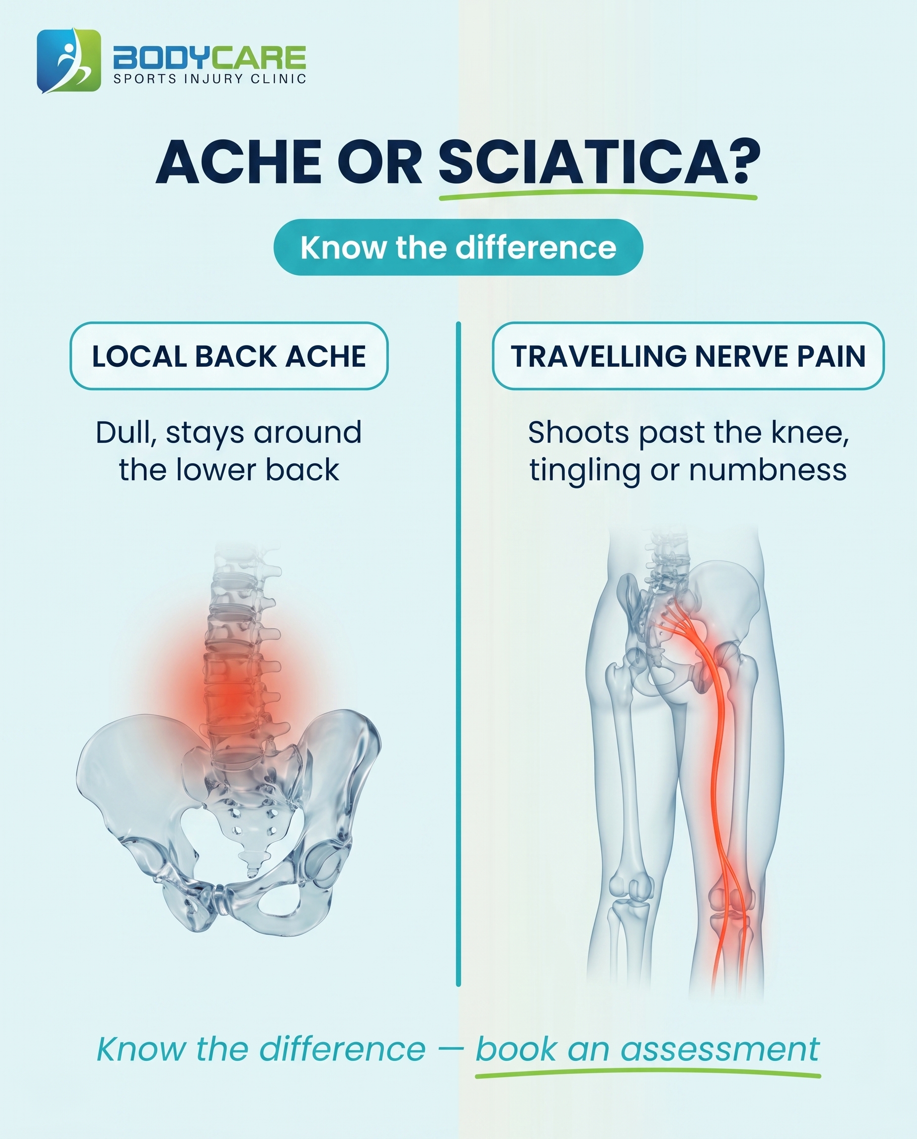
1856×2304
L4S2A2
v4
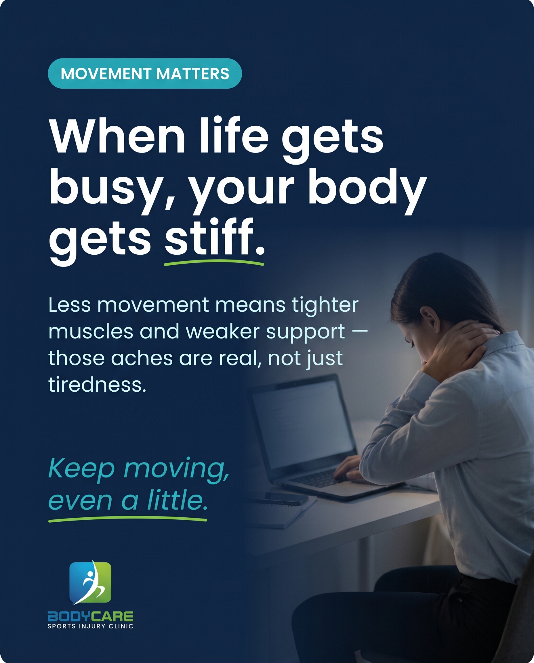
1856×2304
L1S8A4
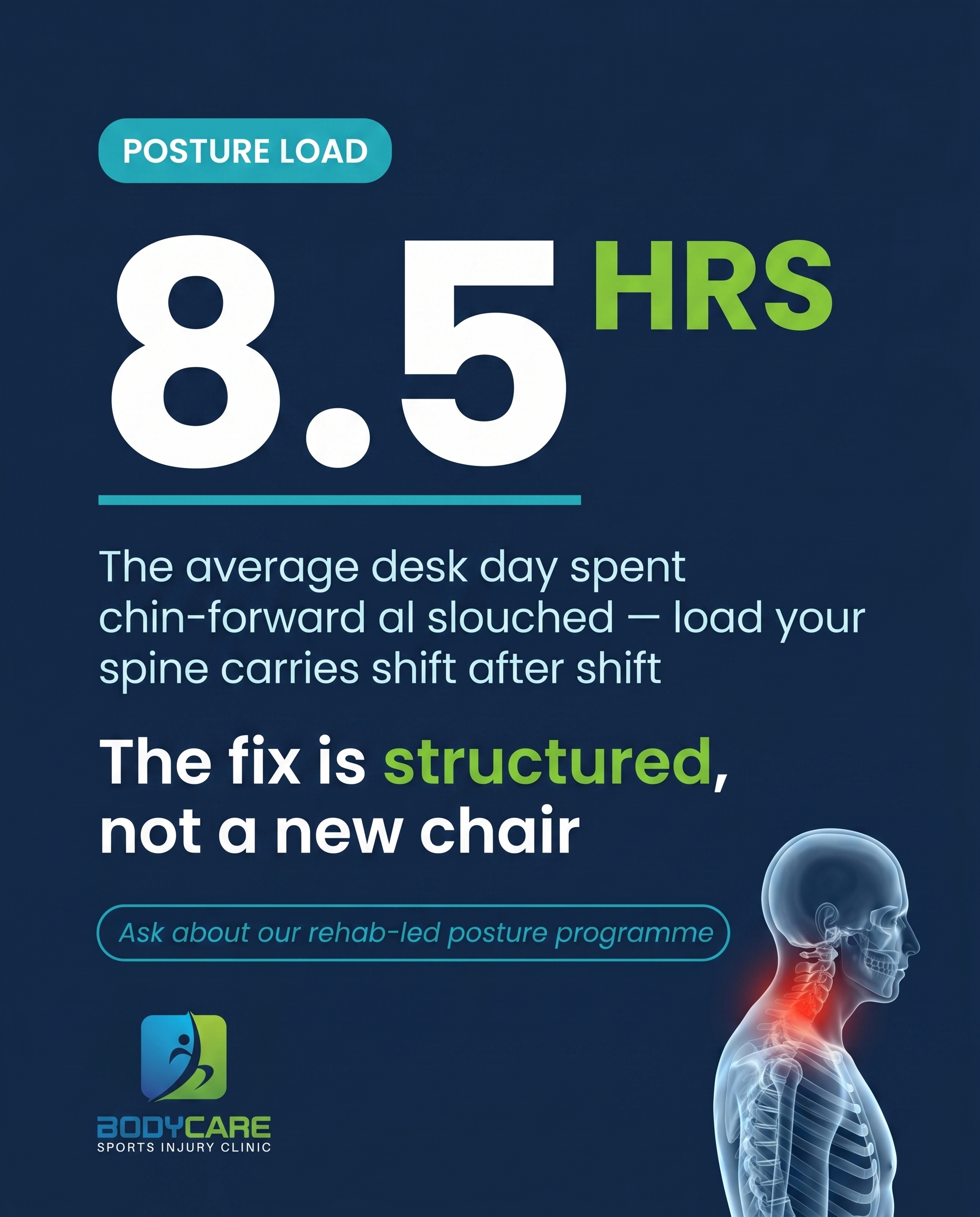
1856×2304
L2S5A3
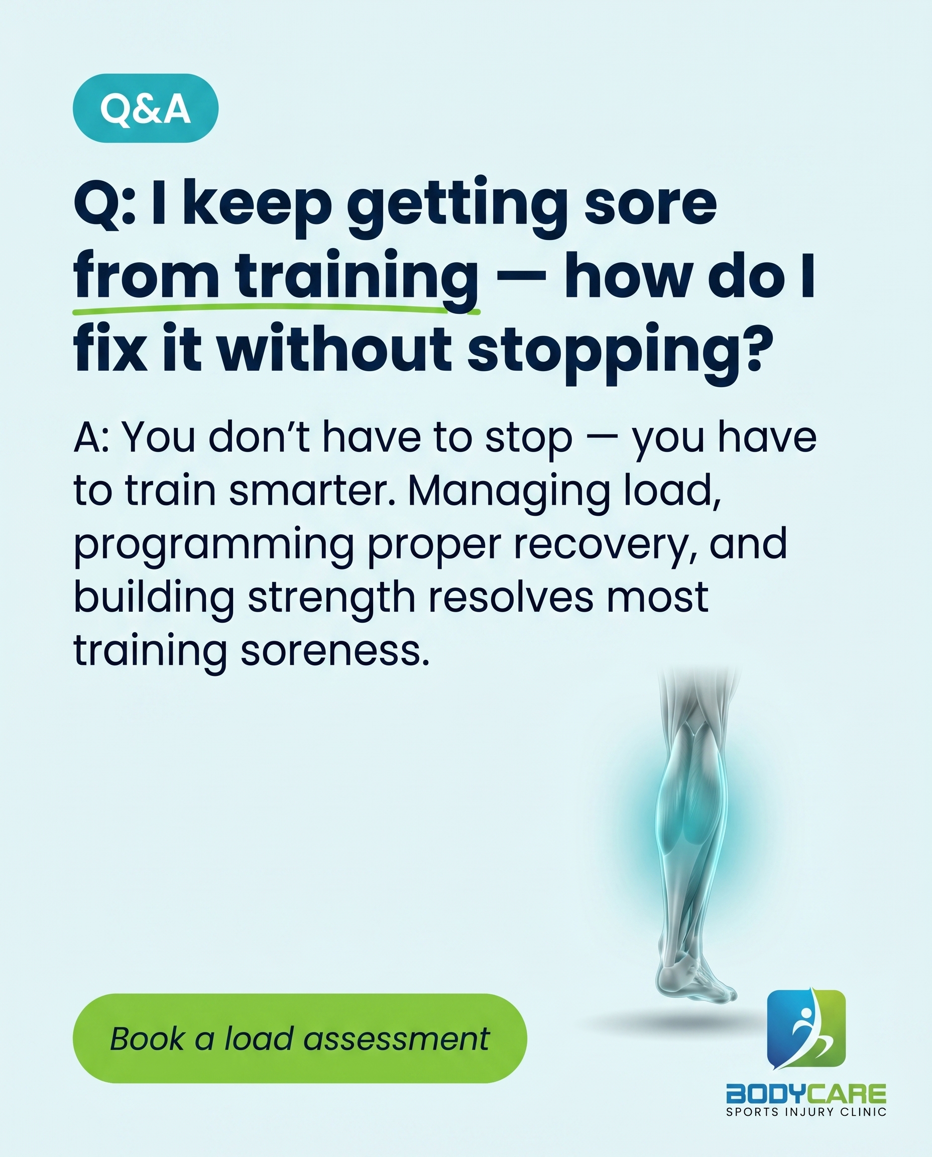
1856×2304
C3S7
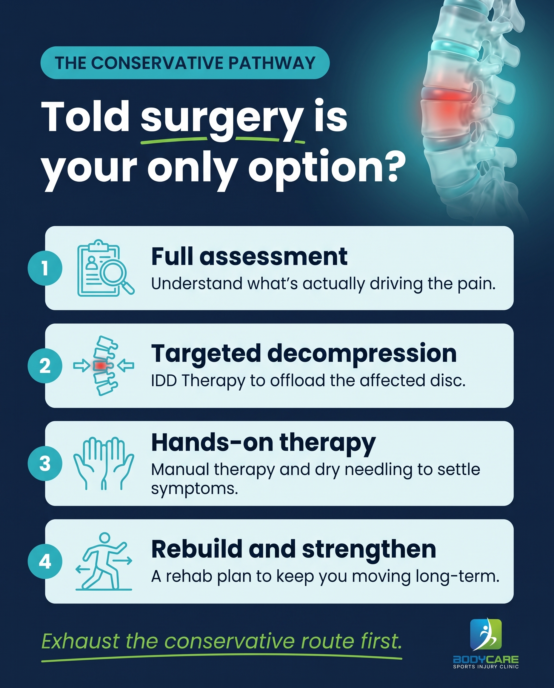
1856×2304
C1S3
v4
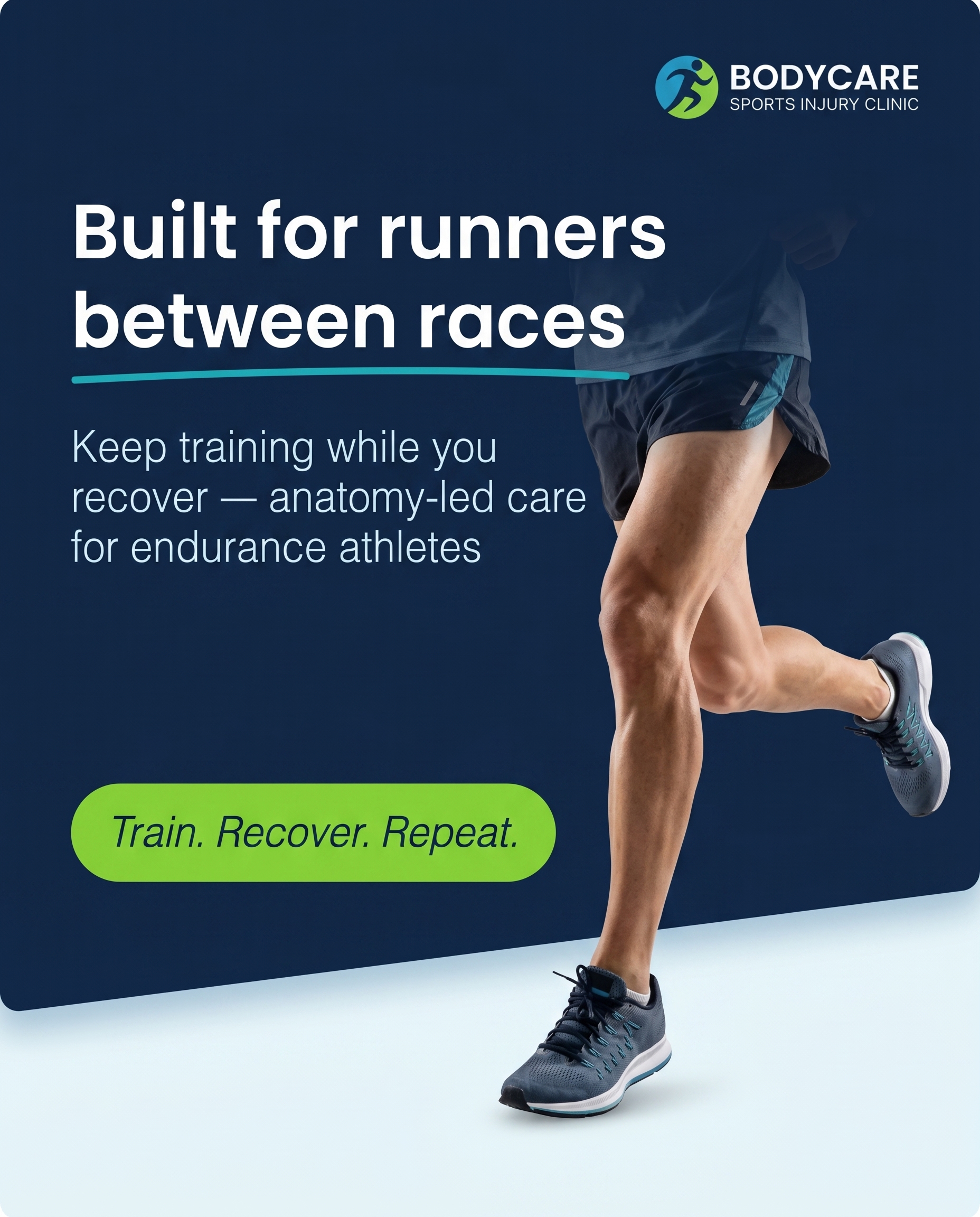
1856×2304
L4S6A3
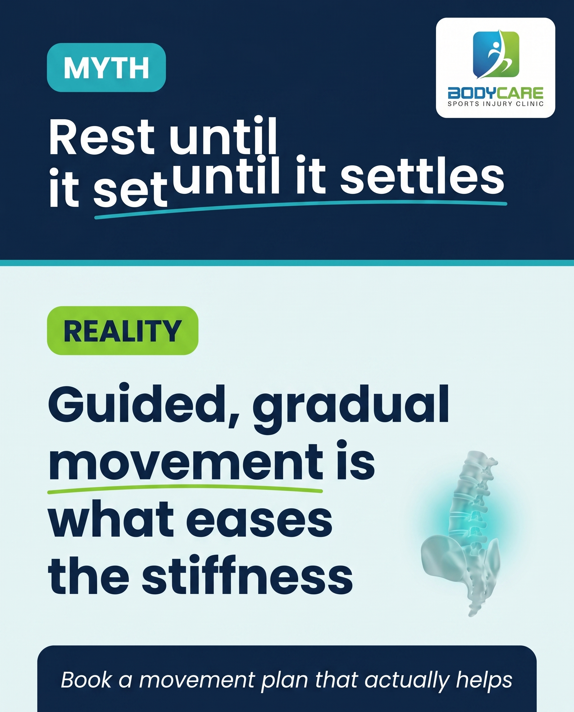
1856×2304
T6S5A3
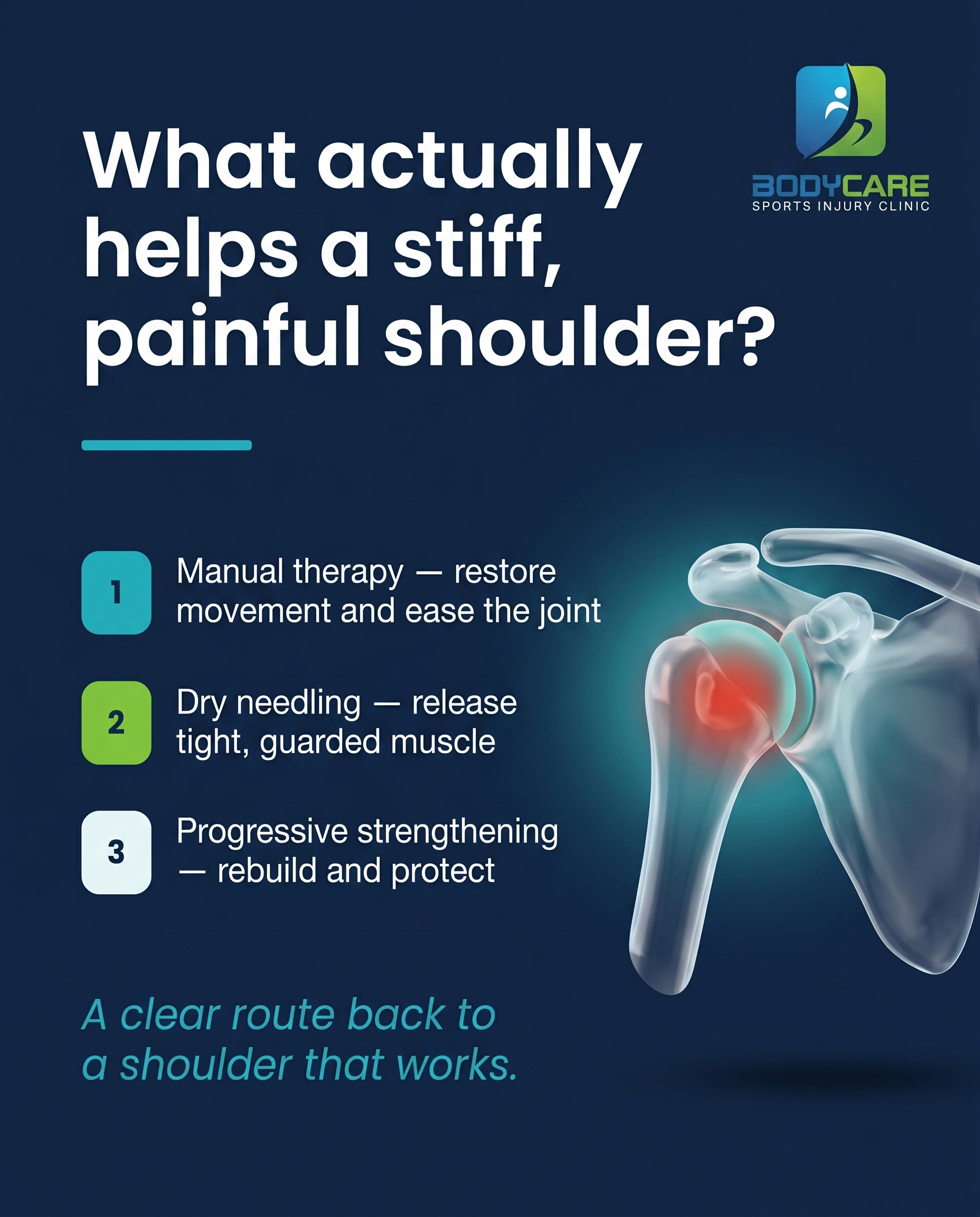
1856×2304
T2S9A1
v2
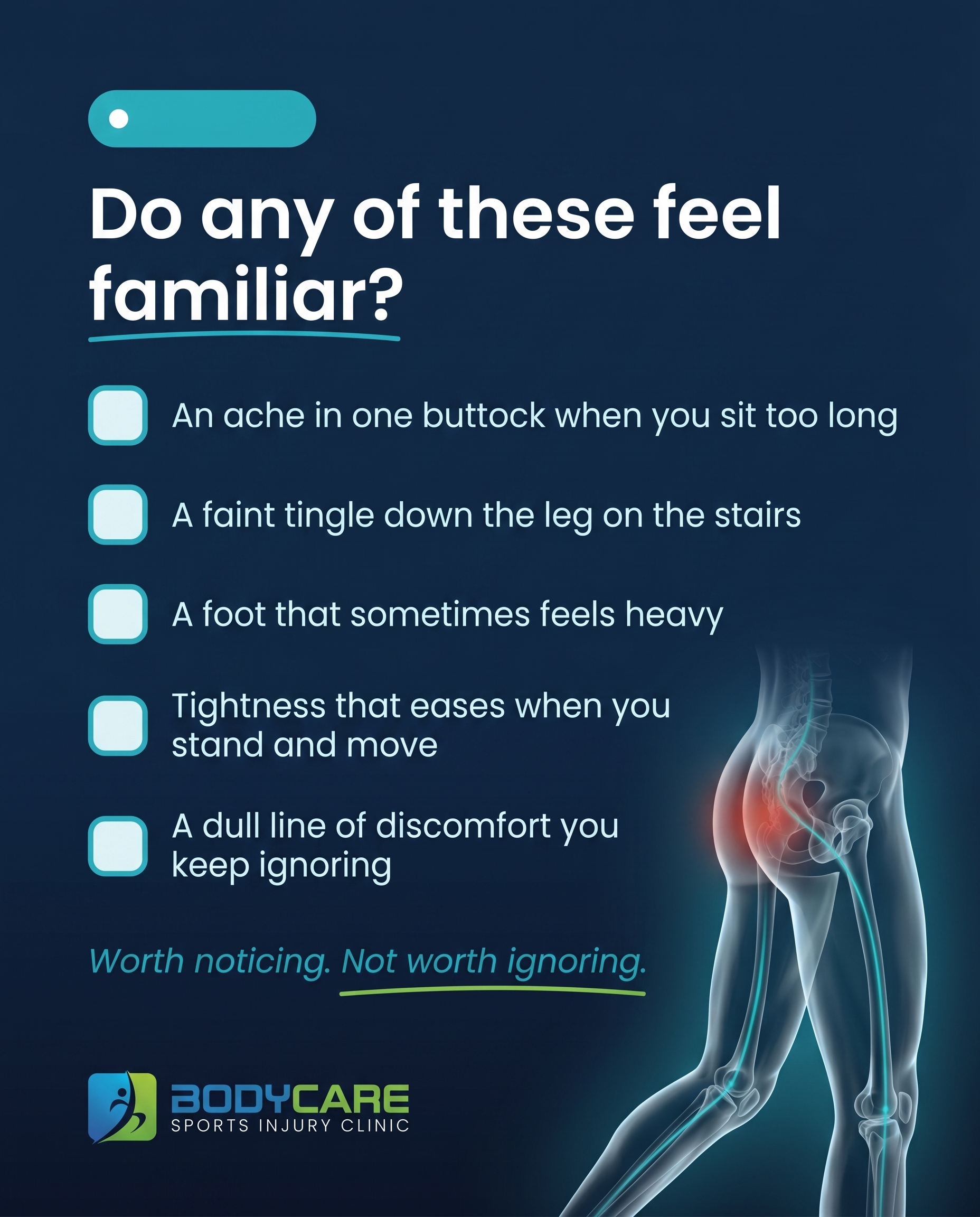
1856×2304
T1S7A3
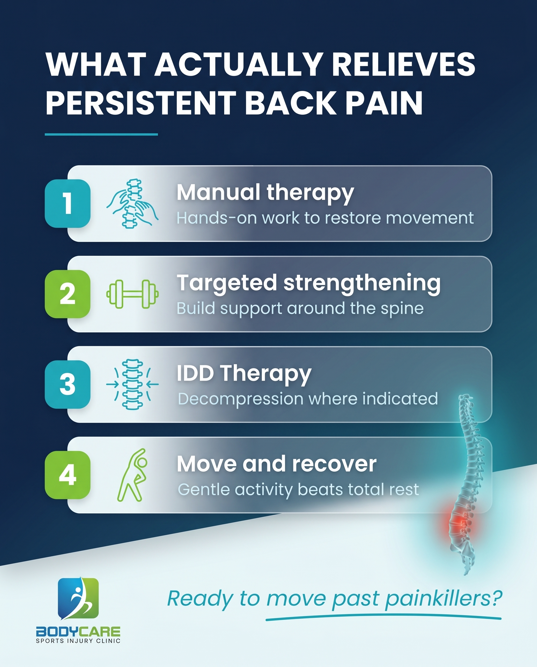
1856×2304
C2S1

1856×2304
T9S1A3
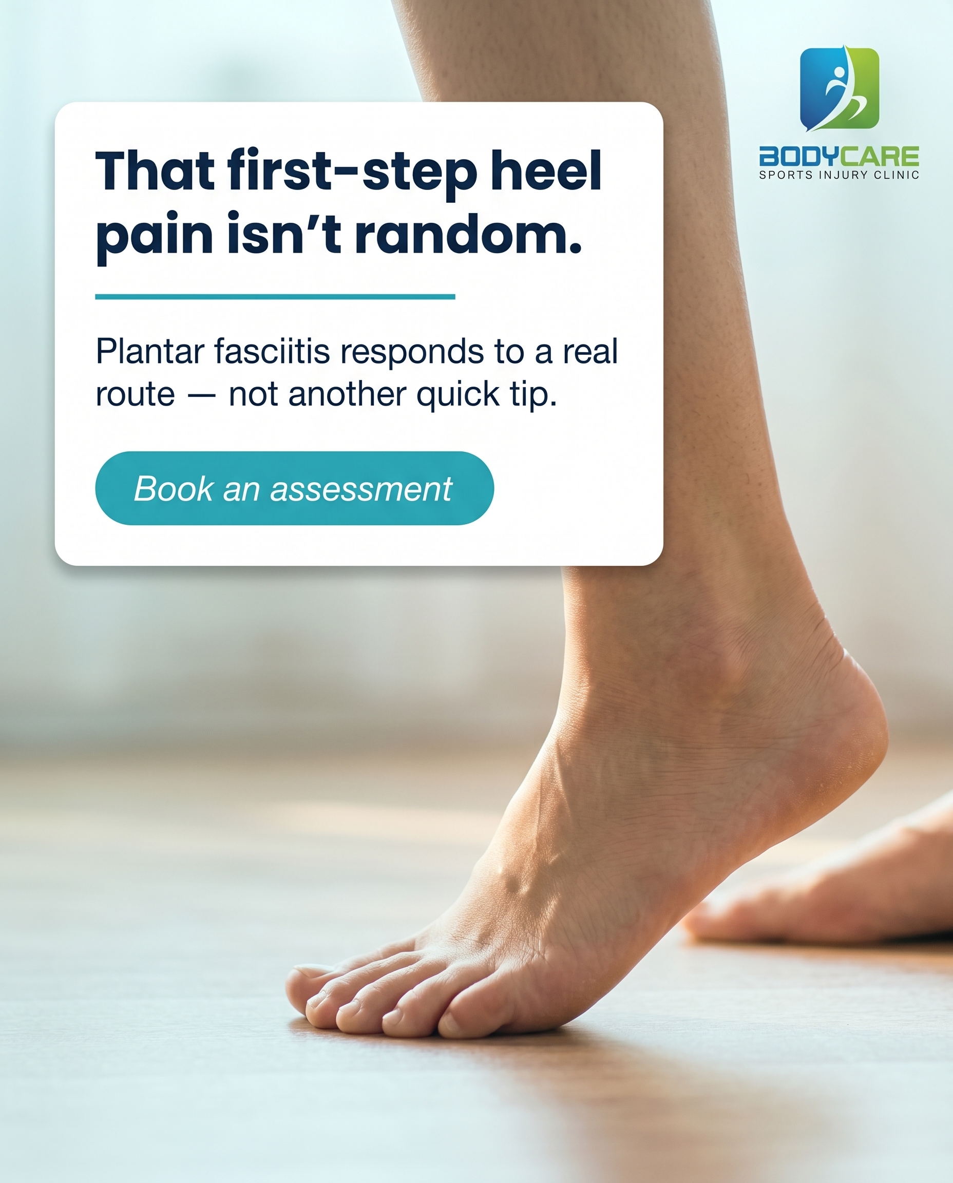
1856×2304
L5S6A2
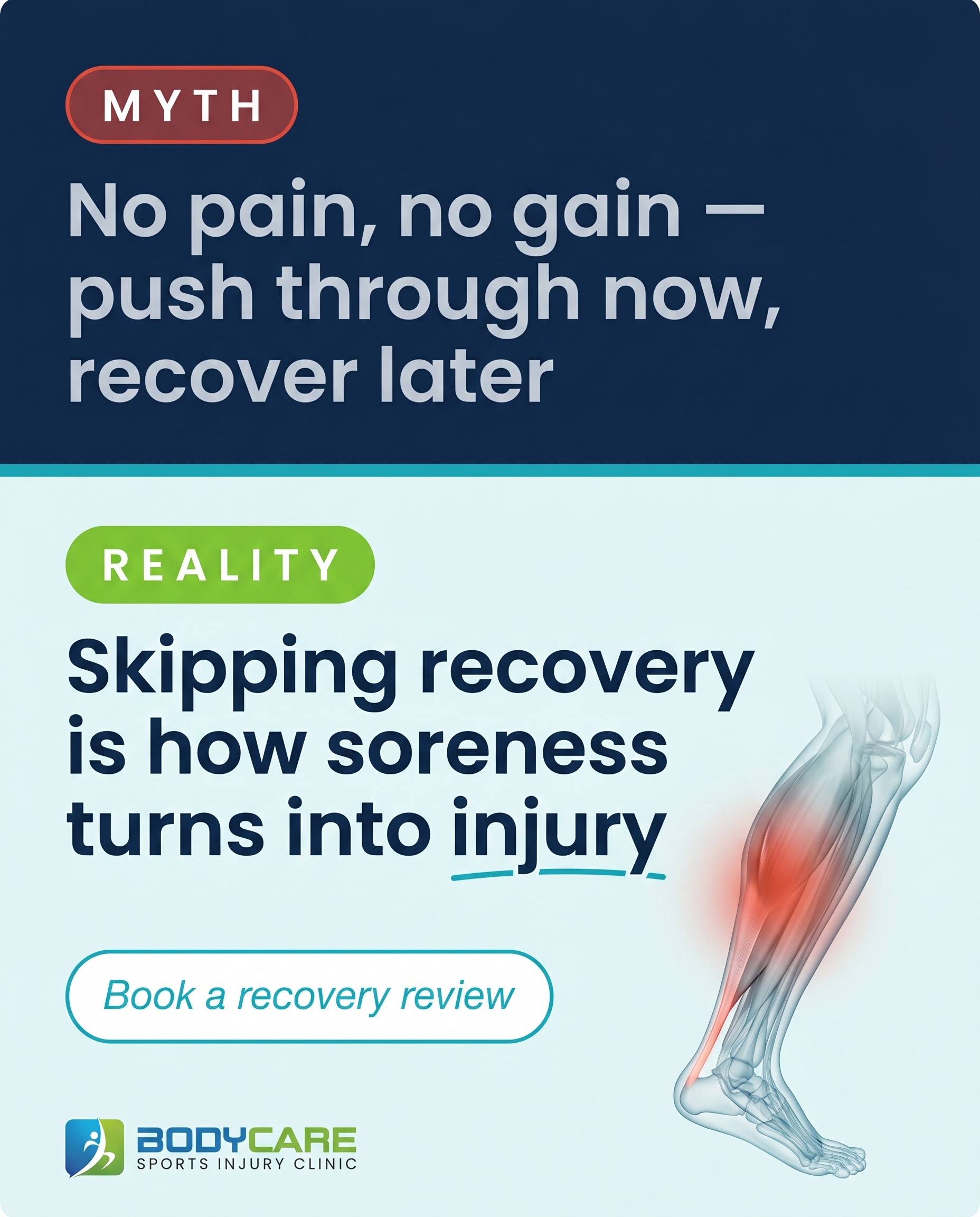
1856×2304
L2S5A1
v2
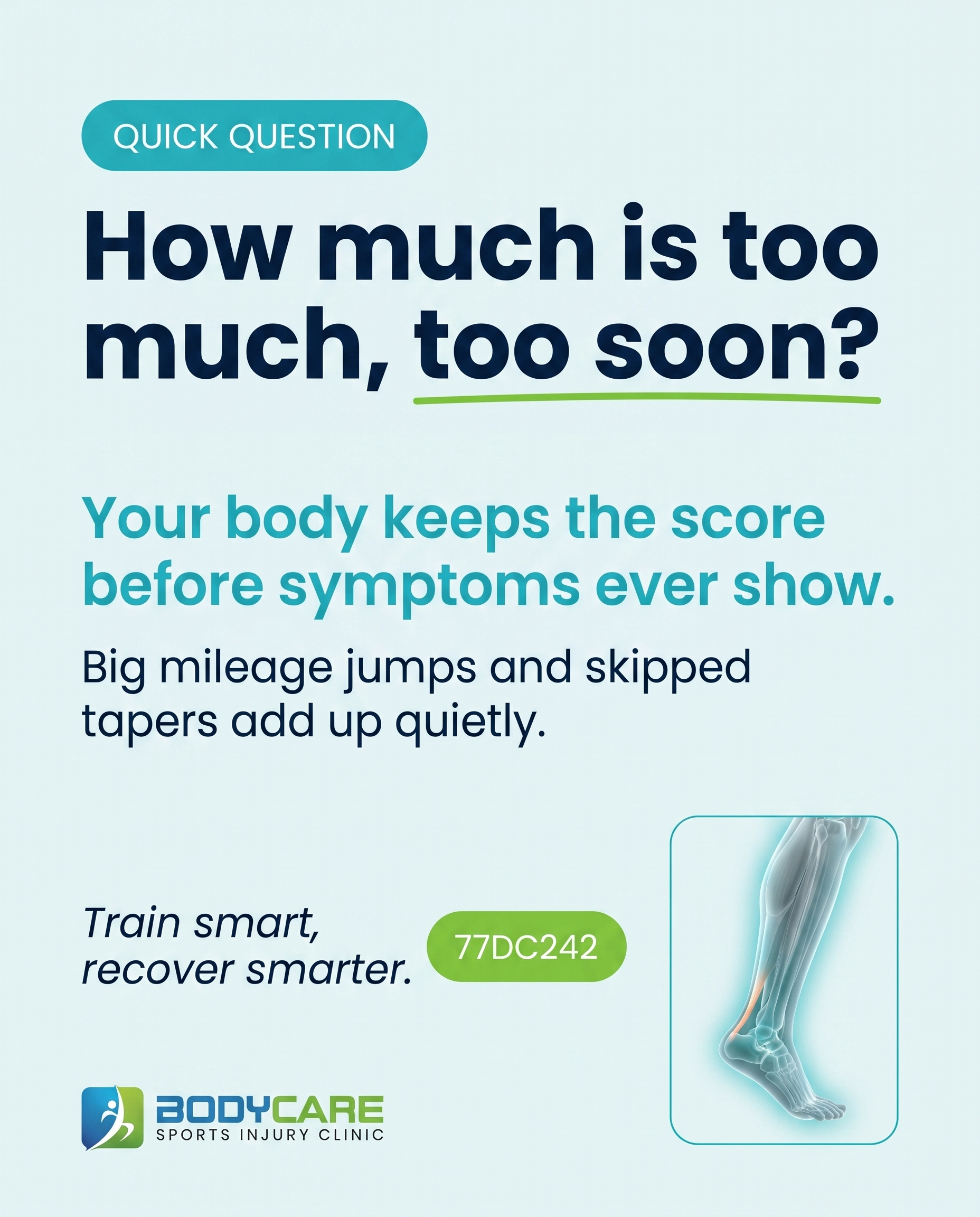
1856×2304
T10S3A2
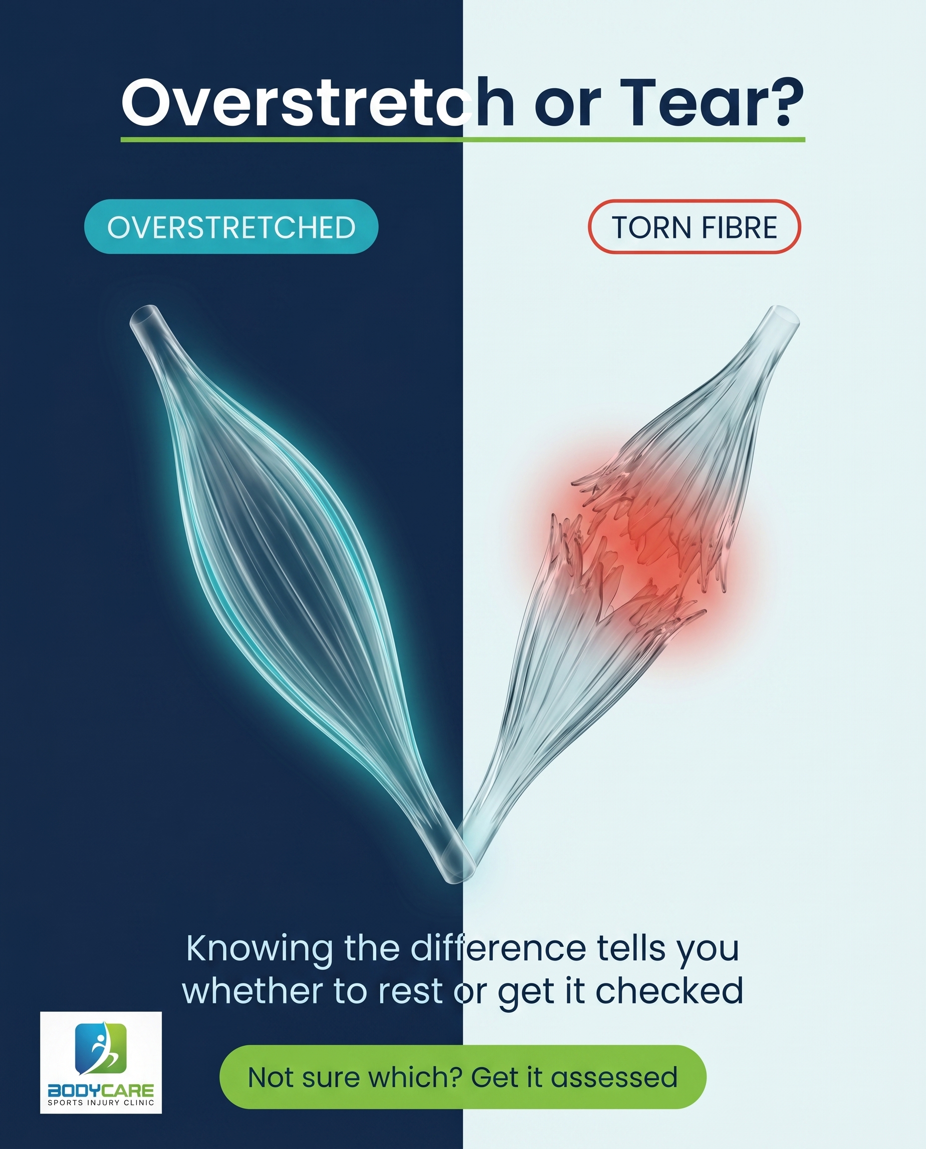
1856×2304
T5S2A3
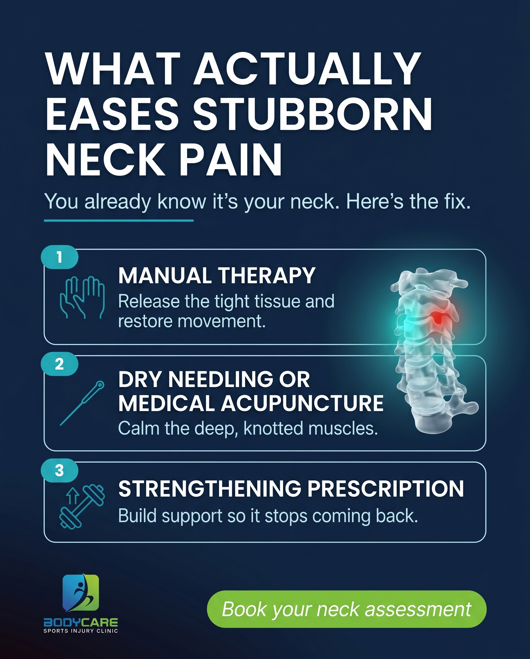
1856×2304
T2S3A1
v2
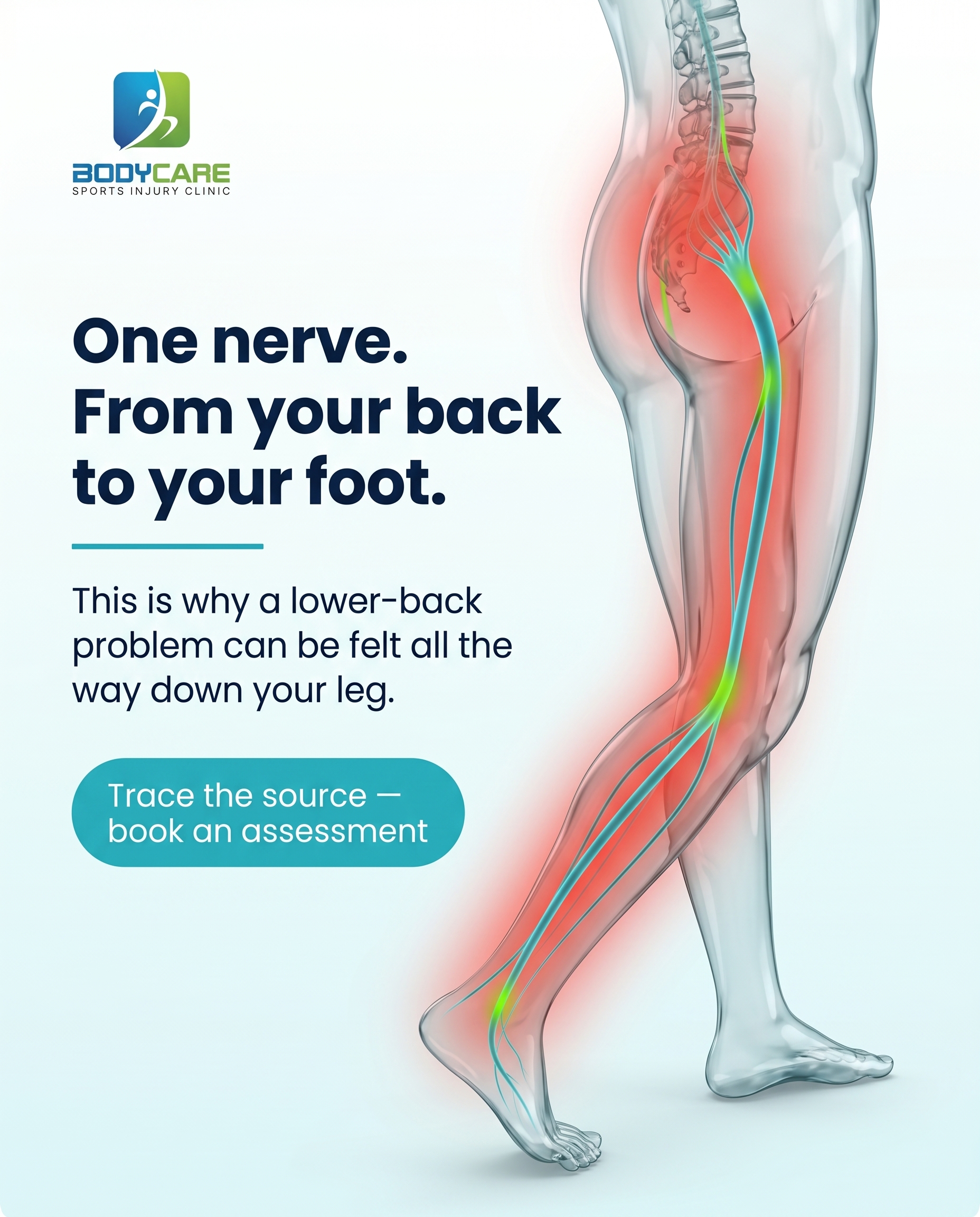
1856×2304
T7S2A2
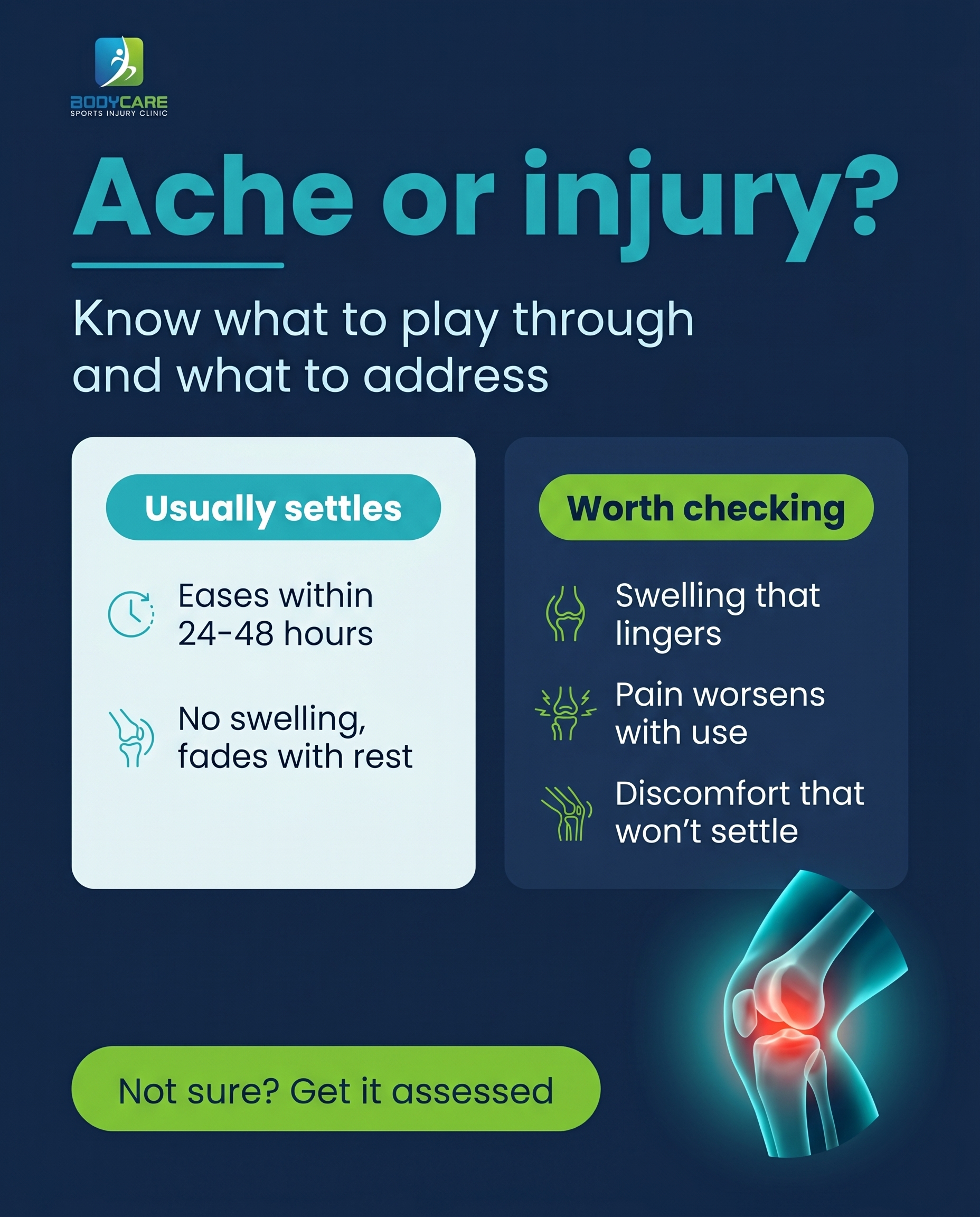
1856×2304