Draw — 10 posts
1
Coordinates
10 coordinates
10 selected
▼
| # | Code | Theme | Subject | Style | Awareness | Source |
|---|---|---|---|---|---|---|
| 1 | T2S1A2 | treatments | T2 — Sciatica | photography | A2 — Problem-aware | CURATED |
| 2 | T5S2A3 | treatments | T5 — Disc Protrusion | graphic-design | A3 — Solution-aware | CURATED |
| 3 | T8S3A1 | treatments | T8 — Chronic Shoulder Pain | illustrative-3D | A1 — Unaware | CURATED |
| 4 | L5S4A4 | lifestyle | L5 — Delaying care until pain becomes years of accumulated damage | comparison-card | A4 — Product-aware | CURATED |
| 5 | T4S5A2 | treatments | T4 — Whiplash (Auto Accident Injury) | qa-card | A2 — Problem-aware | CURATED |
| 6 | T6S6A3 | treatments | T6 — Neck Pain & Stiffness | myth-buster | A3 — Solution-aware | CURATED |
| 7 | T3S7A3 | treatments | T3 — Chronic Back Pain | list-tips | A3 — Solution-aware | CURATED |
| 8 | T11S8A2 | treatments | T11 — Radiating Leg Pain / Numbness | stat-card | A2 — Problem-aware | CURATED |
| 9 | L1S9A1 | lifestyle | L1 — Pushing through chronic pain instead of addressing the disc | checklist | A1 — Unaware | CURATED |
| 10 | C3S3 | clinic | C3 — Adults with disc-driven back, neck, or radiating nerve pain | illustrative-3D | — | CURATED |
2
Content Briefs
10 briefs · 2026-06-08T12:10
10 briefs generated
▼
1.
T2S1A2
photography
Problem-aware
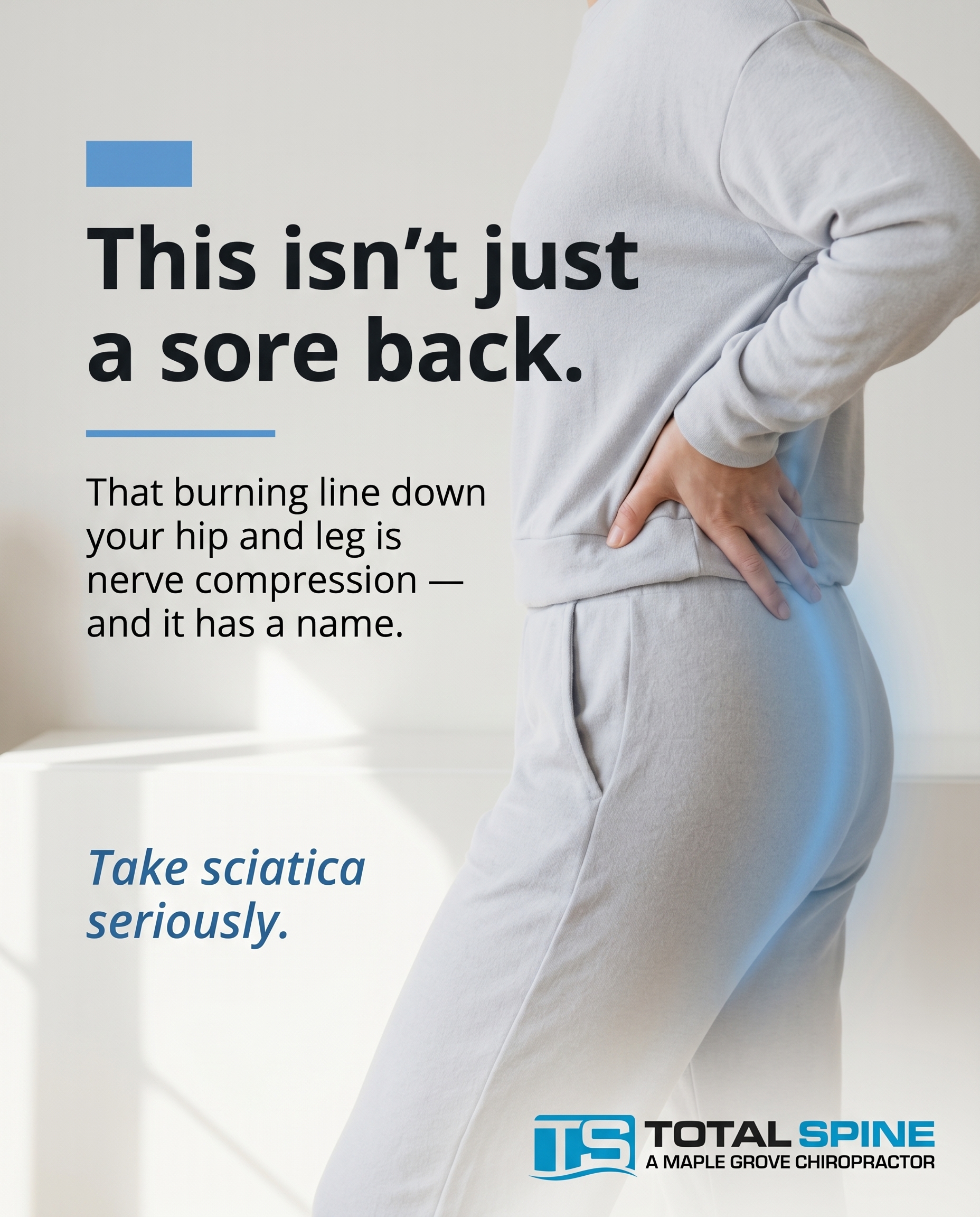
A photographic post that names the lived reality of sciatica — the burning line that runs from the lower back down through the hip and leg, the leg that goes numb when you sit too long. The angle: this radiating pain isn't 'just a sore back,' it's nerve compression worth taking seriously, validating that what the reader feels is a real, identifiable problem.
Content: A photographic post that names the lived reality of sciatica — the burning line that runs from the lower back down through the hip and leg, the leg that goes numb when you sit too long. The angle: this radiating pain isn't 'just a sore back,' it's nerve compression worth taking seriously, validating that what the reader feels is a real, identifiable problem.
Style: photography
2.
T5S2A3
graphic-design
Solution-aware
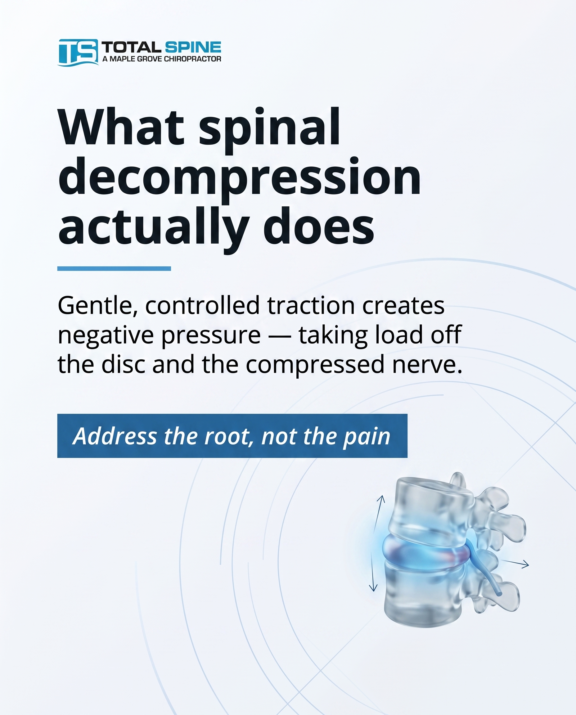
A clean graphic explainer on what spinal decompression actually does for a disc protrusion: gentle, controlled traction on the Hill DT table creates negative pressure that takes load off the bulging disc and the compressed nerve. The angle is mechanism — showing the reader who already knows they have a disc issue exactly what this treatment is and how it addresses the root rather than masking pain.
Content: A clean graphic explainer on what spinal decompression actually does for a disc protrusion: gentle, controlled traction on the Hill DT table creates negative pressure that takes load off the bulging disc and the compressed nerve. The angle is mechanism — showing the reader who already knows they have a disc issue exactly what this treatment is and how it addresses the root rather than masking pain.
Style: graphic-design
3.
T8S3A1
illustrative-3D
Unaware
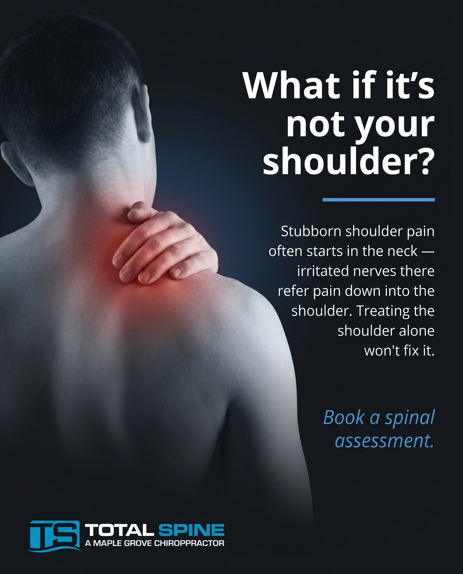
A 3D illustration reframing chronic shoulder pain the reader has written off as 'just the shoulder' — opening the idea that stubborn shoulder ache can trace back to the neck and nerve pathways in the spine. The angle is curiosity, not a sell: making someone who'd scroll past 'shoulder pain' pause and wonder whether they've been looking at the wrong joint.
Content: A 3D illustration reframing chronic shoulder pain the reader has written off as 'just the shoulder' — opening the idea that stubborn shoulder ache can trace back to the neck and nerve pathways in the spine. The angle is curiosity, not a sell: making someone who'd scroll past 'shoulder pain' pause and wonder whether they've been looking at the wrong joint.
Style: illustrative-3D
4.
L5S4A4
comparison-card
Product-aware
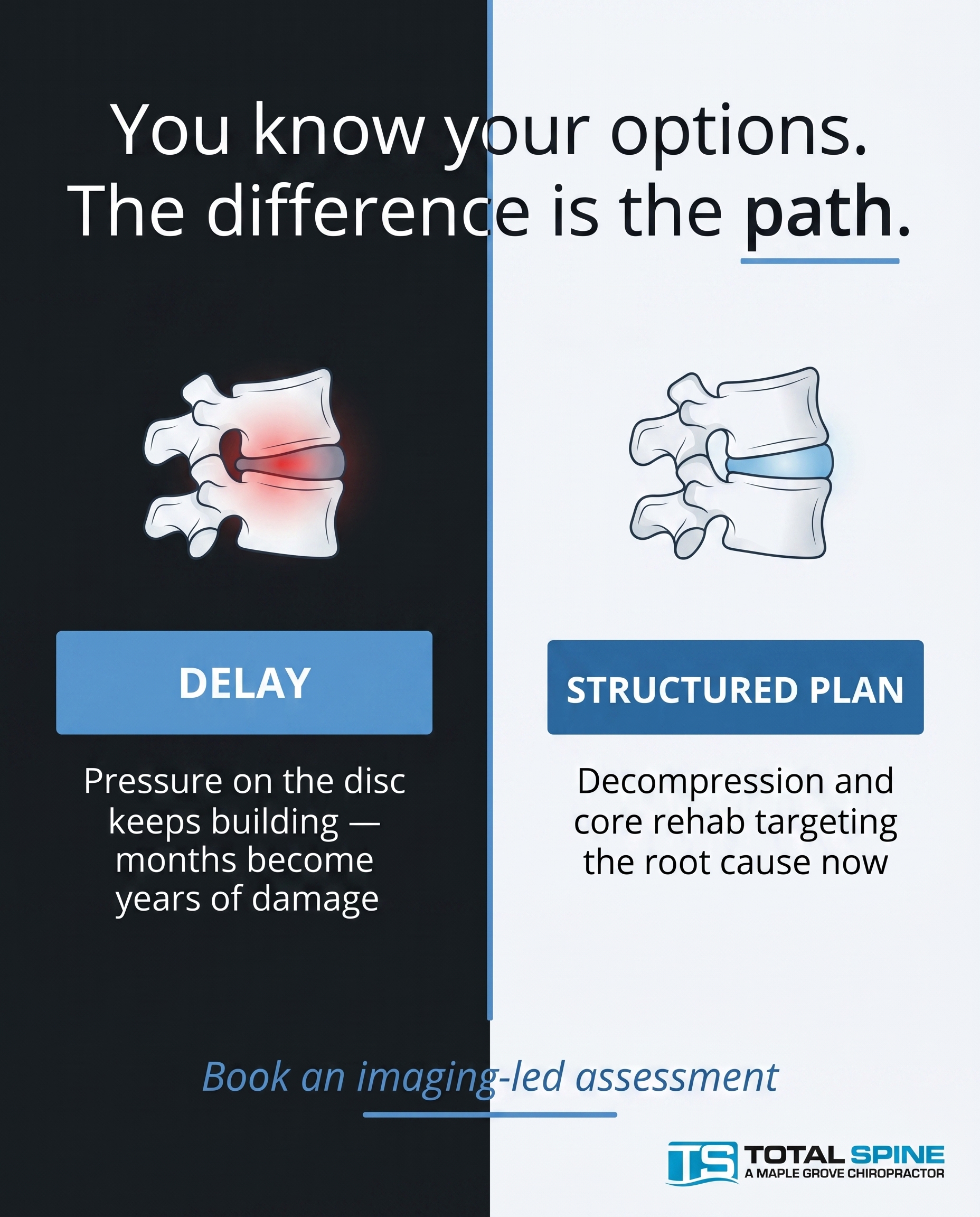
A comparison-card contrasting two paths for someone who already knows their options: keep delaying and let pressure on the disc accumulate into years of damage, versus a structured plan built around decompression and core rehab that targets the root now. The angle answers 'why you' — this clinic's function-focused, imaging-led approach addresses the cause instead of chasing symptoms appointment to appointment.
Content: A comparison-card contrasting two paths for someone who already knows their options: keep delaying and let pressure on the disc accumulate into years of damage, versus a structured plan built around decompression and core rehab that targets the root now. The angle answers 'why you' — this clinic's function-focused, imaging-led approach addresses the cause instead of chasing symptoms appointment to appointment.
Style: comparison-card
5.
T4S5A2
qa-card
Problem-aware
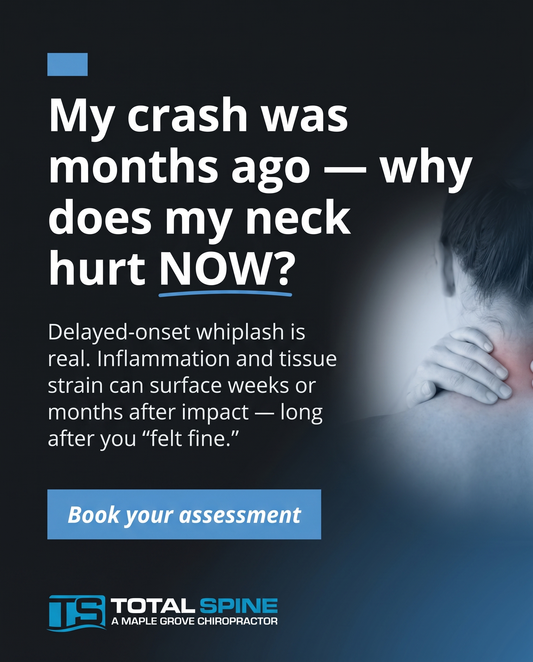
A Q&A card tackling the question auto-accident patients quietly ask: 'My crash was months ago and I felt fine at first — is this neck pain actually related?' The angle validates delayed-onset whiplash as a genuine, common problem, helping the reader recognise that stiffness and headaches surfacing weeks later are worth assessing, not ignoring.
Content: A Q&A card tackling the question auto-accident patients quietly ask: 'My crash was months ago and I felt fine at first — is this neck pain actually related?' The angle validates delayed-onset whiplash as a genuine, common problem, helping the reader recognise that stiffness and headaches surfacing weeks later are worth assessing, not ignoring.
Style: qa-card
6.
T6S6A3
myth-buster
Solution-aware
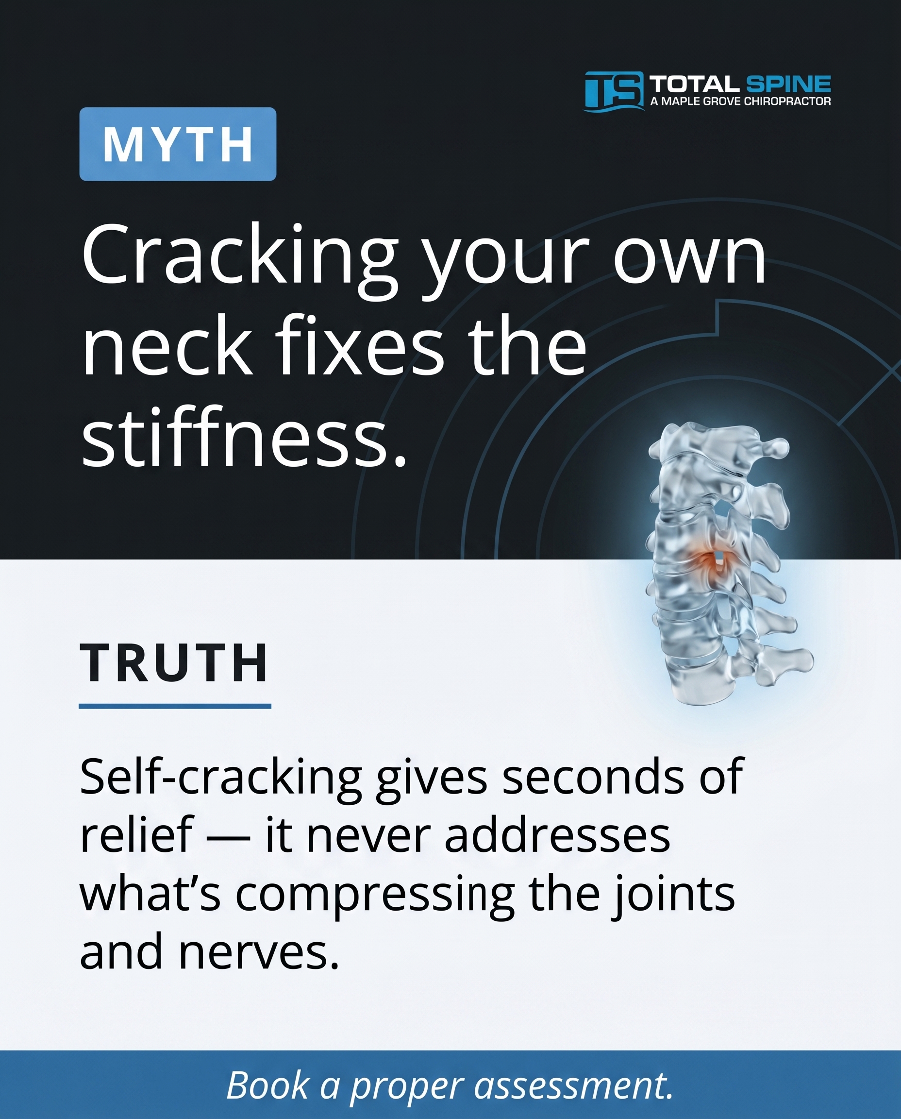
A myth-buster correcting the belief that neck pain and stiffness are fixed by repeatedly cracking your own neck or one-off adjustments. The angle, for a reader actively seeking a fix: lasting relief comes from addressing what's compressing the joints and nerves — through targeted manual therapy, traction, and core-supporting rehab — rather than chasing the temporary relief of self-manipulation.
Content: A myth-buster correcting the belief that neck pain and stiffness are fixed by repeatedly cracking your own neck or one-off adjustments. The angle, for a reader actively seeking a fix: lasting relief comes from addressing what's compressing the joints and nerves — through targeted manual therapy, traction, and core-supporting rehab — rather than chasing the temporary relief of self-manipulation.
Style: myth-buster
7.
T3S7A3
list-tips
Solution-aware
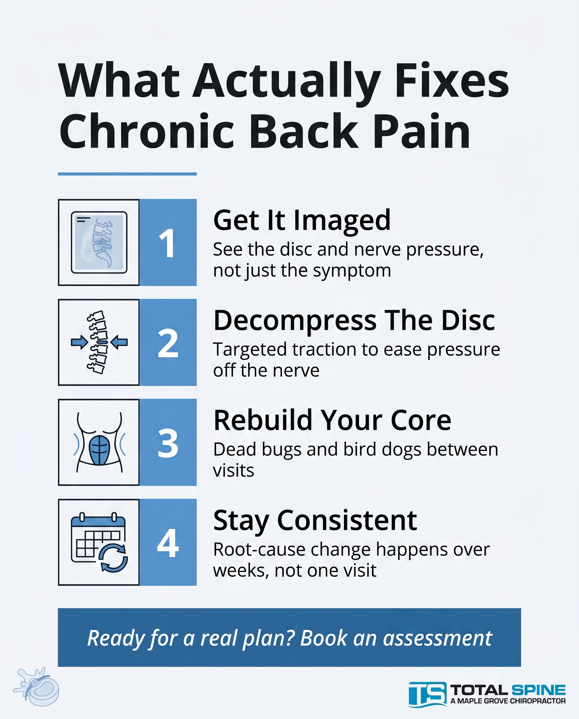
A list-tips post outlining what genuinely helps chronic back pain at the root: getting the disc and nerve pressure assessed with imaging, structured decompression, and consistent core rehab like dead bugs and bird dogs between visits. The angle answers 'what fixes it' by laying out the components of a real plan rather than a single quick trick.
Content: A list-tips post outlining what genuinely helps chronic back pain at the root: getting the disc and nerve pressure assessed with imaging, structured decompression, and consistent core rehab like dead bugs and bird dogs between visits. The angle answers 'what fixes it' by laying out the components of a real plan rather than a single quick trick.
Style: list-tips
8.
T11S8A2
stat-card
Problem-aware
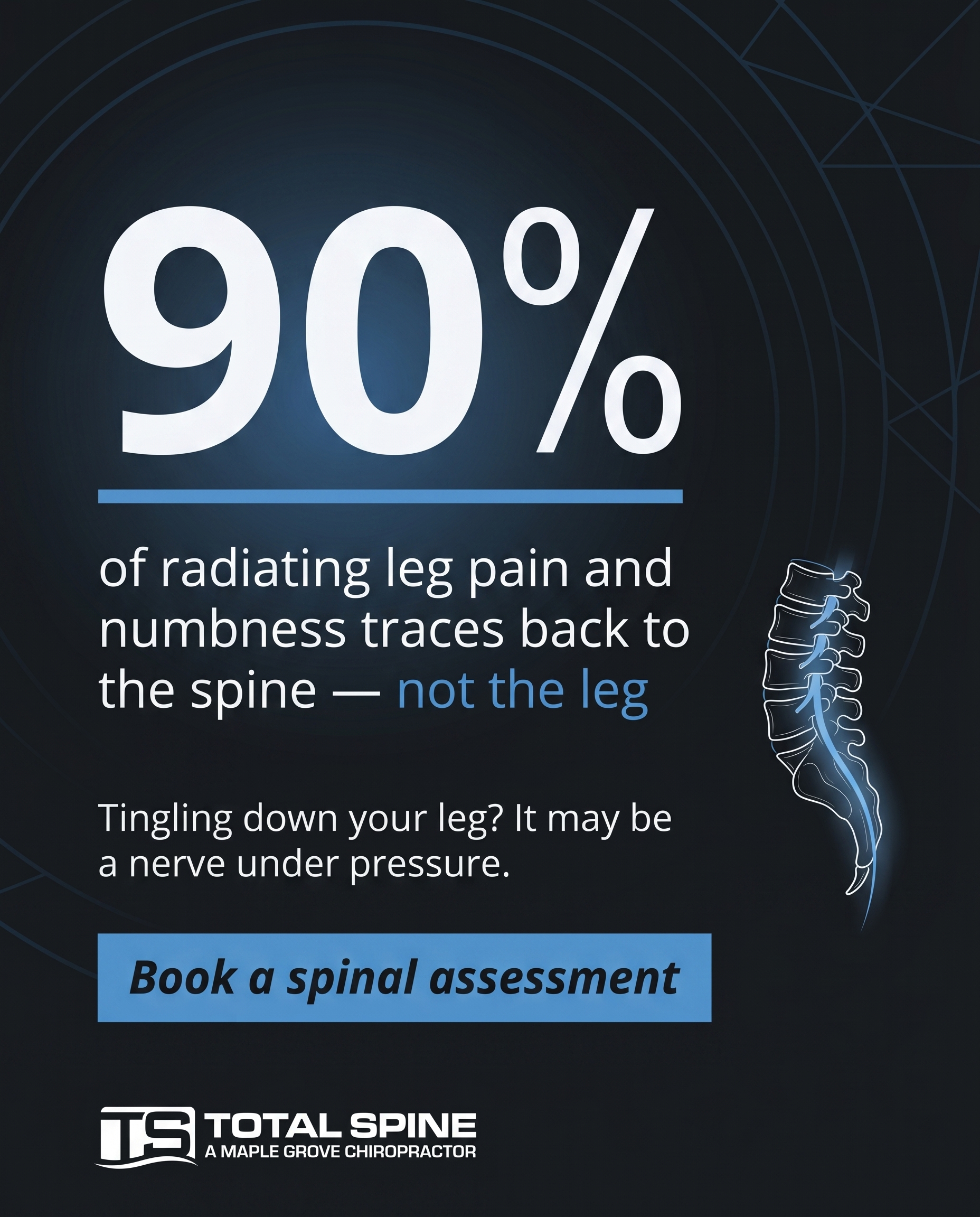
A stat-card built around a striking number on how often radiating leg pain and numbness are driven by nerve compression in the spine rather than a problem in the leg itself. The angle: a reader feeling tingling or numbness down the leg sees the figure and recognises this is a real, identifiable issue worth assessing — not something to wait out.
Content: A stat-card built around a striking number on how often radiating leg pain and numbness are driven by nerve compression in the spine rather than a problem in the leg itself. The angle: a reader feeling tingling or numbness down the leg sees the figure and recognises this is a real, identifiable issue worth assessing — not something to wait out.
Style: stat-card
9.
L1S9A1
checklist
Unaware
A checklist that quietly surfaces the everyday accommodations of someone pushing through chronic pain — bracing to stand up, planning the day around the back, treating discomfort as normal. The angle is recognition at the unaware level: it never mentions discs or treatment, it just makes the reader realise how much they've reorganised life around pain they've stopped questioning.
Content: A checklist that quietly surfaces the everyday accommodations of someone pushing through chronic pain — bracing to stand up, planning the day around the back, treating discomfort as normal. The angle is recognition at the unaware level: it never mentions discs or treatment, it just makes the reader realise how much they've reorganised life around pain they've stopped questioning.
Style: checklist
10.
C3S3
illustrative-3D
A 3D illustrative clinic post built on recognition for adults living with disc-driven back, neck, or radiating nerve pain — the people who come here because they want the root cause addressed, not patched. The angle is belonging: a cool, minimal, function-focused space for those done cycling through treatments that never quite hold.
Content: A 3D illustrative clinic post built on recognition for adults living with disc-driven back, neck, or radiating nerve pain — the people who come here because they want the root cause addressed, not patched. The angle is belonging: a cool, minimal, function-focused space for those done cycling through treatments that never quite hold.
Style: illustrative-3D
3
Developed Posts
10 posts · 2026-06-08T12:13
10 developed
▼
1.
T2S1A2
Rough Image Prompt
Editorial wellness photography communicating the lived reality of sciatica — radiating nerve pain travelling from the lower back through the hip and down the leg. Depict a human subject shown from behind or from the side with no face visible (cropped at the neck, or focusing on the lower back, hip, and upper leg only) — a hand resting against the lower back or the back of the thigh in a quiet moment of discomfort, suggesting the burning line of pain that runs down the leg. Generic neutral setting — a calm home moment, soft and minimal, no clinical or treatment environment, no equipment. Cool, minimalistic, luxury feel — high-quality, considered composition with soft natural lighting and a calm, restrained atmosphere. Subtle cool blue tonal accent integrated naturally (fabric, light, or a soft directional glow tracing the path of the pain down the leg). Brand palette to draw from: #5B9BD5 cool blue, #2E6DA4 deeper blue, #F4F6F8 cool off-white, #14191C near-black, #FFFFFF white. Typography rendered in Open Sans for headline and supporting text, Open Sans italic for the CTA. Text to render: headline 'This isn't just a sore back.', supporting text 'That burning line down your hip and leg is nerve compression — and it has a name.', CTA 'Take sciatica seriously.' Logo placement varies by composition and is finalised downstream. Keep the overall mood elevated, clean, and intentional — a credible, premium health brand image.
Text Overlay
Caption
You know the feeling. The burning line that runs from your lower back, through your hip, and down your leg. The numbness that creeps in when you sit too long. The ache that no amount of shifting in your chair seems to settle.
Here's what we want you to hear: this isn't just a sore back. Sciatica is nerve compression — a real, identifiable problem with a real cause. Often it traces back to a disc pressing on the nerve, and pushing through it rarely makes it quieter. It usually makes it louder.
Naming what you feel is the first step. Once you know it's the nerve and not just the muscle, the path forward changes. Spinal decompression on the Hill DT table is designed to take pressure off that nerve at the source — not just chase the symptom.
If this sounds like your day-to-day, you're not imagining it. Let's get to the root of it. 🩵
📞 (763) 568-7869
🌐 https://totalspinemn.com
✉️ info@totalspinemn.com
Does that radiating pain sound familiar? Tell us where yours travels.
Hashtags
#SciaticaRelief #SpinalDecompression #MapleGroveMN #NerveCompression #ChronicPainRelief
2.
T5S2A3
Rough Image Prompt
A clean, luxury graphic-design explainer communicating the mechanism of spinal decompression therapy for a disc protrusion. The concept: gentle, controlled traction creates negative pressure that takes load off a bulging disc and relieves the compressed nerve — addressing the root, not masking pain. Visual register is typographic-led with a small supporting anatomical illustration as an accent element: a clean, translucent glass-like 3D render of two lumbar vertebrae with an intervertebral disc between them, the disc shown bulging and pressing against a nerve root, with a subtle cool-blue glow indicating decompression/relief and a soft directional cue suggesting gentle traction pulling the vertebrae apart to create space. The anatomical illustration is small and supporting, not full-frame. Mood is cool, minimalistic, high-quality, luxury — generous negative space, premium feel. Brand colours to draw from: #5B9BD5 cool blue, #2E6DA4 deeper blue, #F4F6F8 cool off-white, #14191C near-black, #FFFFFF white. Typography uses Open Sans for the headline, Open Sans for supporting text, and Open Sans italic for the CTA. Text to render: headline 'What spinal decompression actually does', supporting text 'Gentle, controlled traction creates negative pressure — taking load off the disc and the compressed nerve.', and CTA 'Address the root, not the pain'. Logo placement should vary by composition and is finalised downstream. Show clean editorial styling, intentional negative space, and a polished modern medical-design aesthetic.
Text Overlay
Caption
If you already know you have a disc protrusion, here's what decompression therapy is actually doing — not masking the pain, working on the cause. 🩵
The Hill DT table applies gentle, controlled traction to the spine. That traction creates negative pressure inside the disc. The result: load comes off the bulging disc, and the nerve that's been compressed gets room to breathe.
No guessing. No cycling through treatments that only quiet the symptoms for a few days. This targets the mechanical problem at the root — the pressure on the disc and the nerve it's pressing on.
That's the difference between managing pain and addressing why it's there in the first place.
Dealing with a disc issue, sciatica, or radiating leg pain that hasn't resolved? Send us a message — we'll talk through whether decompression is the right path for your spine.
📞 (763) 568-7869
🌐 https://totalspinemn.com
✉️ info@totalspinemn.com
What's one question you have about decompression? Drop it below.
Hashtags
#SpinalDecompression #DiscPain #MapleGroveMN #ChronicBackPain #RootCauseCare
3.
T8S3A1
Rough Image Prompt
A high-quality, luxury-feeling 3D anatomical illustration with a cool, minimalistic aesthetic. Subject: the cervical spine and shoulder region shown together, rendered in a clean translucent / glass-like style, anatomically accurate. The concept communicates that stubborn shoulder ache can trace back to the neck and the nerve pathways of the cervical spine. Show the shoulder joint as one focal point and trace a subtle nerve pathway running from the cervical spine outward toward the shoulder, indicating the link between the two. Use a cool blue glow (#5B9BD5) along the nerve pathway leaving the cervical spine to signal the source, with a softer secondary glow at the shoulder joint to show the felt symptom. The visual should read as illustrative and editorial, not documentary — isolated anatomy on a clean neutral or subtle gradient background drawn from the brand palette, no clinic context. Brand colours available (use exactly these hex values): #5B9BD5 cool blue, #2E6DA4 deeper blue, #F4F6F8 cool off-white, #14191C near-black, #FFFFFF white. Typography: Open Sans for headline, Open Sans for supporting text, Open Sans italic for CTA. Text to render: headline 'What if it's not your shoulder?', supporting text 'Stubborn shoulder pain can start in the neck.', CTA 'Worth a closer look.' Keep typography clean, minimal, and well-spaced for a premium feel. Logo placement varies by composition and is finalised downstream. Composition, framing, crop, and exact placement of all elements are decided at the refinement stage.
Text Overlay
Caption
You've been calling it a shoulder problem for months. But what if you've been looking at the wrong joint?
Chronic shoulder ache that won't settle, no matter how you rest it or stretch it, doesn't always start where you feel it. Nerve pathways travel from the cervical spine out toward the shoulder. When a disc or nerve in the neck is irritated, the pain can show up further down the line, in a joint that feels like the obvious culprit.
That's why some shoulder pain keeps coming back after treatment aimed only at the shoulder. The source was never there.
If yours has lasted longer than it should, it may be worth tracing it back to the spine before writing it off as just the shoulder.
📞 (763) 568-7869
🌐 https://totalspinemn.com
✉️ info@totalspinemn.com
Had shoulder pain that never quite resolved? Tell us where you'd been looking first.
Hashtags
#ShoulderPain #ChronicPain #SpinalHealth #MapleGroveMN #NervePain
4.
L5S4A4
Rough Image Prompt
A comparison-card graphic contrasting two distinct paths for someone with disc-driven pain who already knows their options. Two genuinely different paths shown with equal visual weight: one path labelled 'DELAY' representing accumulating pressure on the disc over time, the other labelled 'STRUCTURED PLAN' representing a targeted decompression-and-rehab approach that addresses the root cause now. Typographic-led design with cool, minimalistic, luxury feeling. Use a small supporting anatomical illustration of a lumbar spinal disc and vertebrae as an accent element — one rendered with subtle red glow indicating compression and accumulated pressure for the DELAY side, one rendered clean with a cool blue accent indicating relief and targeted care for the STRUCTURED PLAN side. Keep anatomical accents small and supporting, not full-frame. Brand palette to draw from: #5B9BD5 cool blue, #2E6DA4 deeper blue, #F4F6F8 cool off-white, #14191C near-black with faint cool-blue undertone, #FFFFFF white. Typography: Open Sans for all text elements, Open Sans italic for the CTA. Text content to render: side label 'DELAY', under it 'Pressure on the disc keeps building — months become years of damage'; side label 'STRUCTURED PLAN', under it 'Decompression and core rehab targeting the root cause now'; headline 'You know your options. The difference is the path.'; CTA 'Book an imaging-led assessment'. High quality, clean editorial finish, generous negative space, sharp typographic hierarchy. Logo placement should vary by composition and is finalised downstream.
Text Overlay
Caption
If you already know your options, the question isn't what to do. It's how long you let the pressure build before you act. 🩵
The waiting path looks harmless. A bad week here, a flare-up there, another round of the same temporary fixes. But disc pressure doesn't pause while you decide. Left alone, months quietly turn into years of accumulated damage.
The structured path is different. We start with imaging so we can see what's actually happening, then build a plan around spinal decompression on the Hill DT table and targeted core rehab. The goal isn't to chase the symptom appointment to appointment. It's to take the pressure off the disc and address the root.
That's the difference between managing pain and resolving the cause of it.
If you've been delaying, this is your nudge to find out what your spine actually needs.
📞 (763) 568-7869
🌐 https://totalspinemn.com
✉️ info@totalspinemn.com
Which path have you been on?
Hashtags
#SpinalDecompression #MapleGroveChiropractor #DiscPain #ChronicBackPain #RootCauseCare
5.
T4S5A2
Rough Image Prompt
A typographic-led Q&A card for a chiropractic clinic specialising in spinal decompression and auto-accident injury care. Cool, minimalistic, luxury feeling with high-quality finish. The card presents a clear question-and-answer hierarchy about delayed-onset whiplash. Components: a question element reading 'My crash was months ago — why does my neck hurt NOW?' and an answer element reading 'Delayed-onset whiplash is real. Inflammation and tissue strain can surface weeks or months after impact — long after you 'felt fine.'' Include a small supporting CTA element reading 'Worth getting assessed.' Use a subtle anatomical accent: a clean, editorial illustration of the cervical spine (neck vertebrae) rendered in a translucent, glass-like style with a soft cool-blue glow highlighting the upper cervical region to suggest hidden strain — small and supporting, not full-frame. Brand colour palette to draw from: #5B9BD5 cool blue, #2E6DA4 deeper blue, #F4F6F8 cool off-white, #14191C near-black cool charcoal, #FFFFFF white. Typography: Open Sans for the question headline, Open Sans for the answer supporting text, Open Sans italic for the CTA. Render all text crisply and accurately. Subtle gradient background in brand cool blues and off-white. Logo placement should vary by composition and is finalised downstream. The post should look intentional, premium, and clinical-clean — typographic in character with a small anatomical accent.
Text Overlay
Caption
Here's a question we hear quietly, all the time: my accident was months ago and I felt fine at first — so why is my neck stiff now?
It's not in your head. Delayed-onset whiplash is genuinely common. After a collision, soft tissue strain, inflammation, and small disc changes don't always announce themselves on day one. Sometimes the stiffness, the headaches, the tightness that won't shift — they surface weeks or even months later, once the adrenaline and the initial 'I'm okay' have worn off.
The instinct is to write it off as unrelated. Old crash, new ache, no connection. But that delay is exactly why so much post-accident pain becomes chronic — it gets ignored until it's years of accumulated damage instead of a problem worth assessing now.
If neck pain, stiffness, or headaches have crept in since a past accident, it's worth getting properly looked at. Earlier is always easier.
📞 (763) 568-7869
🌐 https://totalspinemn.com
✉️ info@totalspinemn.com
Felt fine at first, then not so much? Tell us what surfaced. 🩵
Hashtags
#WhiplashRecovery #AutoAccidentInjury #MapleGroveMN #NeckPainRelief #SpinalHealth
6.
T6S6A3
Rough Image Prompt
A myth-buster graphic correcting the belief that self-cracking the neck or a single adjustment resolves persistent neck pain and stiffness. Typographic-led composition with bold contrast between a MYTH statement and a TRUTH statement. Cool, minimalistic, luxury aesthetic — clean negative space, refined typography, high-end clinical polish. Include a small supporting accent element: a translucent, glass-like 3D anatomical illustration of the cervical spine (neck vertebrae) with a subtle cool blue glow highlighting the joint and nerve compression area — small and supporting, not full-frame. Components: MYTH label, single myth statement, TRUTH label, single truth statement, and a CTA. Brand colour palette to draw from: #5B9BD5 (cool blue), #2E6DA4 (deeper blue), #F4F6F8 (cool off-white), #14191C (near-black), #FFFFFF (white). Typography: Open Sans for the MYTH and TRUTH labels, Open Sans for the myth and truth statements, Open Sans italic for the CTA. Text to render exactly: MYTH label 'MYTH', myth statement 'Cracking your own neck fixes the stiffness.', TRUTH label 'TRUTH', truth statement 'Self-cracking gives seconds of relief — it never addresses what's compressing the joints and nerves.', CTA 'Get to the root, not the crack.'. Logo placement should vary by composition and is finalised downstream. Keep the design refined, intentional, and editorial — typography leads, the cervical spine render supports.
Text Overlay
Caption
That satisfying crack? It's seconds of relief, not a fix.
When your neck feels stiff, self-cracking can feel like it's doing something. But it's not touching the actual problem — the pressure on the joints and nerves that keeps the stiffness coming back. So you crack again. And again. And the cycle never ends.
Lasting relief works differently. It comes from addressing what's compressing those structures — through targeted manual therapy, traction to take the load off the joints, and core-supporting rehab that holds the progress in place. That's how stiffness stops returning instead of just resetting for an hour.
If you're tired of chasing temporary relief and ready to deal with the root, the team at Total Spine can map out what's actually driving your neck pain.
📞 (763) 568-7869
🌐 https://totalspinemn.com
✉️ info@totalspinemn.com
Still cracking your neck out of habit? Tell us — when did the relief stop lasting?
Hashtags
#NeckPainRelief #Chiropractic #MapleGroveMN #SpinalDecompression #RootCauseCare
7.
T3S7A3
Rough Image Prompt
A typographic-led list-tips graphic for a chronic back pain root-cause plan, cool and minimalistic with a luxury feel. The post communicates that real, lasting relief comes from a structured plan, not a single quick trick. Header introduces the list, followed by four short numbered items each paired with a clean custom illustrated icon: an imaging/x-ray scan icon, a spinal decompression icon (stylised stretched spine with directional arrows showing gentle separation), a core rehab icon (simple abstract figure or torso showing core engagement, no face), and a consistency/calendar-cycle icon. Icons are simple line-and-fill style in brand blues on a clean off-white surface. Optional small supporting anatomical accent of a spinal disc with subtle nerve indication, kept minor and supporting, not full-frame. Use exact brand colours: cool blue #5B9BD5, deeper blue #2E6DA4, cool off-white #F4F6F8, near-black #14191C, white #FFFFFF. Typography in Open Sans for the header, Open Sans for item titles and supporting lines, Open Sans italic for the CTA. Header text: 'What Actually Fixes Chronic Back Pain'. Item 1 title: 'Get It Imaged' with line 'See the disc and nerve pressure, not just the symptom'. Item 2 title: 'Decompress The Disc' with line 'Targeted traction to ease pressure off the nerve'. Item 3 title: 'Rebuild Your Core' with line 'Dead bugs and bird dogs between visits'. Item 4 title: 'Stay Consistent' with line 'Root-cause change happens over weeks, not one visit'. CTA text: 'Ready for a real plan? Book an assessment'. Logo placement varies by composition and is finalised downstream. Keep the design intentional, high-quality, and minimal with generous space around each element.
Text Overlay
Caption
There's no single trick that fixes chronic back pain. If the disc and nerve pressure are driving it, you need a plan that actually addresses the root, not another temporary patch. 🩵
Here's what a real plan looks like:
1. Get it imaged. You can't fix what you haven't seen. X-ray and assessment show whether disc pressure or nerve compression is the real problem.
2. Decompress the disc. Structured spinal decompression eases pressure off the nerve, instead of chasing the pain around.
3. Rebuild your core. Dead bugs and bird dogs between visits give your spine the support it needs to hold the progress.
4. Stay consistent. Years of accumulated pressure don't undo in one appointment. Real change happens over weeks of structured care.
If you've cycled through treatments without lasting relief, the issue might be that nobody addressed the disc. Let's change that.
📞 (763) 568-7869
🌐 https://totalspinemn.com
✉️ info@totalspinemn.com
Which step have you been skipping?
Hashtags
#ChronicBackPain #SpinalDecompression #MapleGroveMN #DiscPain #BackPainRelief
8.
T11S8A2
Rough Image Prompt
A typographic-led stat-card communicating that radiating leg pain and numbness most often originate from nerve compression in the spine, not from a problem in the leg itself. The composition is dominated by one striking statistic as the visual anchor: '90%'. Supporting context reframes the source of the symptom toward the spine. Cool, minimalistic, luxury aesthetic — clean typographic field with generous negative space, premium and considered. Include a small supporting anatomical accent: a stylised, anatomically accurate illustration of the lower lumbar spine with a nerve root highlighted by a subtle cool-blue glow tracing downward to suggest radiating leg pain — illustrative, isolated, not full-frame, supporting the typography rather than competing with it. Brand colours to draw from: cool blue #5B9BD5, deeper blue #2E6DA4, cool off-white #F4F6F8, near-black #14191C, white #FFFFFF. Typography: Open Sans for the statistic and headline, Open Sans for supporting text, Open Sans italic for the CTA. Text content to render: '90%', 'of radiating leg pain and numbness traces back to the spine — not the leg', 'Tingling down your leg? It may be a nerve under pressure.', 'Book a spinal assessment'. Logo placement varies by composition and is finalised downstream. Crisp letterforms, intentional and credible high-end clinical design.
Text Overlay
Caption
That tingling, numbness, or shooting pain down your leg? It often has nothing to do with the leg at all.
Most radiating leg symptoms trace back to a nerve under pressure in the spine — a disc pressing where it shouldn't, compressing the nerve root that runs down the leg. The leg is where you feel it. The spine is where it starts.
This matters, because waiting it out rarely works when the root cause is structural. The longer the nerve stays compressed, the more that discomfort can settle into years of accumulated damage.
The good news: it's identifiable. A proper assessment — imaging included — can show exactly what's pressing on the nerve and why. From there, decompression therapy and targeted care address the source, not just the symptom.
If you've been brushing off numbness or radiating pain down one leg, it's worth getting it looked at.
📞 (763) 568-7869
🌐 https://totalspinemn.com
✉️ info@totalspinemn.com
Feeling it down one leg? Tell us where it travels. 🩵
Hashtags
#Sciatica #SpinalDecompression #MapleGroveMN #NerveCompression #BackPainRelief
9.
L1S9A1
Rough Image Prompt
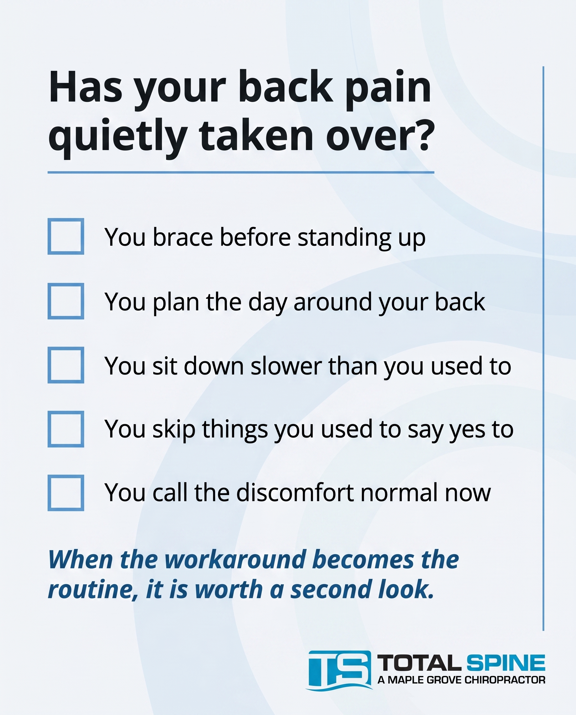
A clean, typographic-led checklist post for a function-focused chiropractic and spinal decompression clinic. Cool, minimalistic, luxury feeling — high quality, restrained, premium. The post quietly surfaces the everyday accommodations of someone who has reorganised life around chronic pain without realising it. Typographic in character with checkbox graphics. Components: a framing line at the top, five short checklist items each paired with a clean checkbox graphic, and a soft CTA. Optional subtle accent: a small, minimal symbolic line element or abstract cool-blue accent shape — NOT full-frame photography, NOT a clinic interior, NOT a practitioner. Brand palette to draw from (use exact hex values): #5B9BD5 cool blue, #2E6DA4 deeper blue, #F4F6F8 cool off-white, #14191C near-black with faint cool-blue undertone, #FFFFFF white. Typography: Open Sans for the framing line and headline, Open Sans for the checklist items and supporting lines, Open Sans italic for the CTA. Text content to render — framing line: 'How much have you reorganised around it?'. Checklist items: 'You brace before standing up', 'You plan the day around your back', 'You sit down slower than you used to', 'You skip things you used to say yes to', 'You call the discomfort normal now'. CTA: 'When the workaround becomes the routine, it is worth a second look.'. Checkbox graphics should be clean, minimal, and consistent — empty checkboxes in cool blue. Keep the composition spacious, premium, and uncluttered. Logo placement should vary by composition and is finalised downstream.
Text Overlay
Caption
It rarely shows up as one bad day. It shows up as a hundred small adjustments you stopped noticing.
You brace before you stand. You plan errands around how your back will feel. You sit down a little slower. You pass on things you used to say yes to. And somewhere along the way, you started calling it normal.
None of that is normal. It is accommodation — your body quietly rerouting your life around discomfort it has been carrying for a long time. The longer it goes unquestioned, the more it becomes the default.
If a few of these felt familiar, that is worth paying attention to. Not because something is wrong with you, but because pain you have stopped questioning is still pain worth understanding.
We work with chronic back, neck, and nerve pain in Maple Grove every day — and the first step is simply noticing how much you have already adjusted.
📞 (763) 568-7869
🌐 https://totalspinemn.com
✉️ info@totalspinemn.com
How many of these sounded like you?
Hashtags
#ChronicPainRelief #MapleGroveMN #SpinalDecompression #BackPainSupport
10.
C3S3
Rough Image Prompt
An illustrative-3D anatomical render of a lumbar spinal segment, focused on a single intervertebral disc shown in cross-section between two vertebrae, with the nerve root exiting the spine highlighted to communicate disc-driven pain that radiates. Render the spine in a translucent, glass-like, clinical-polish style with the affected disc and nerve pathway picked out using a cool blue glow accent (#5B9BD5) to draw the eye to the root cause rather than the symptom. Anatomically accurate, isolated on a clean cool off-white or deep charcoal field — no environmental context, no clinic setting, no people. The mood is cool, minimal, luxury, function-focused. Components: the anatomical spine render as the visual anchor, a glow indicator on the disc and exiting nerve, and clean typographic text. Typography in Open Sans for all text, Open Sans italic for the CTA. Text to render: headline 'For people done patching the problem', supporting line 'Disc-driven back, neck and nerve pain has a root cause. We address it.', CTA 'Start with a real answer'. Brand colour palette available: #5B9BD5 cool blue, #2E6DA4 deeper blue, #F4F6F8 cool off-white, #14191C near-black, #FFFFFF white. Logo placement varies by composition and is finalised downstream. The overall look should read as intentional, high-quality, and minimal — anatomical render plus typography only.
Text Overlay
Caption
If you've cycled through treatments that helped for a week and then faded, this is for you.
The people who come here aren't looking to be patched. They're done masking disc-driven back pain, neck stiffness, and nerve pain that radiates down a leg or arm. They want the actual source addressed — the disc, the pressure, the compressed nerve — not another temporary fix.
That's the work we do. Spinal decompression on the Hill DT table, Class IV laser, structured imaging and assessment, and a plan built around your spine, not a generic protocol.
No wellness fluff. No endless cycle. Just a focused, function-first approach for adults who want a real answer. 🩵
If you've been pushing through chronic pain for years, it's worth knowing what's actually driving it.
📞 (763) 568-7869
🌐 https://totalspinemn.com
✉️ info@totalspinemn.com
Ready to address the root cause? Send us a message.
Hashtags
#SpinalDecompression #MapleGroveChiropractor #DiscPain #SciaticaRelief #RootCauseCare
4
Refined Image Prompts
10 prompts · 2026-06-08T12:13
10 prompts refined
▼
1.
T2S1A2
Refined Image Prompt
Editorial wellness photograph communicating the lived reality of sciatica — radiating nerve pain travelling from the lower back through the hip and down the leg. A human subject shown from the side, cropped at the neck so no face is visible, framing the lower back, hip, and upper thigh as the focal region. One hand rests gently against the lower back in a quiet, restrained moment of discomfort, suggesting the burning line of pain that runs down the leg. The subject wears soft, simple, neutral-toned clothing — pale cool-grey loungewear that reads as understated and premium. The setting is a calm, minimal home interior, soft and quiet, with no clinical environment, no medical equipment, and no treatment context — a generic, elevated domestic space with smooth uncluttered surfaces and clean negative space.
Soft natural directional lighting falls from the left, gentle and diffused, modelling the form of the lower back and hip with quiet contrast and a restrained, intentional atmosphere. A subtle cool blue tonal accent in #5B9BD5 is integrated naturally as a soft directional glow tracing the implied path of nerve pain down the hip and outer thigh, low in intensity so it reads as atmospheric rather than graphic. The overall colour world is cool, minimalist, and luxurious — built from #F4F6F8 cool off-white tones in the environment, with #14191C near-black holding the deepest shadows.
Composition is vertical and considered, with the subject positioned slightly off-centre toward the right, leaving clean open space on the upper left and lower portion for typography. The mood is elevated, calm, clinical-luxury — credible and premium, never warm, soft-focus, or sentimental, and free of any wellness-family or kids framing.
In the upper-left open space, a solid block in #5B9BD5 cool blue with sharp 0-2px corners sits as a small accent marker above the headline. Below it, the headline reads "This isn't just a sore back." in Open Sans, in #14191C near-black, set large and clean across two lines. Directly beneath the headline, a thin horizontal underline rule in #5B9BD5 sits flush left, short and precise. Below the underline, the supporting text reads "That burning line down your hip and leg is nerve compression — and it has a name." in Open Sans, in #14191C near-black at a smaller, comfortable reading size with generous line spacing.
In the lower-left area, the CTA reads "Take sciatica seriously." in Open Sans italic, in #2E6DA4 deeper blue, set apart with clean breathing room.
Place the provided logo file in the bottom-right corner at a modest, balanced scale, preserving its exact original colours, proportions, lettering, and detail without recolouring, redrawing, distorting, or regenerating it in any way — reproduce the logo precisely as supplied.
Maintain a calm, restrained, premium register throughout. Keep all rectangular elements — accent blocks and any containers — with sharp 0-2px corners. Keep generous negative space, crisp typography, and a cohesive cool blue and off-white palette. Keep the human subject faceless and the environment free of clinical equipment, warm domestic clutter, and any family or child presence.
2.
T5S2A3
Refined Image Prompt
A premium editorial explainer graphic communicating the mechanism of spinal decompression therapy, rendered in a cool minimalist clinical-luxury aesthetic with generous negative space and a polished modern medical-design feel.
Background surface in cool off-white #F4F6F8, clean and uninterrupted, occupying the majority of the frame. The composition is typographic-led with a small supporting anatomical illustration as an accent element, balanced asymmetrically.
In the lower-right region, positioned as a small supporting accent rather than a full-frame subject, a refined translucent glass-like 3D render of two lumbar vertebrae with an intervertebral disc between them. The disc is shown subtly bulging and pressing against a slender nerve root. A soft cool-blue glow in #5B9BD5 surrounds the disc and nerve area to signal decompression and relief. A subtle directional cue — fine upward and downward arrows or a faint elongation gradient along the vertebrae axis — suggests gentle traction pulling the vertebrae apart to create space. The render is crisp, premium, with soft studio lighting, delicate edge highlights, and clean shadows, occupying roughly one third of the frame and surrounded by ample empty space.
Text layout anchored in the upper-left to center region with intentional negative space:
Headline in Open Sans, near-black #14191C, large and confident, set in two or three lines reading "What spinal decompression actually does". Directly beneath the headline, a thin solid underline accent block in cool blue #5B9BD5, short and precise, drawing attention.
Below the headline, supporting text in Open Sans, near-black #14191C at a calm readable size with comfortable line spacing, reading "Gentle, controlled traction creates negative pressure — taking load off the disc and the compressed nerve."
The CTA set apart lower in the composition, in Open Sans italic, white #FFFFFF, placed inside a solid rectangular block of deeper blue #2E6DA4 with sharp 0 to 2px corners, reading "Address the root, not the pain".
All rectangular surfaces — the CTA block, any callout containers, image framing — use sharp corners of 0 to 2px. Accent treatment is limited to solid colour blocks and thin underlines only, keeping the design restrained and clinical-luxury.
Lighting is even, cool, and soft throughout, evoking a high-end medical brand. The colour palette stays strictly within #5B9BD5 cool blue, #2E6DA4 deeper blue, #F4F6F8 cool off-white, #14191C near-black, and #FFFFFF white.
Place the attached logo small and discreet in the top-left corner, scaled modestly with clear surrounding space. Preserve the logo exactly as supplied — do not redraw, recolour, distort, or alter its proportions, lettering, or marks in any way.
Constraints: keep the framing strictly function-focused and clinical; no wellness, family, or children imagery; no playful or soft-lifestyle styling; maintain the cool, minimalistic, luxury register with abundant negative space; render all text crisply and legibly with correct spelling.
3.
T8S3A1
Refined Image Prompt
A high-quality 3D anatomical illustration with a cool, minimalistic clinical-luxury aesthetic, rendered in an editorial rather than documentary style. The composition is set against a deep charcoal surface in #14191C with a subtle, barely-there gradient deepening toward the lower edges to give the scene quiet depth and a premium register.
The subject is the cervical spine and shoulder joint shown together, anatomically accurate, rendered in a clean translucent glass-like material with soft internal refraction and gentle specular highlights. The anatomy floats isolated in the frame with no clinical environment, no surgical context, and no surrounding objects. Position the cervical spine on the upper-left and the shoulder joint lower-right, occupying roughly the central two-thirds of the composition and angled three-quarter toward the viewer so both regions read clearly.
Trace a single subtle nerve pathway leaving the cervical spine and arcing outward toward the shoulder joint, drawn as a fine luminous filament. Render a cool blue glow in #5B9BD5 concentrated and brightest where the nerve exits the cervical spine, signalling the source, and let the glow soften and fade as it travels toward the shoulder, where a gentler, more diffuse secondary glow in #5B9BD5 rests over the shoulder joint to indicate the felt symptom. Use #2E6DA4 as a deeper supporting tone within the translucent anatomy shadows and refractions for depth. Keep all glow soft and controlled, never neon, in keeping with the restrained luxury mood.
Lighting is cool, soft, and directional from upper-left, producing clean edge definition on the glass anatomy and gentle falloff into the dark surface. The overall mood is calm, precise, and quietly premium.
Text is set in clean, generously-spaced layout in the right portion and lower area of the frame, never overlapping the brightest anatomy. Render the headline "What if it's not your shoulder?" in Open Sans, in #FFFFFF, positioned in the upper-right, large and clear. Directly beneath the headline place a short thin solid underline accent in #5B9BD5, no more than 2px corner radius, sized to roughly two-thirds the width of the headline. Render the supporting text "Stubborn shoulder pain can start in the neck." in Open Sans, in #F4F6F8, smaller, placed just below the underline with comfortable line spacing. Place the CTA "Worth a closer look." in Open Sans italic, in #5B9BD5, positioned in the lower-right, set apart from the supporting text.
All rectangular elements, including any text containers or accent blocks, use sharp 0 to 2px corners. The single solid underline beneath the headline is the primary attention-drawer; the CTA colour treatment is the supporting accent.
Place the provided logo file in the bottom-left corner at a modest, restrained scale, with clear margin from the frame edges. Render the logo exactly as supplied without recolouring, redrawing, distorting, or altering its proportions or details. Preserve the logo precisely as the attached file.
Constraints: keep the composition cool, minimal, and luxury in feel. Maintain isolated anatomy on a clean dark background. Keep all glow soft and editorial. Avoid any wellness, family, or children framing. Avoid any clinic-room scenery, equipment, or documentary medical context. Keep negative space generous and typography clean and well-spaced.
4.
L5S4A4
Refined Image Prompt
A premium editorial comparison-card graphic with a cool, minimalist clinical-luxury feeling, built around a precise vertical split contrasting two paths for someone with disc-driven pain. The composition divides the frame into two equal-weight vertical panels separated by a thin 2px vertical line in cool blue #5B9BD5 running floor to ceiling through the centre.
Left panel surface in deep charcoal #14191C with a faint cool-blue undertone. Right panel surface in cool off-white #F4F6F8. The contrast between the two surfaces carries the visual tension between the two paths while keeping both panels equally prominent and balanced. Generous negative space within each panel, uncluttered and breathing.
Across the very top of the full frame, spanning both panels, the headline in Open Sans, set large with a confident typographic hierarchy: "You know your options. The difference is the path." On the left half of the headline (over the charcoal panel) the type is rendered in white #FFFFFF; where it crosses onto the right panel it is rendered in near-black #14191C, the colour switching cleanly at the centre divider so the words remain readable across both surfaces. A short thin underline accent in cool blue #5B9BD5, roughly 2px, sits beneath the word "path." to anchor the headline.
Left panel — the DELAY path. Upper area shows a small supporting anatomical illustration of a lumbar spinal disc nested between two vertebrae, rendered in a clean line-and-form medical style, kept compact and supporting at roughly one quarter of the panel height, never full-frame. The disc carries a subtle soft red glow concentrated at the compression point, indicating accumulated pressure and building strain, set against the dark surface so the glow reads quietly rather than alarmingly. Below the illustration, a solid block label in cool blue #5B9BD5 with sharp 0-2px corners containing the word "DELAY" in Open Sans, white #FFFFFF text. Beneath the label, supporting body text in Open Sans, white #FFFFFF, set smaller: "Pressure on the disc keeps building — months become years of damage".
Right panel — the STRUCTURED PLAN path. Upper area mirrors the left with the same small lumbar disc and vertebrae illustration in the same compact scale and position, but rendered clean and uncompressed with a calm cool blue #5B9BD5 accent highlight indicating relief and targeted care. Below it, a solid block label in deeper blue #2E6DA4 with sharp 0-2px corners containing "STRUCTURED PLAN" in Open Sans, white #FFFFFF text. Beneath the label, supporting body text in Open Sans, near-black #14191C: "Decompression and core rehab targeting the root cause now".
Centred along the bottom of the full frame, spanning the divider, a CTA in Open Sans italic reading "Book an imaging-led assessment" in cool blue #5B9BD5, with a thin 2px cool blue underline directly beneath it as the secondary accent.
Place the attached logo in the bottom right corner over the off-white panel at a modest, restrained scale with clear surrounding margin. Render the supplied logo exactly as provided, preserving its proportions, colours, and detail without redrawing, distorting, or restyling it.
Lighting is even, clean, and editorial with soft gradients only where the anatomical glows appear. Sharp typographic hierarchy throughout, all rectangular elements — labels, blocks, frames — using sharp 0-2px corners. High quality, luxury finish, cool minimalist clinical register, balanced symmetry, generous negative space.
Constraints: keep the framing function-focused and clinical; no wellness, family, or children imagery; no warm or pastel colours; keep anatomical illustrations small and supporting, not dominant; maintain equal visual weight between the two panels; render all text exactly as quoted with correct spelling; use only the specified hex colours.
5.
T4S5A2
Refined Image Prompt
A typographic-led Q&A card for a function-focused spine clinic specialising in spinal decompression and auto-accident injury care, embodying a cool minimalist clinical-luxury register. Premium, intentional, and clinically clean with a high-quality finish.
Background is a deep charcoal surface in #14191C with a subtle, smooth diagonal gradient fading toward a hint of deeper blue #2E6DA4 in the lower-right corner — restrained and luxurious, never busy. The composition uses generous negative space to convey calm confidence.
Layout follows a clear vertical question-and-answer hierarchy, left-aligned within a comfortable margin. In the upper-left, a small solid block accent of cool blue #5B9BD5 with sharp 0-2px corners sits as a label marker. Below it, the question headline reads "My crash was months ago — why does my neck hurt NOW?" set in Open Sans in white #FFFFFF, large and commanding, occupying the upper-to-middle portion of the card. The word "NOW?" is emphasised with a thin underline accent in cool blue #5B9BD5 directly beneath it.
Beneath the headline, separated by clear vertical spacing, the answer supporting text reads "Delayed-onset whiplash is real. Inflammation and tissue strain can surface weeks or months after impact — long after you 'felt fine.'" set in Open Sans at a noticeably smaller size in cool off-white #F4F6F8, with relaxed line spacing for editorial readability.
Toward the lower portion of the card, a solid cool blue #5B9BD5 pill-free rectangular block with sharp 0-2px corners contains the CTA reading "Worth getting assessed." set in Open Sans italic in white #FFFFFF, compact and confident.
On the right side of the composition, occupying roughly the right third and vertically centred, place a small, supporting editorial illustration of the human cervical spine — the upper neck vertebrae rendered in a translucent, glass-like style with subtle refractive depth. A soft cool-blue #5B9BD5 glow highlights the upper cervical region to suggest hidden strain. The illustration is restrained and elegant, never full-frame, integrated against the dark background with a faint ambient bloom.
Lighting is soft, even, and cool-toned, evoking a controlled studio environment with gentle directional emphasis on the glass spine accent.
Place the provided logo file in the bottom-left corner at a small, balanced scale. Reproduce the logo exactly as supplied — preserve its original colours, proportions, lettering, and spacing without recolouring, redrawing, distorting, or regenerating any part of it.
Constraints: keep the design typographic in character with the anatomical illustration as a small supporting accent only. Maintain sharp 0-2px corners on every rectangular element including blocks and accents. Avoid any wellness, family, or children's framing — this is a function-focused clinical clinic. No stock-photo people, no clutter, no decorative flourishes beyond the specified accents. Render all text crisply, accurately, and legibly with correct spelling and punctuation. Keep the palette strictly to #5B9BD5, #2E6DA4, #F4F6F8, #14191C, and #FFFFFF.
6.
T6S6A3
Refined Image Prompt
A typographic-led myth-buster graphic for a clinical-luxury spine clinic, built on a vertical split composition that contrasts a myth with a truth. The upper two-thirds carries a deep charcoal surface in #14191C with a faint cool-blue undertone; the lower third transitions to a cool off-white surface in #F4F6F8, creating a clean horizontal divide that separates the myth zone from the truth zone. Generous negative space throughout, refined and editorial, with a high-end clinical polish.
In the upper charcoal zone, positioned top-left with comfortable margins, a small solid rectangular block in #5B9BD5 with sharp 0-2px corners holds the label "MYTH" in Open Sans, white #FFFFFF, compact and tracked slightly wider. Directly below it, the myth statement "Cracking your own neck fixes the stiffness." set in Open Sans, white #FFFFFF, large and confident, occupying the left and centre of the upper field with the right side kept open as breathing room.
In the lower off-white zone, mirrored to align with the left margin, a thin solid underline in #2E6DA4 sits beneath a label "TRUTH" rendered in Open Sans, near-black #14191C, matching the scale and tracking of the MYTH label. Below it the truth statement "Self-cracking gives seconds of relief — it never addresses what's compressing the joints and nerves." appears in Open Sans, near-black #14191C, set at a slightly smaller body scale than the myth line, with the word group reading as the considered, authoritative counterpoint.
Positioned in the right portion of the composition, bridging the charcoal and off-white zones near the divide, a small supporting 3D anatomical illustration of the cervical spine — the neck vertebrae — rendered as a translucent, glass-like form with refined edges and subtle internal refraction. A soft cool-blue glow in #5B9BD5 highlights one intervertebral joint and nerve compression area, drawing a quiet point of focus. The render is small and supporting, never full-frame, floating in negative space with delicate cast shadow, reading as a premium clinical object rather than a clinical diagram.
Spanning the bottom of the off-white zone, a slim full-width solid bar in #2E6DA4 with sharp 0-2px corners holds the CTA "Get to the root, not the crack." in Open Sans italic, white #FFFFFF, centred or left-aligned within the bar, reading as the resolving statement of the piece.
Place the provided logo small and discreet in the top-right corner of the charcoal zone, scaled modestly so it reads as a clean brand mark without competing with the typography. Render the attached logo exactly as supplied — preserve its proportions, colours, lettering, and spacing precisely, with no recolouring, redrawing, or distortion.
Lighting is even and softly directional, lending the glass cervical render a luxurious sheen while keeping the typographic surfaces flat, matte, and clean. Overall register: cool minimalist clinical-luxury, intentional and editorial — typography leads, the spine render supports.
Constraints: keep all rectangular elements — label blocks, the CTA bar — at sharp 0-2px corners with uniform consistency. Maintain a function-focused clinical-luxury tone with no wellness, family, or children framing. Keep negative space open and the layout uncluttered. Use only the specified hex colours. Keep every text string rendered exactly as quoted, with correct punctuation and the em dash intact.
7.
T3S7A3
Refined Image Prompt
A typographic-led, list-style educational graphic for a chronic back pain root-cause plan, rendered in a cool minimalist clinical-luxury register with generous negative space and intentional, high-quality restraint. The composition uses the light scheme: a clean cool off-white surface #F4F6F8 filling the full frame, with near-black #14191C primary type, and cool blue #5B9BD5 as the accent throughout, supported by deeper blue #2E6DA4 for depth and icon fills.
Layout is a vertical single-column structure with strong left alignment and wide outer margins. At the top, a header zone sits with comfortable breathing room above it. The header text reads "What Actually Fixes Chronic Back Pain" in Open Sans, near-black #14191C, set in two lines, large and confident, occupying roughly the top third of the column width. Directly beneath the header, a single thin solid underline in cool blue #5B9BD5, short and precise, sits as the primary accent marker drawing the eye into the list below.
Below the header, four numbered list items are stacked vertically with equal, generous spacing between each. Each item is a horizontal unit: a small custom-illustrated icon on the left in a simple line-and-fill style using cool blue #5B9BD5 and deeper blue #2E6DA4, paired with text on the right. Each icon sits inside an implied square zone with sharp 0-2px corners, no rounded edges anywhere in the composition.
Item one icon: a clean imaging/x-ray scan icon, a stylised film frame with a faint vertebral silhouette inside. Item one title "Get It Imaged" in Open Sans near-black #14191C, with the supporting line "See the disc and nerve pressure, not just the symptom" beneath it in Open Sans, smaller, in a softened near-black for hierarchy. A small solid blue numeral "1" block in cool blue #5B9BD5 with white #FFFFFF number sits at the left of the row as a solid-block accent.
Item two icon: a spinal decompression icon, a stylised stretched spine with two directional arrows showing gentle vertical separation. Item two title "Decompress The Disc" with supporting line "Targeted traction to ease pressure off the nerve". Solid blue "2" block accent in cool blue #5B9BD5 with white #FFFFFF numeral.
Item three icon: a core rehab icon, a simple abstract faceless torso showing engaged core musculature in clean line-and-fill, no facial features. Item three title "Rebuild Your Core" with supporting line "Dead bugs and bird dogs between visits". Solid blue "3" block accent in cool blue #5B9BD5 with white #FFFFFF numeral.
Item four icon: a consistency/calendar-cycle icon, a minimal calendar grid with a subtle circular cycle arrow. Item four title "Stay Consistent" with supporting line "Root-cause change happens over weeks, not one visit". Solid blue "4" block accent in cool blue #5B9BD5 with white #FFFFFF numeral.
All numbered solid blocks are uniform sharp-cornered squares. All item titles share the same size and the same near-black #14191C; all supporting lines share a smaller consistent size, maintaining a clear two-level hierarchy across every row.
In the lower portion, a deeper blue #2E6DA4 solid block band with sharp 0-2px corners spans a contained width, holding the CTA "Ready for a real plan? Book an assessment" in Open Sans italic, white #FFFFFF, centred within the block. This solid block serves as the closing call-to-action anchor.
A small supporting anatomical accent of a single spinal disc with subtle nerve indication sits minor and unobtrusive in a lower or side margin, rendered in faint cool blue #5B9BD5 line work, kept light and supporting, never dominating the frame.
Place the attached logo small and discreet in the top-right or bottom corner, scaled modestly within the margin so it reads as a clean brand signature. Preserve the logo exactly as supplied — do not redraw, recolour, restyle, distort, or alter its proportions, lettering, or marks in any way; reproduce it faithfully.
Lighting and finish: flat, even, premium editorial lighting with crisp edges and no texture noise, evoking a luxury clinical brand system. Composition is balanced, deliberate, and uncluttered with abundant white space framing every element.
Constraints: keep all corners sharp at 0-2px across icons, blocks, bands, and frames. Use only the specified hex colours. Keep the tone strictly function-focused and clinical-luxury — depict spine, disc, imaging, decompression, and core rehabilitation themes only. Exclude any wellness, family, children, or lifestyle framing. Keep faces absent from the core figure icon. Maintain a cool, minimalist, high-end aesthetic throughout.
8.
T11S8A2
Refined Image Prompt
A premium typographic stat-card for a high-end spine clinic, built on the dark scheme for a cool clinical-luxury register. The full background surface is deep charcoal #14191C with a faint cool-blue undertone, treated as a clean flat field with generous negative space and no texture or gradient noise. The composition is dominated by a single oversized statistic as the visual anchor, positioned in the upper-left to centre region: "90%" rendered in Open Sans, in white #FFFFFF, set at a commanding scale with crisp, intentional letterforms. The percent sign sits slightly smaller than the numerals, tucked to the upper right of the figure.
Directly beneath the statistic, a thin solid underline accent in cool blue #5B9BD5 spans roughly the width of the "90%" figure, drawing the eye downward — a precise 2px-thick horizontal bar, sharp-cornered, acting as the primary accent device.
Below the underline, the supporting context line reads "of radiating leg pain and numbness traces back to the spine — not the leg" in Open Sans, in cool off-white #F4F6F8, at a moderate readable size, left-aligned to match the statistic's left edge, with comfortable line spacing across two lines. The phrase "not the leg" is reinforced subtly by being set in cool blue #5B9BD5 to carry the reframe.
Further down, set apart by clear negative space, a smaller secondary line reads "Tingling down your leg? It may be a nerve under pressure." in Open Sans, in white #FFFFFF at a reduced size, calm and matter-of-fact.
In the lower region, the CTA "Book a spinal assessment" is rendered in Open Sans italic, in near-black #14191C, sitting inside a solid cool-blue #5B9BD5 rectangular button block with sharp 0-2px corners, the button sized snugly to the text with even internal padding.
To the right side of the composition, occupying the right third, place a small supporting anatomical accent: a stylised, anatomically accurate illustration of the lower lumbar spine viewed from a slight angle, rendered in fine clean linework in cool off-white #F4F6F8 and #5B9BD5. A single nerve root is highlighted with a subtle cool-blue #5B9BD5 glow that traces downward and tapers off, suggesting radiating leg pain. The illustration is isolated against the charcoal field, restrained in scale, supporting the typography rather than competing with it — premium, minimal, medically credible.
All rectangular elements (button, any framing blocks) use sharp 0-2px corners consistently. The overall mood is cool, minimalist, clinical-luxury: disciplined alignment, abundant breathing room, premium and considered.
Place the provided logo file in the bottom-left corner at a small, discreet scale, in its white or reversed form for legibility against the dark surface. CRITICAL: reproduce the logo exactly as supplied — do not redraw, recolour beyond reverse/white treatment, distort, or reinterpret its letterforms or mark; preserve its proportions and integrity precisely.
Constraints: keep the design function-focused and clinical — no wellness, family, or children imagery; no playful or soft lifestyle framing. Maintain strict colour discipline using only #14191C, #5B9BD5, #2E6DA4, #F4F6F8, and #FFFFFF. Keep typography crisp and letterforms clean. Preserve generous negative space and a luxury, considered feel throughout.
9.
L1S9A1
Refined Image Prompt
A clean, typographic-led checklist composition for a function-focused chiropractic and spinal decompression clinic, rendered in a cool minimalist clinical-luxury register — restrained, premium, high quality, uncluttered, with generous breathing room throughout.
The surface is a full-bleed cool off-white background in #F4F6F8. The overall mood is calm, considered, and editorial, with a quiet authority. All rectangular elements — checkboxes, any accent blocks, and the framing band — use sharp corners (0-2px), perfectly crisp and squared.
At the top of the composition, set a short framing line in Open Sans, in near-black #14191C, reading "How much have you reorganised around it?" — placed with comfortable margin from the top edge, occupying the upper portion as the headline anchor. Directly beneath this line, render a thin solid underline accent block in cool blue #5B9BD5, short and precise, sitting flush left under the start of the headline to draw attention without crowding it.
Below the framing line, arranged as a vertical checklist with even, generous spacing between each row, render five checklist items. Each row pairs a clean, minimal empty checkbox graphic on the left with a single line of text on the right. The checkboxes are small squares with sharp corners (0-2px), outlined with a thin even stroke in cool blue #5B9BD5, hollow interiors matching the off-white surface, identical in size and consistent in alignment down the column. The checklist text is set in Open Sans, in near-black #14191C, left-aligned and vertically centred against each checkbox.
The five checklist lines read, top to bottom:
"You brace before standing up"
"You plan the day around your back"
"You sit down slower than you used to"
"You skip things you used to say yes to"
"You call the discomfort normal now"
Toward the lower portion of the composition, set the CTA in Open Sans italic, in deeper blue #2E6DA4, reading "When the workaround becomes the routine, it is worth a second look." — placed with clear separation from the checklist above, given quiet emphasis as the closing thought, left-aligned to match the column.
As a single subtle accent, introduce one minimal symbolic line element in cool blue #5B9BD5 — a slim abstract vertical or diagonal hairline running along one margin, or a small restrained geometric mark — kept understated and secondary, never filling the frame, never becoming the focus. No full-frame photography, no clinic interior, no practitioner, no human figures, no anatomical illustration.
Place the attached logo cleanly in one corner of the composition — lower right or lower left, in whichever corner is least crowded — at a modest, balanced scale with clear surrounding space. Render the logo exactly as supplied in the attached file, preserving its original colours, proportions, lettering, and detail without recolouring, redrawing, distorting, or altering it in any way.
Lighting and finish are flat, even, and editorial — no shadows, no gradients, no textures, no glow, keeping the surface premium and minimal.
Constraints: keep the entire composition typographic and spacious; maintain the cool minimalist clinical-luxury feeling throughout; use only the specified hex values #5B9BD5, #2E6DA4, #F4F6F8, #14191C, and #FFFFFF; keep all corners sharp and consistent; preserve the logo exactly as provided. Avoid any wellness, family, or children framing; avoid lifestyle or warm domestic cues; this is a function-focused clinical clinic, not a family-wellness brand.
10.
C3S3
Refined Image Prompt
A premium clinical-luxury composition built on a deep charcoal field of solid #14191C, evoking a cool minimalist spine clinic aesthetic — intentional, high-quality, and restrained. The composition is split into a right-side anatomical render and a left-side typographic column with generous negative space throughout.
The visual anchor is an illustrative-3D anatomical render of a lumbar spinal segment, positioned occupying the right portion of the frame. Show a single intervertebral disc in clear cross-section between two vertebrae, with the nerve root visibly exiting the spine. Render the vertebrae and surrounding bone in a translucent, glass-like clinical-polish material with subtle frosted edges and soft internal refraction, rendered in cool desaturated tones that sit quietly against the charcoal background. The affected disc and the exiting nerve pathway are picked out with a cool blue glow accent of #5B9BD5, the brightest light in the composition, drawing the eye to the root cause. A faint #2E6DA4 deeper-blue ambient bounce sits beneath the render for depth. The spine is isolated entirely — no environmental context, no clinic setting, no people, no instruments. Lighting is soft directional studio light from upper left, with clean specular highlights on the glass-like surfaces and gentle shadow falloff into the charcoal field.
On the left typographic column, all text is set in Open Sans, left-aligned with a tight vertical rhythm.
A thin solid horizontal underline bar in #5B9BD5, sharp 1px corners, sits above the headline as the primary accent marker, roughly 60px wide.
Below it the headline in Open Sans, white #FFFFFF, set large across two or three lines: "For people done patching the problem".
Beneath the headline, with clear spacing, the supporting line in Open Sans, cool off-white #F4F6F8 at a smaller size, reading: "Disc-driven back, neck and nerve pain has a root cause. We address it."
For the CTA, place a solid block in #5B9BD5 with sharp 1px corners, sized snugly around the text, positioned lower in the typographic column. Inside the block, in Open Sans italic, near-black #14191C text reading: "Start with a real answer".
Place the attached logo in the lower-left corner with clear margin, preserved exactly as supplied — do not redraw, recolour, distort, or regenerate the logo; keep its original proportions, colours, and detail fully intact, rendered cleanly against the charcoal field.
Constraints: keep the entire scene cool, minimal, and luxury-grade; maintain the charcoal-and-cool-blue palette with white and off-white typography only; all rectangular elements — the CTA block and accent bar — use sharp 0 to 2px corners; reserve the #5B9BD5 glow exclusively for the disc, nerve pathway, accent underline, and CTA block so attention stays on the root cause; keep ample negative space; render the anatomy with clinical accuracy; no wellness, family, or lifestyle framing; no people, no clinic interior, no environmental props; no decorative gradients beyond the subtle anatomical lighting.
5
Rendered Images
10 rendered · 2026-06-09T10:42
10 rendered
▼
T2S1A2
1856×2304
T5S2A3
v2
1856×2304
T8S3A1
v4
1856×2304
L5S4A4
1856×2304
T4S5A2
v5
1856×2304
T6S6A3
v3
1856×2304
T3S7A3
1856×2304
T11S8A2
v3
1856×2304
L1S9A1
v3
1856×2304
C3S3
v3
1856×2304