Draw — 10 posts
1
Coordinates
10 coordinates
10 selected
▼
| # | Code | Theme | Subject | Style | Awareness | Source |
|---|---|---|---|---|---|---|
| 1 | T9S1A3 | treatments | T9 — Poor Posture | photography | A3 — Solution-aware | CURATED |
| 2 | L2S2A1 | lifestyle | L2 — Sedentary living with sudden weekend bursts of activity ("weekend warrior" pattern) | graphic-design | A1 — Unaware | CURATED |
| 3 | T6S3A1 | treatments | T6 — Shoulder Pain | illustrative-3D | A1 — Unaware | CURATED |
| 4 | L3S4A2 | lifestyle | L3 — Poor sleep positioning (stomach sleeping, unsupportive pillow/mattress) | comparison-card | A2 — Problem-aware | CURATED |
| 5 | T7S5A3 | treatments | T7 — Joint Pain & Stiffness | qa-card | A3 — Solution-aware | CURATED |
| 6 | T1S6A2 | treatments | T1 — Back Pain | myth-buster | A2 — Problem-aware | CURATED |
| 7 | T4S7A2 | treatments | T4 — Headaches & Migraines | list-tips | A2 — Problem-aware | CURATED |
| 8 | T10S8A3 | treatments | T10 — Morning Stiffness | stat-card | A3 — Solution-aware | CURATED |
| 9 | C2S9 | clinic | C2 — Recreational and weekend athletes | checklist | — | CURATED |
| 10 | T8S9A1 | treatments | T8 — Muscle Tension & Soreness | checklist | A1 — Unaware | CURATED |
2
Content Briefs
10 briefs · 2026-06-03T09:33
10 briefs generated
▼
1.
T9S1A3
photography
Solution-aware
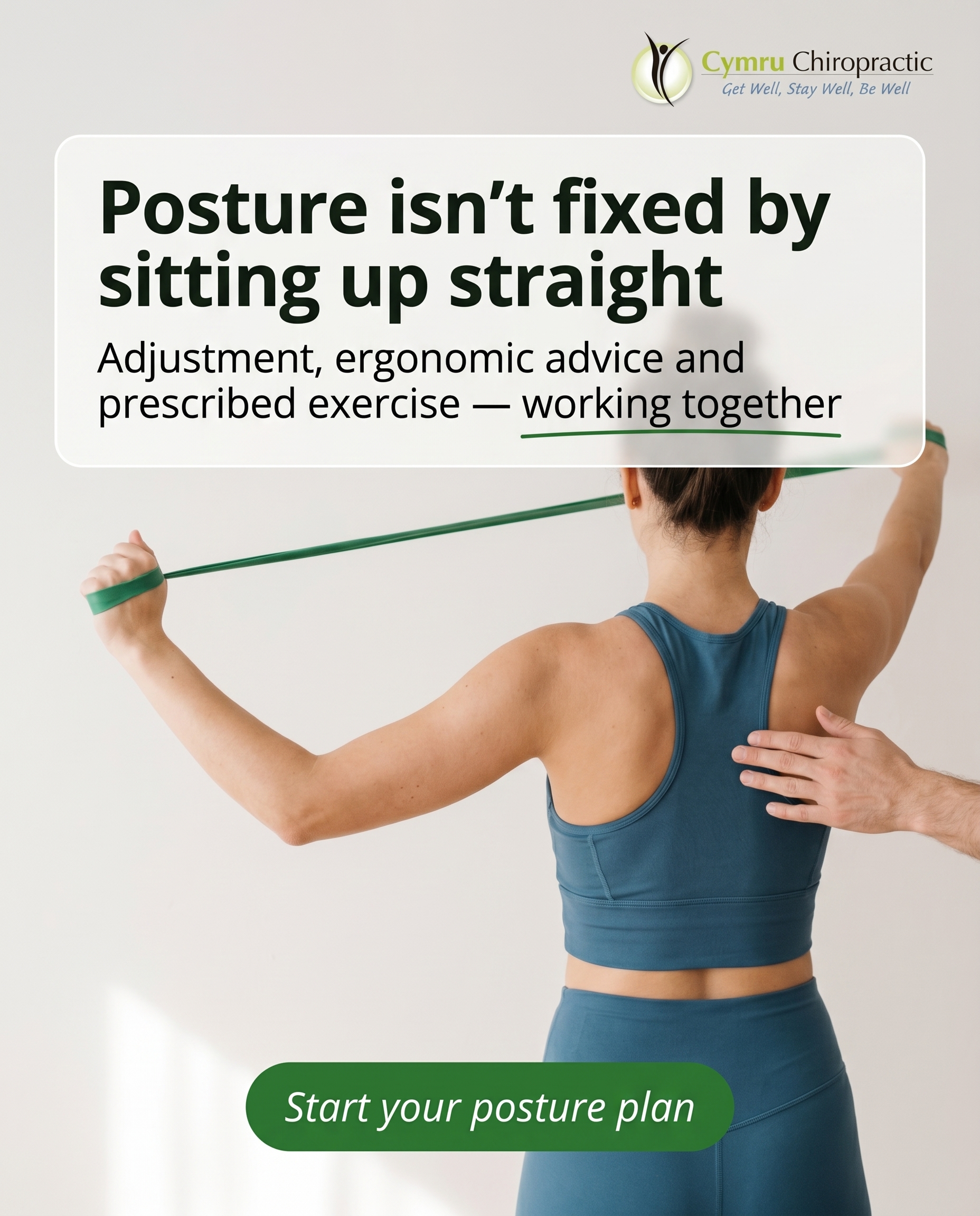
A real-life photo-led post showing what posture correction actually involves — combining manual adjustment, posture and ergonomic advice, and prescribed rehab exercises rather than just being told to 'sit up straight.' The angle answers the reader already asking 'how do I fix this?' by showing the structured, hands-on process behind lasting postural change.
Content: A real-life photo-led post showing what posture correction actually involves — combining manual adjustment, posture and ergonomic advice, and prescribed rehab exercises rather than just being told to 'sit up straight.' The angle answers the reader already asking 'how do I fix this?' by showing the structured, hands-on process behind lasting postural change.
Style: photography
2.
L2S2A1
graphic-design
Unaware
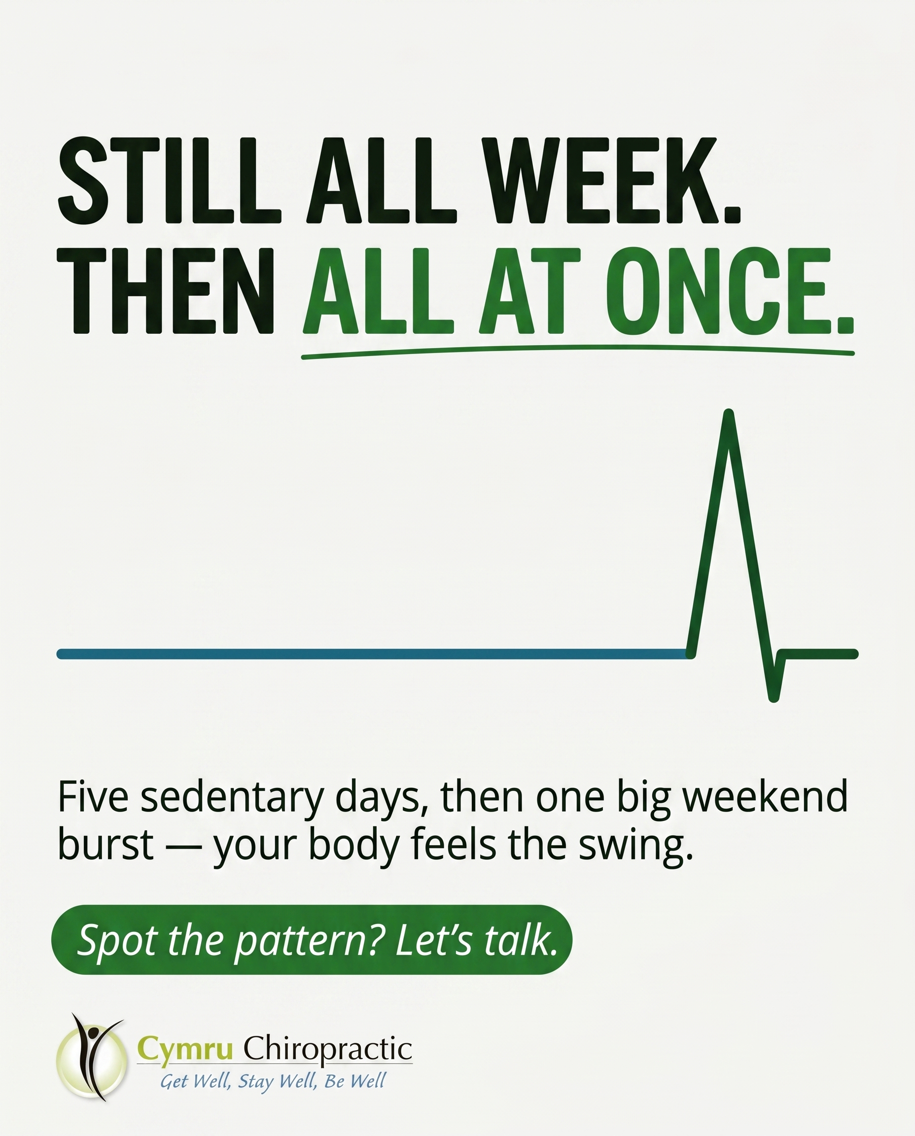
A graphic-led post that reframes the familiar 'fine all week, then go hard at the weekend' routine as something worth a second look. The reader doesn't yet see this swing between sitting still and sudden bursts as a pattern that loads the body — the post makes them curious enough to care.
Content: A graphic-led post that reframes the familiar 'fine all week, then go hard at the weekend' routine as something worth a second look. The reader doesn't yet see this swing between sitting still and sudden bursts as a pattern that loads the body — the post makes them curious enough to care.
Style: graphic-design
3.
T6S3A1
illustrative-3D
Unaware
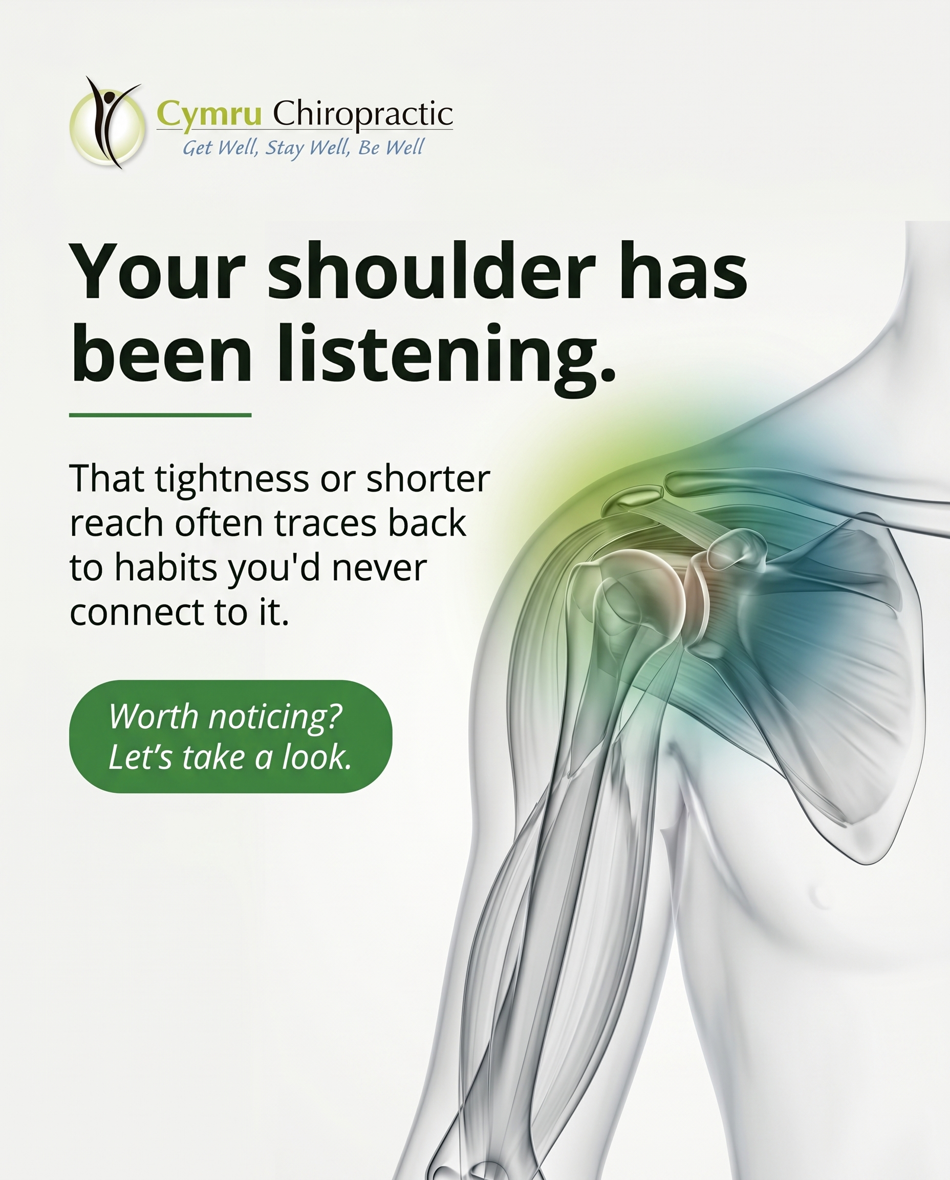
A 3D illustration introducing the shoulder as a region quietly affected by everyday habits the reader hasn't connected to it. The aim is recognition, not alarm — sparking awareness that that low-grade tightness or restricted reach is worth noticing in the first place.
Content: A 3D illustration introducing the shoulder as a region quietly affected by everyday habits the reader hasn't connected to it. The aim is recognition, not alarm — sparking awareness that that low-grade tightness or restricted reach is worth noticing in the first place.
Style: illustrative-3D
4.
L3S4A2
comparison-card
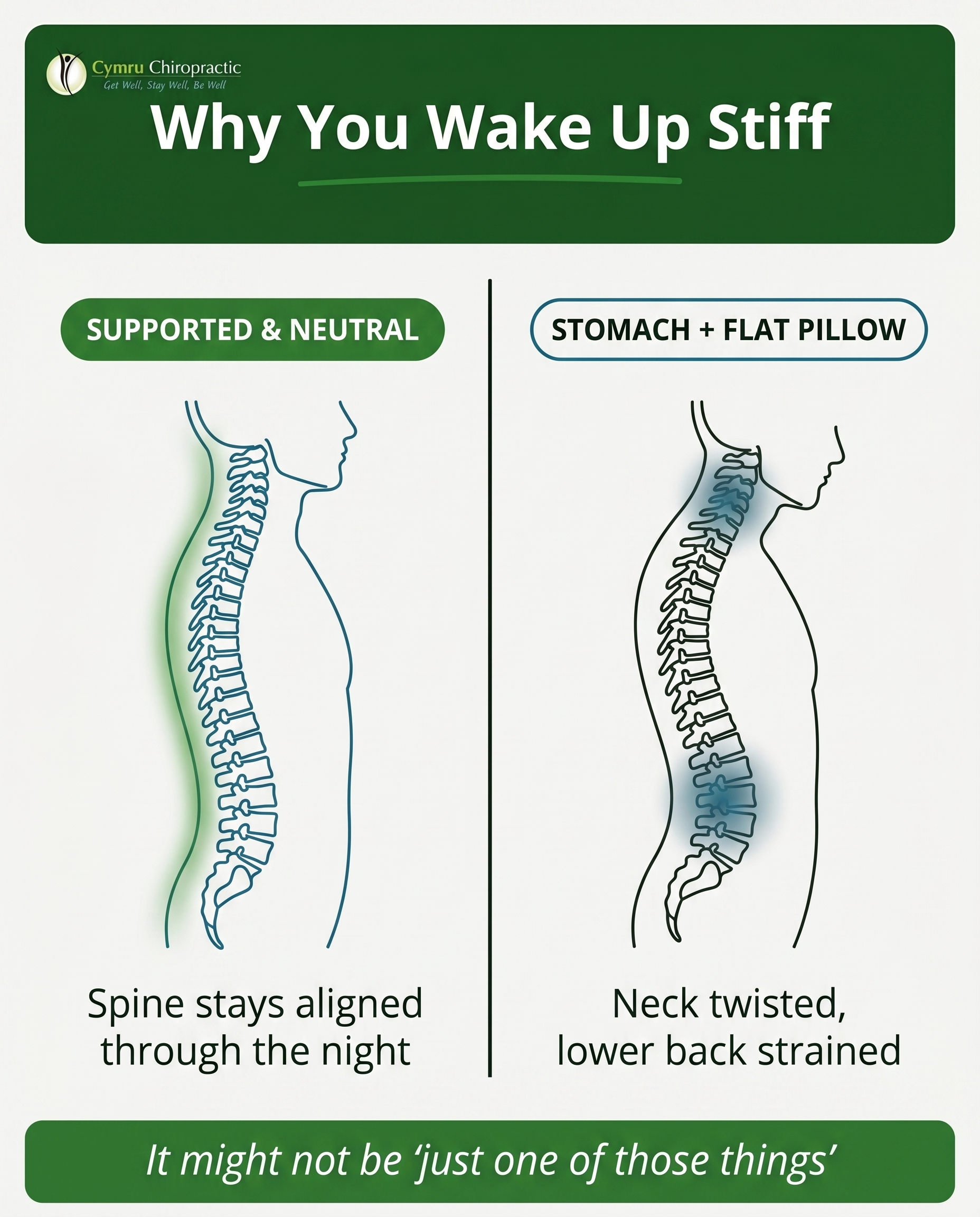
Problem-aware
A comparison card contrasting supported, neutral sleeping positions against stomach-sleeping on an unsupportive pillow, helping the reader see which side they fall on. The angle validates that morning aches and a stiff neck may genuinely trace back to how they sleep — confirming it's a real problem, not just 'one of those things.'
Content: A comparison card contrasting supported, neutral sleeping positions against stomach-sleeping on an unsupportive pillow, helping the reader see which side they fall on. The angle validates that morning aches and a stiff neck may genuinely trace back to how they sleep — confirming it's a real problem, not just 'one of those things.'
Style: comparison-card
5.
T7S5A3
qa-card
Solution-aware
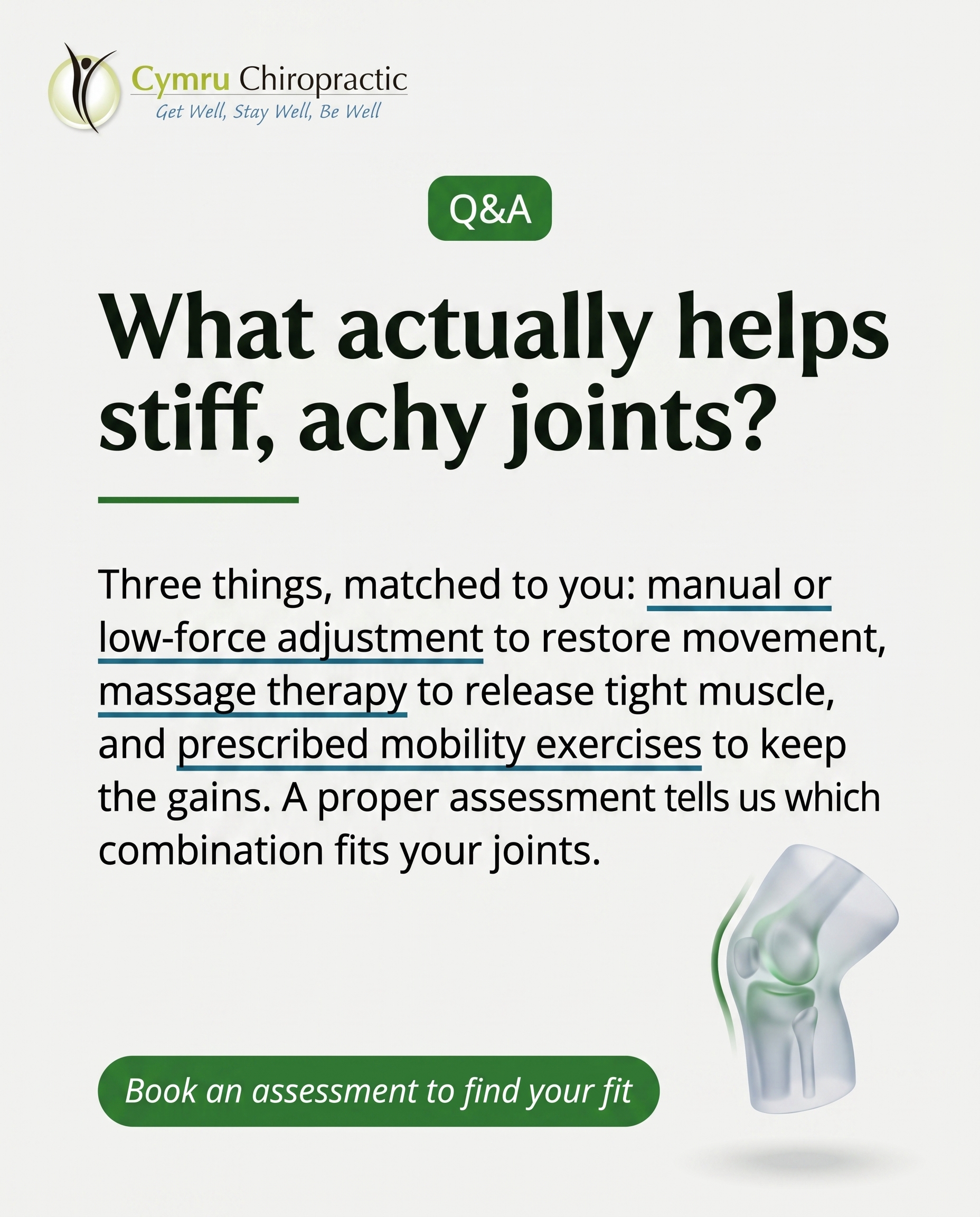
A Q&A card answering the question 'what actually helps stiff, achy joints?' for someone ready to act. It walks through the clinic's options — manual or low-force adjustment, massage therapy, and prescribed mobility exercises — and explains how assessment guides which approach fits.
Content: A Q&A card answering the question 'what actually helps stiff, achy joints?' for someone ready to act. It walks through the clinic's options — manual or low-force adjustment, massage therapy, and prescribed mobility exercises — and explains how assessment guides which approach fits.
Style: qa-card
6.
T1S6A2
myth-buster
Problem-aware
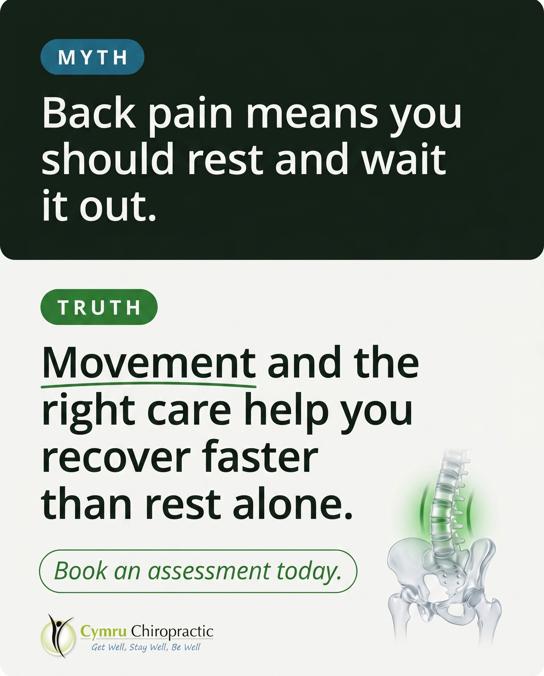
A myth-buster tackling the belief that back pain means you should rest, stop moving, or wait for it to pass on its own. The angle reassures the reader that what they're feeling is a real, addressable problem — and that pushing through or doing nothing both tend to make it worse.
Content: A myth-buster tackling the belief that back pain means you should rest, stop moving, or wait for it to pass on its own. The angle reassures the reader that what they're feeling is a real, addressable problem — and that pushing through or doing nothing both tend to make it worse.
Style: myth-buster
7.
T4S7A2
list-tips
Problem-aware
A list of tell-tale signs that recurring headaches may be coming from the neck and posture rather than being 'just headaches.' The post helps the reader recognise their pattern as a genuine, treatable problem worth taking seriously.
Content: A list of tell-tale signs that recurring headaches may be coming from the neck and posture rather than being 'just headaches.' The post helps the reader recognise their pattern as a genuine, treatable problem worth taking seriously.
Style: list-tips
8.
T10S8A3
stat-card
Solution-aware
A stat card that frames how common morning stiffness is, then pivots to what genuinely eases it — combining gentle movement, manual therapy, and targeted rehab exercises. The angle speaks to the reader already wondering what treatment actually loosens those first stiff hours of the day.
Content: A stat card that frames how common morning stiffness is, then pivots to what genuinely eases it — combining gentle movement, manual therapy, and targeted rehab exercises. The angle speaks to the reader already wondering what treatment actually loosens those first stiff hours of the day.
Style: stat-card
9.
C2S9
checklist
A checklist-style clinic post signalling that recreational and weekend athletes belong here — people who train, play, and push themselves and want to keep doing it without being sidelined. The tone is recognition: 'if this is you, this is your place,' with the clinic positioned as a partner in getting well and staying well.
Content: A checklist-style clinic post signalling that recreational and weekend athletes belong here — people who train, play, and push themselves and want to keep doing it without being sidelined. The tone is recognition: 'if this is you, this is your place,' with the clinic positioned as a partner in getting well and staying well.
Style: checklist
10.
T8S9A1
checklist
Unaware
A checklist that surfaces the small, easily dismissed signs of muscle tension and soreness people carry without questioning — tight shoulders by evening, an ache that never fully lets go. The angle nudges the unaware reader to notice these as something worth caring about rather than background noise.
Content: A checklist that surfaces the small, easily dismissed signs of muscle tension and soreness people carry without questioning — tight shoulders by evening, an ache that never fully lets go. The angle nudges the unaware reader to notice these as something worth caring about rather than background noise.
Style: checklist
3
Developed Posts
10 posts · 2026-06-03T09:36
10 developed
▼
1.
T9S1A3
Rough Image Prompt
Elevated health and wellness lifestyle photography communicating what real posture correction actually involves — a structured, hands-on process rather than simply being told to 'sit up straight.' Depict the concept of someone in mid-routine working on their posture: a person shown from behind or torso-only, no face visible at all, performing a guided rehabilitation exercise (standing wall posture set, thoracic extension stretch, or banded scapular retraction movement) in a generic neutral home or outdoor space with soft natural lighting and a calm, considered atmosphere. Suggest a guidance relationship — supportive practitioner direction implied through a partial, cropped hand or a hands-on technique cue at the edge of frame — without showing a full practitioner figure or any clinic environment. Integrate brand colour cues naturally through clothing, props, or accent elements. Components: lifestyle photographic scene as described, plus clean text overlay. Brand colours available (draw from, do not assign): #2E7D32 green, #1A6B8A teal-blue, #F4F4F2 off-white, #16241A near-black, #FFFFFF white, #1F5A24 deep green. Typography: Ahoura for headline, Open Sans for supporting text, Open Sans italic for CTA. Text to render: headline 'Posture isn't fixed by sitting up straight', supporting text 'Adjustment, ergonomic advice and prescribed exercise — working together', CTA 'Start your posture plan'. Logo placement varies by composition and is finalised downstream. Show the human subject only from behind, cropped at the neck, or as hands/torso/limbs; keep the setting generic and the treatment register illustrative, not documentary.
Text Overlay
Caption
If you've ever been told to 'just sit up straight,' you already know it doesn't last. Within minutes you've slumped right back. That's because lasting postural change isn't about willpower — it's about addressing what's actually holding the old pattern in place.
Real posture correction is a structured process. Manual adjustment to restore movement where things have stiffened. Ergonomic advice so your desk, screen and seat stop working against you. And prescribed rehab exercises that retrain the muscles to hold a better position without you having to think about it.
Forward head posture and rounded shoulders build up over months of desk work and long commutes. Undoing them takes a plan, not a reminder. That's the difference between a quick correction and a change that holds.
If you're already asking 'how do I fix this?' — that's the right question. Let's build the answer around you.
📞 01495 757666
🌐 https://www.cymruchiropractic.co.uk
What's your posture villain — desk, sofa or steering wheel? Tell us below.
Hashtags
#Chiropractic #Pontypool #PostureCorrection #TechNeck #GetWellStayWell
2.
L2S2A1
Rough Image Prompt
A richly designed typographic graphic-design post for a chiropractic brand that reframes the 'sit still all week, then go hard at the weekend' habit as a body-loading pattern worth noticing. Concept: the contrast between five days of near-stillness and one big burst of weekend activity, communicated through bold typography with a supporting visual rhythm cue (a simple flat-line-then-sudden-spike graphic motif, like a quiet horizontal line breaking into a sharp peak) rendered as a clean accent element, not a full chart. Editorial, considered, confident — not minimal-by-default. Optional small supporting accent: a stylised line-art icon of a body in motion or a simple activity-spike symbol on a neutral or gradient field. Brand colour palette to draw from (exact hex): #2E7D32 green, #1A6B8A teal-blue, #F4F4F2 off-white, #16241A near-black, #FFFFFF white, #1F5A24 deep green. Typography: Ahoura for the headline, Open Sans for supporting text, Open Sans italic for the CTA. Text to render: headline 'STILL ALL WEEK. THEN ALL AT ONCE.', supporting line 'Five sedentary days, then one big weekend burst — your body feels the swing.', CTA 'Spot the pattern? Let's talk.'. Keep all text crisp and correctly spelled. Logo placement varies by composition and is finalised downstream. Show a clean, intentional typographic composition with the spike-line motif as the only illustrative accent.
Text Overlay
Caption
Sound familiar? You sit for most of the week — desk, commute, sofa — then throw everything at one big push come Saturday. The garden, the long ride, the five-a-side, the DIY you've been putting off.
It feels productive. And often it feels fine. But that swing between barely moving and suddenly going hard is a pattern, not a one-off. Your joints and muscles spend five days under-loaded, then get asked to perform on day six with no real build-up.
That's when the aches creep in. Not always straight away — sometimes it's the stiffness on Monday that tells the story.
The fix isn't to stop enjoying your weekend. It's to even out the load so your body isn't going from zero to full throttle. Little bits of movement through the week make a real difference.
Notice this in yourself? It's worth a proper look.
📞 01495 757666
🌐 https://www.cymruchiropractic.co.uk
Drop a 🙋 below if this is you.
Hashtags
#ChiropracticCare #Pontypool #WeekendWarrior #MoveWell #BackPainRelief
3.
T6S3A1
Rough Image Prompt
A clean, anatomically accurate 3D illustration of a human shoulder joint — the glenohumeral joint with surrounding deltoid, rotator cuff musculature, and upper trapezius shown in a translucent, glass-like clinical render style. The shoulder is the calm focal subject, isolated on a neutral surface with no environmental or clinical context, signalling this is an illustrative representation rather than a documentary scene. A soft warm highlight or gentle glow rests around the upper trapezius and rotator cuff area to draw the eye to where everyday tension quietly accumulates — awareness-cue, not pain-alarm. The mood is informative and reassuring, not clinical-cold. Draw from these exact brand colours: green #2E7D32, teal-blue #1A6B8A, off-white #F4F4F2, near-black #16241A, white #FFFFFF, deep green #1F5A24. Typography: Ahoura for the headline, Open Sans for supporting text, Open Sans italic for the CTA. Render the following text crisply and legibly: headline 'Your shoulder has been listening.', supporting text 'That tightness or shorter reach often traces back to habits you'd never connect to it.', CTA 'Worth noticing? Let's take a look.' Include the practice logo, with placement varied to suit the final composition and finalised downstream. Keep the anatomical render polished and editorial, with brand colours integrated naturally into the glow accents and surface.
Text Overlay
Caption
Your shoulder rarely shouts. It mentions things quietly.
A reach that doesn't go quite as far as it used to. A tightness that settles in by mid-afternoon. A dull soreness after a long day at the desk or behind the wheel. Easy to shrug off — until you notice it's been there a while.
The thing is, that low-grade restriction often has nothing to do with the shoulder itself. Hours of forward-head desk posture, a pillow that doesn't quite support you, carrying tension you've stopped registering — it all gathers here.
This post isn't about alarm. It's about awareness. Sometimes the first step is simply noticing the ache is worth noticing.
If your shoulder's been mentioning something lately, it might be worth listening. The team here in Pontypool can help you understand what's behind it.
📞 01495 757666
🌐 https://www.cymruchiropractic.co.uk
Noticed any of this in your own shoulders lately? 💬
Hashtags
#ShoulderTension #ChiropractorPontypool #PostureHealth #GetWellStayWell
4.
L3S4A2
Rough Image Prompt
A comparison-card built around two genuinely different sleep set-ups and how each affects the spine and neck overnight. The post contrasts a supported, neutral sleeping position against stomach-sleeping on an unsupportive pillow. Each side carries its own concrete label, a short supporting line, and a small supporting visual: for the supported side, a clean editorial illustration of a neutrally aligned spine and neck (side-on, gentle natural curve maintained); for the stomach-sleeping side, an illustration of the same spine and neck rotated and strained out of neutral alignment. Subtle anatomical accents only — small and supporting, not full-frame. Typographic-led design. Use a gentle highlight accent (green glow or teal accent) to show the aligned curve on one side and a warm or muted strain indicator on the other. Draw only from these exact brand colours: #2E7D32 green, #1A6B8A teal-blue, #F4F4F2 off-white, #16241A near-black, #FFFFFF white, #1F5A24 deep green. Typography: Ahoura for the headline and side labels, Open Sans for supporting text, Open Sans italic for the CTA. Text to render — headline: "Why You Wake Up Stiff"; left label: "SUPPORTED & NEUTRAL"; left support: "Spine stays aligned through the night"; right label: "STOMACH + FLAT PILLOW"; right support: "Neck twisted, lower back strained"; CTA: "It might not be 'just one of those things'". Both sides treated with equal visual weight. Logo included with placement varied by composition and finalised downstream. Clean, intentional, editorial illustration style on neutral brand surfaces.
Text Overlay
Caption
Stiff neck most mornings? A dull ache in your lower back before your feet even hit the floor? It's easy to brush off as one of those things. Often, it isn't.
The way you sleep matters more than people realise. A supported, neutral position keeps your spine in its natural curve through the night. Stomach-sleeping on a flat, unsupportive pillow does the opposite — it twists the neck to one side for hours and lets the lower back sag out of line. Wake up sore, repeat the next night, and the pattern sets in.
The good news? This is a real, fixable problem, not something you just have to live with. Small changes to your sleep set-up can make a genuine difference — and we can help you find the cause if morning stiffness keeps coming back.
Which side do you fall on?
📞 01495 757666
🌐 https://www.cymruchiropractic.co.uk
Tell us in the comments — front, back, or side sleeper?
Hashtags
#ChiropracticCare #Pontypool #MorningStiffness #SleepPosture #GetWellStayWell
5.
T7S5A3
Rough Image Prompt
A clean, typographic Q&A card for a chiropractic clinic answering what genuinely helps stiff, achy joints. The post communicates a clear question-and-answer hierarchy with a calm, clinical-trust feel. Include the following text elements rendered in the brand fonts: question headline in Ahoura — 'What actually helps stiff, achy joints?'; supporting answer text in Open Sans — 'Three things, matched to you: manual or low-force adjustment to restore movement, massage therapy to release tight muscle, and prescribed mobility exercises to keep the gains. A proper assessment tells us which combination fits your joints.'; CTA in Open Sans italic — 'Book an assessment to find your fit'. Use a small supporting anatomical accent element — a clean, translucent 3D illustration of a joint (knee or shoulder) with a soft green highlight indicating renewed mobility, kept small and supporting so the typography leads. Draw only from these exact brand colours: #2E7D32 green, #1A6B8A teal-blue, #F4F4F2 off-white, #16241A near-black, #FFFFFF white, #1F5A24 deep green. Typographic-led composition with the anatomical accent as a supporting element, not a full-frame background. Logo placement varies by composition and is finalised downstream. Keep the look intentional, editorial, and trustworthy.
Text Overlay
Caption
Stiff, achy joints rarely have a single fix. The honest answer is that it depends on what is actually driving the stiffness for you.
That is why we start with an assessment, not assumptions. From there, the approach usually comes down to a combination of three things. Manual or low-force adjustment to restore movement where joints have stiffened up. Massage therapy to release the tight muscle that builds up around a restricted area. And prescribed mobility exercises so the improvement holds between visits, not just on the table.
The assessment is what ties it together. It tells us which combination fits your joints, your history, and how you move day to day. No guesswork, no one-size-fits-all plan.
If stiffness has become part of your morning routine, it does not have to stay that way.
📞 01495 757666
🌐 https://www.cymruchiropractic.co.uk
Ready to find out what your joints actually need? Drop us a message or book in.
Hashtags
#ChiropracticCare #Pontypool #JointHealth #StiffJoints #GetWellStayWell
6.
T1S6A2
Rough Image Prompt
Myth-buster style typographic post tackling the belief that back pain means you should rest and wait it out. Bold typographic impact as the primary visual treatment. Components: a 'MYTH' label paired with the myth statement, a 'TRUTH' label paired with the truth statement, and a CTA. Include a small supporting anatomical illustration of a healthy lower spine and pelvis rendered in a clean translucent glass-like style with a subtle green accent glow on the lumbar region to suggest gentle movement and circulation — keep it small and supporting, not full-frame. Use brand colours drawn from this palette: #2E7D32 green, #1A6B8A teal-blue, #F4F4F2 off-white, #16241A near-black, #FFFFFF white, #1F5A24 deep green. Typography: Ahoura for the MYTH and TRUTH labels and headline statements, Open Sans for supporting text, Open Sans italic for the CTA. Text content to render: 'MYTH' label, 'Back pain means you should rest and wait it out.' / 'TRUTH' label, 'Movement and the right care help you recover faster than rest alone.' CTA: 'Book an assessment today.' Clear visual contrast between the myth side and the truth side. Clean, intentional, editorial design character. Logo placement should vary by composition and is finalised downstream.
Text Overlay
Caption
Resting up and hoping back pain fades on its own feels like the safe option. More often than not, it isn't.
When back pain settles in, the instinct is to stop moving and wait. But long spells of rest can leave muscles tighter, joints stiffer, and the whole area more sensitive than before. Pushing through and gritting your teeth tends to backfire too.
The middle ground is where recovery happens — gentle, guided movement alongside care that actually addresses what's going on. Your back pain is real and it's addressable. It rarely just disappears because you waited.
If an ache has been hanging around longer than it should, that's your cue to get it looked at properly. The sooner we understand what's driving it, the sooner you can get back to feeling like yourself.
Get Well, Stay Well, Be Well.
📞 01495 757666
🌐 https://www.cymruchiropractic.co.uk
Have you ever waited out back pain and wished you'd acted sooner?
Hashtags
#Chiropractic #BackPainRelief #Pontypool #MoveBetter #GetWellStayWell
7.
T4S7A2
Rough Image Prompt
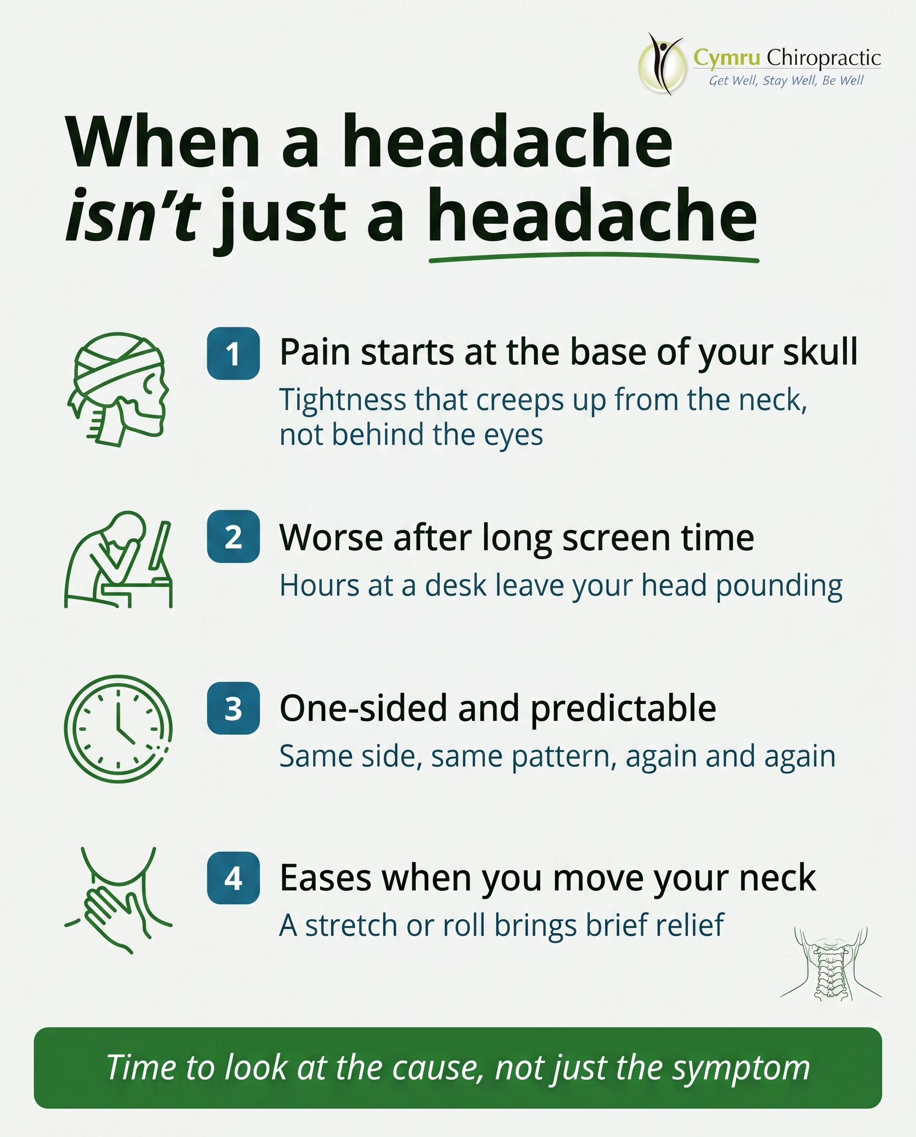
A typographic-led list-tips post for a chiropractic clinic, helping readers recognise when recurring headaches may be coming from the neck and posture rather than being 'just headaches.' Header introduces the list, followed by four short numbered tips each with a custom illustrated line-style icon. Visual register is clean, editorial, typographic — NOT photography, NO clinic interiors, NO faces. Optional small supporting accent: a simple line-style anatomical illustration of the upper neck and base-of-skull region as a subtle motif, kept small and supporting so typography leads. Headline in Ahoura. Supporting text, list item titles and explanations, and CTA in Open Sans, CTA in Open Sans italic. Brand colours to draw from: green #2E7D32, teal-blue #1A6B8A, off-white #F4F4F2, near-black #16241A, white #FFFFFF, deep green #1F5A24. Custom icons illustrated in a consistent line style: a pressure band around the base of the skull, a forward-leaning head over a desk, a clock suggesting end-of-day timing, a hand at the base of the neck. Text content to render exactly — header: 'When a headache isn't just a headache', then four items: '1. Pain starts at the base of your skull' with 'Tightness that creeps up from the neck, not behind the eyes'; '2. Worse after long screen time' with 'Hours at a desk leave your head pounding'; '3. One-sided and predictable' with 'Same side, same pattern, again and again'; '4. Eases when you move your neck' with 'A stretch or roll brings brief relief'; CTA: 'Time to look at the cause, not just the symptom'. Logo placement should vary by composition and is finalised downstream. Keep the overall feel calm, trustworthy and clinically grounded.
Text Overlay
Caption
Not every headache starts in your head.
When the pain creeps up from the base of your skull, settles on the same side every time, and gets worse after a long day at the desk, that's often a sign your neck and posture are part of the story. These are sometimes called cervicogenic headaches — headaches driven by tension and irritation higher up the spine.
The good news? When the cause is the neck, it's something that can be assessed and worked on, rather than something you keep masking with painkillers.
If any of these signs sound familiar, it may be worth looking at the cause, not just the symptom. The team here in Pontypool can assess your posture and movement to see what's really going on.
Which of these four feels most like your pattern? Let us know below.
📞 01495 757666
🌐 https://www.cymruchiropractic.co.uk
Hashtags
#CervicogenicHeadaches #Chiropractic #Pontypool #TechNeck #HeadacheRelief
8.
T10S8A3
Rough Image Prompt
Stat-card concept communicating how common morning stiffness is, then pivoting to what genuinely eases it. One striking statistic dominates as the visual anchor, with a short context line that reframes the reader's experience and a supporting line that names the combined approach — gentle movement, manual therapy, and targeted rehab exercises. Visual register: pure typographic design with a small supporting anatomical accent — a stylised illustration of a spine or stiff joint with a soft warm glow easing into a calm green tone, suggesting overnight stiffness loosening into movement. Keep the anatomical accent small and supporting, not full-frame; typography leads the composition. Use exact brand colours available: #2E7D32 green, #1A6B8A teal-blue, #F4F4F2 off-white, #16241A near-black, #FFFFFF white, #1F5A24 deep green — drawn from this palette, with assignment decided downstream. Typography: Ahoura for the statistic and headline, Open Sans for supporting text, Open Sans italic for the CTA. Text content to render: statistic '1 in 3', context line 'adults wake with stiffness most mornings', supporting line 'What actually eases it: gentle movement, hands-on therapy and targeted rehab', CTA 'Book your assessment'. Logo placement varies by composition and is finalised downstream. Clean, intentional, editorial typographic treatment with credible brand polish.
Text Overlay
Caption
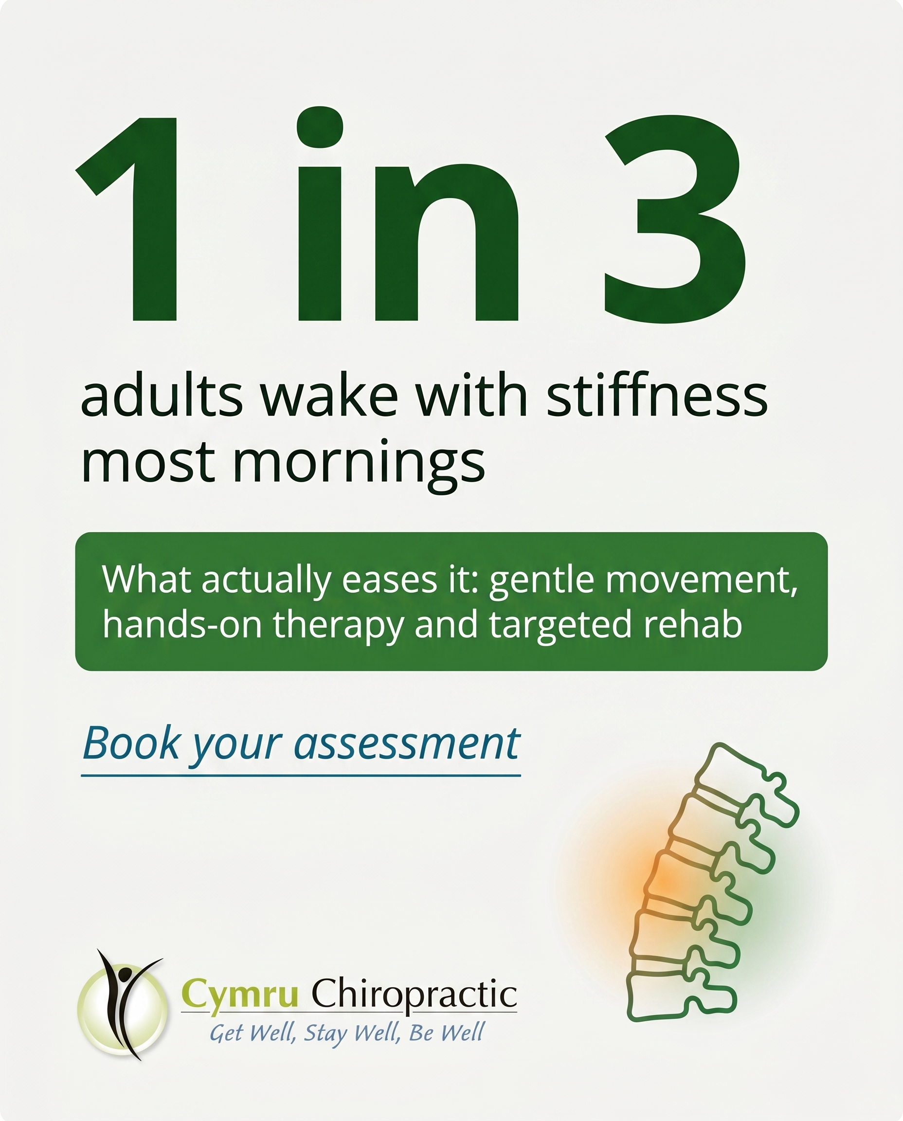
If your first hour of the day feels stiff and slow, you are far from alone. Morning stiffness is one of the most common things people mention to us, and it is rarely as random as it feels.
Those first stiff hours usually come down to how your joints and muscles settle overnight, combined with old habits your body has quietly held on to. The good news is that it responds well to the right approach.
What genuinely eases it tends to be a combination, not a single fix. Gentle movement to wake the joints, hands-on therapy to free up restricted areas, and targeted rehab exercises so the change actually lasts.
If you have been wondering what treatment really loosens those first stiff hours, that is exactly what an assessment is for.
📞 01495 757666
🌐 https://www.cymruchiropractic.co.uk
Does your morning start with stiffness? Tell us where you feel it most.
Hashtags
#Chiropractic #Pontypool #MorningStiffness #JointHealth #GetWellStayWell
9.
C2S9
Rough Image Prompt
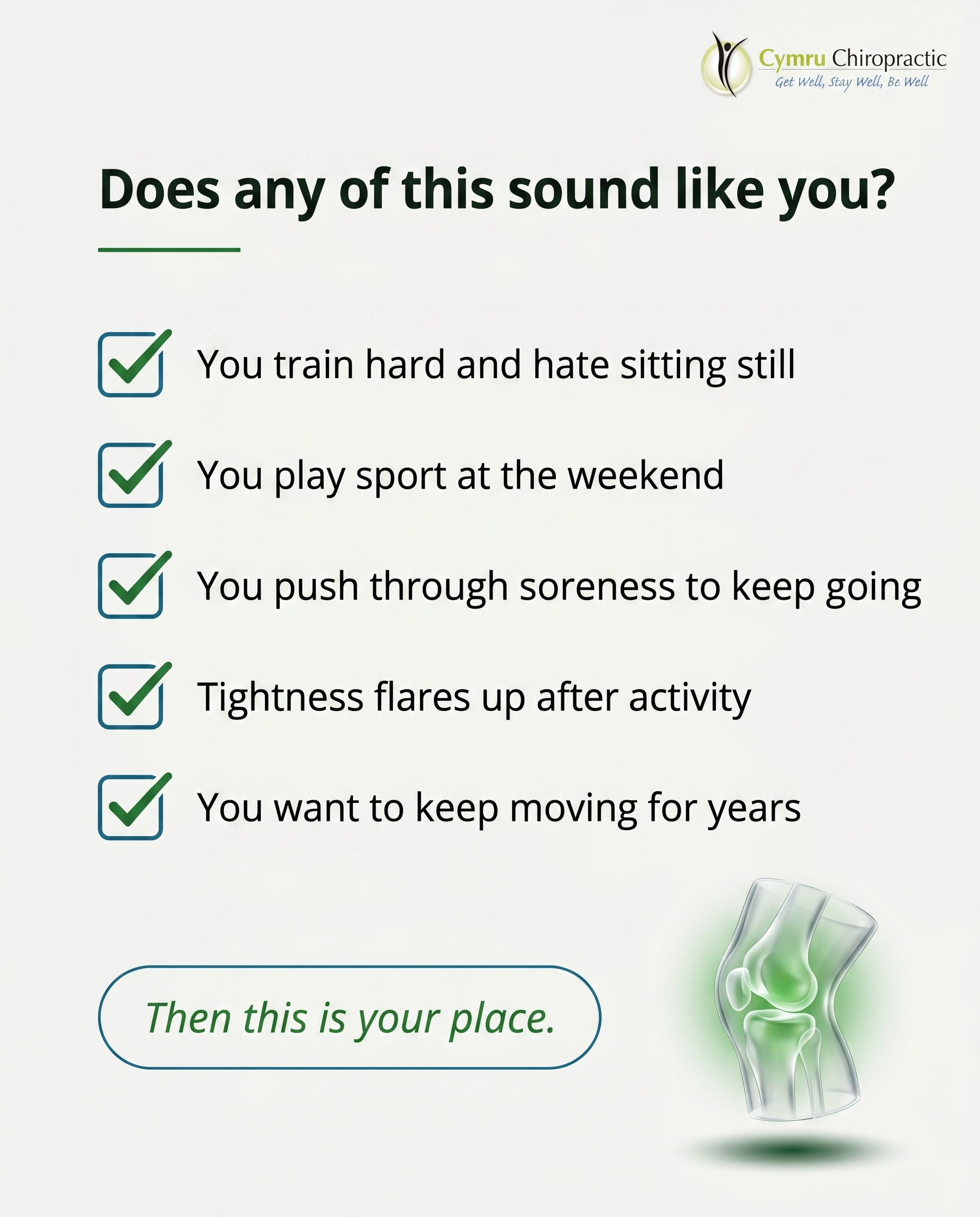
A typographic-led checklist post for a chiropractic clinic speaking directly to recreational and weekend athletes — people who train, play sport, run, lift, and want to keep doing it without being sidelined by soreness or stiffness. The tone is recognition and belonging: 'if this is you, this is your place.' Typographic-led design with checkbox graphics, supported by a small editorial anatomical accent illustration of a translucent glass-like knee or spine joint with a subtle green glow suggesting healthy active movement (small, supporting, not full-frame). Components required: a framing header line, five checklist items each with a checkbox graphic and one short line, and a soft CTA. Use the brand colours available: #2E7D32 green, #1A6B8A teal-blue, #F4F4F2 off-white, #16241A near-black, #FFFFFF white, #1F5A24 deep green. Typography: Ahoura for headline, Open Sans for checklist items and supporting text, Open Sans italic for CTA. Render this exact text content: framing line 'Does any of this sound like you?', checklist items 'You train hard and hate sitting still', 'You play sport at the weekend', 'You push through soreness to keep going', 'Tightness flares up after activity', 'You want to keep moving for years', and CTA 'Then this is your place.' Keep the composition clean and intentional with checkbox graphics aligned to each item and the anatomical accent small and supporting. Logo placement should vary by composition and is finalised downstream. Show crisp, legible typography with healthy active-movement energy throughout.
Text Overlay
Caption
If you train, play, and push yourself, you already know the feeling. The tightness after a heavy session. The soreness that lingers a day longer than it used to. The little ache you keep promising to deal with later.
This is your place.
We work with recreational and weekend athletes who want to keep moving — not wrap themselves in cotton wool. The goal isn't to slow you down. It's to keep you doing the things you love, with less soreness holding you back and a body that recovers the way it should.
Get well, stay well, be well. That's the whole point.
If you've been pushing through discomfort and telling yourself it'll settle on its own, let's have a proper look before it sidelines you.
📞 01495 757666
🌐 https://www.cymruchiropractic.co.uk
Which one of these sounds most like you? Let us know below 👇
Hashtags
#PontypoolChiropractor #WeekendWarrior #SportsRecovery #StayMoving #GetWellStayWell
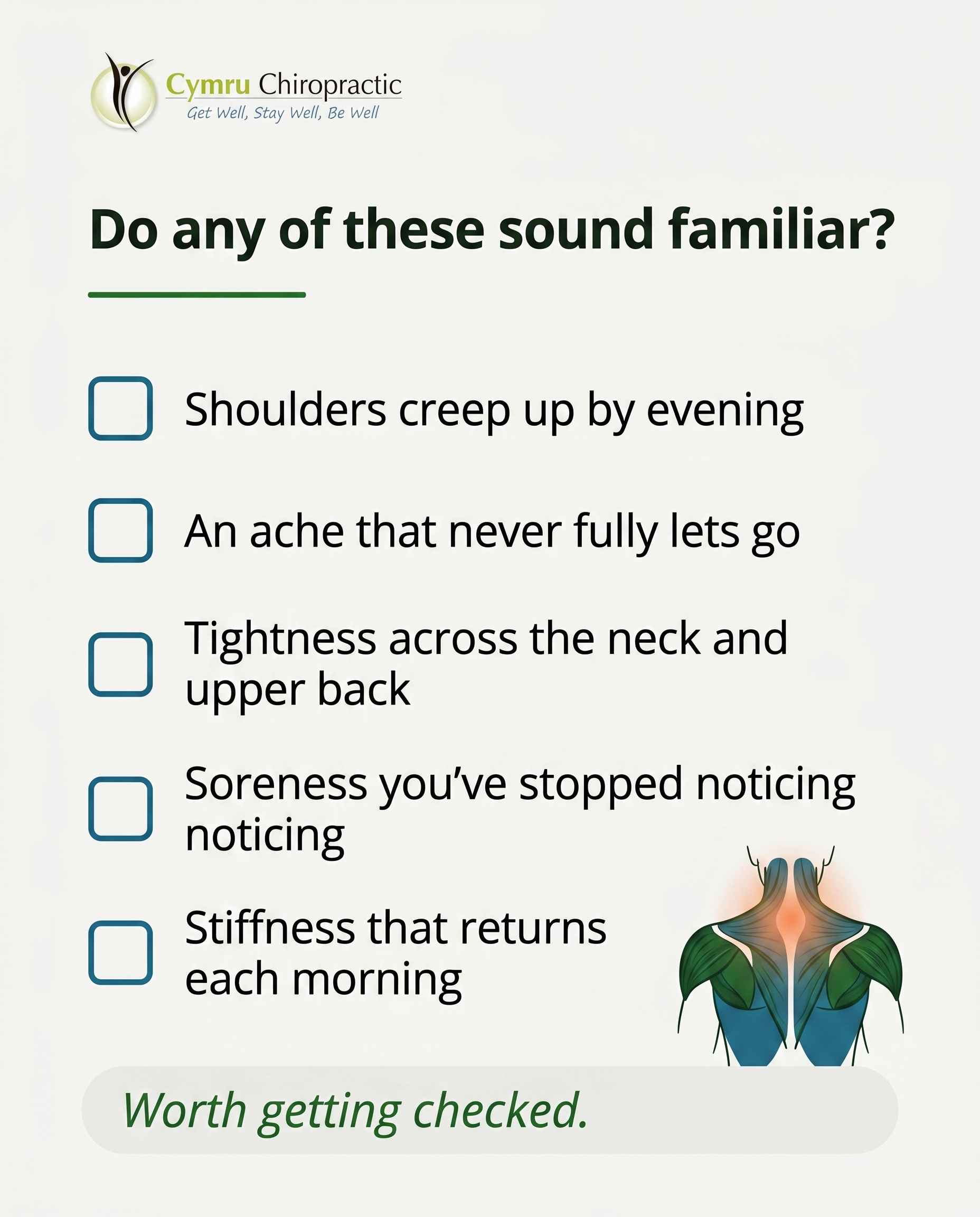
10.
T8S9A1
Rough Image Prompt
A typographic-led checklist post for a chiropractic practice surfacing the small, easily dismissed signs of muscle tension and soreness people carry as background noise. Typographic in character with checkbox graphics, supported by a small, subtle anatomical accent illustration of upper-back and shoulder muscles (trapezius and neck region) with a soft warm glow indicating areas of held tension — kept supporting and small, not full-frame. Components required: a framing line, five checklist items each with a checkbox graphic and one short title line, and a soft CTA. Colour palette to draw from (exact brand hex): #2E7D32 green, #1A6B8A teal-blue, #F4F4F2 off-white, #16241A near-black, #FFFFFF white, #1F5A24 deep green. Typography: Ahoura for the framing headline, Open Sans for checklist items, Open Sans italic for the CTA. Text content to render — framing line: 'Do any of these sound familiar?'; checklist items: 'Shoulders creep up by evening', 'An ache that never fully lets go', 'Tightness across the neck and upper back', 'Soreness you've stopped noticing', 'Stiffness that returns each morning'; CTA: 'Worth getting checked.' Clean, calm, intentional design with checkbox graphics clearly rendered. Logo placement varies by composition and is finalised downstream. Keep the composition typographic and uncluttered, anatomical accent small and supporting.
Text Overlay
Caption
Some aches get so familiar you stop noticing them. The shoulders that creep up by evening. The tightness across your neck and upper back that's just always there. The soreness you've quietly learned to live around.
None of it shouts. That's the problem. Muscle tension has a way of becoming background noise, something you push through rather than question.
But a body that's always a little sore is a body trying to tell you something. Tight muscles, poor posture, the same patterns repeated day after day at a desk or behind the wheel all add up.
Noticing is the first step. The next is doing something about it before it settles in for good.
If a few of these felt a little too familiar, it might be worth getting checked. Our team in Pontypool can help you understand what's driving the tension and how to ease it.
📞 01495 757666
🌐 https://www.cymruchiropractic.co.uk
Which one did you nod along to? 👇
Hashtags
#Chiropractic #Pontypool #MuscleTension #PostureHealth #GetWellStayWell
4
Refined Image Prompts
10 prompts · 2026-06-03T09:38
10 prompts refined
▼
1.
T9S1A3
Refined Image Prompt
Elevated health and wellness lifestyle photograph capturing what genuine posture correction actually involves — a structured, hands-on rehabilitation process rather than a casual instruction to sit up straight. The subject is a single person shown from behind, cropped at the neck so no face is visible, performing a guided thoracic extension and scapular retraction movement against a plain interior wall. Their arms are raised and drawn back in a deliberate banded scapular retraction position, spine lengthening, shoulders rolling open, the whole body language conveying focused effort within a considered routine. The setting is a generic neutral home space with a soft plain off-white wall in #F4F4F2 and warm minimal surroundings, free of clinical equipment or branding. At the very edge of the frame, a single partial cropped hand enters to offer a light hands-on posture cue at the upper back — suggesting supportive practitioner guidance without showing a full figure or any clinic environment. The subject wears calm activewear in a muted #1A6B8A teal-blue, with a slim resistance band carrying a subtle #2E7D32 green accent, integrating brand colour naturally through clothing and props. Soft diffused natural daylight falls from one side, creating gentle shadows and a clean, breathable, wellness-clinical atmosphere that feels approachable and reassuring rather than documentary.
Composition is vertical and balanced, with the figure positioned in the lower two-thirds of the frame and clear negative space in the upper portion reserved for text. Overall mood embodies a clean approachable wellness-clinical register — uncluttered, trustworthy, warm.
In the upper area, place a soft text container as a translucent panel in #FFFFFF at roughly 90 percent opacity with slight 4px rounded corners, sitting over the calm wall space. Inside it, set the headline "Posture isn't fixed by sitting up straight" in Ahoura, in near-black #16241A, generously spaced across two to three lines, left-aligned. Directly beneath the headline, set the supporting text "Adjustment, ergonomic advice and prescribed exercise — working together" in Open Sans, in #16241A at a smaller size, left-aligned with comfortable line spacing. Draw attention to the key phrase by placing a thin underline in #2E7D32 green beneath the words "working together".
Toward the lower portion of the frame, place the call to action "Start your posture plan" in Open Sans italic, in #FFFFFF, centred inside a soft pill button filled with #2E7D32 green and slight 5px rounded corners, sized to sit neatly without dominating the scene.
Place the supplied logo small in the top corner opposite the figure's lean, sized modestly so it reads as a clean brand mark over the off-white wall space. Reproduce the logo exactly as supplied, preserving its original colours, proportions, lettering and spacing without recolouring, redrawing, distorting or restyling it in any way.
Apply slight 3 to 6px rounded corners consistently to every rectangular element including the text panel, the CTA pill and any framed surface. Keep all typography crisp and legible.
Constraints: show the human subject only from behind or as torso, limbs and hands, with the neck-up cropped out and no face visible at any point; keep the practitioner presence to a single partial cropped hand at the frame edge only; keep the environment a generic neutral home space free of any clinic equipment, signage or medical fixtures; keep the treatment register illustrative and lifestyle-led rather than clinical or documentary; render every text string exactly as written with no spelling changes; use only the brand colours specified.
2.
L2S2A1
Refined Image Prompt
An editorial typographic graphic-design composition for a chiropractic wellness brand, clean and confident with a considered register that feels approachable yet clinically credible. The surface is a solid off-white field in #F4F4F2 filling the entire frame, giving a calm, breathable backdrop.
Layout is vertically structured with generous margins. In the upper third, a primary headline set in Ahoura reads "STILL ALL WEEK. THEN ALL AT ONCE." in near-black #16241A, broken across two or three lines and left-aligned with strong intentional spacing. The phrase "ALL AT ONCE." is rendered in saturated green #2E7D32 to draw the eye to the contrast, with a thin underline accent in green #2E7D32 sitting just beneath it.
Centred in the middle band of the composition, the only illustrative accent: a simple flat-line-then-sudden-spike motif. A long, quiet horizontal line in teal-blue #1A6B8A runs across the width, holding flat and level for most of its length, then breaks sharply into a single tall pointed peak near the right end, rendered in deep green #1F5A24. The line is clean, thin, and graphic — not a full chart, just a rhythm cue. The flat stretch suggests five still days; the sudden spike suggests the weekend burst. Keep it crisp, geometric, and uncluttered with plenty of negative space around it.
Below the spike motif, a supporting line set in Open Sans in near-black #16241A reads "Five sedentary days, then one big weekend burst — your body feels the swing." left-aligned, comfortable line length, calm and legible.
In the lower area, a call-to-action set in Open Sans italic reads "Spot the pattern? Let's talk." sitting inside a soft pill shape with slightly rounded 4px corners filled in green #2E7D32, with the CTA text reversed in white #FFFFFF for contrast.
All rectangular elements and containers use slight rounded corners of 3 to 6px applied uniformly. Accents are limited to thin underlines and soft pills, keeping the design disciplined and brand-consistent.
Place the attached logo in the bottom-left corner at a small, balanced scale, preserving its exact colours, proportions, and lettering without recolouring, distortion, or recomposition. Reproduce the logo precisely as supplied.
Lighting is flat, even, and editorial with no harsh shadows, keeping the surface clean. Composition is balanced, intentional, and spacious — confident rather than minimal-by-default.
Render all text crisply with correct spelling, accurate kerning, and clean edges. Use only the specified hex colours: #F4F4F2 off-white surface, #16241A near-black text, #2E7D32 green and #1F5A24 deep green accents, #1A6B8A teal-blue line, #FFFFFF white reversed text. Keep the spike-line as the single illustrative element with no additional charts, gridlines, photographic imagery, or decorative clutter.
3.
T6S3A1
Refined Image Prompt
A clean, anatomically accurate 3D illustration of a human shoulder joint rendered in a translucent, glass-like clinical style — the glenohumeral joint with surrounding deltoid, rotator cuff musculature, and upper trapezius visible through the semi-transparent surface. The shoulder is the calm focal subject, positioned on the right-hand third of the composition, isolated on a smooth neutral surface with no environmental or clinical context, signalling this is an illustrative representation rather than a documentary scene. A soft warm glow in green #2E7D32 fading into teal-blue #1A6B8A rests gently around the upper trapezius and rotator cuff area, drawing the eye to where everyday tension quietly accumulates — an awareness cue, not a pain alarm. The render is polished and editorial, with brand colours integrated naturally into the translucent depths and glow accents.
The overall mood is informative and reassuring, clean and approachable wellness-clinical in register — calm, never cold.
Background surface is off-white #F4F4F2 with a soft even gradient, allowing the glass shoulder render to feel grounded and luminous.
Layout: a left-aligned text column occupies the left 45 percent of the frame, balanced against the shoulder illustration on the right. Generous breathing space throughout.
Headline text reads "Your shoulder has been listening." set in Ahoura, in near-black #16241A, large and confident at the top of the text column. Beneath the headline, a thin underline accent in green #2E7D32 sits flush to the left edge of the text, spanning the width of a short word.
Supporting text reads "That tightness or shorter reach often traces back to habits you'd never connect to it." set in Open Sans, in near-black #16241A at a comfortable readable size, placed below the headline with calm line spacing.
The CTA reads "Worth noticing? Let's take a look." set in Open Sans italic, in white #FFFFFF, contained within a soft pill button in green #2E7D32 with slightly rounded 4px corners, positioned at the lower left of the text column.
Lighting is soft and directional, with a gentle key light bringing out the translucency of the joint render and a low ambient fill keeping shadows soft and editorial.
Place the attached practice logo in the top-left corner of the composition at a modest, balanced scale. Preserve the logo exactly as supplied — do not redraw, recolour, distort, or alter its proportions, lettering, or marks in any way.
All rectangular elements use slight 3-6px rounded corners applied uniformly.
Constraints: keep the anatomical render illustrative and clearly non-documentary; keep the glow gentle and reassuring rather than alarming; keep all text crisp, legible, and correctly spelled; maintain generous negative space; keep brand colours accurate to the specified hex values; render the shoulder as a calm, polished, editorial subject on a clean neutral surface.
4.
L3S4A2
Refined Image Prompt
A clean editorial split-screen comparison card rendered on a neutral wellness-clinical layout, designed as a typographic-led infographic with two vertical halves of equal visual weight separated by a thin centred divider line.
The overall surface is off-white #F4F4F2. A centred header band sits across the top in deep green #1F5A24 with slightly rounded 5px corners, holding the headline "Why You Wake Up Stiff" in Ahoura, in white #FFFFFF, large and clearly the focal point of the composition. Below the header a slim thin underline accent in green #2E7D32 spans a short width centred beneath the headline.
The body divides into two equal vertical panels. A thin vertical divider line in muted near-black #16241A at low opacity runs down the centre separating the two halves.
LEFT PANEL — the supported side. Background remains off-white #F4F4F2. Centred near the top of this panel, a soft pill badge with 5px rounded corners filled in green #2E7D32 holds the label "SUPPORTED & NEUTRAL" in Ahoura, in white #FFFFFF, compact and uppercase. Beneath it, a clean editorial side-on illustration of a human spine and neck in neutral alignment, drawn with a gentle natural curve maintained, side profile, simple line-art anatomical style in teal-blue #1A6B8A with a subtle soft green #2E7D32 glow tracing the aligned curve to signal correct support. The illustration is small to medium and supporting, not full-frame, centred in the panel with generous breathing room. Below the illustration, the supporting line "Spine stays aligned through the night" in Open Sans, in near-black #16241A, centred and calm.
RIGHT PANEL — the stomach-sleeping side. Background remains off-white #F4F4F2. Centred near the top, a soft pill badge with 5px rounded corners outlined with a thin teal-blue #1A6B8A border, holding the label "STOMACH + FLAT PILLOW" in Ahoura, in near-black #16241A, compact and uppercase. Beneath it, the same spine and neck illustration but rotated and strained out of neutral alignment, the neck twisted and lower curve compressed, drawn in the same clean line-art style in muted near-black #16241A with a small muted teal-blue #1A6B8A strain marker indicating the point of tension. Same small-to-medium supporting scale, centred. Below it, the supporting line "Neck twisted, lower back strained" in Open Sans, in near-black #16241A, centred.
At the base, a full-width footer strip spanning both panels in green #2E7D32 with slightly rounded 5px corners holds the CTA "It might not be 'just one of those things'" in Open Sans italic, in white #FFFFFF, centred and conversational in tone.
The supplied logo is placed in the top-left corner of the header band at a modest size, fully intact and unaltered. Preserve the logo exactly as provided — do not redraw, recolour, distort, or regenerate it; keep its proportions and detail precise.
Lighting is even, flat, and editorial with no harsh shadows. The overall register is clean, approachable, wellness-clinical, with intentional spacing, balanced symmetry between the two halves, and a calm trustworthy mood.
Constraints: use only these exact colours — #2E7D32 green, #1A6B8A teal-blue, #F4F4F2 off-white, #16241A near-black, #FFFFFF white, #1F5A24 deep green. Keep both panels at equal visual weight. Keep anatomical illustrations small and supporting rather than dominating the frame. Maintain consistent 5px rounded corners on all rectangular surfaces, badges, and footer. Keep all text legible with clear spacing. Render headline and labels in Ahoura, supporting text in Open Sans, and the CTA in Open Sans italic.
5.
T7S5A3
Refined Image Prompt
A clean, editorial typographic Q&A card for a chiropractic wellness clinic, built on a calm light scheme with a #F4F4F2 off-white surface filling the full frame. The composition is typographic-led with a clear vertical question-and-answer hierarchy, generous breathing space, and a measured, trustworthy register that feels approachable yet clinically confident.
At the top, a small soft pill badge with slightly rounded 4px corners sits in #2E7D32 green containing the short label "Q&A" in Open Sans, set in #FFFFFF white, kept compact and quiet.
Directly below, the question headline in Ahoura reads "What actually helps stiff, achy joints?" set in #16241A near-black, large and dominant as the primary focal point, occupying the upper third with comfortable line breaks. A thin underline accent in #2E7D32 green sits beneath the headline, short and deliberate, drawing the eye without crowding the type.
In the central band, the supporting answer text in Open Sans reads "Three things, matched to you: manual or low-force adjustment to restore movement, massage therapy to release tight muscle, and prescribed mobility exercises to keep the gains. A proper assessment tells us which combination fits your joints." Set in #16241A near-black at a calm, readable size with relaxed line spacing, kept to a comfortable column width so it never feels dense. The three key phrases "manual or low-force adjustment", "massage therapy" and "prescribed mobility exercises" each carry a thin #1A6B8A teal-blue underline to lightly mark the three pillars without disrupting the flow.
In the lower-right quadrant, as a small supporting element rather than a background, place a clean translucent 3D illustration of a knee joint rendered in soft frosted glass with subtle depth, tinted in cool neutral tones with a gentle #2E7D32 green highlight tracing the joint to suggest renewed, easy mobility. Keep it modest in scale, softly lit, and visually secondary so the typography always leads.
Toward the bottom, the CTA in Open Sans italic reads "Book an assessment to find your fit" set in #FFFFFF white inside a soft pill button with slightly rounded 5px corners filled in #2E7D32 green, positioned along the lower-left, balanced against the anatomical accent on the right.
Lighting is soft, even and natural, casting only the faintest shadow beneath the 3D joint element to ground it. Overall mood is clean, intentional and wellness-clinical — uncluttered, editorial, and reassuring.
Place the provided logo file in the top-left corner at a small, balanced scale, preserving its exact original colours, proportions, lettering and spacing without recolouring, redrawing, distorting or altering it in any way.
Constraints: draw every colour strictly from this exact brand palette — #2E7D32 green, #1A6B8A teal-blue, #F4F4F2 off-white, #16241A near-black, #FFFFFF white, #1F5A24 deep green. Keep all rectangular surfaces, pills and buttons to slight 3-6px rounded corners uniformly. Keep the anatomical illustration small and supporting so the typography dominates. Maintain generous whitespace and a calm, balanced layout. Render all text crisp, correctly spelled and legible in the specified fonts.
6.
T1S6A2
Refined Image Prompt
A clean editorial myth-buster typographic composition split into two distinct vertical zones with clear visual contrast between a myth side and a truth side, embodying a clean approachable wellness-clinical register.
The upper zone is a horizontal band with a surface of near-black #16241A occupying roughly the top 42 percent of the layout. In the top-left of this band sits a small soft pill badge with slight 4px rounded corners, filled with teal-blue #1A6B8A, containing the word "MYTH" in Ahoura, in white #FFFFFF, letter-spaced and compact. Below the badge, the myth statement "Back pain means you should rest and wait it out." is set in Ahoura in white #FFFFFF, large and dominant, left-aligned, with generous line spacing for editorial calm. The phrase reads slightly muted and resigned in tone.
The lower zone uses an off-white surface #F4F4F2 occupying the bottom 58 percent of the layout. In its upper-left a soft pill badge with slight 4px rounded corners, filled with green #2E7D32, holds the word "TRUTH" in Ahoura in white #FFFFFF, letter-spaced and compact, mirroring the myth badge for visual rhyme. Beneath it, the truth statement "Movement and the right care help you recover faster than rest alone." is set in Ahoura in near-black #16241A, large and confident, left-aligned, with a thin underline accent in green #2E7D32 sitting beneath the word "Movement" to draw the eye. The truth side feels brighter and more assured than the myth side.
In the lower-right corner of the off-white zone, render a small supporting anatomical illustration of a healthy lower spine and pelvis in a clean translucent glass-like style, with smooth refractive surfaces and soft internal highlights. A subtle green #2E7D32 accent glow radiates gently around the lumbar region to suggest gentle movement and circulation. Keep this illustration small and supporting, occupying no more than the lower-right quarter, never full-frame, and visually subordinate to the typography.
Toward the bottom of the off-white zone, the CTA "Book an assessment today." is set in Open Sans italic in green #2E7D32, medium scale, left-aligned, sitting inside a soft pill outline with a thin 1.5px stroke in green #2E7D32 and slight 4px rounded corners.
Place the provided logo in the bottom-left corner of the off-white zone at a small, balanced scale with clear margin around it. Render the logo exactly as supplied without altering its colours, proportions, lettering, or layout — preserve it precisely as the original file.
Composition lighting is even, soft, and clean throughout, with crisp contrast between the dark myth band and the bright truth field. Generous negative space, intentional editorial spacing, and confident typographic hierarchy define the overall feel. All rectangular surfaces, badges, and containers carry slight 4px rounded corners uniformly.
Constraints: keep the anatomical illustration small and supporting rather than dominant; maintain strong contrast and legibility between the two zones; use only the specified hex colours; render all headline and label text in Ahoura, supporting text in Open Sans, and the CTA in Open Sans italic; preserve the logo exactly as provided.
7.
T4S7A2
Refined Image Prompt
A clean editorial typographic list-tips composition for a chiropractic wellness clinic, rendered as flat vector graphic design with NO photography, NO clinic interiors, NO faces. The overall register is clean, approachable, wellness-clinical — calm, trustworthy and clinically grounded with generous breathing space and confident typographic hierarchy.
Background surface is a solid off-white #F4F4F2 filling the full canvas, giving a light, airy editorial feel.
At the top, a header zone with comfortable margin. The headline reads "When a headache isn't just a headache" in Ahoura, set in near-black #16241A, large and dominant, the word "isn't" in italic for emphasis, occupying two lines and left-aligned. Directly beneath the headline a thin horizontal underline accent in green #2E7D32, short and tucked under the final word to draw the eye.
Below the header, four numbered list items arranged vertically in a single column, evenly spaced with consistent gaps. Each item sits in a clean layout pairing a custom line-style icon on the left with text on the right. The numerals "1", "2", "3", "4" rendered inside small soft pills with 4px rounded corners, filled in teal-blue #1A6B8A with the numeral in white #FFFFFF.
Each item title is set in Open Sans, near-black #16241A, medium size and clear. Each explanation sits directly below its title in Open Sans, smaller, in a softer teal-blue #1A6B8A tone for gentle differentiation.
The four items render exactly as:
"1. Pain starts at the base of your skull" with explanation "Tightness that creeps up from the neck, not behind the eyes"
"2. Worse after long screen time" with explanation "Hours at a desk leave your head pounding"
"3. One-sided and predictable" with explanation "Same side, same pattern, again and again"
"4. Eases when you move your neck" with explanation "A stretch or roll brings brief relief"
Each item has a custom illustrated icon in a consistent thin line style, single-weight strokes in green #2E7D32, no fills, clean and minimal: item one a pressure band wrapping around the base of a skull; item two a forward-leaning head bent over a desk; item three a clock face suggesting end-of-day timing; item four a hand resting at the base of the neck. All four icons share identical stroke weight, scale and visual language for cohesion.
As a subtle supporting motif, a small simple line-style anatomical illustration of the upper neck and base-of-skull region placed quietly in a corner or margin, drawn in a faint deep green #1F5A24 at low opacity, kept small and secondary so typography always leads.
At the bottom, a CTA banner spanning the lower zone, a solid green #2E7D32 block with 5px rounded corners. The CTA text reads "Time to look at the cause, not just the symptom" in Open Sans italic, white #FFFFFF, centred within the block.
The attached logo is placed in the top corner opposite the headline emphasis, scaled small and clear against the off-white surface. Render the logo exactly as supplied, preserving its original colours, proportions, text and spacing without recolouring, redrawing, distorting or adding effects.
Lighting is flat and even with no photographic shadows, consistent with vector flat design. All rectangular surfaces — pills, the CTA banner, any callout containers — use a uniform slight corner rounding of 3 to 6px. Accents are limited to thin underlines and soft pills only.
Constraints: keep all listed text exactly as written; maintain clean editorial spacing; let typography lead with icons and the anatomical motif supporting; use only the specified hex colours; no photographic imagery, no clinic interiors, no human faces, no realistic rendering, no gradients beyond the subtle low-opacity motif, no extra decorative clutter.
8.
T10S8A3
Refined Image Prompt
A clean editorial stat-card composition in portrait orientation, built as a single calm typographic surface with a small supporting anatomical accent. The background is a soft off-white surface in #F4F4F2, giving the design an airy, approachable wellness-clinical feel with generous breathing room around all elements.
The composition is anchored by one dominant statistic placed in the upper-centre-left of the canvas. Render "1 in 3" very large in Ahoura, in deep green #1F5A24, sized to be the unmistakable visual anchor occupying roughly the top third of the layout. The numerals sit confidently with comfortable spacing, intentional and editorial.
Directly beneath the statistic, set the context line "adults wake with stiffness most mornings" in Open Sans, in near-black #16241A, at a calm readable size, left-aligned to sit under the statistic. Keep the line tight and grounded so it reads as a single clear thought.
Below this, a supporting callout block sits as a soft pill-shaped container with slightly rounded corners of 4px, filled in muted green #2E7D32. Inside the pill, set the supporting line "What actually eases it: gentle movement, hands-on therapy and targeted rehab" in Open Sans, in white #FFFFFF, balanced with even internal padding. The pill spans most of the width and is centred horizontally, giving the design its primary point of attention.
Toward the lower portion of the layout, place a small supporting anatomical accent on the right side: a stylised, minimal illustration of a spine or stiffened vertebral segment, kept small and elegant, never full-frame. Render it with a soft warm amber-toned glow at one end easing smoothly into a calm green tone in #2E7D32 at the other, visually suggesting overnight stiffness loosening into fluid movement. Keep the linework clean and modern, illustrative rather than clinical, occupying no more than a quarter of the lower canvas so typography clearly leads.
Beneath the supporting block, set the CTA "Book your assessment" in Open Sans italic, in teal-blue #1A6B8A, with a thin underline accent in the same teal-blue #1A6B8A running directly beneath the words to draw the eye toward action.
Position the attached logo in the bottom-left corner at a modest, balanced scale with clear margin around it. Reproduce the logo exactly as supplied, preserving its original colours, proportions, lettering and spacing without any recolouring, distortion or redrawing.
Lighting is even and soft across the surface, with the only warmth coming from the subtle glow within the anatomical accent. The overall mood is clean, intentional and trustworthy, with credible brand polish.
Constraints: keep all rectangular surfaces and containers at a consistent slight corner radius of 3 to 6px. Use only the specified hex colours. Maintain generous negative space so the layout feels uncluttered and editorial. Keep the anatomical accent small and supporting so typography remains the lead element. Ensure all text is crisp, correctly spelled and legible. Keep the composition calm, balanced and free of visual clutter.
9.
C2S9
Refined Image Prompt
A clean, typographic-led checklist post for a chiropractic wellness clinic, designed in a clean approachable wellness-clinical register with crisp, intentional layout and healthy active-movement energy throughout.
Surface and background: a full off-white #F4F4F2 background giving an airy, breathable clinical feel with generous margins and open whitespace around all elements.
Layout and composition: a single-column vertical structure, top-weighted with the framing header, a stacked checklist of five items in the centre, and a soft CTA toward the lower third. Everything left-aligned along a consistent vertical axis for an editorial, intentional rhythm. A small supporting anatomical accent illustration sits in the lower-right corner, balanced against the text mass.
Header: the line "Does any of this sound like you?" set in Ahoura, in near-black #16241A, positioned at the top-left with comfortable padding above. Beneath the header sits a thin underline accent in green #2E7D32, short and tidy, drawing the eye into the checklist below.
Checklist block: five items stacked vertically with even, generous spacing between each. Each item has a small square checkbox graphic with slightly rounded 4px corners, outlined in teal-blue #1A6B8A, containing a clean green #2E7D32 checkmark. To the right of each checkbox sits one short line in Open Sans, near-black #16241A, vertically centred against the checkbox. The five lines read, in order:
"You train hard and hate sitting still"
"You play sport at the weekend"
"You push through soreness to keep going"
"Tightness flares up after activity"
"You want to keep moving for years"
Each checkbox aligns precisely along the left axis and each text line aligns to a consistent left edge for a tidy, scannable column.
CTA: the line "Then this is your place." set in Open Sans italic, in green #2E7D32, presented inside a soft pill-shaped container with 6px rounded corners. The pill has a gentle off-white #F4F4F2 fill with a thin teal-blue #1A6B8A outline, sized snugly to the text with comfortable internal padding. Positioned below the checklist with clear separation.
Anatomical accent illustration: a small, editorial, translucent glass-like rendering of a healthy knee joint, with a soft subtle green #2E7D32 inner glow suggesting clean active movement. Rendered small and supporting in the lower-right area, never dominating the frame, with delicate refractive highlights and a faint deep green #1F5A24 shadow grounding it against the off-white surface.
Logo placement: place the attached logo small in the top-right corner, balanced against the header on the left. Preserve the logo exactly as supplied — do not redraw, recolour, distort, or alter its proportions, lettering, or layout in any way; reproduce it faithfully at a modest, tasteful size.
Lighting and finish: even, soft, bright clinical lighting with no harsh shadows, giving a fresh, trustworthy wellness feel. Typography is crisp and highly legible throughout.
Colour application summary: off-white #F4F4F2 surface, near-black #16241A for header and checklist text, green #2E7D32 for checkmarks, header underline, CTA text and the anatomical glow, teal-blue #1A6B8A for checkbox outlines and the CTA pill outline, deep green #1F5A24 for the subtle illustration shadow.
Constraints: keep all rectangular elements at a consistent slight corner radius of 3 to 6px. Keep the anatomical illustration small and supporting. Maintain abundant whitespace and a calm, uncluttered composition. Render all text exactly as quoted with correct spelling. Keep the palette limited strictly to the listed hex values.
10.
T8S9A1
Refined Image Prompt
A clean, typographic-led vertical checklist composition for a chiropractic wellness practice, calm and uncluttered with a clinical-trust register. The background surface is a soft off-white #F4F4F2 fwith generous breathing room around all elements.
At the top, the framing headline "Do any of these sound familiar?" is set in Ahoura, in near-black #16241A, positioned left-aligned in the upper third with comfortable margin. Beneath the headline sits a short thin underline accent in green #2E7D32, roughly one-third the width of the headline, marking the section start.
Below the framing line, five checklist rows are stacked vertically with even, generous spacing, each row left-aligned. Each row begins with a small square checkbox graphic with slightly rounded 4px corners, outlined with a thin 2px stroke in teal-blue #1A6B8A, the checkbox interior left as the off-white surface, the boxes empty and clean. To the right of each checkbox sits one short title line in Open Sans, near-black #16241A, vertically centred against its checkbox.
The five checklist lines read, top to bottom:
"Shoulders creep up by evening"
"An ache that never fully lets go"
"Tightness across the neck and upper back"
"Soreness you've stopped noticing"
"Stiffness that returns each morning"
In the lower-right region of the composition, a small and subtle supporting anatomical illustration of the upper-back and shoulder muscles — trapezius, neck and upper-back region — rendered in soft line-and-fill style using deep green #1F5A24 and teal-blue #1A6B8A tones, with a gentle warm soft glow over the trapezius and neck area indicating held tension. This anatomical accent is kept small, partially set behind or alongside the lower checklist items, supporting and quiet, never full-frame, occupying no more than the lower-right quarter at low visual prominence.
At the bottom of the composition, the CTA "Worth getting checked." is set in Open Sans italic, in green #2E7D32, presented inside a soft pill-shaped container with fully rounded ends, the pill filled with a light tint sitting on the off-white surface, centred or left-aligned in the lower band with clear separation from the checklist above.
Lighting is soft, even and natural across the entire surface, gentle and approachable with no harsh shadows. Composition is minimal, intentional, and typographic in character, with strong negative space and clear visual hierarchy from headline to checklist to CTA.
Place the provided logo file in the top-left corner at a small, restrained scale with clear margin from the headline. Render the logo exactly as supplied without altering its colours, proportions, lettering, or layout — preserve it faithfully.
Apply slight 3-6px rounded corners uniformly to all rectangular elements including checkboxes and any containers. Use thin underlines and soft pills as the only accent treatments throughout. Keep all text crisp, legible and correctly spelled exactly as quoted. Keep the anatomical illustration small and supporting. Maintain a clean, approachable, wellness-clinical mood with the off-white, green, teal-blue and near-black palette as specified.
5
Rendered Images
10 rendered · 2026-06-03T09:38
10 rendered
▼
T9S1A3
1856×2304
L2S2A1
1856×2304
T6S3A1
1856×2304
L3S4A2
1856×2304
T7S5A3
1856×2304
T1S6A2
1856×2304
T4S7A2
1856×2304
T10S8A3
1856×2304
C2S9
1856×2304
T8S9A1
1856×2304