Draw — 10 posts
1
Coordinates
10 coordinates
10 selected
▼
| # | Code | Theme | Subject | Style | Awareness | Source |
|---|---|---|---|---|---|---|
| 1 | T2S1A4 | treatments | T2 — Neck Pain | photography | A4 — Product-aware | CURATED |
| 2 | L3S2A3 | lifestyle | L3 — Training load and sports activity without recovery | graphic-design | A3 — Solution-aware | CURATED |
| 3 | T1S3A3 | treatments | T1 — Back Pain | illustrative-3D | A3 — Solution-aware | CURATED |
| 4 | T3S4A3 | treatments | T3 — Sciatica | comparison-card | A3 — Solution-aware | CURATED |
| 5 | C1S5 | clinic | C1 — Families across generations (newborns to grandparents) | qa-card | — | CURATED |
| 6 | T4S6A4 | treatments | T4 — Headaches & Migraines | myth-buster | A4 — Product-aware | CURATED |
| 7 | T9S7A2 | treatments | T9 — Disc Herniations | list-tips | A2 — Problem-aware | CURATED |
| 8 | T10S8A4 | treatments | T10 — Muscle Tension & Strain | stat-card | A4 — Product-aware | CURATED |
| 9 | L5S9A2 | lifestyle | L5 — Poor sleep and lifestyle habits (hydration, screen time before bed) | checklist | A2 — Problem-aware | CURATED |
| 10 | T7S7A4 | treatments | T7 — Sports Injuries | list-tips | A4 — Product-aware | CURATED |
2
Content Briefs
10 briefs · 2026-06-03T10:20
10 briefs generated
▼
1.
T2S1A4
photography
Product-aware
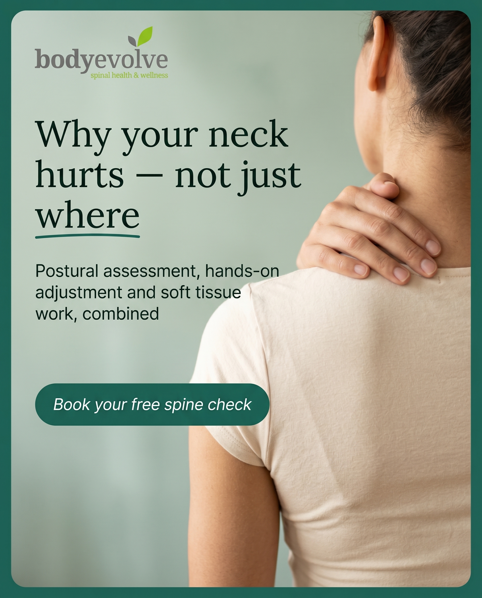
A calm clinical photograph of a neck assessment in progress, framing why someone living with neck pain would choose Body Evolve specifically. The angle: this isn't a quick rub-and-go — it's postural assessment, hands-on adjustment, and soft tissue work combined to find why the neck hurts, not just where. Positions the clinic as the considered choice for people who want the cause addressed.
Content: A calm clinical photograph of a neck assessment in progress, framing why someone living with neck pain would choose Body Evolve specifically. The angle: this isn't a quick rub-and-go — it's postural assessment, hands-on adjustment, and soft tissue work combined to find why the neck hurts, not just where. Positions the clinic as the considered choice for people who want the cause addressed.
Style: photography
2.
L3S2A3
graphic-design
Solution-aware
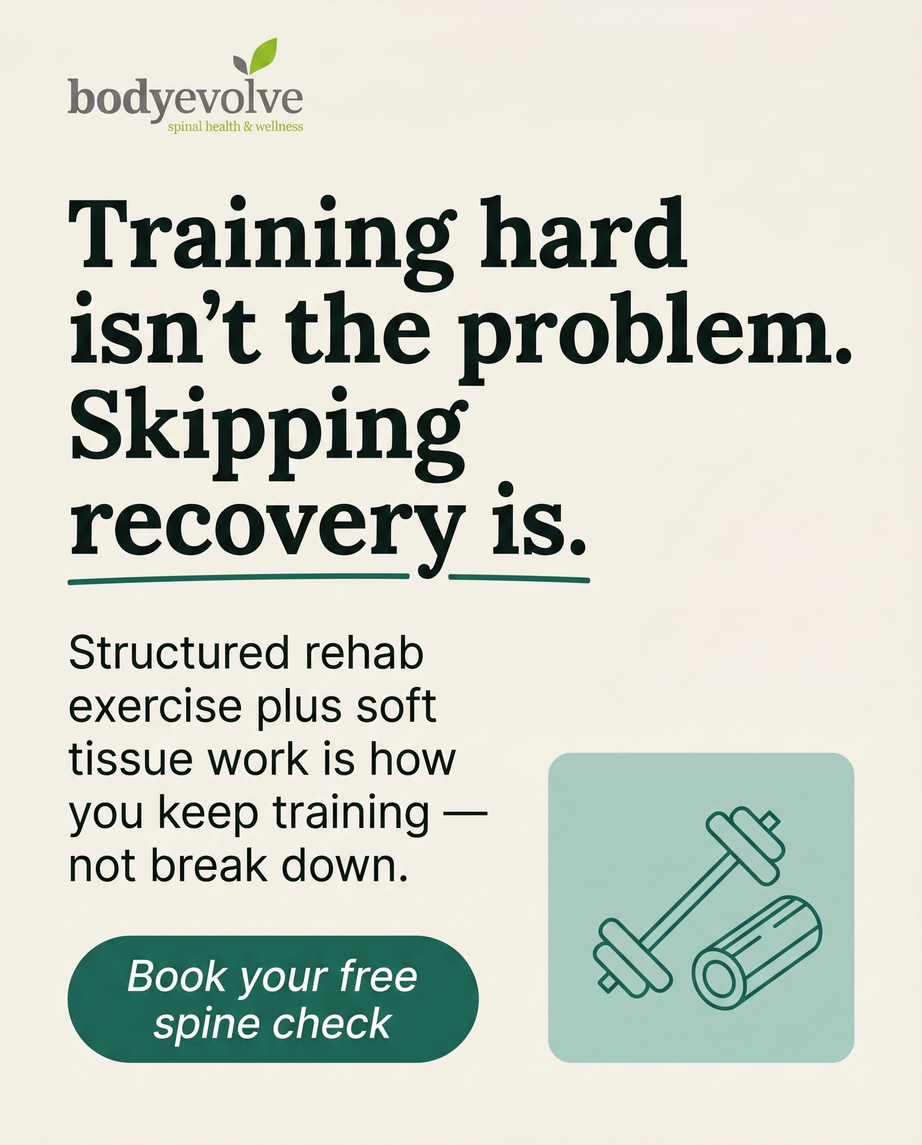
A clean graphic showing the gap between training hard and recovering properly — the missing piece for people piling on load without rest. The message: recovery isn't passive, and structured rehab exercise plus soft tissue work is how you keep training without breaking down. Answers the 'what actually fixes this' question for active people.
Content: A clean graphic showing the gap between training hard and recovering properly — the missing piece for people piling on load without rest. The message: recovery isn't passive, and structured rehab exercise plus soft tissue work is how you keep training without breaking down. Answers the 'what actually fixes this' question for active people.
Style: graphic-design
3.
T1S3A3
illustrative-3D
Solution-aware
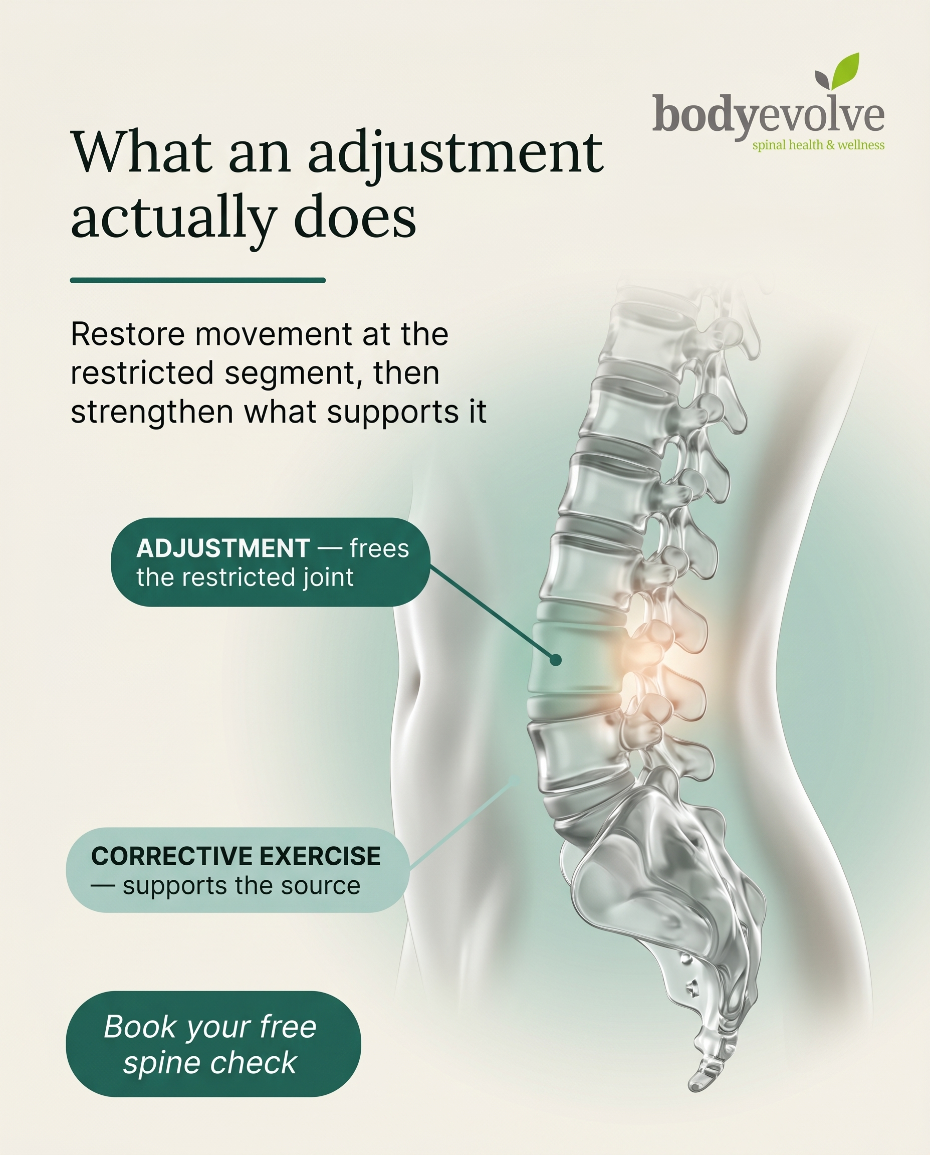
A 3D illustration of the spine that walks through what a chiropractic adjustment and corrective exercise plan actually does for back pain. The angle is purely explanatory — showing the reader who already knows they want help what the treatment involves and why it targets the source. Demystifies the process so it feels understandable rather than mysterious.
Content: A 3D illustration of the spine that walks through what a chiropractic adjustment and corrective exercise plan actually does for back pain. The angle is purely explanatory — showing the reader who already knows they want help what the treatment involves and why it targets the source. Demystifies the process so it feels understandable rather than mysterious.
Style: illustrative-3D
4.
T3S4A3
comparison-card
Solution-aware
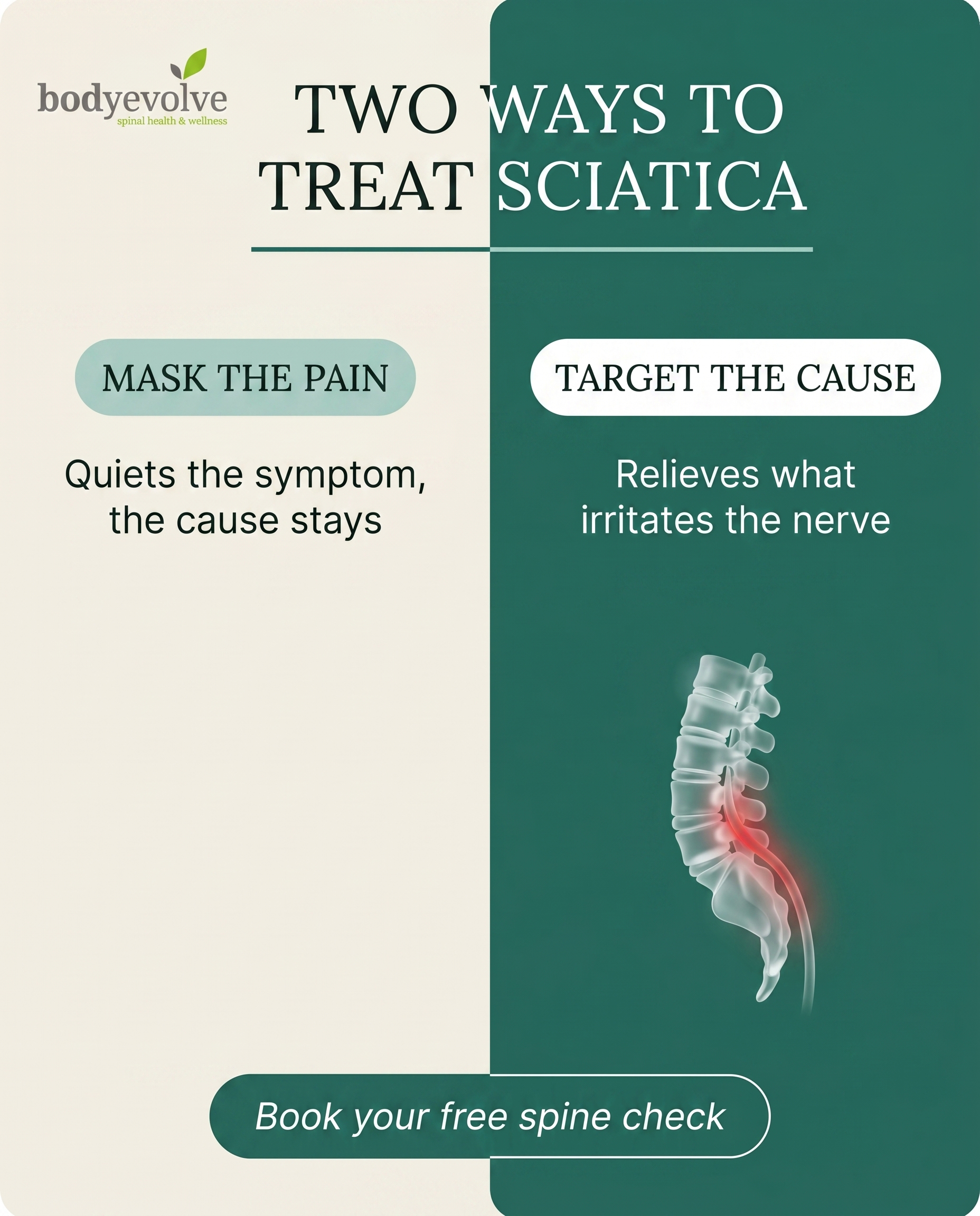
A comparison card contrasting two approaches to sciatica: masking the pain versus addressing what's compressing or irritating the nerve. The message lands by showing the reader why structured manual therapy and rehab exercise targets the cause where painkillers only quiet the symptom. Helps a solution-aware reader understand what 'fixing it' really means.
Content: A comparison card contrasting two approaches to sciatica: masking the pain versus addressing what's compressing or irritating the nerve. The message lands by showing the reader why structured manual therapy and rehab exercise targets the cause where painkillers only quiet the symptom. Helps a solution-aware reader understand what 'fixing it' really means.
Style: comparison-card
5.
C1S5
qa-card
A warm Q&A card answering 'who actually comes here?' — the honest answer being everyone from newborns to grandparents, often the same family across generations. The angle is belonging: this is a place where a whole family's care lives under one roof, whatever stage of life. Builds recognition that people like you, and yours, are already here.
Content: A warm Q&A card answering 'who actually comes here?' — the honest answer being everyone from newborns to grandparents, often the same family across generations. The angle is belonging: this is a place where a whole family's care lives under one roof, whatever stage of life. Builds recognition that people like you, and yours, are already here.
Style: qa-card
6.
T4S6A4
myth-buster
Product-aware
A myth-buster correcting the assumption that headaches and migraines are purely something to medicate away. The angle reframes toward the neck and posture as drivers many people overlook, and positions Body Evolve's combined assessment and adjustment approach as the reason to choose them for tension-driven headaches. Lands as 'here's the angle others miss, and here's why we're suited to it.'
Content: A myth-buster correcting the assumption that headaches and migraines are purely something to medicate away. The angle reframes toward the neck and posture as drivers many people overlook, and positions Body Evolve's combined assessment and adjustment approach as the reason to choose them for tension-driven headaches. Lands as 'here's the angle others miss, and here's why we're suited to it.'
Style: myth-buster
7.
T9S7A2
list-tips
Problem-aware
A list of tell-tale signs that what you're feeling in your back or leg might involve a disc, not just an everyday twinge. The angle validates a worried reader's question — is this a real problem? — by naming the symptoms that warrant attention without alarming them. Helps them recognise their experience as something worth taking seriously.
Content: A list of tell-tale signs that what you're feeling in your back or leg might involve a disc, not just an everyday twinge. The angle validates a worried reader's question — is this a real problem? — by naming the symptoms that warrant attention without alarming them. Helps them recognise their experience as something worth taking seriously.
Style: list-tips
8.
T10S8A4
stat-card
Product-aware
A stat card that quantifies how common persistent muscle tension and strain really is among desk-bound and active people, used to frame why the right hands matter. The angle: with numbers this high, the choice isn't whether to address it but who you trust — and Body Evolve combines soft tissue therapy, assessment and rehab rather than a one-off massage. Positions the clinic as the considered option.
Content: A stat card that quantifies how common persistent muscle tension and strain really is among desk-bound and active people, used to frame why the right hands matter. The angle: with numbers this high, the choice isn't whether to address it but who you trust — and Body Evolve combines soft tissue therapy, assessment and rehab rather than a one-off massage. Positions the clinic as the considered option.
Style: stat-card
9.
L5S9A2
checklist
Problem-aware
A checklist of everyday sleep and lifestyle habits — late screens, poor hydration, restless nights — that quietly feed back into aches and tension. The angle helps a problem-aware reader connect the dots between how they live and how their body feels, confirming the discomfort is real and traceable. Gentle self-recognition, not a hard sell.
Content: A checklist of everyday sleep and lifestyle habits — late screens, poor hydration, restless nights — that quietly feed back into aches and tension. The angle helps a problem-aware reader connect the dots between how they live and how their body feels, confirming the discomfort is real and traceable. Gentle self-recognition, not a hard sell.
Style: checklist
10.
T7S7A4
list-tips
Product-aware
A list-tips post on what to look for when choosing where to take a sports injury — and why a place offering assessment, soft tissue work, taping and rehab exercise prescription matters more than a single quick fix. The angle is decision-stage: for active people weighing options, this shows why Body Evolve's combined approach gets them back to training properly. Frames the clinic as the recovery partner, not just the patch-up.
Content: A list-tips post on what to look for when choosing where to take a sports injury — and why a place offering assessment, soft tissue work, taping and rehab exercise prescription matters more than a single quick fix. The angle is decision-stage: for active people weighing options, this shows why Body Evolve's combined approach gets them back to training properly. Frames the clinic as the recovery partner, not just the patch-up.
Style: list-tips
3
Developed Posts
10 posts · 2026-06-03T10:22
10 developed
▼
1.
T2S1A4
Rough Image Prompt
Elevated wellness photography communicating a considered, cause-focused approach to neck pain care. Subject: a person shown from behind or from the shoulders only, head cropped out entirely, one hand resting lightly at the base of their own neck where tension sits — suggesting the area of discomfort. The relationship of a chiropractor's care is implied through a partial, cropped hand offering supportive guidance near the neck/shoulder region (no full practitioner figure, no faces, no clinic furniture). Concept: this is not a quick fix but a methodical assessment — posture, hands-on adjustment, and soft tissue work combined to find WHY the neck hurts, not just where. Mood: calm, considered, trustworthy, soft natural lighting, neutral uncluttered setting, editorial in feel rather than documentary. Integrate brand colour cues naturally through fabric tones, soft surfaces, or a gentle background field. Brand palette to draw from: #1E6B5C deep teal-green, #A8CFC4 soft sage, #F4F0E8 warm cream, #14211D near-black green undertone, #FFFFFF white. Typography: Lora Regular for headline, Inter Regular for supporting text, Inter Regular italic for CTA. Text to render: headline 'Why your neck hurts — not just where', supporting text 'Postural assessment, hands-on adjustment and soft tissue work, combined', CTA 'Book your free spine check'. Logo placement varies by composition and is finalised downstream. Show clean, intentional composition with the body framed from behind or shoulders-down only, soft daylight, calm atmosphere.
Text Overlay
Caption
Neck pain rarely starts in the neck. The ache you feel is often the end of a chain — hours at a desk, a phone held a little too low, shoulders that have quietly crept forward over months. Rubbing the sore spot might ease it for an afternoon. Finding why it's there is what actually changes things.
That's the difference here. A neck assessment at Body Evolve isn't a quick rub-and-go. It's postural assessment to see how you're holding yourself, hands-on adjustment to restore movement, and soft tissue work to release what's been gripping — all combined to address the cause, not just the symptom.
If your neck has been talking to you for a while now, it's worth listening properly. Our free spine check is a calm place to start.
📞 0161 366 0904
🌐 https://body-evolve.co.uk
✉️ info@body-evolve.co.uk
Where does your neck tightness tend to creep in — desk, phone, or sleep?
Hashtags
#NeckPainRelief #GeeCrossChiropractor #PosturalHealth #BodyEvolve #BEgreen
2.
L3S2A3
Rough Image Prompt
A typographic-led graphic design post for a chiropractic and sports recovery practice, communicating that recovery is an active, structured part of training — not an afterthought. The concept centres on closing the gap between heavy training load and proper recovery, framing rehab exercise and soft tissue work as the missing piece that keeps active people training without breaking down. Visual register is rich graphic design: bold typography carries the message, supported by a small editorial-style accent element such as a clean line illustration or icon set suggesting load, balance, and recovery (e.g. a simple weight or barbell motif paired with a recovery or movement motif), or an isolated athletic object close-up like a foam roller or running shoe on a neutral ground used small and supporting — not full-frame. Keep all imagery illustrative and editorial, no clinic interiors, no treatment tables, no practitioner-patient scenes, no faces. Use the brand colour palette: #1E6B5C deep teal-green, #A8CFC4 soft sage, #F4F0E8 warm cream, #14211D near-black with green undertone, #FFFFFF white. Typography: Lora Regular for the headline and display text, Inter Regular for supporting text, Inter Regular italic for the CTA. Text to render: headline 'Training hard isn't the problem. Skipping recovery is.', supporting text 'Structured rehab exercise plus soft tissue work is how you keep training — not break down.', CTA 'Book your free spine check'. Logo placement varies by composition and is finalised downstream. Clean, intentional, confident sports-recovery aesthetic with generous space and strong typographic hierarchy.
Text Overlay
Caption
You can train as hard as you like. But load without recovery is how good athletes end up sidelined.
Recovery isn't sitting still and hoping the soreness fades. It's active. Structured rehab exercise to build the areas that keep breaking down, soft tissue and sports massage work to release the tension that builds with every session, and a plan that lets you keep pushing without paying for it later.
Most of the active people we see aren't training wrong. They're just missing the recovery half of the equation. Sort that, and you train more consistently, recover faster, and stop cycling through the same aches.
If you're piling on the load and feeling it catch up with you, let's take a proper look.
📞 0161 366 0904
🌐 https://body-evolve.co.uk
✉️ info@body-evolve.co.uk
What's your recovery routine actually look like? 💚
Hashtags
#SportsRecovery #ChiropractorHyde #RehabExercise #TrainSmart #BodyEvolve
3.
T1S3A3
Rough Image Prompt
Illustrative-3D anatomical render of a human lumbar spine and lower back region, shown as a clean translucent glass-like model with anatomically accurate vertebrae, discs, and surrounding soft tissue suggested. The illustration is explanatory in character — it visually communicates how a chiropractic adjustment restores movement at a restricted spinal segment and how corrective exercise supports the surrounding muscles. Use a subtle green accent glow (#A8CFC4) on the targeted lower-back vertebral segment to indicate the focus area, and a soft warm highlight to suggest restored motion. Render the spine with clinical polish — translucent, editorial, intentional — on a clean neutral or gently graded brand-colour background. Anatomical illustration only, no people, no faces, no clinic environment. Available brand palette (use only these): #1E6B5C deep teal-green, #A8CFC4 soft sage, #F4F0E8 warm cream, #14211D near-black green undertone, #FFFFFF white. Typography: Lora for the headline and any short framing text, Inter for supporting text, Inter italic for the CTA. Text to render: headline 'What an adjustment actually does', supporting line 'Restore movement at the restricted segment, then strengthen what supports it', CTA 'Book your free spine check'. Two small supporting labels near the diagram: 'ADJUSTMENT — frees the restricted joint' and 'CORRECTIVE EXERCISE — supports the source'. Keep labelled diagram elements to a maximum of 4. Logo placement varies by composition and is finalised downstream.
Text Overlay
Caption
Back pain can feel like a mystery — so here's what's actually happening when you come in for help. 💚
Most lower back pain comes down to a spinal segment that isn't moving the way it should. The surrounding muscles tighten to protect it, and the whole area gets stuck in a cycle of discomfort.
A chiropractic adjustment works on that restricted segment — restoring movement where it's been lost. That's step one. Step two is corrective exercise, building strength in the muscles that support the source so the relief actually holds.
It's not about chasing the pain around. It's about targeting why it started in the first place.
If you've been putting up with an ache that keeps coming back, our free spine check is a simple place to start.
📞 0161 366 0904
🌐 https://body-evolve.co.uk
✉️ info@body-evolve.co.uk
Whereabouts do you feel yours most — lower back or higher up?
Hashtags
#Chiropractic #BackPainRelief #HydeChiropractor #SpinalHealth #BodyEvolve
4.
T3S4A3
Rough Image Prompt
A comparison-card graphic contrasting two approaches to sciatica, designed as a clean typographic composition with a supporting anatomical accent. The concept: one side represents quieting the symptom (masking nerve pain), the other represents addressing the root cause (relieving what compresses or irritates the sciatic nerve through structured manual therapy and rehab). Two distinct labelled sides carrying equal visual weight, each with a short heading and one supporting line. Include a small, supporting anatomical illustration of the lower spine and sciatic nerve pathway rendered in a clean, semi-translucent, glass-like editorial style — with a subtle red glow accent indicating nerve irritation, used to anchor the cause-focused side. Brand colours to draw from: #1E6B5C deep teal-green, #A8CFC4 soft sage, #F4F0E8 warm cream, #14211D near-black green undertone, #FFFFFF white. Typography: Lora for the headline and side labels, Inter for supporting text, Inter italic for the CTA. Text to render: headline 'TWO WAYS TO TREAT SCIATICA', side one label 'MASK THE PAIN' with supporting line 'Quiets the symptom, the cause stays', side two label 'TARGET THE CAUSE' with supporting line 'Relieves what irritates the nerve', CTA 'Book your free spine check'. Logo placement varies by composition and is finalised downstream. Keep the treatment typographic and intentional, with the anatomical illustration as a small supporting accent rather than a full-frame background.
Text Overlay
Caption
Sciatica isn't a single problem — it's a signal. That sharp, radiating ache down the leg means a nerve is being compressed or irritated somewhere along its path.
Painkillers have their place. They can quiet the symptom and get you through a rough day. But they don't change what's pressing on the nerve in the first place. Turn the volume down, and the cause is still sitting there waiting.
That's the difference structured care makes. Manual therapy and targeted rehab exercise work on what's actually driving the irritation — easing the compression, restoring movement, and giving the nerve room to settle properly.
One approach mutes the alarm. The other addresses why it's going off.
If sciatica keeps creeping back, it might be time to look at the cause rather than chase the symptom.
📞 0161 366 0904
🌐 https://body-evolve.co.uk
✉️ info@body-evolve.co.uk
Had sciatica that keeps returning? Tell us your story below.
Hashtags
#SciaticaRelief #ChiropracticCare #HydeManchester #BackPainSupport #BEgreen
5.
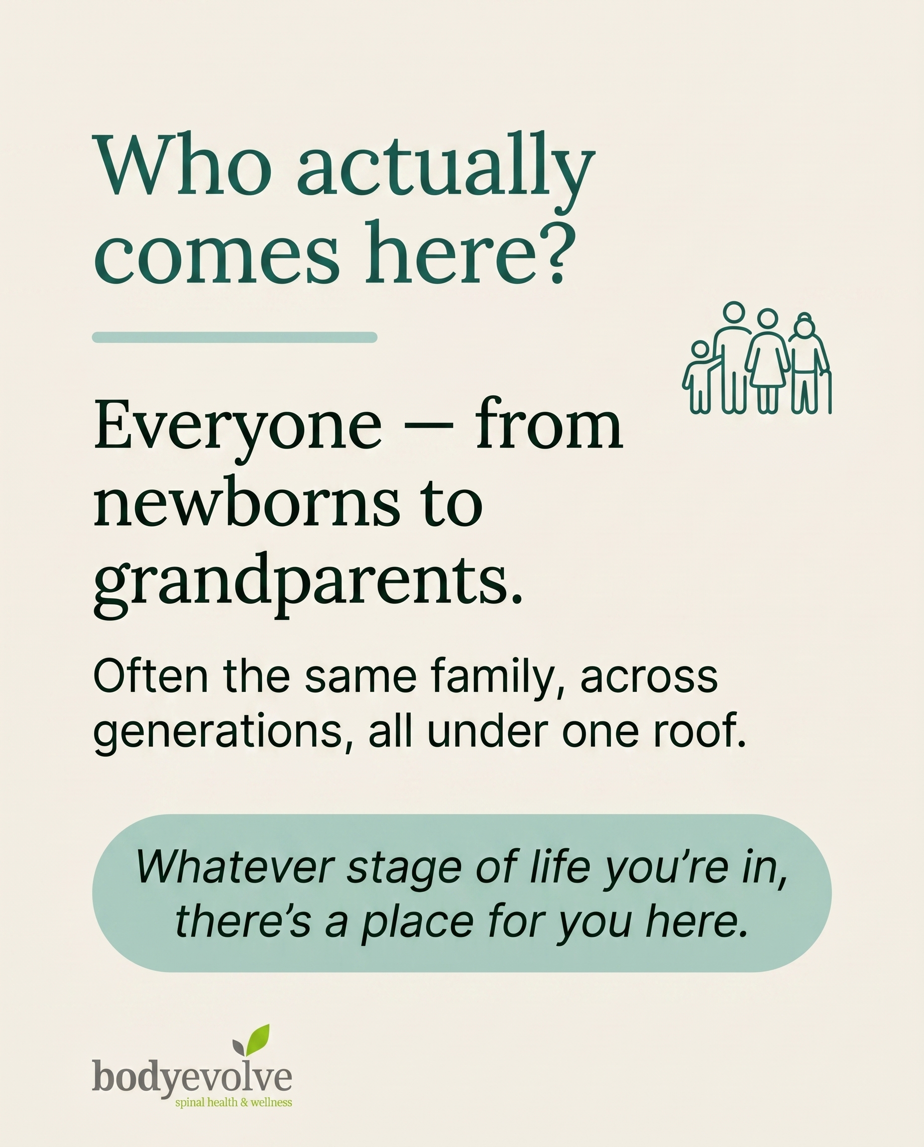
C1S5
Rough Image Prompt
A warm, typographic Q&A card answering the question 'Who actually comes here?' with a message of multigenerational family belonging — that care here spans every life stage, from newborns to grandparents, often the same family across generations. Typographic-led design with optional small supporting accent: a simple custom-illustrated icon or symbolic motif suggesting connected generations (e.g. a small line-drawn cluster of figures of varying sizes, or an abstract linked-shapes motif representing a family across stages) rendered as a clean accent, not full-frame imagery. Clear question-and-answer hierarchy. Typography: Lora Regular for the headline question and answer, Inter Regular for supporting text, Inter Regular italic for the CTA. Render this exact text: question 'Who actually comes here?', answer 'Everyone — from newborns to grandparents.', supporting text 'Often the same family, across generations, all under one roof.', CTA 'Whatever stage of life you're in, there's a place for you here.' Use only these brand colours: deep teal-green #1E6B5C, soft sage #A8CFC4, warm cream #F4F0E8, near-black green undertone #14211D, white #FFFFFF. Keep the composition warm, considered and editorial — typography is the hero. Logo placement should vary by composition and is finalised downstream.
Text Overlay
Caption
People often ask us who actually walks through the door. The honest answer? Everyone.
Newborns having their first gentle check. New mums recovering after pregnancy. Desk-bound professionals undoing a week of slouching. Weekend runners and club players keeping their bodies moving. Grandparents staying active and steady on their feet.
And more often than you'd think, it's the same family across all of it — three generations of care living under one roof. There's something quietly lovely about that.
This isn't a place for one type of person. It's a place where a whole family's wellbeing can be looked after, whatever stage of life they're at. If you've ever wondered whether it's for someone like you — it almost certainly is. And probably for the people you love too.
We're proud to be part of family life here in Gee Cross.
📞 0161 366 0904
🌐 https://body-evolve.co.uk
✉️ info@body-evolve.co.uk
Who in your family would benefit most? 💚
Hashtags
#ChiropracticCare #GeeCross #FamilyWellbeing #AllAgesWelcome #BodyEvolve
6.
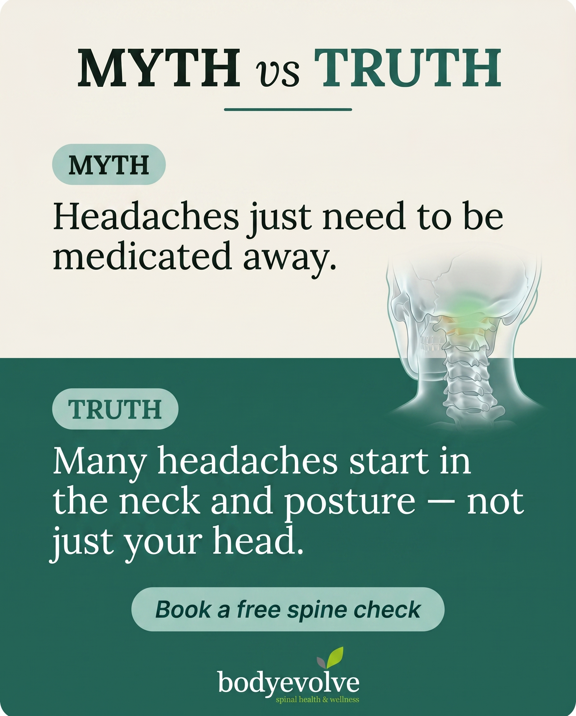
T4S6A4
Rough Image Prompt
Myth-buster style post correcting the belief that headaches and migraines can only be managed with painkillers. Typographic-led design with a supporting anatomical accent. Components: a 'MYTH' label and statement, a 'TRUTH' label and statement, and a soft CTA. Include a small, clean anatomical illustration of the upper neck and base-of-skull region (cervical spine and suboccipital area) rendered in a translucent, glass-like clinical style, with a gentle accent highlight at the top of the neck where tension drivers commonly originate — this is a supporting accent, not full-frame. Brand palette to draw from: #1E6B5C deep teal-green, #A8CFC4 soft sage, #F4F0E8 warm cream, #14211D near-black green undertone, #FFFFFF white. Typography: Lora for the MYTH and TRUTH statements and any headline, Inter for supporting text, Inter italic for the CTA. Text content to render: 'MYTH', 'Headaches just need to be medicated away.', 'TRUTH', 'Many headaches start in the neck and posture — not just your head.', and the CTA 'Book a free spine check'. Keep the composition bold and typographic with clear contrast between the myth side and the truth side. Logo placement should vary by composition and is finalised downstream. Show clean, intentional anatomical detail and crisp legible type on brand-coloured surfaces.
Text Overlay
Caption
Reaching for another painkiller every time a headache hits? It might be treating the symptom and missing the source.
So many tension headaches and migraines we see don't actually start in the head at all. They start lower down — in the neck, the base of the skull, and the postural habits that quietly build tension day after day. Hours hunched at a desk, looking down at a phone, shoulders creeping up towards your ears. The muscles tighten, the joints in the upper neck get irritated, and the ache travels up.
That's the angle a lot of people overlook. Medication can take the edge off, but it won't change what's driving it.
Here's where we're different. We assess the neck and posture properly first, then combine adjustment and soft tissue work to address the actual cause — not just quiet the symptom for a few hours.
If your headaches keep coming back, let's look at why.
📞 0161 366 0904
🌐 https://body-evolve.co.uk
✉️ info@body-evolve.co.uk
How often are you reaching for the paracetamol? 💚
Hashtags
#TensionHeadaches #ChiropracticCare #HydeManchester #PostureMatters #BodyEvolve
7.
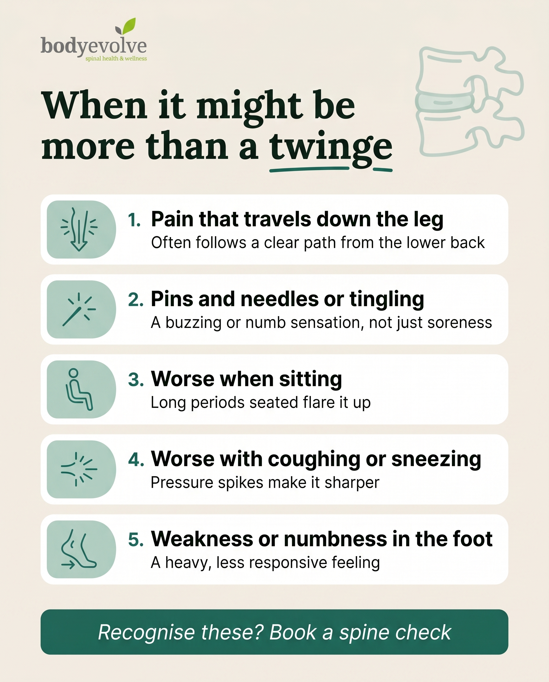
T9S7A2
Rough Image Prompt
A list-tips graphic for a chiropractic clinic, typographic-led design with custom illustrated icon accents. The post names tell-tale signs that back or leg discomfort might involve a spinal disc rather than everyday tightness — validating a worried reader without alarming them. Header introducing the list, followed by five short signs, each with its own small custom-illustrated line icon (a downward radiating line for pain travelling down the leg, a tingling/spark mark for pins and needles, a seated figure abstract for worse-when-sitting, a cough/pressure burst for worse with coughing or sneezing, a foot-and-arrow for weakness or numbness in foot). Keep the visual character clean, calm and editorial — typography dominant with supporting icons, not photography. Optional small supporting accent: a simplified anatomical illustration of two vertebrae with a disc between them, rendered in a clean translucent style, used as a subtle accent rather than the focus. Brand palette to draw from: #1E6B5C deep teal-green, #A8CFC4 soft sage, #F4F0E8 warm cream, #14211D near-black with green undertone, #FFFFFF white. Typography: Lora for the headline, Inter for the supporting and item text, Inter italic for the CTA. Text to render: headline 'When it might be more than a twinge', then five items — 'Pain that travels down the leg' / 'Often follows a clear path from the lower back', 'Pins and needles or tingling' / 'A buzzing or numb sensation, not just soreness', 'Worse when sitting' / 'Long periods seated flare it up', 'Worse with coughing or sneezing' / 'Pressure spikes make it sharper', 'Weakness or numbness in the foot' / 'A heavy, less responsive feeling', and CTA 'Recognise these? Book a spine check'. Logo placement should vary by composition and is finalised downstream. Clean, considered, reassuring tone throughout.
Text Overlay
Caption
If you've been quietly wondering whether that back pain is something to take seriously, this one's for you.
Most aches settle on their own. But when a disc is involved, your body tends to give clearer signals — and they're worth listening to.
Here's what often points to more than everyday soreness:
1. Pain that travels down the leg, following a path from the lower back
2. Pins and needles or tingling, rather than a dull ache
3. Discomfort that gets worse the longer you sit
4. A sharper jolt when you cough or sneeze
5. Weakness or numbness in the foot
None of these mean panic. They simply mean your back is asking for a proper look rather than another week of hoping it passes. Recognising the signs early gives you the best shot at staying mobile and avoiding the longer road.
Noticed one or two of these? A spine check is a calm, no-pressure place to start.
📞 0161 366 0904
🌐 https://body-evolve.co.uk
✉️ info@body-evolve.co.uk
Which of these sounds most familiar to you?
Hashtags
#Chiropractic #DiscHealth #BackPainRelief #GeeCross #BEgreen
8.
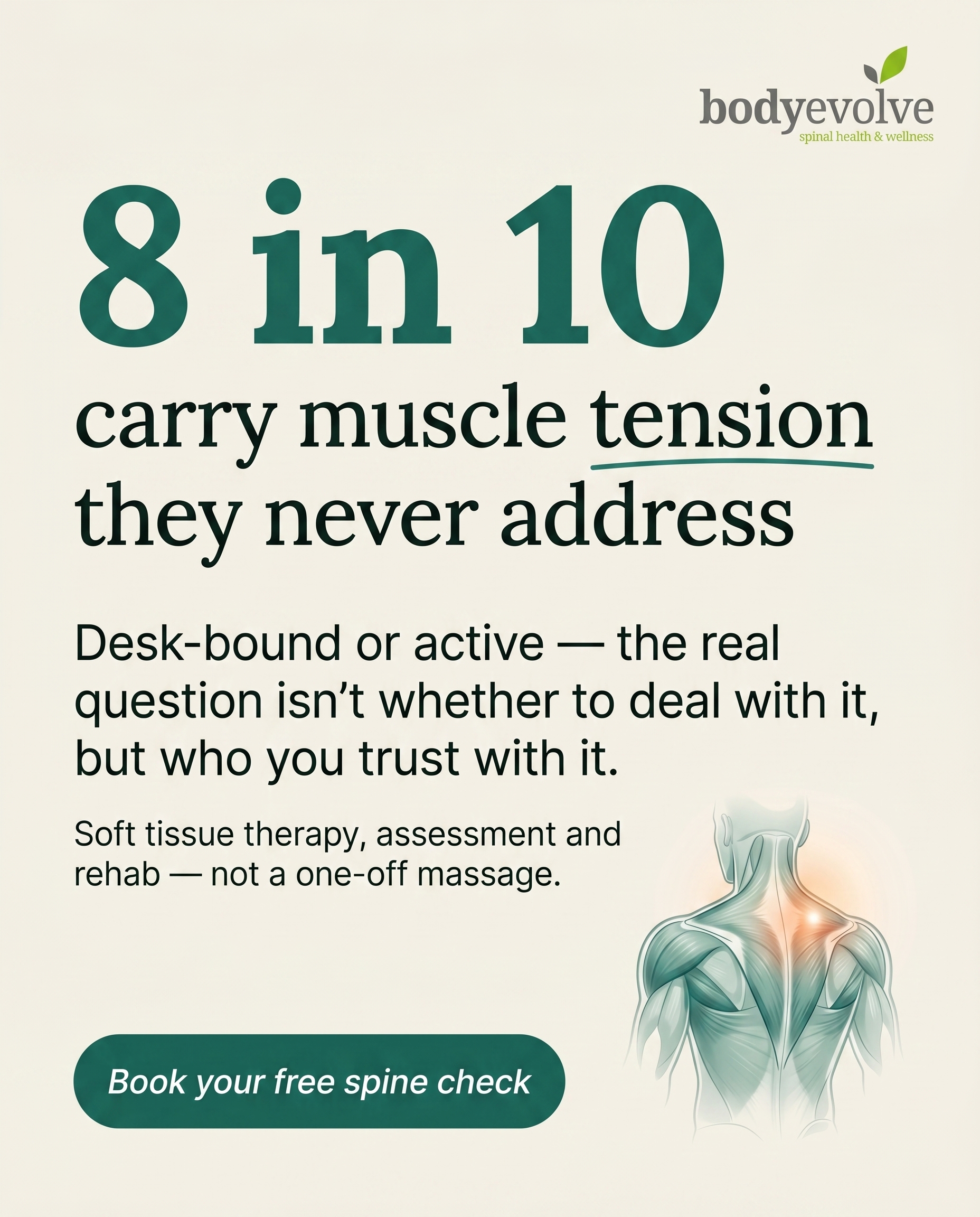
T10S8A4
Rough Image Prompt
A stat-card in a strong typographic register that makes one statistic the dominant visual anchor: how widespread persistent muscle tension and strain is among desk-bound and active adults. The composition is typography-led with a small supporting accent only — a clean anatomical illustration of upper back and shoulder muscle structure (trapezius and surrounding soft tissue) rendered in a translucent, glass-like clinical style, with a subtle warm highlight over the muscle to suggest tension. The accent must stay small and supporting, never full-frame, never competing with the stat. No faces, no bodies, no clinic environment, no treatment scene. Brand palette to draw from: #1E6B5C deep teal-green, #A8CFC4 soft sage, #F4F0E8 warm cream, #14211D near-black green undertone, #FFFFFF white. Typography: Lora Regular for the headline statistic and any display text, Inter Regular for supporting context and source line, Inter Regular italic for the CTA. Text to render: large stat '8 in 10', headline phrase 'carry muscle tension they never address', supporting line 'Desk-bound or active — the real question isn't whether to deal with it, but who you trust with it.', smaller context line 'Soft tissue therapy, assessment and rehab — not a one-off massage.', and CTA 'Book your free spine check'. Keep total rendered text elements within cap. Logo placement varies by composition and is finalised downstream. The overall feel is considered, credible, editorial — clean surface, generous space around the statistic, restrained clinical accent.
Text Overlay
Caption
Tightness across the shoulders. A back that never quite switches off. A neck that stiffens by mid-afternoon. For most desk-bound and active people, persistent muscle tension isn't the exception — it's the everyday. The numbers are high enough that the honest question isn't whether to do something about it. It's who you trust to actually get to the cause. A one-off massage can ease the surface for a day or two. But tension that keeps coming back is usually telling you something about how you sit, train, recover or move. That's why our approach pairs soft tissue therapy with proper assessment and a rehab plan built around you — so the relief lasts longer than the appointment. Carrying tension you've learned to live with? Let's look at why it keeps returning. 💚
📞 0161 366 0904
🌐 https://body-evolve.co.uk
✉️ info@body-evolve.co.uk
Where do you hold your tension most — shoulders, neck or lower back?
Hashtags
#MuscleTension #SoftTissueTherapy #GeeCross #DeskPosture #BodyEvolve
9.
L5S9A2
Rough Image Prompt
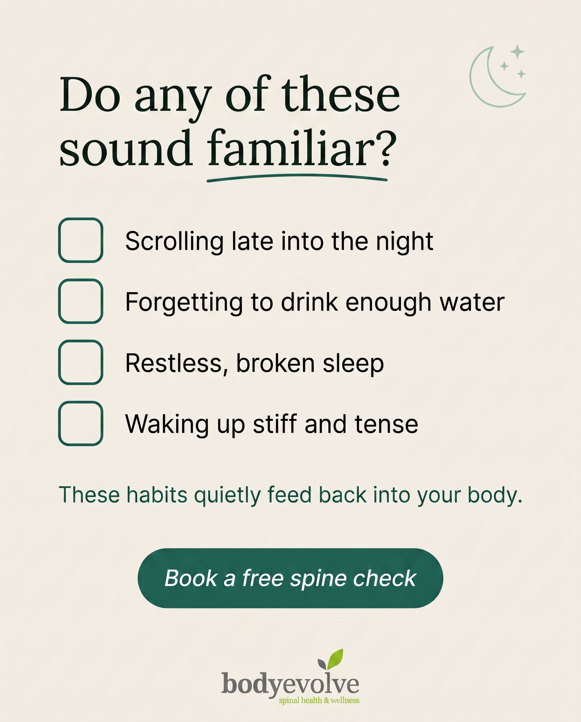
A typographic-led checklist graphic for a chiropractic clinic, helping a problem-aware reader connect everyday sleep and lifestyle habits to the aches and tension they feel. The composition is clean and editorial, built primarily from typography with checkbox graphics. Include a framing question line, four short checklist items each paired with a clean checkbox graphic, and a soft closing line. Add a small supporting accent element relating to rest and recovery — a simple line-style moon-and-stars or pillow icon, or a subtle abstract wave suggesting calm — kept small and secondary so it never competes with the text. Brand colours to draw from: deep teal-green #1E6B5C, soft sage #A8CFC4, warm cream #F4F0E8, near-black green undertone #14211D, white #FFFFFF. Typography: Lora Regular for the headline and framing line, Inter Regular for checklist items and supporting text, Inter Regular italic for the CTA. Text to render: framing line 'Do any of these sound familiar?'; checklist items 'Scrolling late into the night', 'Forgetting to drink enough water', 'Restless, broken sleep', 'Waking up stiff and tense'; closing line 'These habits quietly feed back into your body.'; CTA 'Book a free spine check'. Checkbox graphics should be clean and consistent. Logo placement varies by composition and is finalised downstream. Keep the look warm, calm and considered — soft brand-colour surfaces, generous spacing, and a recovery-focused mood.
Text Overlay
Caption
The way you feel in the morning often starts the night before. 🌙
Late screens, not enough water, broken sleep — none of it seems like a big deal on its own. But your body keeps the score. Tight shoulders, a stiff lower back, that ache that's there before you've even got out of bed — they're often the slow build-up of small daily habits.
If you ticked one or two of these, it's not in your head. The discomfort is real, and it's traceable. The good news is that means it's something you can work with.
Start by noticing the patterns. Then, if the tension keeps coming back, it's worth getting your spine and posture properly checked rather than waiting it out.
Our free spine check is a gentle place to begin. 💚
📞 0161 366 0904
🌐 https://body-evolve.co.uk
✉️ info@body-evolve.co.uk
Which one of these is your daily habit? Let us know below.
Hashtags
#Chiropractic #GeeCross #SleepAndPosture #BackPainRelief #BEgreen
10.
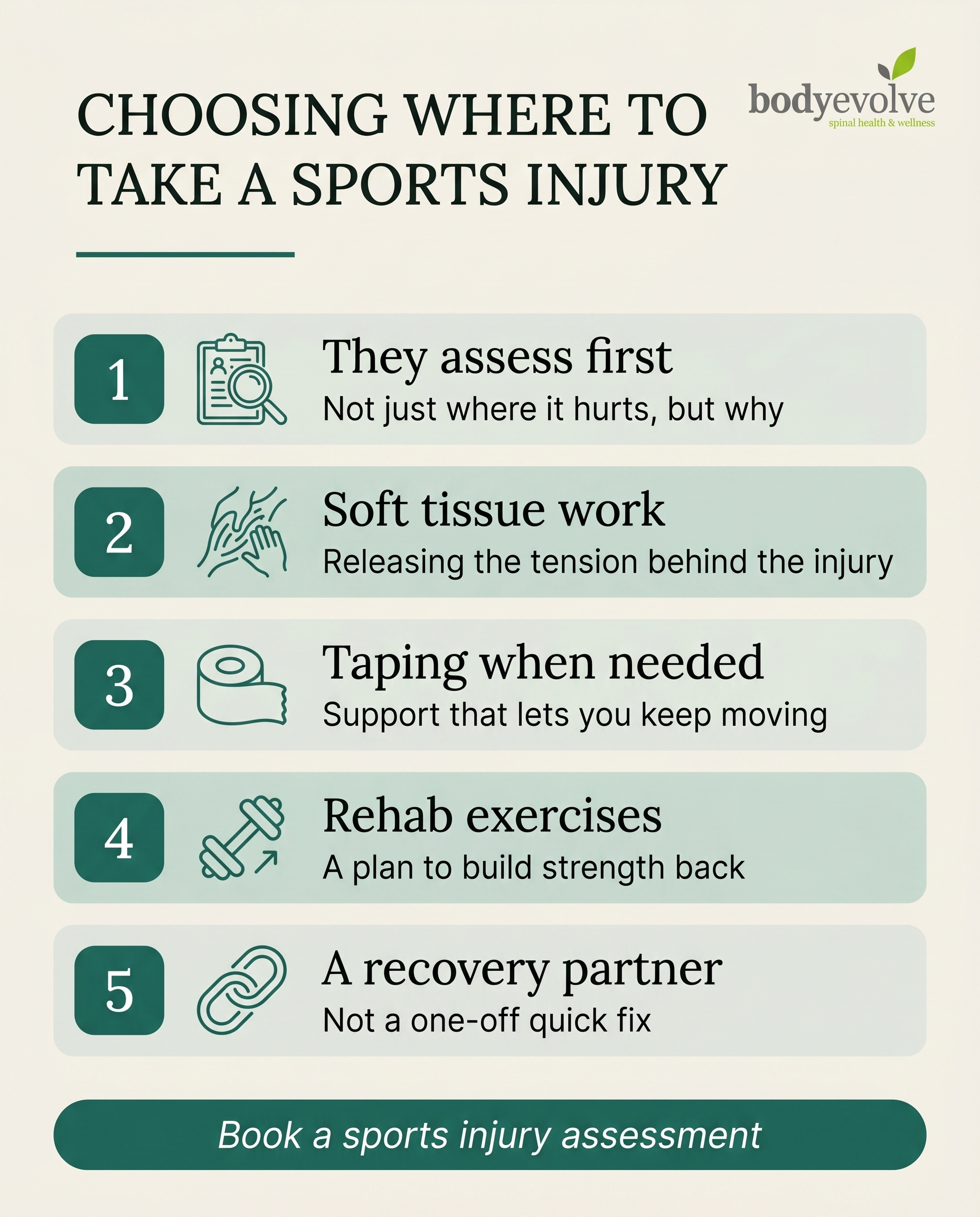
T7S7A4
Rough Image Prompt
A list-tips graphic-design post for an active audience choosing where to take a sports injury. Typographic-led design with custom illustrated icons accenting each tip. Header introduces the list, followed by 5 numbered tips, each with a short heading line and one supporting line. Components required: header text, 5 numbered list items each with its own small custom illustrated icon (a magnifying glass or assessment clipboard icon for assessment, a hands-on-muscle soft tissue icon, a roll of kinesiology tape icon, a dumbbell or movement-arrow rehab icon, a connected-cycle or partnership loop icon), and a CTA line. Brand palette to draw from: #1E6B5C deep teal-green, #A8CFC4 soft sage tint, #F4F0E8 warm cream, #14211D near-black with green undertone, #FFFFFF white. Typography: Lora Regular for the header and numbered tip headings, Inter Regular for supporting lines, Inter Regular italic for the CTA. Text content to render: header 'CHOOSING WHERE TO TAKE A SPORTS INJURY', tip 1 heading 'They assess first' with supporting line 'Not just where it hurts, but why', tip 2 heading 'Soft tissue work' with supporting line 'Releasing the tension behind the injury', tip 3 heading 'Taping when needed' with supporting line 'Support that lets you keep moving', tip 4 heading 'Rehab exercises' with supporting line 'A plan to build strength back', tip 5 heading 'A recovery partner' with supporting line 'Not a one-off quick fix', CTA 'Book a sports injury assessment'. Logo placement should vary by composition and is finalised downstream. Keep the design clean, considered and editorial with small distinct icons and clear numbered hierarchy. Typographic in character throughout — icons remain small supporting accents, not full-frame imagery.
Text Overlay
Caption
When you pick up a sports injury, the temptation is to find the quickest patch-up and get back out there. But a quick fix on the painful spot rarely sorts the reason it happened in the first place.
Here's what actually gets you back to training properly:
An assessment that looks at why the injury happened, not just where it hurts. Soft tissue work to release the tension feeding the problem. Taping for support that keeps you moving while you heal. And rehab exercises to rebuild the strength that protects you next time.
That's the difference between being patched up and being properly looked after. We'd rather be your recovery partner — the place that gets you back to full training, not just out the door.
If you're weighing up your options after a sports injury, come and have it properly assessed first.
📞 0161 366 0904
🌐 https://body-evolve.co.uk
✉️ info@body-evolve.co.uk
What's been holding you back from training lately? Let us know below.
Hashtags
#SportsInjury #ChiropractorHyde #InjuryRecovery #BackToTraining #BodyEvolve
4
Refined Image Prompts
10 prompts · 2026-06-03T10:24
10 prompts refined
▼
1.
T2S1A4
Refined Image Prompt
Editorial wellness photography communicating a considered, cause-focused approach to neck pain care. The subject is a person shown from the shoulders down only, head cropped entirely out of frame, photographed from behind at a slight three-quarter angle. One of their own hands rests lightly at the base of the neck where tension gathers, fingers softly pressing the muscle just above the shoulder blade. A second hand — a partial, cropped practitioner's hand entering gently from the upper edge — offers supportive guidance near the neck and shoulder region, communicating careful, methodical hands-on care. No faces, no full practitioner figure, no clinic furniture. The subject wears a soft, fitted top in warm cream #F4F0E8 with subtle natural fabric texture. The setting is a neutral, uncluttered space with a gentle soft-focus background field in soft sage #A8CFC4 fading toward deeper teal-green #1E6B5C at the edges, creating quiet depth.
Lighting is soft, diffused natural daylight falling from the upper left, wrapping the shoulders and neck in calm, even illumination with gentle shadows. The mood is trustworthy, considered, and reassuring — refined and editorial in feel rather than documentary. Skin tones are natural and warm.
Composition: the figure occupies the right two-thirds of the frame, leaving generous open space on the left for text. The overall register is warm, rounded, approachable family wellness — soft edges throughout, nothing clinical or harsh.
Text treatment, placed in the left open space:
Headline in Lora Regular, in near-black with green undertone #14211D, reading "Why your neck hurts — not just where", set across two to three lines with comfortable line spacing, positioned in the upper-left quadrant. Beneath the word "where", a thin underline accent in deep teal-green #1E6B5C drawing the eye.
Supporting text in Inter Regular, in #14211D at a softer weight of emphasis, reading "Postural assessment, hands-on adjustment and soft tissue work, combined", set in two lines directly below the headline with clear breathing room.
CTA rendered inside a soft pill-shaped button with 10px rounded corners, filled solid in deep teal-green #1E6B5C, positioned in the lower-left. The CTA text reads "Book your free spine check" in Inter Regular italic, in white #FFFFFF, centred within the pill with even padding.
All rectangular and contained elements use moderate 8-12px rounded corners. Accents are limited to the thin teal underline and the soft teal CTA pill, keeping attention calm and intentional.
Place the supplied logo, exactly as provided in the attached logo file, in the top-left corner at a modest scale with clear margin around it. Preserve the logo's original colours, proportions, lettering and layout precisely — do not recolour, distort, redraw, or alter it in any way.
Constraints: keep the composition clean and uncluttered with generous negative space; no faces or cropped facial features; no full practitioner figure; no clinic furniture or equipment; soft natural daylight only; warm, calm, editorial atmosphere; all text legible with strong contrast against its background; colours drawn only from the specified hex values.
2.
L3S2A3
Refined Image Prompt
A typographic-led editorial graphic design composition for a chiropractic and sports recovery practice, built on a warm cream surface in #F4F0E8 with generous breathing space and a confident, intentional sports-recovery aesthetic. The overall mood is warm, rounded, approachable family wellness — clean and calm but with strong graphic backbone.
Layout is structured around a dominant left-aligned typographic block in the upper two-thirds of the frame. The headline reads "Training hard isn't the problem. Skipping recovery is." set in Lora Regular in #14211D near-black with green undertone, large and commanding, stacked across three or four lines with tight, deliberate line breaks so "Skipping recovery is." lands on its own line as the emphatic close. Beneath the headline, underline the phrase "Skipping recovery is." with a thin horizontal accent line in #1E6B5C deep teal-green, kept slim and elegant.
Below the headline, after a comfortable gap, set the supporting text "Structured rehab exercise plus soft tissue work is how you keep training — not break down." in Inter Regular in #2B2B2B charcoal at a calm, readable size, constrained to a measured column width on the left so it does not run edge to edge.
In the lower-left region, place a soft pill-shaped button with moderate 10px rounded corners filled in #1E6B5C deep teal-green, containing the CTA "Book your free spine check" in Inter Regular italic in #FFFFFF white, centred within the pill with even padding.
In the lower-right quadrant, balancing the typographic weight on the left, place a small supporting editorial line-illustration motif: a simple, clean single-weight line drawing of a barbell paired with a foam roller, drawn in #1E6B5C deep teal-green strokes on the cream ground, sized small and restrained as an accent — suggesting training load and recovery side by side. Keep it minimal, geometric, and editorial. Optionally rest the motif inside a soft sage #A8CFC4 rounded panel with moderate 10px corners to anchor it gently, with quiet space around it. No clinic interiors, no treatment tables, no practitioner or patient scenes, no faces, no photographic people.
Position the attached logo in the top-left corner at a modest, confident size, reproduced exactly as supplied with its original colours, proportions, and lettering fully intact and unaltered — do not redraw, recolour, restyle, or regenerate the logo in any way; preserve it precisely as the provided file.
Lighting is flat, even, and editorial with no harsh shadows, allowing the typography and cream surface to feel clean and open. All rectangular elements, panels, and buttons use consistent moderate 8 to 12px rounded corners. Attention is drawn only through soft pills and thin underlines, never heavy boxes or glows.
Constraints: keep all imagery illustrative and editorial only; use solely the colours #1E6B5C, #A8CFC4, #F4F0E8, #14211D, #2B2B2B and #FFFFFF; render only the specified text exactly as quoted with correct spelling and apostrophes; maintain generous negative space and strong typographic hierarchy throughout.
3.
T1S3A3
Refined Image Prompt
A polished illustrative-3D anatomical render serving as the centrepiece of an editorial wellness infographic. The subject is a human lumbar spine and lower back region rendered as a clean translucent glass-like model, with anatomically accurate vertebrae and intervertebral discs, surrounded by a soft suggestion of supporting soft tissue and musculature. The model is explanatory in character, intentionally communicating how a chiropractic adjustment restores movement at a restricted spinal segment while corrective exercise strengthens the surrounding muscles. The spine sits angled three-quarter view, occupying the centre-right of the composition, with the targeted lower-back vertebral segment carrying a subtle sage-green accent glow in #A8CFC4 to mark the focus area, and a soft warm highlight suggesting restored motion at that joint. Clinical polish throughout — translucent, editorial, intentional.
The background is the warm cream surface #F4F0E8, gently graded with a faint soft halo of #A8CFC4 behind the spine to lift it off the surface. Overall mood is warm, rounded, approachable family wellness — calm, trustworthy, unhurried.
Lighting is soft and diffused, studio-quality, with gentle directional light catching the translucent edges of the vertebrae and a soft ambient occlusion grounding the model.
In the upper-left region, the headline "What an adjustment actually does" in Lora, in near-black #14211D, set across two lines with generous breathing room. Directly beneath it a thin underline accent in #1E6B5C, roughly two-thirds the width of the headline. Below the underline, the supporting line "Restore movement at the restricted segment, then strengthen what supports it" in Inter, in #14211D at a comfortable readable size.
Two small supporting labels positioned near the diagram, each as a soft pill-shaped callout with moderate 10px rounded corners. The first pill, filled with #1E6B5C with white #FFFFFF text in Inter, connected by a thin #1E6B5C leader line to the highlighted segment, reading "ADJUSTMENT — frees the restricted joint". The second pill, filled with #A8CFC4 with #14211D text in Inter, connected by a thin leader line to the surrounding soft tissue, reading "CORRECTIVE EXERCISE — supports the source". Keep labelled diagram elements to a maximum of four.
In the lower-left, a soft pill-shaped CTA button with moderate 10px rounded corners, filled with #1E6B5C, containing the text "Book your free spine check" in Inter italic in white #FFFFFF.
Place the supplied logo in the top-right corner at a modest, balanced scale with clear surrounding space. Render the logo exactly as supplied without altering its colours, proportions, lettering, or layout — preserve it faithfully.
All rectangular and pill surfaces use moderate rounded corners of 8 to 12px applied uniformly. Composition is clean, generously spaced, and editorially balanced with clear visual hierarchy flowing from headline to diagram to CTA.
Constraints: use only these brand colours — #1E6B5C, #A8CFC4, #F4F0E8, #14211D, #FFFFFF. Keep the illustration to anatomy only — no people, no faces, no clinic environment. Render all specified text exactly as quoted with correct spelling. Maintain a calm, warm, professional wellness register throughout.
4.
T3S4A3
Refined Image Prompt
A clean editorial comparison-card graphic contrasting two approaches to treating sciatica, built as a typographic split composition with a small supporting anatomical accent. The overall register is warm, rounded, approachable family wellness — calm, considered, and confidence-building rather than clinical or alarming.
The canvas is divided into two vertical halves of equal visual weight. The left half is a warm cream surface in #F4F0E8. The right half is a deep teal-green surface in #1E6B5C. A soft, gently rounded vertical seam separates them, with a moderate 10px radius softening where the two surfaces meet so the divide feels intentional and friendly rather than hard.
Across the very top, centred and spanning the full width above both halves, sits the headline "TWO WAYS TO TREAT SCIATICA" in Lora, in #14211D where it crosses the cream side and shifting to #FFFFFF where it crosses the teal side, set in a comfortable, generous size with relaxed letter spacing. Beneath the headline runs a single thin horizontal underline accent in #1E6B5C on the cream portion and #A8CFC4 on the teal portion, short and centred, drawing the eye down into the comparison.
On the left cream half, upper-centre, a soft pill badge with moderate 10px rounded corners filled in #A8CFC4 holds the side label "MASK THE PAIN" in Lora, in #14211D. Below the pill, comfortably spaced, the supporting line "Quiets the symptom, the cause stays" in Inter, in #2B2B2B-toned #14211D, set in a quieter, smaller size, centred within the half. This side is left visually calm and slightly muted to read as the lesser approach.
On the right teal half, upper-centre, a soft pill badge with moderate 10px rounded corners filled in #FFFFFF holds the side label "TARGET THE CAUSE" in Lora, in #1E6B5C. Below the pill, the supporting line "Relieves what irritates the nerve" in Inter, in #FFFFFF, in a matching smaller size, centred within the half. This side carries slightly more presence and warmth, signalling it as the recommended path.
Anchoring the lower portion of the right teal half, a small supporting anatomical illustration of the lower spine and sciatic nerve pathway, rendered in a clean, semi-translucent, glass-like editorial style with soft frosted highlights and gentle depth. The illustration is modest in scale, occupying roughly the lower third of the right half, never dominating the frame. A subtle, soft red glow accent traces along the irritated section of the sciatic nerve pathway, indicating the point of compression, glowing gently against the teal surface to read as the cause being addressed. The glass material catches faint light from the upper left.
Centred along the bottom of the composition, spanning both halves, the CTA "Book your free spine check" in Inter italic, set in #1E6B5C on the cream side and #FFFFFF on the teal side, contained within a soft pill button with moderate 10px rounded corners. The pill is filled #1E6B5C with #FFFFFF italic text, sitting just below the seam so it bridges both approaches and resolves the comparison.
Place the supplied logo small in the top-left corner on the cream half, preserving comfortable padding around it. Render the logo EXACTLY as supplied — do not recolour, redraw, distort, restyle, or regenerate it in any way; preserve its original colours, proportions, and detail precisely.
Lighting is soft and even with a gentle warmth, no harsh shadows, giving the whole piece a reassuring family-wellness mood. Composition is balanced, generously spaced, and breathable with clear negative space around every text element.
Constraints: keep the treatment typographic and intentional with the anatomical illustration as a small supporting accent and never a full-frame background; keep the red glow subtle and soft rather than aggressive or graphic; maintain equal visual weight between the two sides; use only the specified hex colours; render all text exactly as quoted; keep every rectangular surface, badge, pill, and button at a consistent moderate 10px corner radius.
5.
C1S5
Refined Image Prompt
A warm, editorial typographic Q&A card built on a full warm cream #F4F0E8 surface, with typography as the clear hero. The mood is warm, rounded, approachable family wellness — considered, calm and welcoming.
Layout flows top to bottom in a clear question-and-answer hierarchy with generous breathing space and comfortable margins. In the upper portion, positioned slightly left of centre, render the question "Who actually comes here?" in Lora Regular, in deep teal-green #1E6B5C, set at a moderate display scale. Directly beneath the question, place a thin underline accent — a short horizontal stroke in soft sage #A8CFC4, roughly one third the width of the question text — as a gentle attention marker separating question from answer.
Below the underline, with clear vertical spacing, render the answer "Everyone — from newborns to grandparents." in Lora Regular, in near-black green undertone #14211D, at a slightly smaller size than the question but still prominent, allowing it to wrap naturally across two lines.
Beneath the answer, render the supporting text "Often the same family, across generations, all under one roof." in Inter Regular, in near-black green undertone #14211D at a calm, readable body scale, set narrower than the answer block for a refined editorial column.
In the lower third, set the CTA "Whatever stage of life you're in, there's a place for you here." inside a soft pill-shaped container with moderate 8-12px rounded corners, filled with soft sage #A8CFC4. The CTA text sits in Inter Regular italic, in deep teal-green #1E6B5C, comfortably padded within the pill, the pill sized to hug the text with a little breathing room.
To the right of the answer area, or tucked into the upper right negative space, place a small clean custom line-drawn accent motif: a simple cluster of three to four abstract human figures of varying heights — suggesting a child, two adults and an elder — drawn as minimal connected line shapes, rendered in deep teal-green #1E6B5C thin strokes. The motif is a small supporting accent, never dominating the frame, leaving typography as the hero.
Any rectangular surfaces or subtle background callout blocks use moderate 8-12px rounded corners. Lighting is soft, even and bright with no harsh shadows, giving a gentle warmth across the cream surface.
Place the attached logo in the bottom left corner at a small, restrained scale, preserving its original colours, proportions and details exactly as supplied without recolouring, distorting or redrawing it. Keep clear space around the logo.
Constraints: use only the brand colours deep teal-green #1E6B5C, soft sage #A8CFC4, warm cream #F4F0E8, near-black green undertone #14211D and white #FFFFFF. Keep the composition typographically led, warm, considered and editorial. Render all specified text exactly as written, with correct spelling and clean kerning. Keep the figure motif minimal and abstract, as a small line-drawn accent only.
6.
T4S6A4
Refined Image Prompt
A vertical myth-buster wellness graphic with a clean horizontal split composition. The upper section is a surface of warm cream #F4F0E8 occupying roughly the top 45 percent; the lower section is a surface of deep teal-green #1E6B5C occupying the bottom 55 percent, with the dividing line straight and clean across the middle.
At the very top centred, the headline reads "MYTH vs TRUTH" in Lora, with "MYTH" in near-black green undertone #14211D, "vs" smaller in italic, and "TRUTH" in deep teal-green #1E6B5C, all on the cream surface. Beneath the word it sits a thin underline accent in #1E6B5C, short and centred.
In the upper cream section, a soft pill-shaped badge with moderate 10px rounded corners in soft sage #A8CFC4 contains the word "MYTH" in Lora in near-black #14211D, positioned left-aligned. Directly below it, the myth statement "Headaches just need to be medicated away." rendered in Lora in near-black #14211D, set large and legible across two lines.
In the lower teal-green section, a soft pill-shaped badge with moderate 10px rounded corners in soft sage #A8CFC4 contains the word "TRUTH" in Lora in deep teal-green #1E6B5C, positioned left-aligned. Directly below it, the truth statement "Many headaches start in the neck and posture — not just your head." rendered in Lora in white #FFFFFF, set large and legible across two to three lines.
To the right side of the composition, spanning the divide between the two sections, a small clean anatomical illustration of the upper cervical spine and suboccipital area at the base of the skull, rendered in a translucent glass-like clinical style with soft edges and gentle internal light. A gentle accent highlight in soft sage #A8CFC4 glows at the top of the neck where tension drivers commonly originate, where it meets the cream half rendered with a faint teal-green outline and where it meets the green half rendered with a soft sage glow. The illustration is a supporting accent occupying roughly the right third, not full-frame, intentional and crisp with subtle clinical detail.
Near the bottom of the teal-green section, a soft pill-shaped button with moderate 10px rounded corners in soft sage #A8CFC4 contains the CTA "Book a free spine check" in Inter italic in deep teal-green #1E6B5C, centred and clearly legible.
The attached logo is placed in the bottom centre below the CTA, reproduced exactly as supplied with its original colours, proportions, and lettering fully preserved and unaltered, sized small and balanced against the teal-green surface, with clear breathing space around it.
Overall mood is warm, rounded, approachable family wellness — soft even lighting, generous spacing, calm and trustworthy. All rectangular and pill surfaces carry consistent moderate rounded corners. Composition is bold and typographic with clear contrast between the cream myth side and the teal-green truth side.
Constraints: keep all type crisp, sharp, and perfectly legible; render every word of text exactly as quoted with correct spelling; preserve the logo exactly as provided without redrawing, recolouring, or distorting it; keep the anatomical illustration subtle and supporting rather than dominating; maintain generous margins so no text or element touches the edges; use only the specified hex colours.
7.
T9S7A2
Refined Image Prompt
A clean, editorial typographic list graphic for a family wellness chiropractic clinic, typography-dominant with custom line-illustrated icon accents and a calm, reassuring register that feels warm, rounded and approachable. The composition uses the light scheme with a warm cream background of #F4F0E8 filling the full surface, giving the whole piece an airy, considered feel.
Across the top, a header band sits within generous breathing space. The headline reads "When it might be more than a twinge" set in Lora, rendered in near-black #14211D with a green undertone, large and confident, left-aligned, occupying two lines. Directly beneath the final word of the headline, a thin underline accent in brand teal-green #1E6B5C draws a gentle line to anchor the title. To the upper area, used as a subtle background accent and not the focus, a simplified anatomical illustration of two vertebrae with a single disc between them rendered in a clean translucent line style in soft sage #A8CFC4 at low opacity, placed toward the right side so it never competes with the text.
Below the header sits a vertical stack of five list items, each in its own softly rounded container with moderate 10px rounded corners in white #FFFFFF, evenly spaced with comfortable padding. Each item card pairs a small custom-illustrated line icon on the left, drawn in a clean single-weight line style in brand teal-green #1E6B5C, sitting inside a soft pill-shaped chip of sage #A8CFC4 with moderate rounded corners. The icons are: a downward radiating line suggesting pain travelling down the leg, a small spark or tingle mark for pins and needles, an abstract seated figure for worse-when-sitting, a short pressure burst for worse with coughing or sneezing, and a foot with a small directional arrow for weakness or numbness in the foot.
To the right of each icon, two lines of text. The bold first line and softer descriptive second line are both set in Inter in near-black #14211D, with the descriptive line slightly smaller and in a softer tone. The five items read in order: "Pain that travels down the leg" then "Often follows a clear path from the lower back"; "Pins and needles or tingling" then "A buzzing or numb sensation, not just soreness"; "Worse when sitting" then "Long periods seated flare it up"; "Worse with coughing or sneezing" then "Pressure spikes make it sharper"; "Weakness or numbness in the foot" then "A heavy, less responsive feeling". A small numeral 1 through 5 in brand teal-green #1E6B5C precedes each item heading for gentle ordering.
At the base of the composition, a CTA bar rendered as a soft rounded container with moderate 10px corners filled in brand teal-green #1E6B5C. Inside it, the text "Recognise these? Book a spine check" set in Inter italic in white #FFFFFF, centred, calm and inviting.
Lighting is soft and even, flat editorial daylight with no harsh shadows, giving the whole piece a gentle, clean, trustworthy feel. Composition is balanced and uncluttered with clear hierarchy from headline down through list to CTA, plenty of negative space, and a sense of order.
Place the supplied logo in the top-left corner at a modest, tasteful size with clear margin around it. Preserve the logo exactly as supplied — do not redraw, recolour, restyle, or alter its proportions in any way; render it cleanly and legibly at its native design.
Keep all text crisp, correctly spelled and legible. Keep the design typography-led with supporting icons rather than photographic. Maintain a calm, reassuring, non-alarming tone throughout. Use only the specified hex colours. Keep all rectangular surfaces, cards, chips and the CTA bar consistently at moderate rounded corners. Ensure comfortable spacing and a balanced, professional family-wellness feel.
8.
T10S8A4
Refined Image Prompt
A typography-led editorial stat-card composition on a clean warm cream surface (#F4F0E8), with generous breathing space and a considered, credible register that feels warm, rounded and approachable. The layout is anchored by one dominant statistic placed in the upper-left to upper-centre area of the frame.
The hero statistic "8 in 10" rendered very large in Lora Regular in deep teal-green (#1E6B5C), commanding the top third of the composition as the single dominant visual anchor. Directly beneath it, the headline phrase "carry muscle tension they never address" set in Lora Regular in near-black with green undertone (#14211D), at roughly one-third the size of the stat, with a thin teal-green (#1E6B5C) underline accent running beneath the word "tension" to draw the eye.
In the middle band, the supporting line "Desk-bound or active — the real question isn't whether to deal with it, but who you trust with it." set in Inter Regular in #14211D at comfortable body size. Below it, a smaller context line "Soft tissue therapy, assessment and rehab — not a one-off massage." set in Inter Regular in a slightly muted near-black, kept visually quieter than the line above.
Toward the lower-right of the composition, a small supporting accent: a clean anatomical illustration of the upper back and shoulder muscle structure, showing the trapezius and surrounding soft tissue, rendered in a translucent glass-like clinical style with soft sage (#A8CFC4) and teal-green (#1E6B5C) tones, a subtle warm highlight glowing over the central muscle to suggest tension. This illustration stays small and supporting, occupying no more than a quarter of the frame, never full-frame, never competing with the statistic. Plenty of negative space surrounds it.
At the bottom-left, a soft pill-shaped call-to-action button with moderately rounded corners (8-12px radius) filled in deep teal-green (#1E6B5C), containing the text "Book your free spine check" in Inter Regular italic in white (#FFFFFF), centred within the pill.
All rectangular surfaces, any callout containers and the button use consistent moderate corner rounding (8-12px). The overall mood is editorial, restrained and credible while remaining warm and approachable — clean surface, balanced asymmetry, generous margins.
Place the supplied logo small in the top-right corner at a respectful margin, preserving its exact original colours, proportions, lettering and spacing without recolouring, distorting, redrawing or regenerating it in any way.
Lighting is soft and even across the cream surface with a gentle warm highlight isolated to the muscle illustration. Composition is calm, spacious and typography-first.
Constraints: keep the anatomical accent small and supporting only. Show no faces, no human bodies, no clinic environment, no treatment scene, no hands. Render only the five specified text elements and nothing more. Maintain exact hex colours as specified. Keep all corners consistently rounded at 8-12px.
9.
L5S9A2
Refined Image Prompt
A clean, editorial typographic checklist graphic for a family chiropractic and wellness clinic, built primarily from typography with simple checkbox graphics, in a warm, calm, recovery-focused mood. The composition embodies a warm, rounded, approachable family-wellness register with generous breathing space throughout.
Background surface is a full warm cream field in #F4F0E8, soft and matte with no texture, giving an airy editorial feel.
In the upper portion, a framing question headline set in Lora Regular reads "Do any of these sound familiar?" in near-black green undertone #14211D, large and centred, with a thin underline accent in deep teal-green #1E6B5C sitting beneath the word "familiar" — a short, soft-edged line drawing gentle attention.
Below the headline, a vertical stack of four checklist rows, generously spaced and left-aligned within a centred column. Each row pairs a clean, consistent checkbox graphic with text. The checkboxes are simple rounded squares with moderate 10px corners, outlined in deep teal-green #1E6B5C with a thin even stroke and an empty cream interior, all identical in size and weight. Each checklist item is set in Inter Regular in #14211D at a comfortable reading size:
"Scrolling late into the night"
"Forgetting to drink enough water"
"Restless, broken sleep"
"Waking up stiff and tense"
Keep equal vertical rhythm between every row so the list feels orderly and calm.
Below the checklist, separated by a small amount of space, a soft closing line set in Inter Regular in a slightly softer tone, deep teal-green #1E6B5C, reading "These habits quietly feed back into your body." centred and gentle.
Near the lower portion, a soft pill-shaped call-to-action button with moderate fully rounded ends, filled solid in deep teal-green #1E6B5C, containing the text "Book a free spine check" in Inter Regular italic in white #FFFFFF, centred within the pill, comfortably padded.
To the upper right of the composition, kept small and clearly secondary so it never competes with the text, a simple thin line-style crescent moon paired with two small stars, drawn in soft sage #A8CFC4, suggesting rest and recovery. Render it delicate and minimal as a quiet accent.
Overall composition is balanced and centred with wide, generous margins on all sides. Lighting is soft and even, flat editorial illustration with no harsh shadows. All rectangular elements use moderate 8 to 12px rounded corners.
Place the attached Body Evolve logo small in the bottom centre or bottom left of the composition, sitting comfortably within the lower margin. Reproduce the logo exactly as supplied, preserving its original colours, proportions, lettering and spacing without recolouring, redrawing, distorting or altering it in any way.
Constraints: keep the surface a soft warm cream with calm, recovery-focused mood; maintain generous spacing and uncluttered layout; keep all four checkboxes identical in size, stroke and corner radius; use only the specified hex colours #1E6B5C, #A8CFC4, #F4F0E8, #14211D and #FFFFFF; keep the moon-and-stars accent small and subordinate to the typography; render all text crisply and legibly with correct spelling.
10.
T7S7A4
Refined Image Prompt
A clean editorial typographic list-tips graphic in portrait format, warm and rounded in personality, embodying an approachable family wellness register. Surface is a solid warm cream #F4F0E8 fill across the entire canvas, with generous breathing space and a considered, gently structured layout.
At the top, a header block: the title "CHOOSING WHERE TO TAKE A SPORTS INJURY" set in Lora Regular, near-black with green undertone #14211D, in two or three balanced lines, left-aligned with comfortable line spacing. Directly beneath the header sits a short thin horizontal underline accent in deep teal-green #1E6B5C, roughly one-third the width of the header, marking the section start.
Below the header, five numbered list items arranged in a clean vertical stack with even spacing. Each item has a consistent structure: on the left a small soft pill badge with moderate 10px rounded corners filled in deep teal-green #1E6B5C, containing the item number "1", "2", "3", "4", "5" in Lora Regular in white #FFFFFF. To the right of each number badge sits a small custom-illustrated line icon rendered in deep teal-green #1E6B5C with soft rounded strokes, kept small and distinct as a supporting accent, never dominating. Beside each icon, the tip heading sits in Lora Regular in near-black #14211D, with the supporting line directly underneath in Inter Regular in a softer charcoal-green #14211D at slightly reduced presence.
The five items render exactly as:
Item 1 — a magnifying glass over an assessment clipboard icon, heading "They assess first", supporting line "Not just where it hurts, but why".
Item 2 — a hands-pressing-on-muscle soft tissue icon, heading "Soft tissue work", supporting line "Releasing the tension behind the injury".
Item 3 — a roll of kinesiology tape icon, heading "Taping when needed", supporting line "Support that lets you keep moving".
Item 4 — a dumbbell with a small movement arrow icon, heading "Rehab exercises", supporting line "A plan to build strength back".
Item 5 — a connected partnership loop icon of two interlinked curves, heading "A recovery partner", supporting line "Not a one-off quick fix".
A subtle alternating rhythm may be added by placing each row inside a faint soft sage tint #A8CFC4 callout block with moderate 10px rounded corners on alternating rows, very gently differentiated from the cream surface so the numbered hierarchy reads cleanly without clutter.
At the bottom, a CTA strip: a soft pill button with moderate 10px rounded corners filled in deep teal-green #1E6B5C, containing the text "Book a sports injury assessment" in Inter Regular italic in white #FFFFFF, centred within the pill.
The Body Evolve logo, provided as the attached reference image, is placed small in the top-right corner of the header area, kept at its original proportions, colours and detail with no recolouring, distortion or redrawing — reproduce the attached logo exactly as supplied.
Lighting is flat and even with crisp clean typographic rendering. Composition is balanced, spacious and editorial with clear numbered hierarchy from top to bottom. Constraints: keep all icons small and consistent in stroke weight as supporting accents only; maintain consistent moderate 10px rounded corners on every pill, badge and callout block; use only the specified hex colours; render all text crisply and legibly with accurate spelling; keep the design typographic in character throughout, avoiding full-frame photographic imagery.
5
Rendered Images
10 rendered · 2026-06-03T12:31
10 rendered
▼
T2S1A4
v4
1856×2304
L3S2A3
1856×2304
T1S3A3
1856×2304
T3S4A3
1856×2304
C1S5
1856×2304
T4S6A4
1856×2304
T9S7A2
1856×2304
T10S8A4
1856×2304
L5S9A2
1856×2304
T7S7A4
1856×2304